How to use color psychology to increase conversion
To form an opinion about the product, the user needs only 90 seconds . The decisive role in the opinion of users is provided by the selected color scheme. Color controls the emotions of visitors and determines the attitude to the site and the brand as a whole. When you look at a color, your eyes interact with a specific area of the brain known as the hypothalamus. It sends a signal in the pituitary gland to the endocrine system, and then to the thyroid gland. And the thyroid gland gives a signal for the production of special hormones that affect mood, emotions and behavior.
Neil Patelfrom QuickSprout claims that 85% of the color affects the decision to purchase a product. Therefore, many companies invest a lot of money in research and the creation of selling packaging for their goods. The same rule also works for selling sites: use the right colors and you will always win.
Since color is everywhere, it is necessary at the very beginning to decide which color gamut to use. If you are making a children's-selling website, then use green-yellow-red in the logo, phone number, menu, headers. Your task is to cause positive emotions in parents, which is why it is recommended to use more bright and saturated colors.

In order to choose the right color scheme, you must follow the following principles:
Here are some key tips on how professionals use colors in their work.
There are large differences between color preferences in women and men. Nit Patel revealed which colors are preferred for each gender.
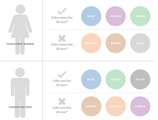
In a survey he conducted, 35% of women said that blue is their favorite color, followed by purple (23%) and green (14%). 33% of women admitted that orange and brown are their most unloved colors, in addition to the most unloved women they also attributed gray (17%).
The results of this survey are very clearly confirmed by the WomansDay website, they use blue and purple on their home page.

There is a paradigm that women love pink. But this is not so. Only a small percentage of women chose pink as their favorite color. Therefore, it is recommended that e-commerce sites use inserts of blue, purple and green. This will increase the attractiveness of your site for women and increase conversion.
If you are selling goods for men, then do not use purple, orange and brown as the primary colors of your site. This may push away a potential buyer. Traditional colors for a male audience are blue and black. It is these colors that are associated with masculinity.
Blue is the most common color. Not surprisingly, after all, it is he who is most preferred, both for men and for women. Here are some other associations that the color blue causes:
Most of the scientific community is inclined to believe that the blue color causes confidence and peace. And it is not surprising why the largest social network in the world uses precisely blue as the main one.

PayPal also prefers this color. This color scheme helps to attract trust from users. If PayPal used red or orange as the primary color, they probably would have been less popular in the world.

Blue color is often used by banks and credit organizations. So for example, VTB24 uses it as the primary color.

Despite the fact that blue is a very common color, it is by no means recommended to use it in the design of sites that relate to nutrition and food. Evolutionary theory suggests that blue is associated with poison. Therefore, never use blue if you are selling gourmet products.
Yellow is used in warning signs, traffic lights and road markings.

It seems strange, because it is known that yellow is the color of happiness. Business Insider reports that “brands use yellow to show that they are interesting and friendly.” According to this hypothesis, yellow causes a sense of playfulness. However, most likely yellow stimulates the excitation of the central part of the brain, and playfulness is simply a consequence of a state of increased emotionality, and not pure joy.
The psychology of color is closely linked to memory and experience. So, if you constantly wore a yellow shirt, lived in a house with yellow walls and ate fast food centers with yellow arches, then the yellow color can cause you joy because of the association with memorable events in your life.
Yellow can cause anxiety, so try to use yellow in small quantities, as this can lead to the loss of your customers.
Green is associated with nature, clean ecology and the environment. If the theme of your site is related to nature (construction, air conditioning, etc.), it is recommended to use green color to cause users to associate with cleanliness and ease.
Green is the most common color for buttons. So SpringSled, known for its customer acquisition strategy, uses green in design. Therefore, green is the perfect color for a call to action.

The use of green color will positively affect the site and improve the reputation among those who are puzzled by environmental problems.
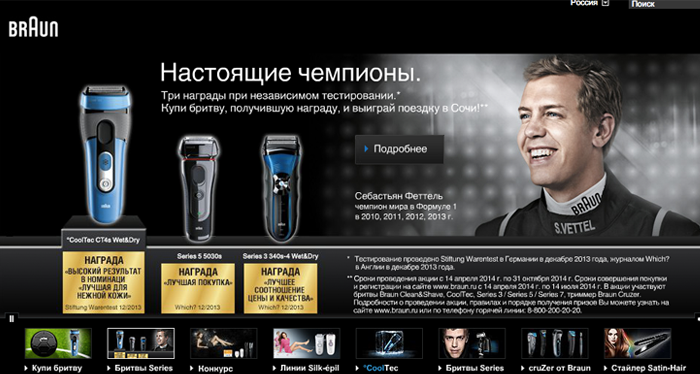
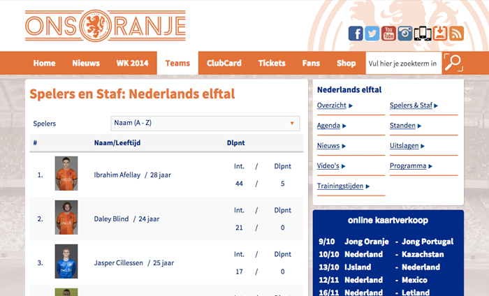
The positive side of the orange color is that it can be used to evoke a cheerful mood. According to some, orange helps stimulate physical activity, competition, and self-confidence. Maybe that's why orange is actively used by sports teams (for example, the Dutch team) and in children's goods.
Amazon uses orange to design the Kindle page. Orange indicates relevance, making the message more visible and effective.

Orange means pleasure and unity. Sometimes, orange is interpreted as "cheap." It is enough to compare orange with the color of luxury - black. Therefore, if you sell goods in a cheap price segment, it is recommended to use this color when designing website elements.
The darker the background, the more lux. An article from Lifescript describes black as "elegant, sophisticated, strong." Therefore, most high-end designers use black for e-commerce sites. Black is also described as "timeless, classic." This helps explain the use of black in high value-added products.
Black can also be considered as a luxurious color. Black is also glamor, sophistication, exclusivity.
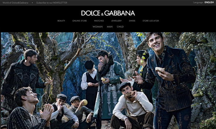
Just open the D&G website and everything will fall into place.
Black color is actively used by automakers. Here's an example of a Lamborghini website.
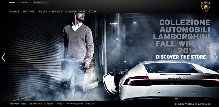
If you sell expensive luxury commodities, then be sure to use black in the design of the site to give special elegance and exclusivity.
The most common colors for a call to action are: red, green, orange, yellow. Darker colors like black, brown, or purple have low transition rates, unlike bright colors.
Russian ebay uses red for pop-ups.

Aliexpress uses orange on the main buttons.

Orange is associated with “cheap”, but if you want to capture the attention of users, then use this color.
The abundant use of white space is a powerful design element. Take, for example, the most popular site in the world.

Most well-designed websites today use white to create a sense of freedom and lightness.
If you use color in the right direction, at the right time, for the right audience, and for the right purpose, you can achieve very high results. The more freedom you have in the color scheme, the better. Here are some tips to make your site better:
The material is based on an article from the Kissmetrics blog . It was he who helped us with the development of templates for selling pages for LPCloud.
And how did the color affect the conversion of your site?
Neil Patelfrom QuickSprout claims that 85% of the color affects the decision to purchase a product. Therefore, many companies invest a lot of money in research and the creation of selling packaging for their goods. The same rule also works for selling sites: use the right colors and you will always win.
In which elements to use color?
Since color is everywhere, it is necessary at the very beginning to decide which color gamut to use. If you are making a children's-selling website, then use green-yellow-red in the logo, phone number, menu, headers. Your task is to cause positive emotions in parents, which is why it is recommended to use more bright and saturated colors.

In order to choose the right color scheme, you must follow the following principles:
- the right color for the theme;
- the right color for the target audience;
- correct color depending on time;
- The right color for each target action.
Here are some key tips on how professionals use colors in their work.
1. Women do not like gray, orange and brown. They love blue, purple and green.
There are large differences between color preferences in women and men. Nit Patel revealed which colors are preferred for each gender.

In a survey he conducted, 35% of women said that blue is their favorite color, followed by purple (23%) and green (14%). 33% of women admitted that orange and brown are their most unloved colors, in addition to the most unloved women they also attributed gray (17%).
The results of this survey are very clearly confirmed by the WomansDay website, they use blue and purple on their home page.

There is a paradigm that women love pink. But this is not so. Only a small percentage of women chose pink as their favorite color. Therefore, it is recommended that e-commerce sites use inserts of blue, purple and green. This will increase the attractiveness of your site for women and increase conversion.
2. Men do not like purple, orange and brown. They are closer to blue, green and black.
If you are selling goods for men, then do not use purple, orange and brown as the primary colors of your site. This may push away a potential buyer. Traditional colors for a male audience are blue and black. It is these colors that are associated with masculinity.

3. Use blue if you want to gain trust among users.
Blue is the most common color. Not surprisingly, after all, it is he who is most preferred, both for men and for women. Here are some other associations that the color blue causes:
- It is the color of trust, peace and order;
- Blue is the main corporate color in the USA (Intel, Dell, HP, IBM, etc.);
- It evokes a sense of calm and serenity.
Most of the scientific community is inclined to believe that the blue color causes confidence and peace. And it is not surprising why the largest social network in the world uses precisely blue as the main one.

PayPal also prefers this color. This color scheme helps to attract trust from users. If PayPal used red or orange as the primary color, they probably would have been less popular in the world.

Blue color is often used by banks and credit organizations. So for example, VTB24 uses it as the primary color.

Despite the fact that blue is a very common color, it is by no means recommended to use it in the design of sites that relate to nutrition and food. Evolutionary theory suggests that blue is associated with poison. Therefore, never use blue if you are selling gourmet products.
4. Yellow - the color of the warning.
Yellow is used in warning signs, traffic lights and road markings.

It seems strange, because it is known that yellow is the color of happiness. Business Insider reports that “brands use yellow to show that they are interesting and friendly.” According to this hypothesis, yellow causes a sense of playfulness. However, most likely yellow stimulates the excitation of the central part of the brain, and playfulness is simply a consequence of a state of increased emotionality, and not pure joy.
The psychology of color is closely linked to memory and experience. So, if you constantly wore a yellow shirt, lived in a house with yellow walls and ate fast food centers with yellow arches, then the yellow color can cause you joy because of the association with memorable events in your life.
Yellow can cause anxiety, so try to use yellow in small quantities, as this can lead to the loss of your customers.
5. Green is perfect for decoration.
Green is associated with nature, clean ecology and the environment. If the theme of your site is related to nature (construction, air conditioning, etc.), it is recommended to use green color to cause users to associate with cleanliness and ease.
Green is the most common color for buttons. So SpringSled, known for its customer acquisition strategy, uses green in design. Therefore, green is the perfect color for a call to action.

The use of green color will positively affect the site and improve the reputation among those who are puzzled by environmental problems.
6. Orange is fun.
The positive side of the orange color is that it can be used to evoke a cheerful mood. According to some, orange helps stimulate physical activity, competition, and self-confidence. Maybe that's why orange is actively used by sports teams (for example, the Dutch team) and in children's goods.

Amazon uses orange to design the Kindle page. Orange indicates relevance, making the message more visible and effective.

Orange means pleasure and unity. Sometimes, orange is interpreted as "cheap." It is enough to compare orange with the color of luxury - black. Therefore, if you sell goods in a cheap price segment, it is recommended to use this color when designing website elements.
7. Black adds a sense of luxury.
The darker the background, the more lux. An article from Lifescript describes black as "elegant, sophisticated, strong." Therefore, most high-end designers use black for e-commerce sites. Black is also described as "timeless, classic." This helps explain the use of black in high value-added products.
Black can also be considered as a luxurious color. Black is also glamor, sophistication, exclusivity.
Just open the D&G website and everything will fall into place.

Black color is actively used by automakers. Here's an example of a Lamborghini website.

If you sell expensive luxury commodities, then be sure to use black in the design of the site to give special elegance and exclusivity.
8. Use vibrant colors to call to action.
The most common colors for a call to action are: red, green, orange, yellow. Darker colors like black, brown, or purple have low transition rates, unlike bright colors.
Russian ebay uses red for pop-ups.

Aliexpress uses orange on the main buttons.

Orange is associated with “cheap”, but if you want to capture the attention of users, then use this color.
9. Do not neglect white.
The abundant use of white space is a powerful design element. Take, for example, the most popular site in the world.

Most well-designed websites today use white to create a sense of freedom and lightness.
Conclusion
If you use color in the right direction, at the right time, for the right audience, and for the right purpose, you can achieve very high results. The more freedom you have in the color scheme, the better. Here are some tips to make your site better:
- Test the colors . No need to dwell on one specific color. Check out different color combinations to find out which color your target audience likes more.
- Do not drive your designer into the “color frame” . When working with a designer, do not place strict conditions for him to use one color.
- Stay tuned for color . Do not forget that your goal is not to create a design that will look cool on a dribble. Beauty is certainly good, but the main task of the site is to sell. Do not forget about it.
- Avoid overloading colors . Do not try to use all colors at once in one design. This can lead to sad consequences. Too many colors can create a sense of confusion.
The material is based on an article from the Kissmetrics blog . It was he who helped us with the development of templates for selling pages for LPCloud.
And how did the color affect the conversion of your site?
