February 14, 2014 at 14:40
Custom font in Unity3d
Somehow, when preparing my project in Unity3d, I had to use a Bitmap font (aka bitmap font). I was very happy when I discovered in Unity the tools for creating such a font. But after some time I realized that this procedure is by no means trivial due to the lack of any documentation on this subject.
This article is about how to build Custom Bitmap Font ready to use in Unity. The lesson is quite detailed and affects the work in Photoshop. Interested, I ask for cat.
As the wiki explains , a bitmap font is actually a set of bitmap images of all the characters used. That is, first of all we need a texture containing images of all the characters we need. In this example, I will limit myself to only numbers and a couple of auxiliary characters, however, you can use this technique on any number of glyphs.
Our font will contain 14 characters: numbers from zero to nine, signs "+", "-", a dot separating the fractional and integer parts and a space. We’ll also leave a couple of reserved places for symbols that we might want to add in the future. Total 16 slots on the texture.
In the most optimal way to arrange these 16 slots on a texture, you can do this: use 4 columns and 4 rows.

I used Photoshop to prepare the example, and during the lesson I will also give some explanations for my actions in it. So, open the image editor and create a new document, 400 by 400 pixels in size. The size measurement of the texture at this stage is not particularly critical, the main thing is that it is not too small. We will expose the final texture size in Unity at the very end of the lesson.
For convenience, I advise you to enable the display of rulers, grids and guides (ruler, grid and guides). Hotkey to display the grid Ctrl + 'for guides Ctrl +; for the line Ctrl + R. To create a guideline, simply drag it from the document ruler. The settings for all these helpers are in the menu Edit -> Preferences -> Units & Rulers
Next, we have to fill the texture with content in the form of, in fact, symbols. As the basis of my bitmap font, I used the free Unispace font. Call the Text tool with the Shift + T hotkey and enter our first glyph. All characters must be accurately positioned in the center of each of the 16 slots (here we will need an auxiliary grid). After entering the first character (in our case it is zero), press Enter to confirm the entry. To position the layer correctly, by pressing the Ctrl + T keys we call the Transform tool and move the layer to the desired location, guided by the auxiliary grid.

We perform this simple operation with all the symbols we need and - voila!
In the next step, we will combine all the resulting layers with numbers and signs into one common layer. To do this, select them in the Layers panel and press Ctrl + E. The main thing is not to accidentally hook the background layer, because then all the information about transparency will disappear. After that, the most interesting and creative part of the work begins. Customize layer effects to taste. I will not describe it in detail here, everyone will decide for himself what he likes and does in his own way. What happened to me can be seen in the picture below.

So, at the moment we have two layers: our numbers with signs and a white background layer. After we have configured all the effects we need, make a backup copy of the layer and proceed to the next step: creating an alpha channel.
The alpha channel will store transparency information. Black pixels are responsible for full transparency, white pixels - on the contrary. Shades of gray create the effect of various degrees of translucency. In my case, there is a soft black shadow around the symbols, which I would like to see smoothly fading as it spreads away from the symbols. To achieve this effect, we will just use halftones in the alpha channel.
A freshly duplicated layer will become the core of our alpha channel. First we need to bake all its effects, that is, to rasterize the layer. To do this, I usually create a new empty layer, select it and the layer I'm working with now - and merge them into one (Ctrl + E).

We got a rasterized layer with transparency information. Now it remains only to transfer this information to the alpha channel. To do this, holding Ctrl, click on the ionic layer in the Layers panel - getting the selection using the transparency mask, and in the Channels panel create a new channel, again holding Ctrl. The button for creating a new channel is located at the bottom right of the panel near the button for deleting the channel, with a basket. The resulting channel turned out to be inverted - it does not matter. Combination Ctrl + I restore the normal state of things.

Alpha channel is ready. Texture, in general, too. Except that the white background layer interferes with the correct display of the shadow around the characters. I painted it in the color of the shadow.
We save the texture to a favorite format that supports the alpha channel (I use TGA-32bit) and move on to the next step.
Import the texture into Unity3d. To do this, in the Project panel we find the Assets folder and from the context menu call Import New Asset ... We find the file with our texture. Done.

The texture settings are pretty obvious, and I will not detail them. I only mention that you need to set the sane texture size. In our case, 256x256 px is fine.
Next, in the same context menu, create a new material and font asset (Create -> Material, Create -> Custom Font). In the material settings, select the just imported texture. Also, the material must maintain transparency. Therefore, the type of material we select the appropriate: Transparent / Diffuse.

Finally, we come to the very essence of the lesson. We have customized material with a beautiful texture, and now we need to somehow assemble a raster font ready for use in Unity from it.
For some reason, the tool for creating a raster font in Unity is made extremely inconvenient. In addition, no documentation on it was found on the network. All we have is an indistinct panel with settings:

After digging through it for several hours, I still managed to recognize most of the parameters that are enough to create a font.
Ascii Start Offset - an integer responsible for shifting the Ascii code table. Example: set the value to 10, and now access to the character "A" with code 65 can be obtained through code 75.
Kerning - the interval between letters.
Line Spacing - the distance between lines of text.
Default Material - material with font texture. We have already created it.
Character rects- An array of mapping settings for each character.
It is Character Rects that interests us most.
Size - the size of the array (the number of characters in the font).
Element x - element of the Character Rects array with the settings for a specific symbol.
Index - Ascii-code of the symbol, taking into account Ascii Start Offset.
UV - coordinates and sizes of the symbol on the texture.
X, Y, W, H - coordinates of the lower left corner of the texture section with the symbol, as well as the width and height of this section.
Here it is necessary to make a small digression into the theory of mappig, in the spoiler there is a short visual aid.
Vert - coordinates and sizes of the polygon, to which the symbol
X, Y, W, H will map - the coordinates of the lower left corner of the polygon with the symbol, as well as the width and height of this polygon. In the general case, x and y are set to 0, w and h are the length and width of the polygon, and h is a negative number. Do not ask why, I myself did not understand.
Width is a bit of a letter spacing for a particular character.
Flipped - rotates the texture 90 degrees relative to the polygon (can be used for vertical fonts).
So, the main parameters should be clear. Let's start mapping our numbers. First, take a look at the table of Ascii codes.

As you can see, each character has a unique Ascii code. For example, code 43 belongs to the plus sign. And now we are starting the hard, dreary work of entering the coordinates into the corresponding fields. Below is a picture that shows how the plus and minus signs were blurred.

After all the characters are mapped, you can congratulate you on a very difficult task: the font is ready and now it can be used!
Create an empty object in the project scene. Assign the “TextMesh” component to it and select our font in the settings.
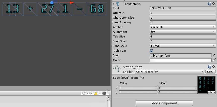
Beauty!
Creating raster fonts in Unity is a very difficult but interesting job. I would like to believe that, having passed this lesson, you have learned something new and useful for yourself. The lack of such a description at one time greatly impeded the progress of my project. And I hope that this text will save a lot of time for everyone who someday needs to create a custom font in Unity.
This article is about how to build Custom Bitmap Font ready to use in Unity. The lesson is quite detailed and affects the work in Photoshop. Interested, I ask for cat.
Introduction
As the wiki explains , a bitmap font is actually a set of bitmap images of all the characters used. That is, first of all we need a texture containing images of all the characters we need. In this example, I will limit myself to only numbers and a couple of auxiliary characters, however, you can use this technique on any number of glyphs.
Texture preparation
Our font will contain 14 characters: numbers from zero to nine, signs "+", "-", a dot separating the fractional and integer parts and a space. We’ll also leave a couple of reserved places for symbols that we might want to add in the future. Total 16 slots on the texture.
In the most optimal way to arrange these 16 slots on a texture, you can do this: use 4 columns and 4 rows.
I used Photoshop to prepare the example, and during the lesson I will also give some explanations for my actions in it. So, open the image editor and create a new document, 400 by 400 pixels in size. The size measurement of the texture at this stage is not particularly critical, the main thing is that it is not too small. We will expose the final texture size in Unity at the very end of the lesson.
For convenience, I advise you to enable the display of rulers, grids and guides (ruler, grid and guides). Hotkey to display the grid Ctrl + 'for guides Ctrl +; for the line Ctrl + R. To create a guideline, simply drag it from the document ruler. The settings for all these helpers are in the menu Edit -> Preferences -> Units & Rulers
Next, we have to fill the texture with content in the form of, in fact, symbols. As the basis of my bitmap font, I used the free Unispace font. Call the Text tool with the Shift + T hotkey and enter our first glyph. All characters must be accurately positioned in the center of each of the 16 slots (here we will need an auxiliary grid). After entering the first character (in our case it is zero), press Enter to confirm the entry. To position the layer correctly, by pressing the Ctrl + T keys we call the Transform tool and move the layer to the desired location, guided by the auxiliary grid.
We perform this simple operation with all the symbols we need and - voila!
In the next step, we will combine all the resulting layers with numbers and signs into one common layer. To do this, select them in the Layers panel and press Ctrl + E. The main thing is not to accidentally hook the background layer, because then all the information about transparency will disappear. After that, the most interesting and creative part of the work begins. Customize layer effects to taste. I will not describe it in detail here, everyone will decide for himself what he likes and does in his own way. What happened to me can be seen in the picture below.
So, at the moment we have two layers: our numbers with signs and a white background layer. After we have configured all the effects we need, make a backup copy of the layer and proceed to the next step: creating an alpha channel.
The alpha channel will store transparency information. Black pixels are responsible for full transparency, white pixels - on the contrary. Shades of gray create the effect of various degrees of translucency. In my case, there is a soft black shadow around the symbols, which I would like to see smoothly fading as it spreads away from the symbols. To achieve this effect, we will just use halftones in the alpha channel.
A freshly duplicated layer will become the core of our alpha channel. First we need to bake all its effects, that is, to rasterize the layer. To do this, I usually create a new empty layer, select it and the layer I'm working with now - and merge them into one (Ctrl + E).
We got a rasterized layer with transparency information. Now it remains only to transfer this information to the alpha channel. To do this, holding Ctrl, click on the ionic layer in the Layers panel - getting the selection using the transparency mask, and in the Channels panel create a new channel, again holding Ctrl. The button for creating a new channel is located at the bottom right of the panel near the button for deleting the channel, with a basket. The resulting channel turned out to be inverted - it does not matter. Combination Ctrl + I restore the normal state of things.
Alpha channel is ready. Texture, in general, too. Except that the white background layer interferes with the correct display of the shadow around the characters. I painted it in the color of the shadow.
We save the texture to a favorite format that supports the alpha channel (I use TGA-32bit) and move on to the next step.
Preparing to create a font in Unity
Import the texture into Unity3d. To do this, in the Project panel we find the Assets folder and from the context menu call Import New Asset ... We find the file with our texture. Done.
The texture settings are pretty obvious, and I will not detail them. I only mention that you need to set the sane texture size. In our case, 256x256 px is fine.
Next, in the same context menu, create a new material and font asset (Create -> Material, Create -> Custom Font). In the material settings, select the just imported texture. Also, the material must maintain transparency. Therefore, the type of material we select the appropriate: Transparent / Diffuse.
Finally, we come to the very essence of the lesson. We have customized material with a beautiful texture, and now we need to somehow assemble a raster font ready for use in Unity from it.
Bitmap font in Unity
For some reason, the tool for creating a raster font in Unity is made extremely inconvenient. In addition, no documentation on it was found on the network. All we have is an indistinct panel with settings:
After digging through it for several hours, I still managed to recognize most of the parameters that are enough to create a font.
Ascii Start Offset - an integer responsible for shifting the Ascii code table. Example: set the value to 10, and now access to the character "A" with code 65 can be obtained through code 75.
Kerning - the interval between letters.
Line Spacing - the distance between lines of text.
Default Material - material with font texture. We have already created it.
Character rects- An array of mapping settings for each character.
It is Character Rects that interests us most.
Size - the size of the array (the number of characters in the font).
Element x - element of the Character Rects array with the settings for a specific symbol.
Index - Ascii-code of the symbol, taking into account Ascii Start Offset.
UV - coordinates and sizes of the symbol on the texture.
X, Y, W, H - coordinates of the lower left corner of the texture section with the symbol, as well as the width and height of this section.
Here it is necessary to make a small digression into the theory of mappig, in the spoiler there is a short visual aid.
Brief explanation in mapping
Texture mapping is the process of applying texture to polygonal surfaces in computer graphics.

The texture coordinates of the plot with the number five will be as follows:
The texture coordinates of the plot with the number five will be as follows:
X = 0.25, Y = 0.5, H = 025, W = 0.25Vert - coordinates and sizes of the polygon, to which the symbol
X, Y, W, H will map - the coordinates of the lower left corner of the polygon with the symbol, as well as the width and height of this polygon. In the general case, x and y are set to 0, w and h are the length and width of the polygon, and h is a negative number. Do not ask why, I myself did not understand.
Width is a bit of a letter spacing for a particular character.
Flipped - rotates the texture 90 degrees relative to the polygon (can be used for vertical fonts).
So, the main parameters should be clear. Let's start mapping our numbers. First, take a look at the table of Ascii codes.
As you can see, each character has a unique Ascii code. For example, code 43 belongs to the plus sign. And now we are starting the hard, dreary work of entering the coordinates into the corresponding fields. Below is a picture that shows how the plus and minus signs were blurred.
After all the characters are mapped, you can congratulate you on a very difficult task: the font is ready and now it can be used!
Create an empty object in the project scene. Assign the “TextMesh” component to it and select our font in the settings.
Beauty!
Afterword
Creating raster fonts in Unity is a very difficult but interesting job. I would like to believe that, having passed this lesson, you have learned something new and useful for yourself. The lack of such a description at one time greatly impeded the progress of my project. And I hope that this text will save a lot of time for everyone who someday needs to create a custom font in Unity.