Designing dashboards for web analytics e-commerce site. Part 1: User-friendly interface
Dashboards call an array of data presented in visual form in the form of tables, graphs, and elements of infographics. Sometimes a dashboard is any beautifully designed set of numbers. As, for example, the information panel shown in the picture.
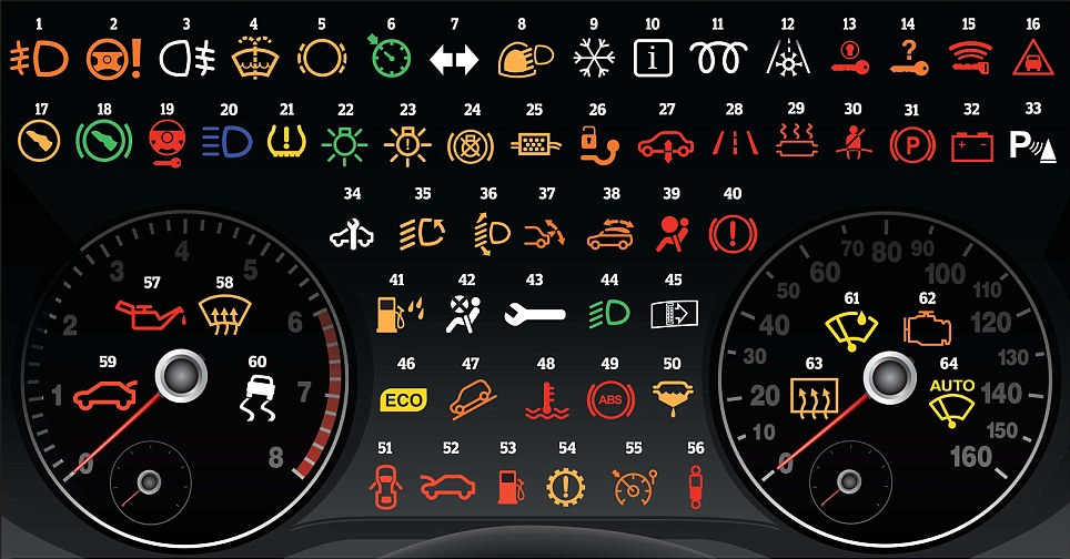
Dashboards for motorists
The cycle of publications will consist of articles describing the content of dashboards for web analytics e-commerce sites. Let's talk about creating a user-friendly dashboard interface.
In order for the set of numbers, graphs and other visual elements presented in the dashboard to be understandable to the end customer, more than one iteration will be required. When designing a dashboard will have to answer the questions:
Dashboards for motorists
The cycle of publications will consist of articles describing the content of dashboards for web analytics e-commerce sites. Let's talk about creating a user-friendly dashboard interface.
Make the report content delicious!
In order for the set of numbers, graphs and other visual elements presented in the dashboard to be understandable to the end customer, more than one iteration will be required. When designing a dashboard will have to answer the questions:
- Who is the dashboard for? Will it be used by a marketing director or a director? How often will the customer open this report? The level of information display and time periods for the dynamics of indicators depend on the end user of the dashboard.
There are three types of dashboards: operational, analytical and strategic. Operational panels serve to display information that changes rapidly with time. Analytical dashboards are used to conduct a study of current trends, assess the situation and adopt conclusions to correct negative trends. Strategic dashboards, as a rule, are used as a guide for determining the direction of a company, identifying problems in structural units and setting targets for their correction.
Example. The marketer sees that the traffic from Contextual Advertising generates too expensive leads (strategic dashboards), sets the task for the director to correct the situation. The analyst finds in the analytical report a decrease in positions on conversion keywords due to the increased cost of a click and increases the bids on keywords. Set the task for account managers to control which positions the keywords will take after changing the cost of a click and whether the cost of circulation will not exceed the target value. Account managers “keep their hands on the pulse” using an operational dashboard.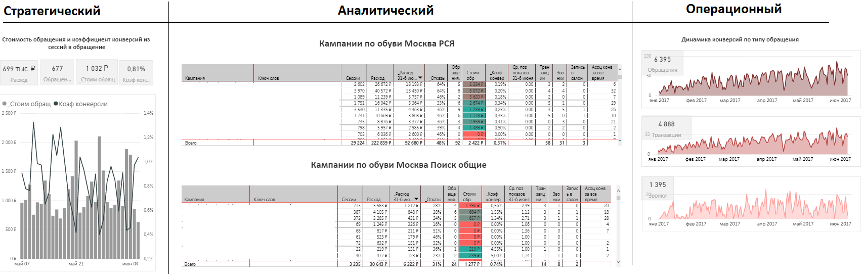
Strategic, analytical and operational dashboards without conclusions and recommendations - What decision to take? Recall the principles of the decision pyramid. We go from the general to the particular: first, we choose which solution is needed, then which performance indicators will help evaluate the decision made, and finally, which indicators may have an impact on KPI. And those and other indicators will need to reflect on the dashboard from top to bottom.
An example . The customer of the dashboard wants to understand how to increase the number of orders and reduce their cost. At the beginning of the list, we will reflect the main KPI, for example, the number of orders and their cost. Next, we derive auxiliary KPIs, such as a bounce rate and a viewing depth, for assessing the quality of traffic. Below we place the segmented data, for example, indicators of the number of orders and the cost of circulation in the context of cities, device types, days of the week and time of day.
Performance targets must meet ACTA principles:- Actionable - the name of the metric should display its content. For example,% of orders delivered on time.
- Common interpretation - all users of the report should interpret the indicators in the same way.
- Transparent - everyone should understand how the metric is calculated.
- Accessible, credible data - the data source must be reliable.
Dashboard differs from the information panel in that it contains analysis, conclusions and recommendations for changing the situation. Good dashboards contain assumptions about the consequences of decisions made. In analyzing the situation and conclusions, it is not necessary to describe the information that is already obvious from the graphs. Customers are waiting for an analysis of trends and the reasons for the current behavior of target performance indicators. Be sure to give clear and understandable guidelines for action based on data from the dashboards. It is not always possible to predict the result of your actions, but when you show the client the expected benefits from the implementation of changes, he will certainly take into account your recommendations in his work.Do not forget about the appearance of dashboard
Presentation of information on dashboards is not an easy task, especially when you need to display a lot of heterogeneous data in a language understandable to the customer. It is customary to use the following visualizations: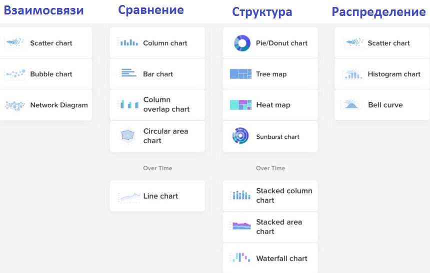
Visualization by the type of information
Usability of dashboards is somewhat similar to the usability of the site, I recall the basic rules.Heder
When you first open a dashboard, the customer must at a glance understand where he is and what benefit he can get from the data. You should not rely on the fact that only your customer will use your designed dashboards. He will always be able to share dashboards with one of his colleagues. And even better if he wants to do it. So do not forget about the cap. It consists of the name of the dashboard, the logo of the company-customer and, possibly, the company-performer.Footer
After reviewing the data, the customer wants to see the conclusions and recommendations for further action. Not necessarily conclusions and recommendations should be located in the footer, but must be present in the dashboard.Structuring information
The location of the information blocks must adhere to certain rules. The location of elements on the dashboard from page to page is better not to change and use the grid. There must be enough free space between the elements. Charts should be signed, following uniform formatting. Use 2-3 fonts. Important information to highlight the color size.Easy navigation
Navigation should be clear and accessible. If you didn’t display detailed information on the dynamics of indicators on this dashboard, but the customer needs it, you should give a link to the dashboard sheet on which this information is presented.Color spectrum
The color palette you choose should match the color palette of the customer site. No need to compose your own color palette.
Dashboard from Kevin Jackson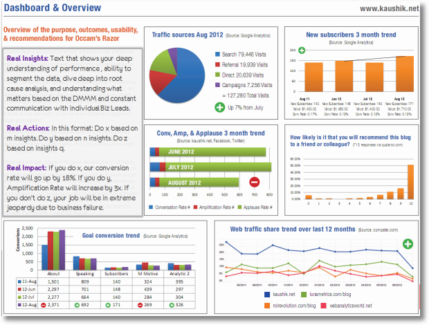
Dashboard from Christopher EddyPrototype dashboard with user-friendly interface
All subsequent dashboards for articles on Habré will be created in Power BI, so I will give a sketch of the prototype in the same program.
The cap contains the name of the dashboard, the filter by date (at the first reading it will be clear when the dashboard was updated), the company logo. The maximum attention of the dashboard user is focused on the elements in the upper left corner of the screen. Filters are located in the right corner, so as not to delay attention to themselves. Findings, recommendations and forecast are located in the upper left corner. Positive dynamics are marked in green, negative ones are marked in red. The scrollbar does not interfere with the perception of information. Complied with the space between the elements.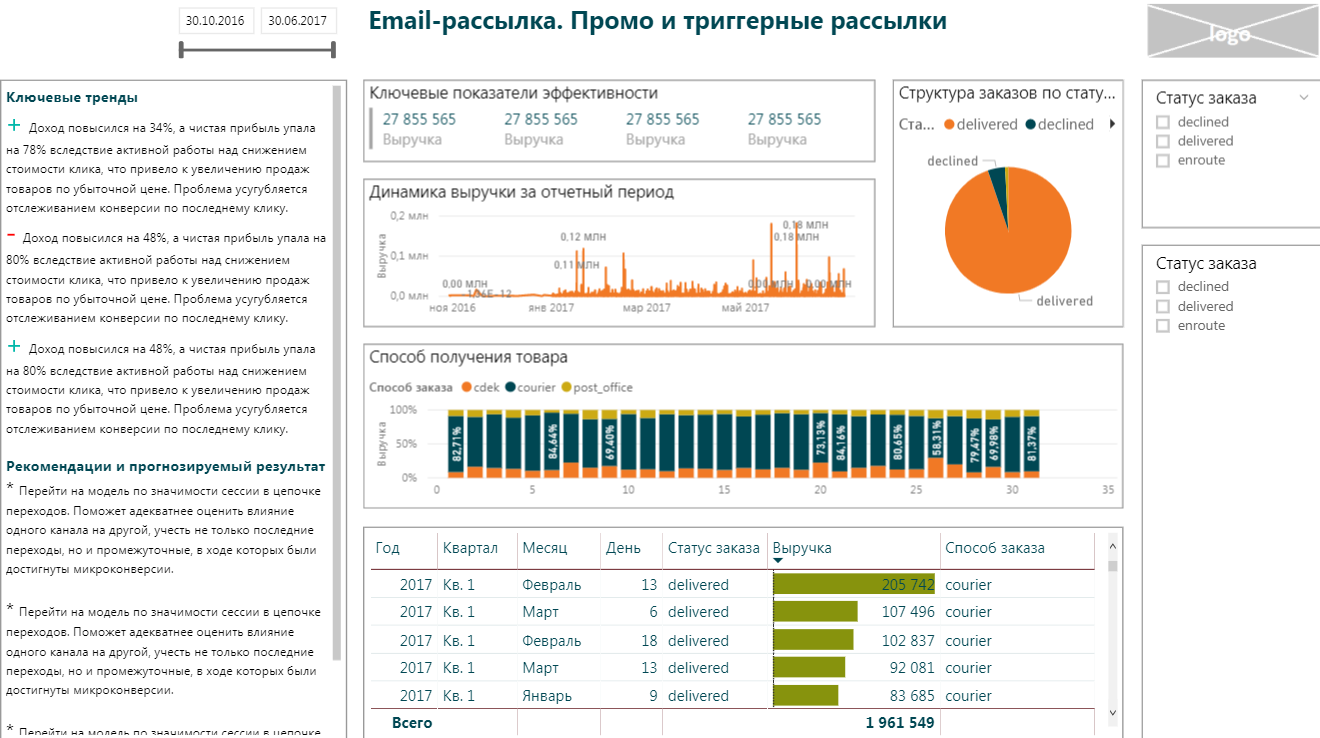
Prototype of my dashboard
Sources- Heuristic principles of usability by Jacob Nielsen
- How to make a dashboard interface convenient
- Dashboards, strategic and tactical
Articles from the cycle