WEB DESIGN: Going Personal
Hello, Habrachitatel! I work as a web designer, and today we will continue to develop the theme that began in the last article . Namely, let's talk about the interaction of two specialists who usually work in conjunction when creating sites. The article is devoted to designers and their some typical mistakes when working with layouts.
Here are 8 situations in which the web designer, Dmitry, working in Photoshop, and the layout designer, Vladimir, will participate. These two guys know their stuff, but they constantly have conflicts, and sometimes one of them has a strange desire to hit the other with a monitor on the head. However, we are all civilized people and we cannot allow such a denouement. And so now we will understand some of the causes of the conflict between these two invaluable specialists.
Dmitry (D) finished rendering the layout of the site and gives it to Vladimir (B) with a clear conscience. The site is uncomplicated, and therefore our layout designer managed it in a day. However, the layout was somewhat embarrassed for Dmitry.
D: What about informers? They seem to have become smaller.
Q: I had to crop them from all sides by 1 pixel.
D :?
Q: They did not have clear boundaries, I deleted the blurry pixels.
Our layout designer had to trim the widgets a bit more than the designer had planned. As a result, extra indentation appeared in the layout. But this was not the only problem. Later it turned out that all the graphic elements of the layout that had strictly vertical and horizontal lines were also not clear enough, which ultimately strains the user's vision and causes him a headache.
All images are clickable.
No matter how Dmitry tries to convince Vladimir of the illegality of his actions with respect to the informers, Dmitry will still be guilty, 100%. The typesetter should not guess at what pixels he should cut elements.
Photoshop has support for vector graphics. But if, for example, you create a square, most likely its borders will be fuzzy. This is due to the fact that the mouse when specifying the size of the square does not always lie exactly between the pixels, in this case the primitive border touches the neighboring pixel, making it translucent.
Correcting these inaccuracies is better right away: you can zoom in many times and specify the border of the primitive without touching the neighboring pixels, or you can use a square eraser, but you will have to rasterize the primitive, which in most cases is undesirable. In general, the problem is solved quickly and easily, the main thing not to forget about it. The same goes for icons and thin stripes. Wherever there are vertical and horizontal borders / lines, it is necessary to control their extreme clarity.
Now Dmitry monitors the clarity of his layouts and no longer causes migraines among users and Vladimir, but this was only the first simple test. New order, new layout.
Q: I have to catch it in a day.
3 days have passed ...
D: Vladimir, do you have a problem?
Q: In the layout there are so many gradients with shadows that I needed a couple of sleepless nights and a bit of RedBull, but in the end I managed.
D: Ok, the order fell through, so put yourself in order, we have a new one. These two extra days were extremely important for the customer, he did not want to work with us further.
Q: ...
D: Vladimir?
Well, again this awkwardness. The customer liked the layout and he even approved it, but the layout process took much more time than expected. Why? On the one hand, an incorrect estimation of the amount of work by the layout designer, on the other, the layout is overloaded with pseudo 3D elements.
Shadows - they do not have clear boundaries; they expand objects, and in some cases add the need to use transparency. Sometimes shadows can intersect with neighboring objects, and this is a real hemorrhoids for a layout designer. Think: Do they really carry an informational or functional idea? Not sure? Then remove them. Yes, now shadows can be implemented using CSS, but they, most likely, will not be displayed everywhere as designed by the designer.
Gradients are not such a big problem compared to shadows. Sometimes they very well emphasize the smoothness of style, give the layout a calm. And sometimes they clutter up the graphics or, if the gradient is insignificant, add extra code. And if it is a non-linear gradient, in this case you should be 200% sure of the need for its use.
Dmitry and Vladimir are ready to work on a new project. Yes, one order is lost, perhaps even a part of the reputation is lost, but they are decisive and relentless. Reputation can be restored if you try. Highly. The layout is ready, approved, clarity is in order, pseudo 3D in moderation, nothing portended trouble:
Q: What color is this text?
D: In the sense of “what”, look at the attributes.
Q: I look. It is black in the attributes, but the text is clearly lighter.
D: Use a dropper.
Q: Can you say exactly what number this color has?
D: For a second, I’ll look now ...
Q: And?
D: Just pipette it.
Q: ...
There are situations when neither the layout designer, nor even the designer himself, can accurately determine the color of the text in the layout. How is this even possible? Easy. When choosing colors for text, designers sometimes do not use color attributes, but layer transparency. It is easier and faster. There is a background, for example, red. It should be text, light, but not white. The designer sets white color in the text attributes and then simply plays with the transparency of the layer, in which case he will never miss the key. But to find out the true meaning of the resulting color will be impossible. Very bad designer's habit.
Everything is very simple: never use transparency for text ever and never. Pick up color immediately without transparency, protect yourself from problems in the future.
If you are already in such an unpleasant situation, the only quick way is to set the text to a gigantic size and add boldness, so that it would be more accurate to use a pipette on it. It is hoped that the text was not rasterized.
Of course, transparency is completely unnecessary. For example, a floating horizontal menu with little transparency visually facilitates the layout and does not disorientate the user.
This is how experience is gained, but the relationship between the designer and the layout designer is not getting any better. You need to at least superficially understand what and how your colleague is doing, otherwise there will be conflicts. For example, such as this one:
Q: Did you use the overlay effect in this layer?
D: Yes, problems?
B: Large. I will not make it up until you remove the interaction of the layers.
D: You can clean it yourself.
Q: ...
Never use blending effects in layouts. Never. These effects only work in Photoshop. The designer must learn this rule once and for all.

If the use of blending effects is really necessary, you need to transform the layers in such a way that everything in the layout turns out to be without layer interaction, otherwise, it will be useless to typeset. Perhaps for this the designer will need to merge the result of the interaction into a separate image and use it again, which, of course, is inconvenient, but leaving effects for the layout designer is unacceptable.
No matter what, our couple continues to work. And it doesn’t matter that Vladimir is already naturally afraid of every new Dmitry’s layout, orders are on the way. The new project did not need an extensive schedule, there was simply nowhere to make mistakes - that’s what our layout designer thought.
Q: Dmitry, I don’t understand why it was so scoffed at this text.
D: We have almost no graphics, everything rests on the text, I used it to the maximum.
Q: You increased its height, reduced its width, changed the intersymbol spacing - is that some kind of grandiose plan?
D: You just need to learn how to typeset the text.
Q: ...
The application of attributes to the text and changes in its properties takes place only if such text is subsequently rasterized and used, for example, in some slides. But now, even in slides, they try not to rasterize the text. There are many fonts to suit the needs of any font designer. Do not make life difficult for layout designers; it’s not worth it.
If the text is not rasterized, it should not have changes in the properties, moreover, we are talking about the types of style. If you are planning to use bold font somewhere, do not add boldness to Photoshop functions. Each adequate font has several ready-made font styles that are specially adapted for a particular font - this is more than enough.
After all that has happened, Vladimir seriously begins to think about the opportunity to work with another designer, and our Dmitry, in turn, would be happy to work with a layout designer who would not ache for any occasion, but simply do his job. The only problem is that Dmitry will never find such a layout, not because they are not there, but because our designer does not even understand the basics of layout, and this is sad, both for Dmitry himself and for Vladimir.
D: When I gave you the layout, it had 3 key colors, and orange now does not match what was in the layout.
Q: Which code matched your orange?
D: Can't you just use the eyedropper again?
Q: I can.
D: Then what is the problem?
Q: Your layout has more orange than you think ...
If you are a designer, then all the work with color lies entirely with you. Remember, every inaccuracy in your layout, subsequently, will certainly make itself felt at the most inopportune moment. What is obvious to the designer is not at all obvious to the layout designer - always remember this.
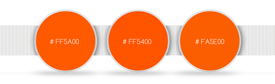
Dmitry used the orange color as one of the key in the layout. But he was too lazy to copy the color code for the new orange element every time. As a result, Vladimir gets a layout with a full set of orange colors that do not match the code. What to do? Most likely, the layout designer will take the first orange code that comes across and use it everywhere, and most likely this will not go unnoticed.
The designer has many ways to make the layout designer hate himself. Lots of. But we consider only a few. However, they will be enough to achieve the goal. Conflict can happen even out of the blue. The perfect layout made flawlessly. But Vladimir feels somewhere there is a catch.
D: Are you kidding?
Q: I finished layout, why should I joke?
D: Yes, there is not a good third of the elements from the layout!
Q: It cannot be, I did everything on it.
D: You're kidding, open the layout and find 10 differences with what you show me!
Q: I see no differences ...
D: Very funny.
Q: ...
The situation is incredible, but absolutely realistic. Both are partly to blame, it is impossible to single out anyone specifically. Until these poor fellows finally come to understand why it happened, a lot of time can pass, and many words can be said, not the most pleasant. Quite unpleasant.
If someone else has not guessed - the problem is in the different brightness settings of monitors. The designer worked on the layout on the monitor with a lower brightness compared to the typesetting monitors. Dmitry worked on the site, mainly in light colors: a lot of white, and some elements are light gray. On his monitor, he distinguished them perfectly, but on a new monitor with high brightness and LED-backlight, these elements are simply not visible at point blank range.
This is actually a real situation. The solution to the banality is simple: make sure that your monitors and your colleague have approximately the same brightness / contrast settings. Calibrate your monitors in one calibration test, and the world will immediately become kinder.
After the following situation, our couple used a lot of not the most censored expressions, so I can not give them below. The new project was very capacious:

It doesn't matter anymore.
To run.
PS. Thank you for your attention, I hope this article will help you not to get into any of the above situations, and I also want understanding between designers and layout designers, because the quality of our Internet environment depends on them to a large extent.
All images were drawn specifically for the article and are clickable (for viewing in the original size).
Here are 8 situations in which the web designer, Dmitry, working in Photoshop, and the layout designer, Vladimir, will participate. These two guys know their stuff, but they constantly have conflicts, and sometimes one of them has a strange desire to hit the other with a monitor on the head. However, we are all civilized people and we cannot allow such a denouement. And so now we will understand some of the causes of the conflict between these two invaluable specialists.
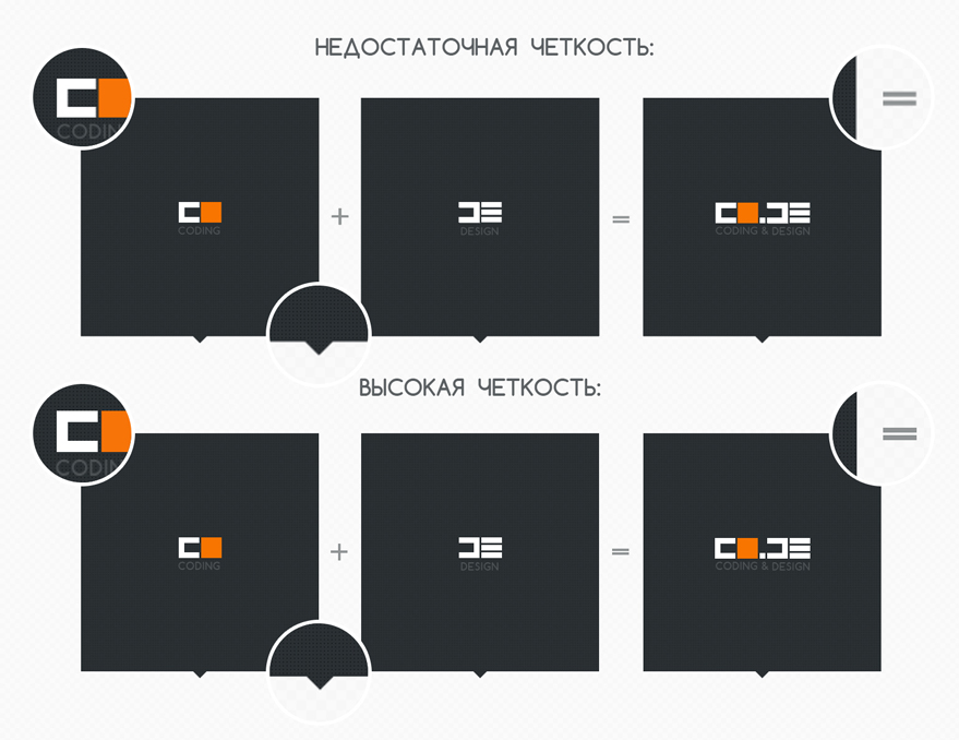
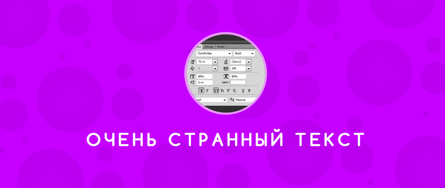
1. Sharpness
Dmitry (D) finished rendering the layout of the site and gives it to Vladimir (B) with a clear conscience. The site is uncomplicated, and therefore our layout designer managed it in a day. However, the layout was somewhat embarrassed for Dmitry.
D: What about informers? They seem to have become smaller.
Q: I had to crop them from all sides by 1 pixel.
D :?
Q: They did not have clear boundaries, I deleted the blurry pixels.
Our layout designer had to trim the widgets a bit more than the designer had planned. As a result, extra indentation appeared in the layout. But this was not the only problem. Later it turned out that all the graphic elements of the layout that had strictly vertical and horizontal lines were also not clear enough, which ultimately strains the user's vision and causes him a headache.
All images are clickable.

Who's guilty?
No matter how Dmitry tries to convince Vladimir of the illegality of his actions with respect to the informers, Dmitry will still be guilty, 100%. The typesetter should not guess at what pixels he should cut elements.
What to do?
Photoshop has support for vector graphics. But if, for example, you create a square, most likely its borders will be fuzzy. This is due to the fact that the mouse when specifying the size of the square does not always lie exactly between the pixels, in this case the primitive border touches the neighboring pixel, making it translucent.
Correcting these inaccuracies is better right away: you can zoom in many times and specify the border of the primitive without touching the neighboring pixels, or you can use a square eraser, but you will have to rasterize the primitive, which in most cases is undesirable. In general, the problem is solved quickly and easily, the main thing not to forget about it. The same goes for icons and thin stripes. Wherever there are vertical and horizontal borders / lines, it is necessary to control their extreme clarity.
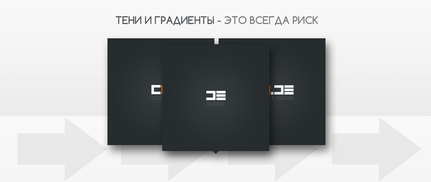
2. Pseudo 3D
Now Dmitry monitors the clarity of his layouts and no longer causes migraines among users and Vladimir, but this was only the first simple test. New order, new layout.
Q: I have to catch it in a day.
3 days have passed ...
D: Vladimir, do you have a problem?
Q: In the layout there are so many gradients with shadows that I needed a couple of sleepless nights and a bit of RedBull, but in the end I managed.
D: Ok, the order fell through, so put yourself in order, we have a new one. These two extra days were extremely important for the customer, he did not want to work with us further.
Q: ...
D: Vladimir?
Who's guilty?
Well, again this awkwardness. The customer liked the layout and he even approved it, but the layout process took much more time than expected. Why? On the one hand, an incorrect estimation of the amount of work by the layout designer, on the other, the layout is overloaded with pseudo 3D elements.

What to do?
Shadows - they do not have clear boundaries; they expand objects, and in some cases add the need to use transparency. Sometimes shadows can intersect with neighboring objects, and this is a real hemorrhoids for a layout designer. Think: Do they really carry an informational or functional idea? Not sure? Then remove them. Yes, now shadows can be implemented using CSS, but they, most likely, will not be displayed everywhere as designed by the designer.
Gradients are not such a big problem compared to shadows. Sometimes they very well emphasize the smoothness of style, give the layout a calm. And sometimes they clutter up the graphics or, if the gradient is insignificant, add extra code. And if it is a non-linear gradient, in this case you should be 200% sure of the need for its use.
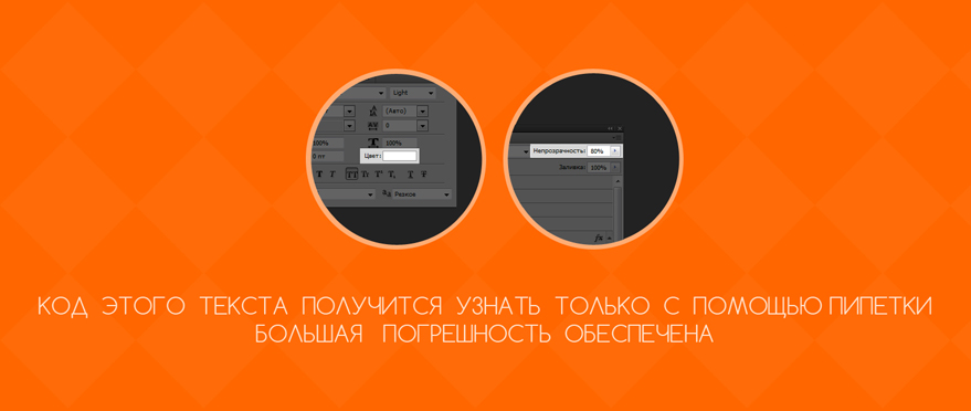
3. Transparency
Dmitry and Vladimir are ready to work on a new project. Yes, one order is lost, perhaps even a part of the reputation is lost, but they are decisive and relentless. Reputation can be restored if you try. Highly. The layout is ready, approved, clarity is in order, pseudo 3D in moderation, nothing portended trouble:
Q: What color is this text?
D: In the sense of “what”, look at the attributes.
Q: I look. It is black in the attributes, but the text is clearly lighter.
D: Use a dropper.
Q: Can you say exactly what number this color has?
D: For a second, I’ll look now ...
Q: And?
D: Just pipette it.
Q: ...
Who's guilty?
There are situations when neither the layout designer, nor even the designer himself, can accurately determine the color of the text in the layout. How is this even possible? Easy. When choosing colors for text, designers sometimes do not use color attributes, but layer transparency. It is easier and faster. There is a background, for example, red. It should be text, light, but not white. The designer sets white color in the text attributes and then simply plays with the transparency of the layer, in which case he will never miss the key. But to find out the true meaning of the resulting color will be impossible. Very bad designer's habit.

What to do?
Everything is very simple: never use transparency for text ever and never. Pick up color immediately without transparency, protect yourself from problems in the future.
If you are already in such an unpleasant situation, the only quick way is to set the text to a gigantic size and add boldness, so that it would be more accurate to use a pipette on it. It is hoped that the text was not rasterized.
Of course, transparency is completely unnecessary. For example, a floating horizontal menu with little transparency visually facilitates the layout and does not disorientate the user.
4. Overlay effects
This is how experience is gained, but the relationship between the designer and the layout designer is not getting any better. You need to at least superficially understand what and how your colleague is doing, otherwise there will be conflicts. For example, such as this one:
Q: Did you use the overlay effect in this layer?
D: Yes, problems?
B: Large. I will not make it up until you remove the interaction of the layers.
D: You can clean it yourself.
Q: ...
Who's guilty?
Never use blending effects in layouts. Never. These effects only work in Photoshop. The designer must learn this rule once and for all.

What to do?
If the use of blending effects is really necessary, you need to transform the layers in such a way that everything in the layout turns out to be without layer interaction, otherwise, it will be useless to typeset. Perhaps for this the designer will need to merge the result of the interaction into a separate image and use it again, which, of course, is inconvenient, but leaving effects for the layout designer is unacceptable.
5. Text Attributes
No matter what, our couple continues to work. And it doesn’t matter that Vladimir is already naturally afraid of every new Dmitry’s layout, orders are on the way. The new project did not need an extensive schedule, there was simply nowhere to make mistakes - that’s what our layout designer thought.
Q: Dmitry, I don’t understand why it was so scoffed at this text.
D: We have almost no graphics, everything rests on the text, I used it to the maximum.
Q: You increased its height, reduced its width, changed the intersymbol spacing - is that some kind of grandiose plan?
D: You just need to learn how to typeset the text.
Q: ...
Who's guilty?
The application of attributes to the text and changes in its properties takes place only if such text is subsequently rasterized and used, for example, in some slides. But now, even in slides, they try not to rasterize the text. There are many fonts to suit the needs of any font designer. Do not make life difficult for layout designers; it’s not worth it.

What to do?
If the text is not rasterized, it should not have changes in the properties, moreover, we are talking about the types of style. If you are planning to use bold font somewhere, do not add boldness to Photoshop functions. Each adequate font has several ready-made font styles that are specially adapted for a particular font - this is more than enough.
6. Colors
After all that has happened, Vladimir seriously begins to think about the opportunity to work with another designer, and our Dmitry, in turn, would be happy to work with a layout designer who would not ache for any occasion, but simply do his job. The only problem is that Dmitry will never find such a layout, not because they are not there, but because our designer does not even understand the basics of layout, and this is sad, both for Dmitry himself and for Vladimir.
D: When I gave you the layout, it had 3 key colors, and orange now does not match what was in the layout.
Q: Which code matched your orange?
D: Can't you just use the eyedropper again?
Q: I can.
D: Then what is the problem?
Q: Your layout has more orange than you think ...
Who's guilty?
If you are a designer, then all the work with color lies entirely with you. Remember, every inaccuracy in your layout, subsequently, will certainly make itself felt at the most inopportune moment. What is obvious to the designer is not at all obvious to the layout designer - always remember this.

What to do?
Dmitry used the orange color as one of the key in the layout. But he was too lazy to copy the color code for the new orange element every time. As a result, Vladimir gets a layout with a full set of orange colors that do not match the code. What to do? Most likely, the layout designer will take the first orange code that comes across and use it everywhere, and most likely this will not go unnoticed.
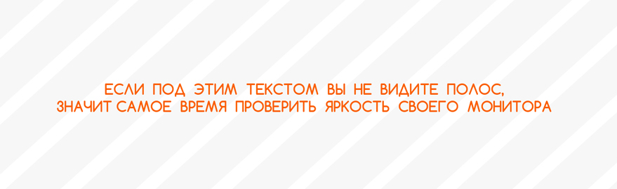
7. Brightness
The designer has many ways to make the layout designer hate himself. Lots of. But we consider only a few. However, they will be enough to achieve the goal. Conflict can happen even out of the blue. The perfect layout made flawlessly. But Vladimir feels somewhere there is a catch.
D: Are you kidding?
Q: I finished layout, why should I joke?
D: Yes, there is not a good third of the elements from the layout!
Q: It cannot be, I did everything on it.
D: You're kidding, open the layout and find 10 differences with what you show me!
Q: I see no differences ...
D: Very funny.
Q: ...
Who's guilty?
The situation is incredible, but absolutely realistic. Both are partly to blame, it is impossible to single out anyone specifically. Until these poor fellows finally come to understand why it happened, a lot of time can pass, and many words can be said, not the most pleasant. Quite unpleasant.
What to do?
If someone else has not guessed - the problem is in the different brightness settings of monitors. The designer worked on the layout on the monitor with a lower brightness compared to the typesetting monitors. Dmitry worked on the site, mainly in light colors: a lot of white, and some elements are light gray. On his monitor, he distinguished them perfectly, but on a new monitor with high brightness and LED-backlight, these elements are simply not visible at point blank range.
This is actually a real situation. The solution to the banality is simple: make sure that your monitors and your colleague have approximately the same brightness / contrast settings. Calibrate your monitors in one calibration test, and the world will immediately become kinder.

8. FATAL ERROR!
After the following situation, our couple used a lot of not the most censored expressions, so I can not give them below. The new project was very capacious:

Who's guilty?
It doesn't matter anymore.
What to do?
To run.
PS. Thank you for your attention, I hope this article will help you not to get into any of the above situations, and I also want understanding between designers and layout designers, because the quality of our Internet environment depends on them to a large extent.
All images were drawn specifically for the article and are clickable (for viewing in the original size).