Treemap, Income of Deputies, and Language Processing
Reading a topic on a habra "the State Duma presented the income of deputies in a new form" , I decided that the data on the income of deputies are worth visualization. Once I got acquainted with the topic “Data Visualization” from the Processing language, therefore it was he who acted as a tool. Below is a fragment of one of the first pictures, and then you can get acquainted with what Treemapping is and how to cook it on Processing.

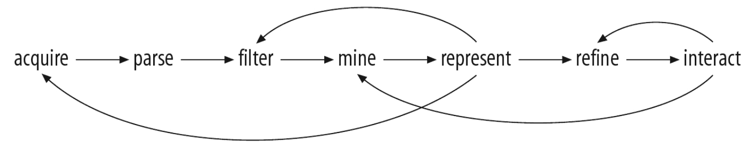
One of the best books on data visualization for me is Ben Fry 's Visualizing Data , a small book by one of the creators of Processing. This book kills two birds with one stone: it tells well about the principles of information visualization, plus tells how to use the Processing language for this. About Processing on Habr already wrote, here and here . Now version 2.0a4 is available (albeit alpha for now). In the first chapter of Visualizing Data, Ben Fry describes the seven stages of data visualization: obtaining data, parsing data, filtering excess data, processing data (for example, finding the minimum and maximum), choosing the data representation, improving this representation, and the last item is adding an interactive. He also indicates that this process is not always sequential and often has to return to the previous stages.
The first item, of course, is getting the data itself. After viewing the pages of several deputies on the Duma’s website, it became clear that only the number changes in the url - it was found by typing that the desired range lies within [23494 - 23964], http://www.duma.gov.ru/structure/deputies / 23494 / until http://www.duma.gov.ru/structure/deputies/23964/. On the page itself, I needed data on membership in a certain fraction and information on income. I downloaded the data using a program in C # (since I already had it), but it will not be difficult to do this with the help of some of my script. True, when I went to the Duma’s website the next day, for some reason I didn’t see information about the income of the deputies — I don’t know what it was — from work and then on other days everything was in place. But I was distracted. The first item was completed - data received. It was time to visualize them, and I decided to start with a bar chart, since it is quite simple to do.

The picture shows well that the bulk of the deputies receives approximately the same money and that there is a part of the deputies that receives an order of magnitude more. Cons of such a chart: it is not very suitable for comparing about 450 indicators. In addition, the strong variation in income values makes small values indistinguishable. You can, of course, make the scale logarithmic, but then the visual intrigue of comparing almost two billion to two million will be lost. Good - since comparing the indicators for the corresponding column length does not work well - you need to compare the area! We draw circles instead of columns:
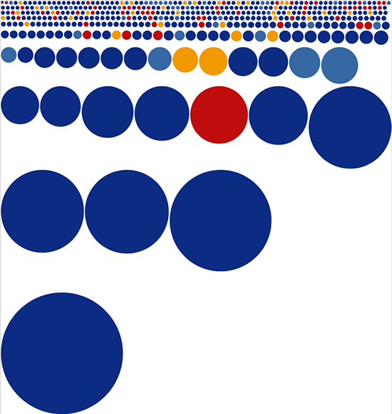
Circles are not impressive - we replace them with squares:

It seems to be better. For some reason, I immediately remembered the picture from xkcd. And then another option comes to my mind - treemap .
Treemap is the invention of the guru in Information Visualization by Ben Shneiderman . Ben Schneiderman in 1990 wondered which files occupy the most space on the hard disk (in the laboratory where he worked, 14 users used a 80 Mbyte disk). Ben began to think about a compact visualization of the tree structure of folders and files - so he came up with a chart, which was later called Treemap. You can read more about the history of Treemapping here : at the end of the article there are many examples of the use of this type of visualization. And in the book Visualizing Data, a whole chapter is devoted to Treemap. The Processing distribution contains examples for this book and there are two examples dedicated to Treemap. Both examples use a libraryTreemap is a modified version of the Java library for working with Processing. This library has several algorithms for splitting space into rectangles: slice-and-dice, pivot-by-middle, pivot-by-size, pivot-by-split-size and squarified layout. You can compare the operation of different algorithms here (requires Java-plugin). The picture that “Squarified layout” gives out is, in my opinion, the most pleasing to the eye. This algorithm seeks to construct rectangles so that their shape is as close to the squares as possible. The Squarified layout algorithm is described in the article.Jack van Wijk To get started with the library, you need to get acquainted with three classes from the library: SimpleMapItem, MapModel, and Treemap. The SimpleMapItem class represents a single cell, the MapModel stores a list of cells in the array, and the Treemap class constructs the visualization itself by accepting an object of the MapModel type and coordinates of the chart borders in the constructor. The MapLayout object is also stored in the Treemap object, which defines the implementation of the stakeout algorithm. By default, Treemap uses the pivot-by-split-size algorithm, but nothing prevents you from specifying another algorithm using the function: setLayout (MapLayout algorithm). So, in general, to get the Treemap visualization in Processing, we create the DeputatItem and DeputatMap classes that implement the SimpleMapItem and MapMode interfaces, respectively. SimpleMapItem has a size parameter,
We read the data and save it in the DeputatItem object, which implements the SimpleMapItem interface. The created object with information about the deputy is added to the DeputatMap object (implementation of the MapModel interface).
Create a Treemap object, giving it the DeputatMap parameters and the dimensions of the rectangle in which to build the chart.
The previous code is executed in the Processing function of setup (), and in the Processing function of draw () we call the draw () function of the treemap object.
If each deputy is assigned a color in accordance with the party to which he belongs and the information on the deputies is displayed in the cells the size of which allows this, we get the following picture:

I decided to group the deputies belonging to the same party: for this, I need to add another one level of the hierarchy is the party. Schematically, the tree structure obtained at the previous stage can be represented as follows: Duma-> deputies, adding parties we get: Duma-> parties-> deputies. For such a scheme, two more classes PartyItem (implementation of the SimpleMapItem interface) and PartyMap (implementation of the MapModel interface) will be needed. After similar steps to create a treemap, you get the following picture:


Pictures make it clear the general structure of the distribution of income, but, unfortunately, it will not work to find a specific deputy from the picture. To do this, you can use the interactive version or download the application for windows , linux , mac os , or run in processing by downloading the source code .
PS Treemap can be built not only in Processing. Natan Yu, the author of the blog Flowing data , promotes this approach to information visualization: we work with data in a statistical analysis program- R , and then we bring the resulting image to mind in Illustrator. Nathan recently released a bookin which such an approach is described in detail. In R there is a special function for building a Treemap, for those interested in linking to the topic on Nathan's blog.
There are also JavaScript implementations:
Google Chart Tools Treemap ;
d3.js Treemap ;
JavaScript InfoVis Toolkit Treemap .
One of the best books on data visualization for me is Ben Fry 's Visualizing Data , a small book by one of the creators of Processing. This book kills two birds with one stone: it tells well about the principles of information visualization, plus tells how to use the Processing language for this. About Processing on Habr already wrote, here and here . Now version 2.0a4 is available (albeit alpha for now). In the first chapter of Visualizing Data, Ben Fry describes the seven stages of data visualization: obtaining data, parsing data, filtering excess data, processing data (for example, finding the minimum and maximum), choosing the data representation, improving this representation, and the last item is adding an interactive. He also indicates that this process is not always sequential and often has to return to the previous stages.
The first item, of course, is getting the data itself. After viewing the pages of several deputies on the Duma’s website, it became clear that only the number changes in the url - it was found by typing that the desired range lies within [23494 - 23964], http://www.duma.gov.ru/structure/deputies / 23494 / until http://www.duma.gov.ru/structure/deputies/23964/. On the page itself, I needed data on membership in a certain fraction and information on income. I downloaded the data using a program in C # (since I already had it), but it will not be difficult to do this with the help of some of my script. True, when I went to the Duma’s website the next day, for some reason I didn’t see information about the income of the deputies — I don’t know what it was — from work and then on other days everything was in place. But I was distracted. The first item was completed - data received. It was time to visualize them, and I decided to start with a bar chart, since it is quite simple to do.
The picture shows well that the bulk of the deputies receives approximately the same money and that there is a part of the deputies that receives an order of magnitude more. Cons of such a chart: it is not very suitable for comparing about 450 indicators. In addition, the strong variation in income values makes small values indistinguishable. You can, of course, make the scale logarithmic, but then the visual intrigue of comparing almost two billion to two million will be lost. Good - since comparing the indicators for the corresponding column length does not work well - you need to compare the area! We draw circles instead of columns:
Circles are not impressive - we replace them with squares:
It seems to be better. For some reason, I immediately remembered the picture from xkcd. And then another option comes to my mind - treemap .
Treemap is the invention of the guru in Information Visualization by Ben Shneiderman . Ben Schneiderman in 1990 wondered which files occupy the most space on the hard disk (in the laboratory where he worked, 14 users used a 80 Mbyte disk). Ben began to think about a compact visualization of the tree structure of folders and files - so he came up with a chart, which was later called Treemap. You can read more about the history of Treemapping here : at the end of the article there are many examples of the use of this type of visualization. And in the book Visualizing Data, a whole chapter is devoted to Treemap. The Processing distribution contains examples for this book and there are two examples dedicated to Treemap. Both examples use a libraryTreemap is a modified version of the Java library for working with Processing. This library has several algorithms for splitting space into rectangles: slice-and-dice, pivot-by-middle, pivot-by-size, pivot-by-split-size and squarified layout. You can compare the operation of different algorithms here (requires Java-plugin). The picture that “Squarified layout” gives out is, in my opinion, the most pleasing to the eye. This algorithm seeks to construct rectangles so that their shape is as close to the squares as possible. The Squarified layout algorithm is described in the article.Jack van Wijk To get started with the library, you need to get acquainted with three classes from the library: SimpleMapItem, MapModel, and Treemap. The SimpleMapItem class represents a single cell, the MapModel stores a list of cells in the array, and the Treemap class constructs the visualization itself by accepting an object of the MapModel type and coordinates of the chart borders in the constructor. The MapLayout object is also stored in the Treemap object, which defines the implementation of the stakeout algorithm. By default, Treemap uses the pivot-by-split-size algorithm, but nothing prevents you from specifying another algorithm using the function: setLayout (MapLayout algorithm). So, in general, to get the Treemap visualization in Processing, we create the DeputatItem and DeputatMap classes that implement the SimpleMapItem and MapMode interfaces, respectively. SimpleMapItem has a size parameter,
We read the data and save it in the DeputatItem object, which implements the SimpleMapItem interface. The created object with information about the deputy is added to the DeputatMap object (implementation of the MapModel interface).
DeputatMap  dMap   = new DeputatMap();
String[] lines = loadStrings("parliamentV2010.csv");
for (int i = 0; i < lines.length; i++)
{
//... получаем id, party, name, money  из lines[i]
        DeputatItem d = new DeputatItem(id, party, name, money);
        dMap.addDeputat(d);
}
dMap.finishAdd();
Create a Treemap object, giving it the DeputatMap parameters and the dimensions of the rectangle in which to build the chart.
Treemap  treemap = new Treemap(dMap ,  0,  0, width - 1, height - 1);
//Меняем алгоритм на SquarifiedLayout и обновляем объект treemap
MapLayout algorithm = new SquarifiedLayout();
treemap.setLayout(algorithm);
treemap.updateLayout();
The previous code is executed in the Processing function of setup (), and in the Processing function of draw () we call the draw () function of the treemap object.
void draw() {
  treemap.draw();
}
If each deputy is assigned a color in accordance with the party to which he belongs and the information on the deputies is displayed in the cells the size of which allows this, we get the following picture:
I decided to group the deputies belonging to the same party: for this, I need to add another one level of the hierarchy is the party. Schematically, the tree structure obtained at the previous stage can be represented as follows: Duma-> deputies, adding parties we get: Duma-> parties-> deputies. For such a scheme, two more classes PartyItem (implementation of the SimpleMapItem interface) and PartyMap (implementation of the MapModel interface) will be needed. After similar steps to create a treemap, you get the following picture:
Pictures make it clear the general structure of the distribution of income, but, unfortunately, it will not work to find a specific deputy from the picture. To do this, you can use the interactive version or download the application for windows , linux , mac os , or run in processing by downloading the source code .
PS Treemap can be built not only in Processing. Natan Yu, the author of the blog Flowing data , promotes this approach to information visualization: we work with data in a statistical analysis program- R , and then we bring the resulting image to mind in Illustrator. Nathan recently released a bookin which such an approach is described in detail. In R there is a special function for building a Treemap, for those interested in linking to the topic on Nathan's blog.
There are also JavaScript implementations:
Google Chart Tools Treemap ;
d3.js Treemap ;
JavaScript InfoVis Toolkit Treemap .