Analyzing cryptocurrency markets with Python
- Transfer
How do Bitcoin markets behave? What are the causes of sudden ups and downs in cryptocurrency prices? Is there a close inseparable connection between the markets of altcoins or are they mostly independent of each other? How can you predict what will happen next?
Dedicated to cryptocurrencies like Bitcoin and Ethereum articles are replete with reasoning and theories. Hundreds of self-proclaimed experts provide arguments in favor of trends, which, in their opinion, will manifest themselves in a short time. What exactly is missing from many similar analyzes is a solid foundation in the form of data and statistics capable of supporting certain statements.
The purpose of this article is to provide a simple introduction to cryptocurrency analysis using Python. In it, we will step by step consider a simple Python script for receiving, analyzing and visualizing data for different cryptocurrencies. In the course of the work, we will discover an interesting trend in the behavior of volatile markets and find out what changes have occurred in them.

This post will not be devoted to explaining what cryptocurrency is (if you need such an explanation, I would recommend this excellent review to you ). There will be no reasoning about what specific currencies will rise or fall in price. Instead, the guide will focus on gaining access to rough, raw data and searching for history hidden under layers of numbers.
This guide is intended for a wide range of enthusiasts, engineers and data processing specialists, regardless of their level of professionalism. From skills, you only need a basic understanding of Python and the minimum command-line skills needed to set up a project.
The full version of the work done and all its results are available here .
The easiest way to install dependencies from scratch for this project is to use Anaconda, a python ecosystem and dependency manager, containing all the necessary packages for working with data and analyzing it.
To install Anaconda, I would recommend using the official instructions available here .
If you are an advanced user, and you don’t like Anaconda, then installing it is not necessary. In this case, I think you do not need help installing the necessary dependencies, and you can go straight to the second stage.
Once Anaconda is installed, we will want to create a new environment for organizing work with dependencies.
Enter the command
Next, enter
And finally, the team will
Why do we use the environment? If you plan to work simultaneously with many Python-projects on your computer, it is useful to place the dependencies (software libraries and packages) separately to avoid conflicts. Within each project, Anaconda creates a special directory for dependencies in the environment, which makes it possible to separate them from the dependencies of other projects and streamline work with them.
Once the environment and dependencies are installed, type

As soon as you see a clean Jupyter log, you will first need to import the necessary dependencies.
In addition, you need to import Plotly and enable offline mode for it.
Now that all settings have been completed, we are ready to begin receiving information for analysis. First of all, we will need to request Bitcoin pricing data using the free bitcoin API Quandl .
To assist with data acquisition, we will define a function that downloads and caches data sets from Quandl.
To convert the downloaded data and save them to a file, we will use
To begin, let's tighten up historical data on the Bitcoin exchange rate from the Kraken exchange .
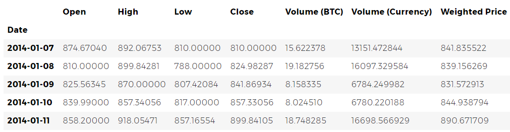
We can check the first 5 rows of a data frame with a method
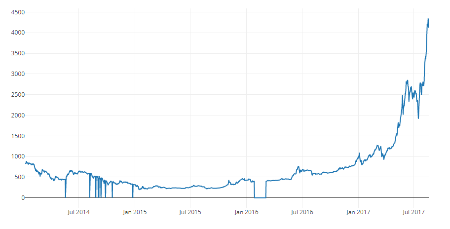
Next, let's generate a simple graph for quick visual verification of the correctness of the data.
Plotly is used here for rendering . This is a less traditional approach in comparison with the more reputable imaging python-libraries such as Matplotlib , but in my opinion, Plotly is a great choice because you can create a fully interactive graphs through the use D3.js . As a result, you can get nice visual charts at the output without any settings. In addition, Plotly is easy to learn and its results are easily inserted into web pages.
Of course, you should always remember about the need to compare the resulting visualization with publicly available cryptocurrency price charts (for example, on Coinbase) for basic validation of downloaded data.
You may have noticed inconsistencies in this set: the schedule sags to zero in several places, especially at the end of 2014 and the beginning of 2016. These drops are found in the Kraken data set, and we obviously do not want them to be reflected in our final price analysis.
The nature of bitcoin exchanges is such that prices are determined by supply and demand, and therefore none of the existing exchanges can claim that its quotes reflect the only correct, "reference" price of Bitcoin. To take into account this drawback, as well as eliminate price gaps in the chart, which is most likely due to technical problems or errors in the data set, we will additionally collect data from three more bitcoin exchanges to calculate the aggregate bitcoin price index.
First, let's download the data from each exchange to the data frame dictionary.
Next, we define a simple function that combines the similar columns of each data frame into a new combined frame.
Now let's combine all the data frames based on the Weighted Price column (weighted average price).
Finally, take a look at the last five lines using the method

Prices look like they should be: they are within similar limits, but there are small differences based on the supply / demand ratio on each individual exchange.
The next logical step is to visualize the comparison of the data sets obtained. To do this, we define an auxiliary function that provides the ability to generate a graph based on a data frame using a one-line command.
For the sake of brevity, I will not go into detail in the work of the auxiliary function. If you are interested in learning more about it, refer to the Pandas and Plotly documentation .
We can easily generate a graph for bitcoin price data.
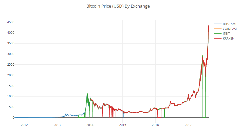
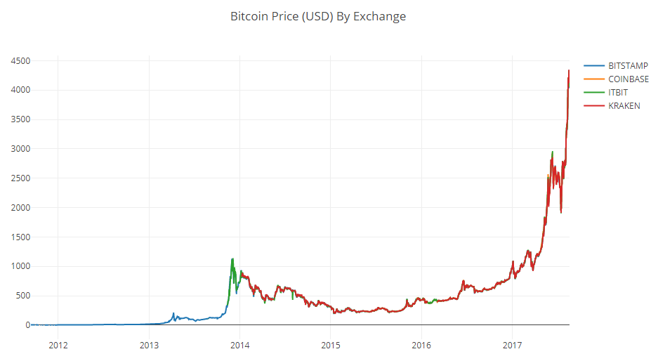
We can see that despite the fact that all 4 data series behave approximately equally, there are several deviations from the norm that need to be corrected.
Let's remove from the frame all zero values, since we know that the price of bitcoin was never equal to zero within the time period we are considering.
Having built the schedule anew, we will get a neater curve, without any sharp dips.
And now we can calculate a new column containing the average daily bitcoin price based on data from all exchanges.
This new column is our bitcoin price index! Let's build a graph on it to make sure it looks normal.
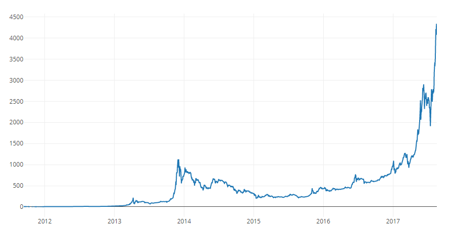
Yes, it looks good. We will use the combined price series in the future to convert stock prices of other cryptocurrencies into the US dollar.
Now that we have a reliable time series of Bitcoin prices, let's request some data for non-bitcoin cryptocurrencies, often called altcoins.
To get data on altcoins, we will use the Poloniex API . This will help us two auxiliary functions that download and cache JSON data transmitted by this API.
To begin, we will determine
Next, we define a function that generates HTTP requests to the Poloniex API, and then the caller
It takes a string indicating the cryptocurrency pair (for example, BTC_ETH) and returns a data frame containing historical data for its exchange rate.
Most Altcoins cannot be purchased directly for US dollars. To purchase them, people often buy bitcoins and change them to altcoins on exchanges. Therefore, we will download BTC exchange rates for each coin and use the data for the BTC price to calculate the cost of altcoins in USD.
We download stock data for the nine most popular cryptocurrencies - Ethereum , Litecoin , Ripple , Ethereum Classic , Stellar , Dashcoin , Siacoin , Monero and NEM .
Now we have a dictionary of 9 data frames, each of which contains historical data on the average daily price quotes for altcoins and bitcoins.
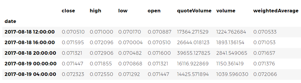
Again, check the last five rows of the Ethereum price table to make sure that everything is fine with it.
Now we can compare the data on price pairs with our Bitcoin price index to directly obtain historical data on the cost of altcoins in US dollars.
With this code, we created a new column in the data frame of each altcoin with dollar prices per coin.
Further, we can reuse the previously defined function
This is how simple it is. Now let's also add bitcoin prices to the last column of the combined data frame.
And now we have a single frame containing daily dollar prices for the ten cryptocurrencies we are studying.
Let's reuse the previously defined function

Fine! The graph allows you to quite visually assess the dynamics of the exchange rates of each cryptocurrency over the past few years.
Please note that we use the logarithmic scale of ordinates, because it allows us to fit all currencies on a single chart. But if you want, you can try different parameter values (such as
You may have noticed that stock exchange rates of cryptocurrency, despite their completely different costs and volatility, look as if there is some correlation between them. Especially if you look at the segment after the August surge, even small fluctuations occur with different tokens as if synchronously.
But a premonition based on external similarity is no better than a simple guess until we can back it up with statistical data.
We can test our correlation hypothesis using the
Correction of 8/22/2017 - This part of the work has been revised. Now, to calculate the correlation coefficients instead of the absolute price values are used the percentage values of their daily changes.
Calculating correlations directly between non-stationary time series (such as raw price data) can lead to biased results. We will correct this defect by applying the method
To begin, calculate the correlation in 2016.
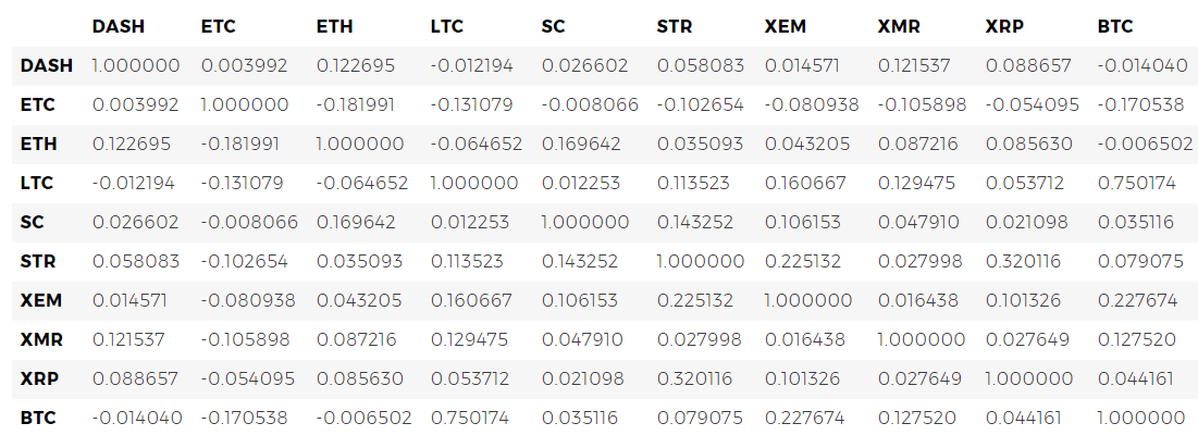
Now we have coefficients everywhere. Values close to 1 or -1 say that there is a strong forward or inverse correlation between time series, respectively. The coefficients close to zero mean that the values do not correlate and change independently of each other.
To visualize the results, we need to create another auxiliary visualization function.
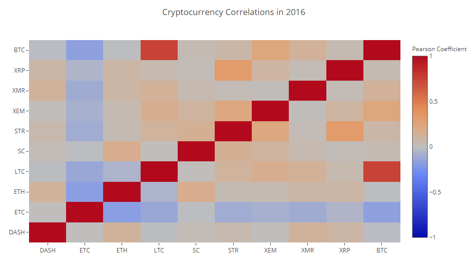
Dark red cells in the diagram indicate a strong correlation (and each currency will obviously correlate as closely as possible with itself), dark blue indicates a strong inverse correlation. All blue, orange, gray, sand colors between them indicate different degrees of weak correlation or lack thereof.
What does this chart tell us? In fact, it shows that the statistically significant relationship between price fluctuations of various cryptocurrencies in 2016 is small.
And now, to test our hypothesis that cryptocurrency has become more correlated in recent months, let's repeat the same test using data already for 2017.
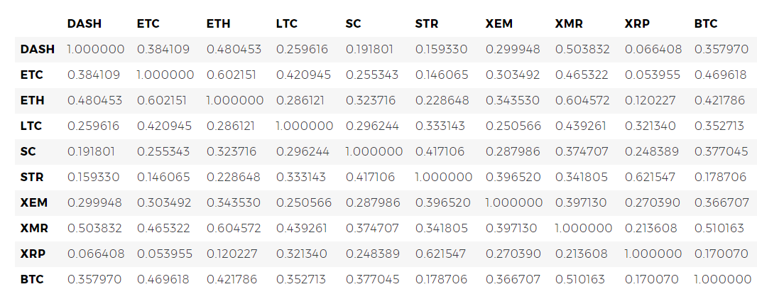
The obtained coefficients indicate the presence of a more significant correlation. Is it strong enough to use this fact to invest? Definitely not.
But it should, however, pay attention to the fact that almost all cryptocurrencies in general have become more correlated with each other.

And this is quite an interesting observation.
Good question. I can not say for sure.
The first thought that comes to mind: the reason is that hedge funds have recently begun to openly trade in cryptocurrency markets. [ 1 ] [ 2 ] Similar funds have much larger amounts of capital than medium-sized traders, and if they protect themselves from risk, spraying their funds across multiple cryptocurrencies and using similar trading strategies for each of them, based on independent variables , for example, on the stock market), then a logical consequence of this approach may be the appearance of a trend of increasing correlations.
For example, one of the trends indirectly confirms the above reasoning. XRP (the Ripple token) correlates with the other altcoins the least. But there is one notable exception - STR (the Stellar token, the official is called “Lumens”), whose correlation coefficient with XRP is 0.62.
Interestingly, both Stellar and Ripple are quite similar fintech platforms whose activities are aimed at simplifying the process of international interbank payments.
It’s quite realistic that I see a situation in which some wealthy players and hedge funds use similar trading strategies for funds invested in Stellar and Ripple, since both services behind these tokens are very similar in nature. This assumption may explain why XRP correlates much more strongly with STR than with other cryptocurrencies.
However, this explanation is in many ways only a speculative conclusion. But maybe you will get better? The foundation that we laid in this work allows us to continue researching data in a variety of ways.
Here are some ideas to check:
An HTML version of this python log is available here .
I hope that now you have at your disposal the skills that allow you to make your own analysis and take a critical look at any article-reasoning about cryptocurrencies that you will come across in the future, especially those whose authors have not taken care to provide data that supports their theory.
Thanks for reading and please leave comments if you have any ideas, suggestions or criticism. If you have any problems with the code, you can report it in the Github repository .
Now in the work is the second, and probably the third part of the material. In them, I will most likely develop some of the ideas described above, so stay in touch in the next few weeks.

Informational and analytical approach to cryptocurrency reasoning
Dedicated to cryptocurrencies like Bitcoin and Ethereum articles are replete with reasoning and theories. Hundreds of self-proclaimed experts provide arguments in favor of trends, which, in their opinion, will manifest themselves in a short time. What exactly is missing from many similar analyzes is a solid foundation in the form of data and statistics capable of supporting certain statements.
The purpose of this article is to provide a simple introduction to cryptocurrency analysis using Python. In it, we will step by step consider a simple Python script for receiving, analyzing and visualizing data for different cryptocurrencies. In the course of the work, we will discover an interesting trend in the behavior of volatile markets and find out what changes have occurred in them.
This post will not be devoted to explaining what cryptocurrency is (if you need such an explanation, I would recommend this excellent review to you ). There will be no reasoning about what specific currencies will rise or fall in price. Instead, the guide will focus on gaining access to rough, raw data and searching for history hidden under layers of numbers.
Stage 1. We equip our laboratory
This guide is intended for a wide range of enthusiasts, engineers and data processing specialists, regardless of their level of professionalism. From skills, you only need a basic understanding of Python and the minimum command-line skills needed to set up a project.
The full version of the work done and all its results are available here .
1.1 Install Anaconda
The easiest way to install dependencies from scratch for this project is to use Anaconda, a python ecosystem and dependency manager, containing all the necessary packages for working with data and analyzing it.
To install Anaconda, I would recommend using the official instructions available here .
If you are an advanced user, and you don’t like Anaconda, then installing it is not necessary. In this case, I think you do not need help installing the necessary dependencies, and you can go straight to the second stage.
1.2 Setting up the project environment in Anaconda
Once Anaconda is installed, we will want to create a new environment for organizing work with dependencies.
Enter the command
conda create --name cryptocurrency-analysis python=3to create a new Anaconda environment for our project. Next, enter
source activate cryptocurrency-analysisand (on Linux / macOS) or activate cryptocurrency-analysis(on Windows) to activate the environment. And finally, the team will
conda install numpy pandas nb_conda jupyter plotly quandlinstall the necessary dependencies in the environment. This process can take several minutes.Why do we use the environment? If you plan to work simultaneously with many Python-projects on your computer, it is useful to place the dependencies (software libraries and packages) separately to avoid conflicts. Within each project, Anaconda creates a special directory for dependencies in the environment, which makes it possible to separate them from the dependencies of other projects and streamline work with them.
1.3 Launch Jupyter Notebook interactive notebook
Once the environment and dependencies are installed, type
jupyter notebookiPython in the console to start the kernel and open the browser link http: // localhost: 8888 / . Create a new Python notebook by checking that the kernel is used for it Python [conda env:cryptocurrency-analysis].1.4 Import dependencies top notebook
As soon as you see a clean Jupyter log, you will first need to import the necessary dependencies.
import os
import numpy as np
import pandas as pd
import pickle
import quandl
from datetime import datetime
In addition, you need to import Plotly and enable offline mode for it.
import plotly.offline as py
import plotly.graph_objs as go
import plotly.figure_factory as ff
py.init_notebook_mode(connected=True)
Step 2. Obtain Bitcoin price data
Now that all settings have been completed, we are ready to begin receiving information for analysis. First of all, we will need to request Bitcoin pricing data using the free bitcoin API Quandl .
2.1 Set the auxiliary function Quandl
To assist with data acquisition, we will define a function that downloads and caches data sets from Quandl.
def get_quandl_data(quandl_id):
    '''Download and cache Quandl dataseries'''
    cache_path = '{}.pkl'.format(quandl_id).replace('/','-')
    try:
        f = open(cache_path, 'rb')
        df = pickle.load(f)
        print('Loaded {} from cache'.format(quandl_id))
    except (OSError, IOError) as e:
        print('Downloading {} from Quandl'.format(quandl_id))
        df = quandl.get(quandl_id, returns="pandas")
        df.to_pickle(cache_path)
        print('Cached {} at {}'.format(quandl_id, cache_path))
    return df
To convert the downloaded data and save them to a file, we will use
pickle. This will prevent re-downloading the same data every time we run the script. The function will return data as a Pandas data frame . If you are unfamiliar with data frames, you can present them as very powerful spreadsheets.2.2 We take the price data from the exchange Kraken
To begin, let's tighten up historical data on the Bitcoin exchange rate from the Kraken exchange .
# Pull Kraken BTC price exchange data
btc_usd_price_kraken = get_quandl_data('BCHARTS/KRAKENUSD')
We can check the first 5 rows of a data frame with a method
head().btc_usd_price_kraken.head()Next, let's generate a simple graph for quick visual verification of the correctness of the data.
# Chart the BTC pricing data
btc_trace = go.Scatter(x=btc_usd_price_kraken.index, y=btc_usd_price_kraken['Weighted Price'])
py.iplot([btc_trace])
Plotly is used here for rendering . This is a less traditional approach in comparison with the more reputable imaging python-libraries such as Matplotlib , but in my opinion, Plotly is a great choice because you can create a fully interactive graphs through the use D3.js . As a result, you can get nice visual charts at the output without any settings. In addition, Plotly is easy to learn and its results are easily inserted into web pages.
Of course, you should always remember about the need to compare the resulting visualization with publicly available cryptocurrency price charts (for example, on Coinbase) for basic validation of downloaded data.
2.3 We request price data from other BTC-exchanges
You may have noticed inconsistencies in this set: the schedule sags to zero in several places, especially at the end of 2014 and the beginning of 2016. These drops are found in the Kraken data set, and we obviously do not want them to be reflected in our final price analysis.
The nature of bitcoin exchanges is such that prices are determined by supply and demand, and therefore none of the existing exchanges can claim that its quotes reflect the only correct, "reference" price of Bitcoin. To take into account this drawback, as well as eliminate price gaps in the chart, which is most likely due to technical problems or errors in the data set, we will additionally collect data from three more bitcoin exchanges to calculate the aggregate bitcoin price index.
First, let's download the data from each exchange to the data frame dictionary.
# Pull pricing data for3 more BTC exchanges
exchanges = ['COINBASE','BITSTAMP','ITBIT']
exchange_data = {}
exchange_data['KRAKEN'] = btc_usd_price_kraken
for exchange in exchanges:
    exchange_code = 'BCHARTS/{}USD'.format(exchange)
    btc_exchange_df = get_quandl_data(exchange_code)
    exchange_data[exchange] = btc_exchange_df
2.4 We combine all price data into one data frame
Next, we define a simple function that combines the similar columns of each data frame into a new combined frame.
def merge_dfs_on_column(dataframes, labels, col):
    '''Merge a single column of each dataframe into a new combined dataframe'''
    series_dict = {}
    for index in range(len(dataframes)):
        series_dict[labels[index]] = dataframes[index][col]
    return pd.DataFrame(series_dict)
Now let's combine all the data frames based on the Weighted Price column (weighted average price).
# Merge the BTC price dataseries' into a single dataframe
btc_usd_datasets = merge_dfs_on_column(list(exchange_data.values()), list(exchange_data.keys()), 'Weighted Price')
Finally, take a look at the last five lines using the method
tail()to make sure that the result of our work looks normal.btc_usd_datasets.tail()Prices look like they should be: they are within similar limits, but there are small differences based on the supply / demand ratio on each individual exchange.
2.5 Visualize the price data sets
The next logical step is to visualize the comparison of the data sets obtained. To do this, we define an auxiliary function that provides the ability to generate a graph based on a data frame using a one-line command.
def df_scatter(df, title, seperate_y_axis=False, y_axis_label='', scale='linear', initial_hide=False):
    '''Generate a scatter plot of the entire dataframe'''
    label_arr = list(df)
    series_arr = list(map(lambda col: df[col], label_arr))
    layout = go.Layout(
        title=title,
        legend=dict(orientation="h"),
        xaxis=dict(type='date'),
        yaxis=dict(
            title=y_axis_label,
            showticklabels= not seperate_y_axis,
            type=scale
        )
    )
    y_axis_config = dict(
        overlaying='y',
        showticklabels=False,
        type=scale )
    visibility = 'visible'if initial_hide:
        visibility = 'legendonly'
    # Form Trace For Each Series
    trace_arr = []
    for index, series in enumerate(series_arr):
        trace = go.Scatter(
            x=series.index,
            y=series,
            name=label_arr[index],
            visible=visibility
        )
        # Add seperate axis for the series
        if seperate_y_axis:
            trace['yaxis'] = 'y{}'.format(index + 1)
            layout['yaxis{}'.format(index + 1)] = y_axis_config
        trace_arr.append(trace)
    fig = go.Figure(data=trace_arr, layout=layout)
    py.iplot(fig)
For the sake of brevity, I will not go into detail in the work of the auxiliary function. If you are interested in learning more about it, refer to the Pandas and Plotly documentation .
We can easily generate a graph for bitcoin price data.
# Plot all of the BTC exchange prices
df_scatter(btc_usd_datasets, 'Bitcoin Price (USD) By Exchange')
2.6 Clearing and merging price data
We can see that despite the fact that all 4 data series behave approximately equally, there are several deviations from the norm that need to be corrected.
Let's remove from the frame all zero values, since we know that the price of bitcoin was never equal to zero within the time period we are considering.
# Remove "0" values
btc_usd_datasets.replace(0, np.nan, inplace=True)
Having built the schedule anew, we will get a neater curve, without any sharp dips.
# Plot the revised dataframe
df_scatter(btc_usd_datasets, 'Bitcoin Price (USD) By Exchange')
And now we can calculate a new column containing the average daily bitcoin price based on data from all exchanges.
# Calculate the average BTC price as a new column
btc_usd_datasets['avg_btc_price_usd'] = btc_usd_datasets.mean(axis=1)
This new column is our bitcoin price index! Let's build a graph on it to make sure it looks normal.
# Plot the average BTC price
btc_trace = go.Scatter(x=btc_usd_datasets.index, y=btc_usd_datasets['avg_btc_price_usd'])
py.iplot([btc_trace])
Yes, it looks good. We will use the combined price series in the future to convert stock prices of other cryptocurrencies into the US dollar.
Stage 3. Obtaining Altcoin price data
Now that we have a reliable time series of Bitcoin prices, let's request some data for non-bitcoin cryptocurrencies, often called altcoins.
3.1 Defining helper functions for working with the Poloniex API
To get data on altcoins, we will use the Poloniex API . This will help us two auxiliary functions that download and cache JSON data transmitted by this API.
To begin, we will determine
get_json_datawhich JSON data will be downloaded and cached at the provided URL.def get_json_data(json_url, cache_path):
'''Download and cache JSON data, return as a dataframe.'''try:
f = open(cache_path, 'rb')
df = pickle.load(f)
print('Loaded {} from cache'.format(json_url))
except (OSError, IOError) as e:
print('Downloading {}'.format(json_url))
df = pd.read_json(json_url)
df.to_pickle(cache_path)
print('Cached {} at {}'.format(json_url, cache_path))
return dfNext, we define a function that generates HTTP requests to the Poloniex API, and then the caller
get_json_data, which, in turn, saves the requested data.base_polo_url = 'https://poloniex.com/public?command=returnChartData¤cyPair={}&start={}&end={}&period={}'
start_date = datetime.strptime('2015-01-01', '%Y-%m-%d') # get data from the start of2015
end_date = datetime.now() # up until today
pediod = 86400 # pull daily data (86,400 seconds per day)
def get_crypto_data(poloniex_pair):
'''Retrieve cryptocurrency data from poloniex'''
json_url = base_polo_url.format(poloniex_pair, start_date.timestamp(), end_date.timestamp(), pediod)
data_df = get_json_data(json_url, poloniex_pair)
data_df = data_df.set_index('date')
return data_dfIt takes a string indicating the cryptocurrency pair (for example, BTC_ETH) and returns a data frame containing historical data for its exchange rate.
3.2 Downloading Trade Data from Poloniex
Most Altcoins cannot be purchased directly for US dollars. To purchase them, people often buy bitcoins and change them to altcoins on exchanges. Therefore, we will download BTC exchange rates for each coin and use the data for the BTC price to calculate the cost of altcoins in USD.
We download stock data for the nine most popular cryptocurrencies - Ethereum , Litecoin , Ripple , Ethereum Classic , Stellar , Dashcoin , Siacoin , Monero and NEM .
altcoins = ['ETH','LTC','XRP','ETC','STR','DASH','SC','XMR','XEM']
altcoin_data = {}
for altcoin in altcoins:
    coinpair = 'BTC_{}'.format(altcoin)
    crypto_price_df = get_crypto_data(coinpair)
    altcoin_data[altcoin] = crypto_price_df
Now we have a dictionary of 9 data frames, each of which contains historical data on the average daily price quotes for altcoins and bitcoins.
Again, check the last five rows of the Ethereum price table to make sure that everything is fine with it.
altcoin_data['ETH'].tail()3.3 price conversion into US dollars
Now we can compare the data on price pairs with our Bitcoin price index to directly obtain historical data on the cost of altcoins in US dollars.
# Calculate USD Price as a new column in each altcoin dataframe
for altcoin in altcoin_data.keys():
    altcoin_data[altcoin]['price_usd'] =  altcoin_data[altcoin]['weightedAverage'] * btc_usd_datasets['avg_btc_price_usd']
With this code, we created a new column in the data frame of each altcoin with dollar prices per coin.
Further, we can reuse the previously defined function
merge_dfs_on_columnto create a data frame containing dollar prices for each cryptocurrency.# Merge USD price of each altcoin into single dataframe
combined_df = merge_dfs_on_column(list(altcoin_data.values()), list(altcoin_data.keys()), 'price_usd')This is how simple it is. Now let's also add bitcoin prices to the last column of the combined data frame.
# Add BTC price to the dataframe
combined_df['BTC'] = btc_usd_datasets['avg_btc_price_usd']
And now we have a single frame containing daily dollar prices for the ten cryptocurrencies we are studying.
Let's reuse the previously defined function
df_scatterto draw a comparative graph of changes in cryptocurrency prices.# Chart all of the altocoin prices
df_scatter(combined_df, 'Cryptocurrency Prices (USD)', seperate_y_axis=False, y_axis_label='Coin Value (USD)', scale='log')Fine! The graph allows you to quite visually assess the dynamics of the exchange rates of each cryptocurrency over the past few years.
Please note that we use the logarithmic scale of ordinates, because it allows us to fit all currencies on a single chart. But if you want, you can try different parameter values (such as
scale='linear') to look at the data from a different perspective.3.4 Analysis of correlation
You may have noticed that stock exchange rates of cryptocurrency, despite their completely different costs and volatility, look as if there is some correlation between them. Especially if you look at the segment after the August surge, even small fluctuations occur with different tokens as if synchronously.
But a premonition based on external similarity is no better than a simple guess until we can back it up with statistical data.
We can test our correlation hypothesis using the
corr()Pandas method by calculating the Pearson correlation coefficient of all frame columns with respect to each other.Correction of 8/22/2017 - This part of the work has been revised. Now, to calculate the correlation coefficients instead of the absolute price values are used the percentage values of their daily changes.
Calculating correlations directly between non-stationary time series (such as raw price data) can lead to biased results. We will correct this defect by applying the method
pct_change()that converts the value of each cell of the frame from the absolute value to the percentage of its daily change. To begin, calculate the correlation in 2016.
# Calculate the pearson correlation coefficients for cryptocurrencies in2016
combined_df_2016 = combined_df[combined_df.index.year == 2016]
combined_df_2016.pct_change().corr(method='pearson')
Now we have coefficients everywhere. Values close to 1 or -1 say that there is a strong forward or inverse correlation between time series, respectively. The coefficients close to zero mean that the values do not correlate and change independently of each other.
To visualize the results, we need to create another auxiliary visualization function.
def correlation_heatmap(df, title, absolute_bounds=True):
    '''Plot a correlation heatmap for the entire dataframe'''
    heatmap = go.Heatmap(
        z=df.corr(method='pearson').as_matrix(),
        x=df.columns,
        y=df.columns,
        colorbar=dict(title='Pearson Coefficient'),
    )
    layout = go.Layout(title=title)
    if absolute_bounds:
        heatmap['zmax'] = 1.0
        heatmap['zmin'] = -1.0
    fig = go.Figure(data=[heatmap], layout=layout)
    py.iplot(fig)
correlation_heatmap(combined_df_2016.pct_change(), "Cryptocurrency Correlations in 2016")Dark red cells in the diagram indicate a strong correlation (and each currency will obviously correlate as closely as possible with itself), dark blue indicates a strong inverse correlation. All blue, orange, gray, sand colors between them indicate different degrees of weak correlation or lack thereof.
What does this chart tell us? In fact, it shows that the statistically significant relationship between price fluctuations of various cryptocurrencies in 2016 is small.
And now, to test our hypothesis that cryptocurrency has become more correlated in recent months, let's repeat the same test using data already for 2017.
combined_df_2017 = combined_df[combined_df.index.year == 2017]
combined_df_2017.pct_change().corr(method='pearson')
The obtained coefficients indicate the presence of a more significant correlation. Is it strong enough to use this fact to invest? Definitely not.
But it should, however, pay attention to the fact that almost all cryptocurrencies in general have become more correlated with each other.
correlation_heatmap(combined_df_2017.pct_change(), "Cryptocurrency Correlations in 2017")And this is quite an interesting observation.
Why is this happening?
Good question. I can not say for sure.
The first thought that comes to mind: the reason is that hedge funds have recently begun to openly trade in cryptocurrency markets. [ 1 ] [ 2 ] Similar funds have much larger amounts of capital than medium-sized traders, and if they protect themselves from risk, spraying their funds across multiple cryptocurrencies and using similar trading strategies for each of them, based on independent variables , for example, on the stock market), then a logical consequence of this approach may be the appearance of a trend of increasing correlations.
In-depth analysis: XRP and STR
For example, one of the trends indirectly confirms the above reasoning. XRP (the Ripple token) correlates with the other altcoins the least. But there is one notable exception - STR (the Stellar token, the official is called “Lumens”), whose correlation coefficient with XRP is 0.62.
Interestingly, both Stellar and Ripple are quite similar fintech platforms whose activities are aimed at simplifying the process of international interbank payments.
It’s quite realistic that I see a situation in which some wealthy players and hedge funds use similar trading strategies for funds invested in Stellar and Ripple, since both services behind these tokens are very similar in nature. This assumption may explain why XRP correlates much more strongly with STR than with other cryptocurrencies.
Your turn
However, this explanation is in many ways only a speculative conclusion. But maybe you will get better? The foundation that we laid in this work allows us to continue researching data in a variety of ways.
Here are some ideas to check:
- Add to the analysis data for more cryptocurrency.
- Adjust the time frame and the degree of detail of the correlation analysis, considering the trends in more detail, or vice versa, in more general terms.
- Search for trends in trading volumes and / or blockchain mining data sets. Ratios of volumes of purchase / sale are more suitable for predicting price fluctuations, rather than the raw price data.
- Add price data on stocks, commodities and raw materials, fiat currencies, to find out which of these assets correlate with cryptocurrencies. (But always remember the good old saying, “Correlation does not yet imply a causal relationship”).
- Quantify the magnitude of the excitement around individual cryptocurrencies using Event Registry , GDELT and Google Trends .
- Using machine learning, practice a program to analyze data to predict price trends. If ambition allows, you could even try to do it with a recurrent neural network.
- Use your analysis to create an automated bot-trader, trading on sites such as Poloniex and Coinbase using the appropriate API. But be careful: a poorly optimized trading bot can quickly strip you of all available funds.
- Share your finds! The best feature of Bitcoin and other cryptocurrencies in general is that their decentralized nature makes them freer and more democratic than almost any other assets. Share your experience with everyone, take part in the life of the community, and maybe even write a blog post about it.
An HTML version of this python log is available here .
I hope that now you have at your disposal the skills that allow you to make your own analysis and take a critical look at any article-reasoning about cryptocurrencies that you will come across in the future, especially those whose authors have not taken care to provide data that supports their theory.
Thanks for reading and please leave comments if you have any ideas, suggestions or criticism. If you have any problems with the code, you can report it in the Github repository .
Now in the work is the second, and probably the third part of the material. In them, I will most likely develop some of the ideas described above, so stay in touch in the next few weeks.