February 19, 2008 at 09:52
Web typography contrasts
- Transfer
Having stumbled upon an article proposed to the public (the original title “Typographic Contrast and Flow”), I could not help translating, because, firstly, it was written in a simple and understandable language, and secondly, it is replete with many examples and illustrations.
So, as you probably know, most Internet users do not read line by line, but “scan” the text, moving from one point to another. For this reason, designers create typographic contrasts to emphasize specific text. Contrast is important because not all page content has the same meaning, one is more important than the other. By creating contrasts, you can direct the reader's attention to important messages and at the same time increase the attractiveness of the appearance of the page. Here are seven basic methods for achieving typographic contrast.
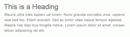
The large font size indicates significance, because it attracts the attention of the reader and therefore this method is usually applied to headings.
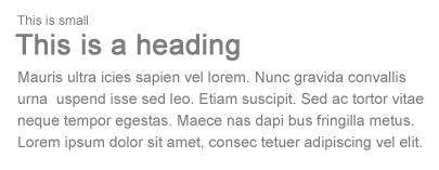
On the other hand, you can reduce significance by using a smaller font size.
Contrast can be achieved by combining various fonts. However, you need to use “ web safe ” fonts of two main types: serif and sans-serif.
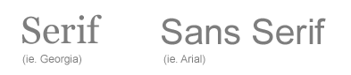
Typically, you can use a serif font for the title and a sans-serif for the rest of the text to create a contrast between the title and the text block.
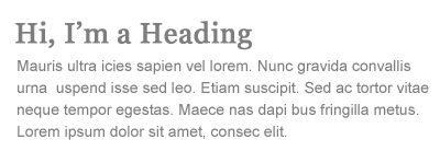
Color contrast is the usual way to distinguish between navigation, headings, links, and body text.
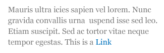
You can use faded colors to indicate something is forbidden or impossible.

Sometimes you don’t have to do something big to attract attention, you can create a selection by using bright colors.

You can also use color to distinguish individual words within text.

When a small font size is combined with a light tone, the importance of the text is doubly lost.
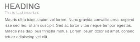
When the same font is used in the header and text, contrast can be enhanced by case. Lowercase ones attract more attention than uppercase ones; therefore, this method is more suitable for headings. CSS property for changing case of letters text-transform: uppercase .
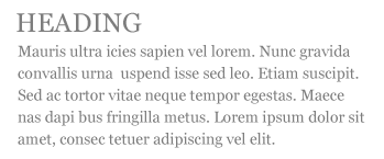
Avoid using only uppercase letters in the text or long sentence, because this reduces the readability of the text.

One of the common mistakes most editors make is the tendency to use underscores to highlight parts of the text. This is a big mistake in web typography. Users confuse underlined text with a link, because browsers underline links by default. Therefore, do not underline any text that is not a link when publishing online.

In return, you can apply italic.

You can emphasize the significance of a particular text by highlighting it in bold.

Another common mistake is that people tend to bold whole lines in the text. From this, the importance or contrast of the fragment is lost.

Empty space plays an important role in shaping your design. Its good use will tell the reader where the beginning is, where is the pause, where is the end and what to do next.
There are various ways to create space:
Let's put all these methods together in practice.

So, as you probably know, most Internet users do not read line by line, but “scan” the text, moving from one point to another. For this reason, designers create typographic contrasts to emphasize specific text. Contrast is important because not all page content has the same meaning, one is more important than the other. By creating contrasts, you can direct the reader's attention to important messages and at the same time increase the attractiveness of the appearance of the page. Here are seven basic methods for achieving typographic contrast.
1. Size
The large font size indicates significance, because it attracts the attention of the reader and therefore this method is usually applied to headings.
On the other hand, you can reduce significance by using a smaller font size.
2. Font
Contrast can be achieved by combining various fonts. However, you need to use “ web safe ” fonts of two main types: serif and sans-serif.
Typically, you can use a serif font for the title and a sans-serif for the rest of the text to create a contrast between the title and the text block.
3. Color
Color contrast is the usual way to distinguish between navigation, headings, links, and body text.
You can use faded colors to indicate something is forbidden or impossible.
Sometimes you don’t have to do something big to attract attention, you can create a selection by using bright colors.
You can also use color to distinguish individual words within text.
When a small font size is combined with a light tone, the importance of the text is doubly lost.
4. Register
When the same font is used in the header and text, contrast can be enhanced by case. Lowercase ones attract more attention than uppercase ones; therefore, this method is more suitable for headings. CSS property for changing case of letters text-transform: uppercase .
Avoid using only uppercase letters in the text or long sentence, because this reduces the readability of the text.
5. Style
One of the common mistakes most editors make is the tendency to use underscores to highlight parts of the text. This is a big mistake in web typography. Users confuse underlined text with a link, because browsers underline links by default. Therefore, do not underline any text that is not a link when publishing online.
In return, you can apply italic.
6. Inscription
You can emphasize the significance of a particular text by highlighting it in bold.
Another common mistake is that people tend to bold whole lines in the text. From this, the importance or contrast of the fragment is lost.
7. Space
Empty space plays an important role in shaping your design. Its good use will tell the reader where the beginning is, where is the pause, where is the end and what to do next.
There are various ways to create space:
- Blocking - padding between block elements using padding or margin.
- Sectioning - creating spaces between <p> elements.
- Letter spacing.
- Line spacing (line-height).
- Use paragraphs to work with quotes and lists.
Conclusion
Let's put all these methods together in practice.