Emoji in the iOS app interface and Apple requirements
I was not surprised to find in the search results on Habru publications on the issue of using emoji in the application interface published in the App Store by the blessed Apple. So in advance I apologize if I do repeat.

The essence of the problem is that Apple prohibits the use of emoji in the application interface. Apparently, it started around the fall of 2018 (at least in the spring of 2018 ). But, perhaps, before I did not go deep into the chronology of the problem. The Internet is full of messages from developers whose applications are rejected due to the presence of emoji in the application interface. Moreover, even updates to previously published applications are wrapped up! Some report a post refusal due to the presence of emoji in app screenshots! Typically, Apple's failure looks like:
Agree, quite an interesting position from the company, which was one of (if not the only) founders of emoji popularization ... Under the cut, I will put forward a couple of assumptions about the reasons and a couple of ways to solve the problem. In particular, as I ended up publishing on the App Store with an application in which emoji was originally the main idea.
I think that the main reason for the ban is not copyright, as it may seem from Apple's answer. Although using third-party emoji helps circumvent the problem, I don’t think this is the root of the problem. In the end, the application is published on the site of the company. She receives interest from sales. At the same time, she also develops and provides a development environment, programming languages and frameworks to simplify and accelerate software creation. Having given all this, but forbidding the use of pictures from the font, it seems strange to push against copyright. It is not logical for a perfectionist company to require developers to use left emoji for input and native ones for output. If, in conclusion, you also use third-party emoji, then this will not look much less strange in the Apple ecosystem.
I am inclined to think that the point is that emoji are not icons ... Ie there are icons in the system and they can be used (when I removed emoji from the interface, but left the icons - it worked, but the icons are also quite copyrighted), but you can not use native emoji as icons! As far as I understand, the developers of keyboards and input tools have no problems with emoji.
You display emoji on the button, the user presses it and it appears in the input field - it seems this is the only scenario that Apple approves when checking the application. In all other cases, you need to use full-fledged icons or other people's emoji fonts (which, apparently, are regarded by the company as icon fonts).
In fact, all these are my personal speculations, but so far they look quite logical, because much converges (at least in my head) ...
Based on the foregoing, the outputs / tips are as follows:
Technically, in my application, emoji was used specifically for user input. But this was not obvious because the application was rejected even for public testing, not to mention publication in the store. I'll explain now.
The meaning of the application is that the user can quickly (literally with one touch) add tags. The target audience is streamers, maybe podcasts or people who broadcast live. Like many application ideas, this one arose when I myself began to need something (and, like many such applications, no one else needs it). The problem is that after the end of the stream, you often want to cut the best moments. But then it’s hard to remember and find everything that was interesting. Shoveling clock streams is not the most fun activity and you needed a way to conveniently and quickly create notes in the process.
So the idea of “Stream Note” came about - applications with a set of buttons with emoji that you press as needed in the broadcast process. When pressed, the time stamp from the start of broadcasting and, in fact, emoji as a title / icon in the list of labels would be saved. The application by default had button sets with emoji for more obviousness to the user.
I suspect that the problem is that the process did not provide for the appearance of emoji in the input field and subsequent manual sending. Because the point was to simplify and speed up the process of creating notes as much as possible, so when you clicked the button with emoji in the list of labels for the stream, a new label with this emoji simply appeared. At the same time, emoji was displayed large (so that you could immediately see which event was noted during the subsequent analysis of materials) and did not look like the text entered by the user.
As a result, the application was rejected for public testing (I wanted to throw my brother a link for testing, so as not to be fooled by adding it to the team of testers on the Apple website). And if the versions for internal testing in the team become available almost instantly, then the versions for public testing pass verification almost like when published in the store. As a result, they shaved me. What was useful because As a result, I already passed the verification of publication in the store the first time.
I redid the manual configuration of the buttons. If earlier it was imprisoned for emoji and the line of them was broken into buttons, now the user can create buttons with inscriptions. Also, emoji buttons were excluded from the set by default.
Naturally, no one forbids the use of a single-character inscription, which will be emoji. But if the name of the moment consists of one emoji, it will still be displayed in large size.
With such a twist, the functionality has not changed (it even became more universal), but in the default version there is no emoji, and the user chooses what to use. What Apple cannot forbid him to do.

The essence of the problem is that Apple prohibits the use of emoji in the application interface. Apparently, it started around the fall of 2018 (at least in the spring of 2018 ). But, perhaps, before I did not go deep into the chronology of the problem. The Internet is full of messages from developers whose applications are rejected due to the presence of emoji in the application interface. Moreover, even updates to previously published applications are wrapped up! Some report a post refusal due to the presence of emoji in app screenshots! Typically, Apple's failure looks like:
From appleGuideline 5.2.5 - Legal - Intellectual Property
Your app does not comply with the Guidelines for Using Apple's Trademarks and Copyrights. Specifically, your app includes:
- Apple trademark, emojis, imagery - or likeness
Agree, quite an interesting position from the company, which was one of (if not the only) founders of emoji popularization ... Under the cut, I will put forward a couple of assumptions about the reasons and a couple of ways to solve the problem. In particular, as I ended up publishing on the App Store with an application in which emoji was originally the main idea.
Why not?
I think that the main reason for the ban is not copyright, as it may seem from Apple's answer. Although using third-party emoji helps circumvent the problem, I don’t think this is the root of the problem. In the end, the application is published on the site of the company. She receives interest from sales. At the same time, she also develops and provides a development environment, programming languages and frameworks to simplify and accelerate software creation. Having given all this, but forbidding the use of pictures from the font, it seems strange to push against copyright. It is not logical for a perfectionist company to require developers to use left emoji for input and native ones for output. If, in conclusion, you also use third-party emoji, then this will not look much less strange in the Apple ecosystem.
I am inclined to think that the point is that emoji are not icons ... Ie there are icons in the system and they can be used (when I removed emoji from the interface, but left the icons - it worked, but the icons are also quite copyrighted), but you can not use native emoji as icons! As far as I understand, the developers of keyboards and input tools have no problems with emoji.
You display emoji on the button, the user presses it and it appears in the input field - it seems this is the only scenario that Apple approves when checking the application. In all other cases, you need to use full-fledged icons or other people's emoji fonts (which, apparently, are regarded by the company as icon fonts).
In fact, all these are my personal speculations, but so far they look quite logical, because much converges (at least in my head) ...
What to do?
Based on the foregoing, the outputs / tips are as follows:
- Use icons or third-party emoji fonts as icons
- Try not to use emoji in app store screenshots
- Use emoji only for user input (there is also a nuance here, see the description of my situation)
- Hide emoji from default state and allow user to configure them
- Create a version for public testing, during the verification process they will point out various publication problems, if any
My story (with derogations)
Technically, in my application, emoji was used specifically for user input. But this was not obvious because the application was rejected even for public testing, not to mention publication in the store. I'll explain now.
The meaning of the application is that the user can quickly (literally with one touch) add tags. The target audience is streamers, maybe podcasts or people who broadcast live. Like many application ideas, this one arose when I myself began to need something (and, like many such applications, no one else needs it). The problem is that after the end of the stream, you often want to cut the best moments. But then it’s hard to remember and find everything that was interesting. Shoveling clock streams is not the most fun activity and you needed a way to conveniently and quickly create notes in the process.
So the idea of “Stream Note” came about - applications with a set of buttons with emoji that you press as needed in the broadcast process. When pressed, the time stamp from the start of broadcasting and, in fact, emoji as a title / icon in the list of labels would be saved. The application by default had button sets with emoji for more obviousness to the user.
This interface was rejected: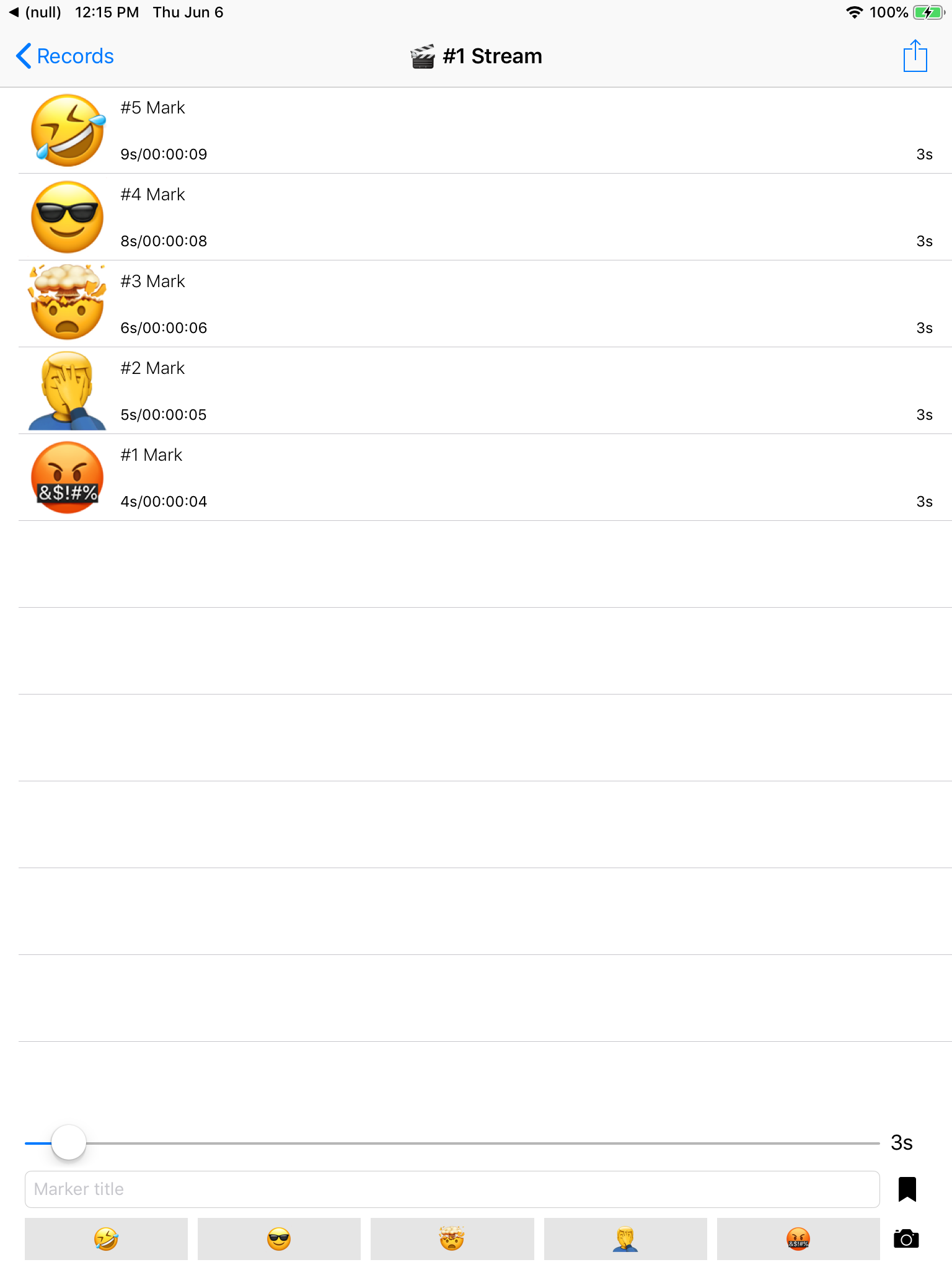
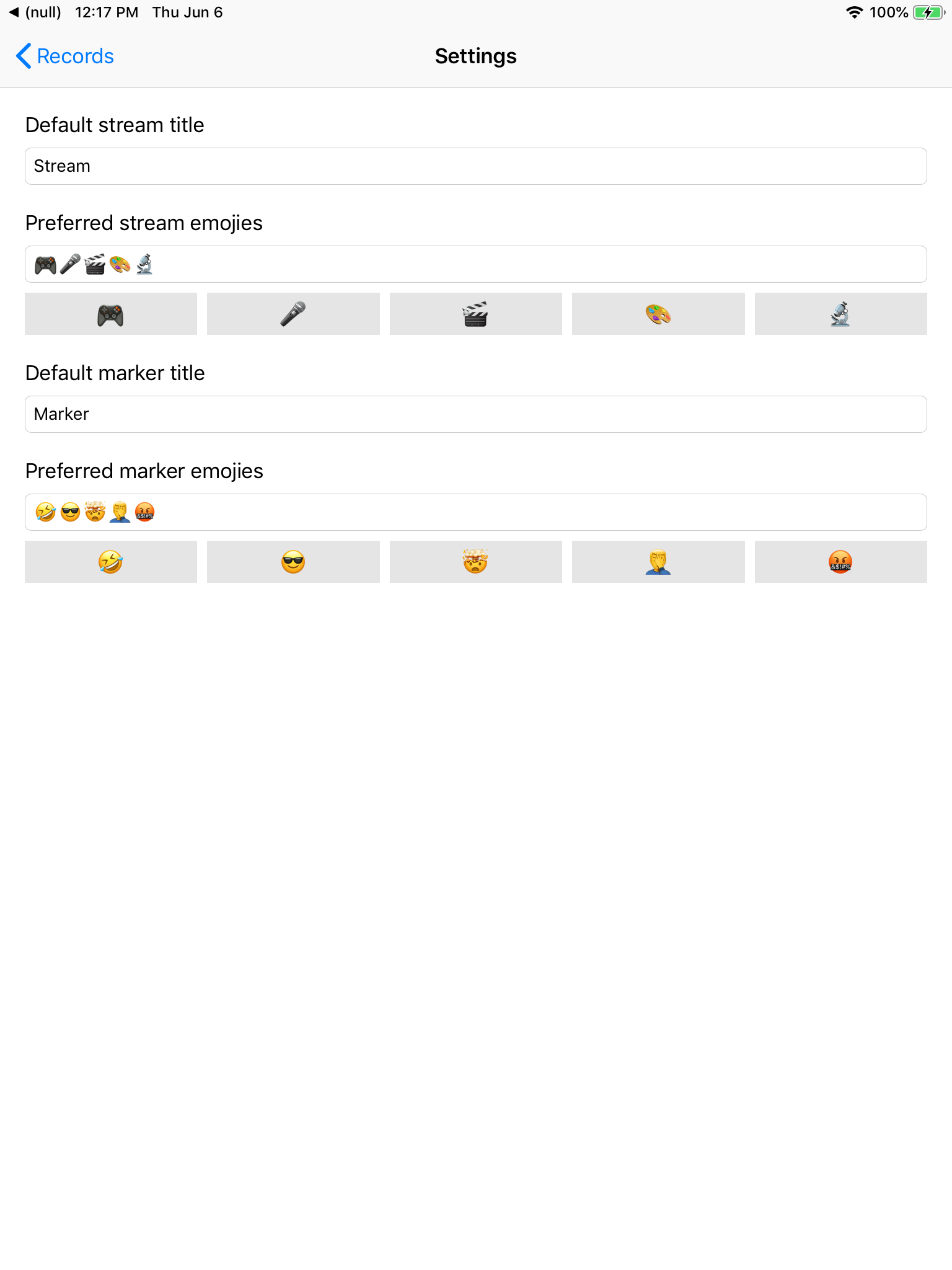


I suspect that the problem is that the process did not provide for the appearance of emoji in the input field and subsequent manual sending. Because the point was to simplify and speed up the process of creating notes as much as possible, so when you clicked the button with emoji in the list of labels for the stream, a new label with this emoji simply appeared. At the same time, emoji was displayed large (so that you could immediately see which event was noted during the subsequent analysis of materials) and did not look like the text entered by the user.
As a result, the application was rejected for public testing (I wanted to throw my brother a link for testing, so as not to be fooled by adding it to the team of testers on the Apple website). And if the versions for internal testing in the team become available almost instantly, then the versions for public testing pass verification almost like when published in the store. As a result, they shaved me. What was useful because As a result, I already passed the verification of publication in the store the first time.
I redid the manual configuration of the buttons. If earlier it was imprisoned for emoji and the line of them was broken into buttons, now the user can create buttons with inscriptions. Also, emoji buttons were excluded from the set by default.
App Store Version: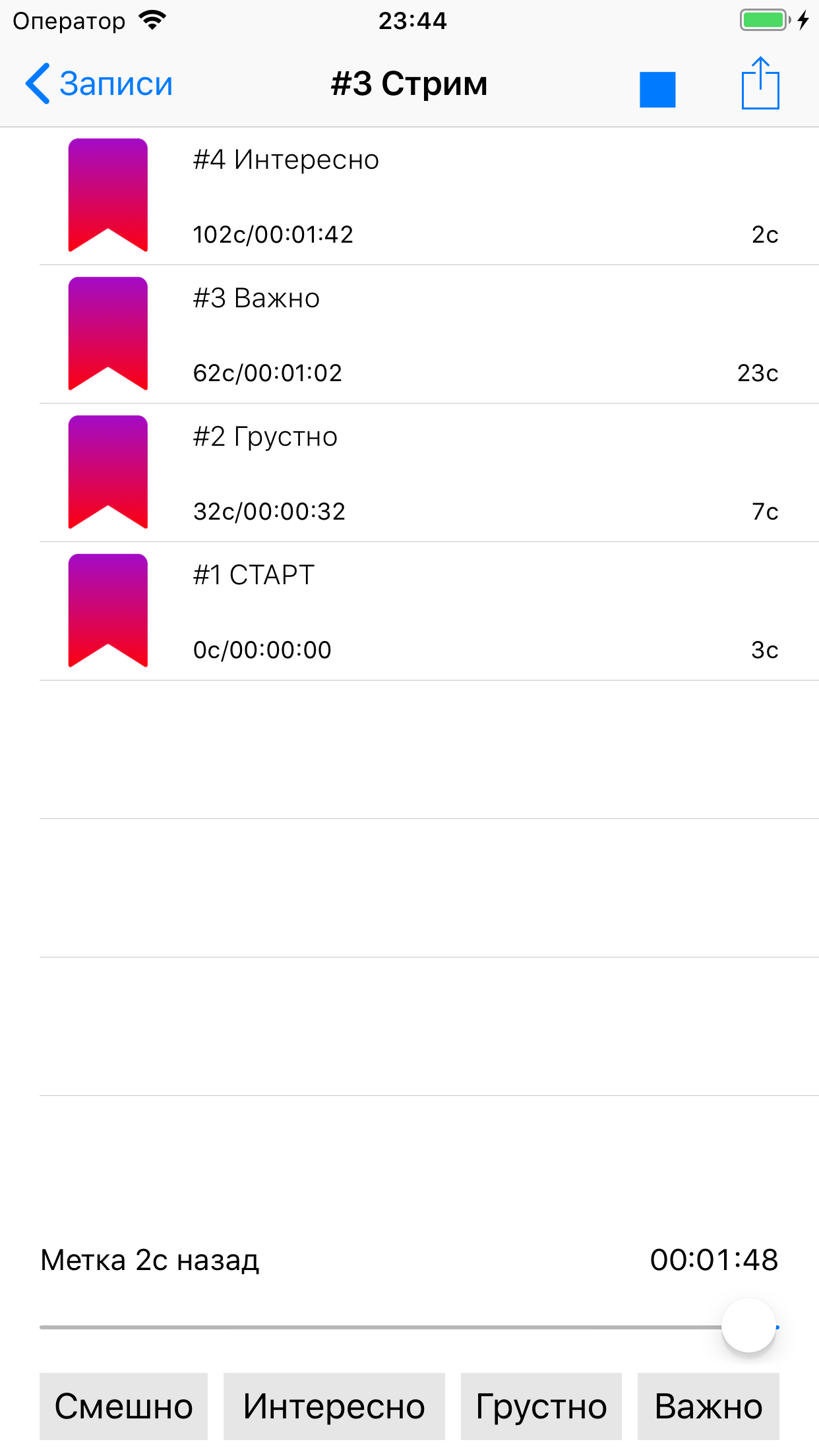
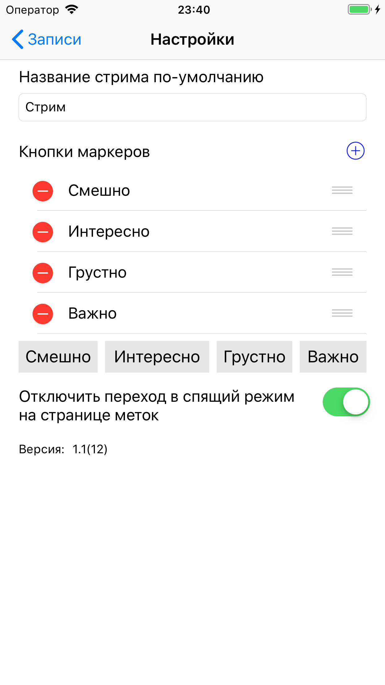


Naturally, no one forbids the use of a single-character inscription, which will be emoji. But if the name of the moment consists of one emoji, it will still be displayed in large size.
What it looks like in business: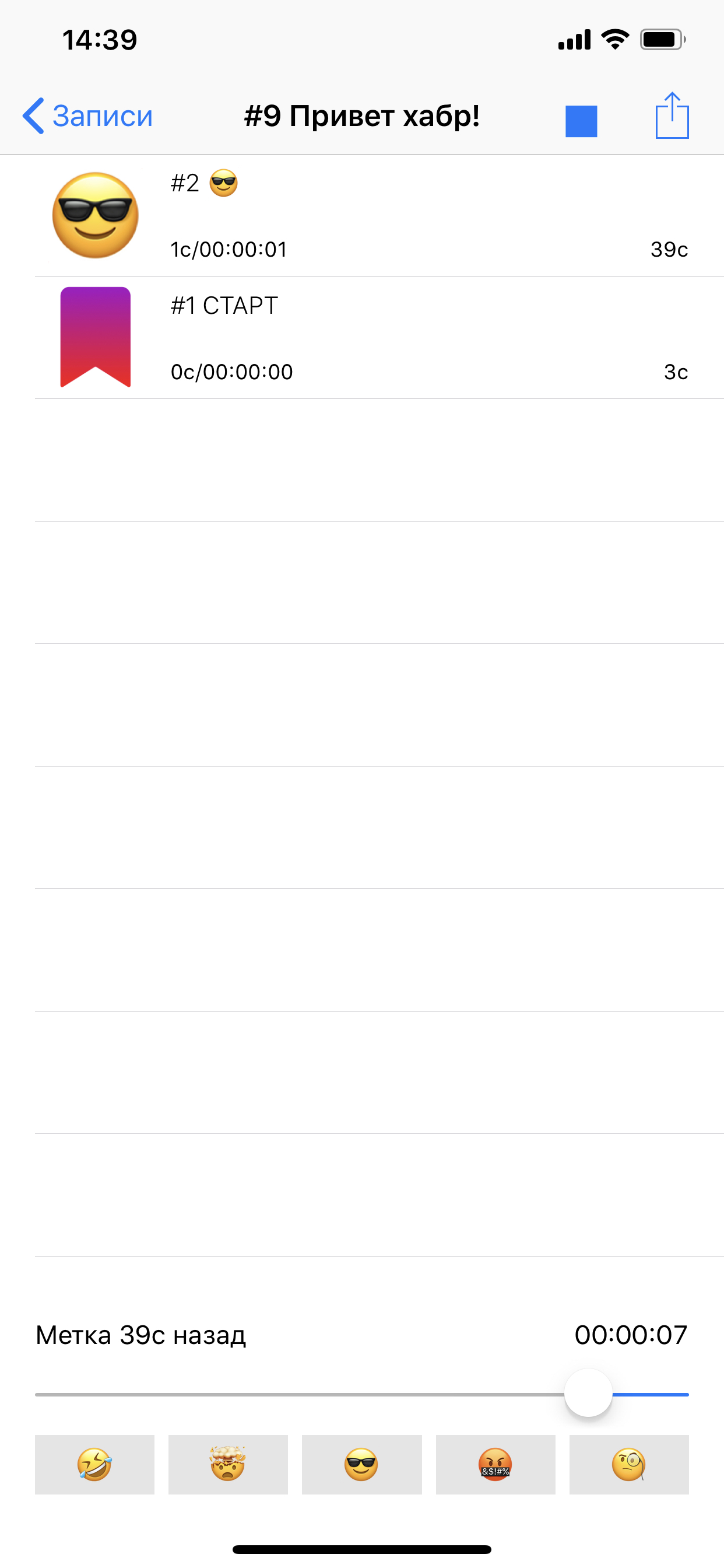
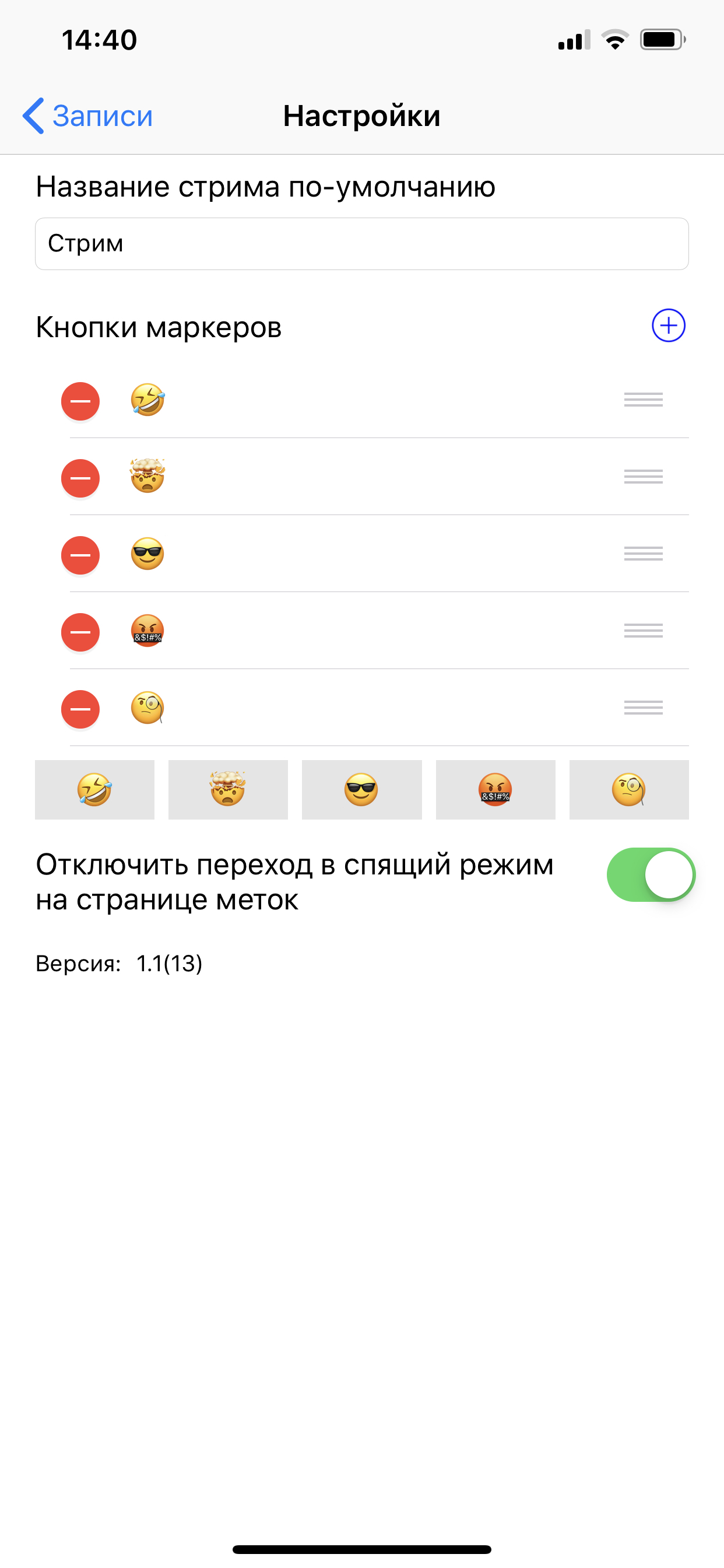


With such a twist, the functionality has not changed (it even became more universal), but in the default version there is no emoji, and the user chooses what to use. What Apple cannot forbid him to do.
