We divide features faster. Android development experience at Badoo
Hello! My name is Anatoly Varivonchik. I have been working at Badoo for over a year, and my total Android development experience is over five years.
In my practice, my colleagues and I often face the need to test ideas as quickly and simply as possible. We do not want to spend a lot of effort on implementation, because we know that if the experiment is unsuccessful, then we will throw out the code.
In this article, I will show with real examples how we act in such situations and what principles help us make a choice in favor of a particular solution to the problem. The analysis of examples should help to understand our pattern of thinking: how can you sometimes cut corners, speeding up development.

The plan is this:
This article is a text version of my report on AppsConf, the video can be viewed here .
Hundreds of millions of people use Badoo, so we can’t roll out new functionality if we are not sure that users will like it and prove to be useful.
Our development approach is influenced by several factors.
We have dozens of A / B tests active on mobile platforms today, while several hundred are completed. Accordingly, if you take the Badoo application on two different devices, then with a high degree of probability there will be some differences between them, possibly imperceptible at first glance.
Why do we need A / B tests? It is important to understand: what product managers consider necessary, and even what seems obvious to us, is not always useful in reality. Sometimes we have to delete code that we wrote just a month or two ago. Sometimes it makes sense to test the idea of a new functional in order to understand whether it is suitable or not. And if users liked the functionality, then we can already invest time in its development.
Of course, we want everything to work quickly and be beautiful. However, it is not always possible to achieve this in a short time. Sometimes it takes a lot of days. To avoid these problems, we try to help product managers by pre-evaluating the cost of tasks and indicating what is difficult for us to do and what is easy.
Imagine that you have a functional that works perfectly under all scenarios on all devices, but at the same time there is a group of users with Chinese devices, where it does not work exactly as expected. In this case, it may not be worth fixing the problem as quickly as possible, since you most likely have more important tasks.
Let's look at a few examples that illustrate how these principles work. Here we will present real cases that we encountered in our work, as well as considered solution options.
To begin with, I suggest you think for yourself how to solve this case. And then I will consider each of the options with an explanation of why it fit / not fit in our case.
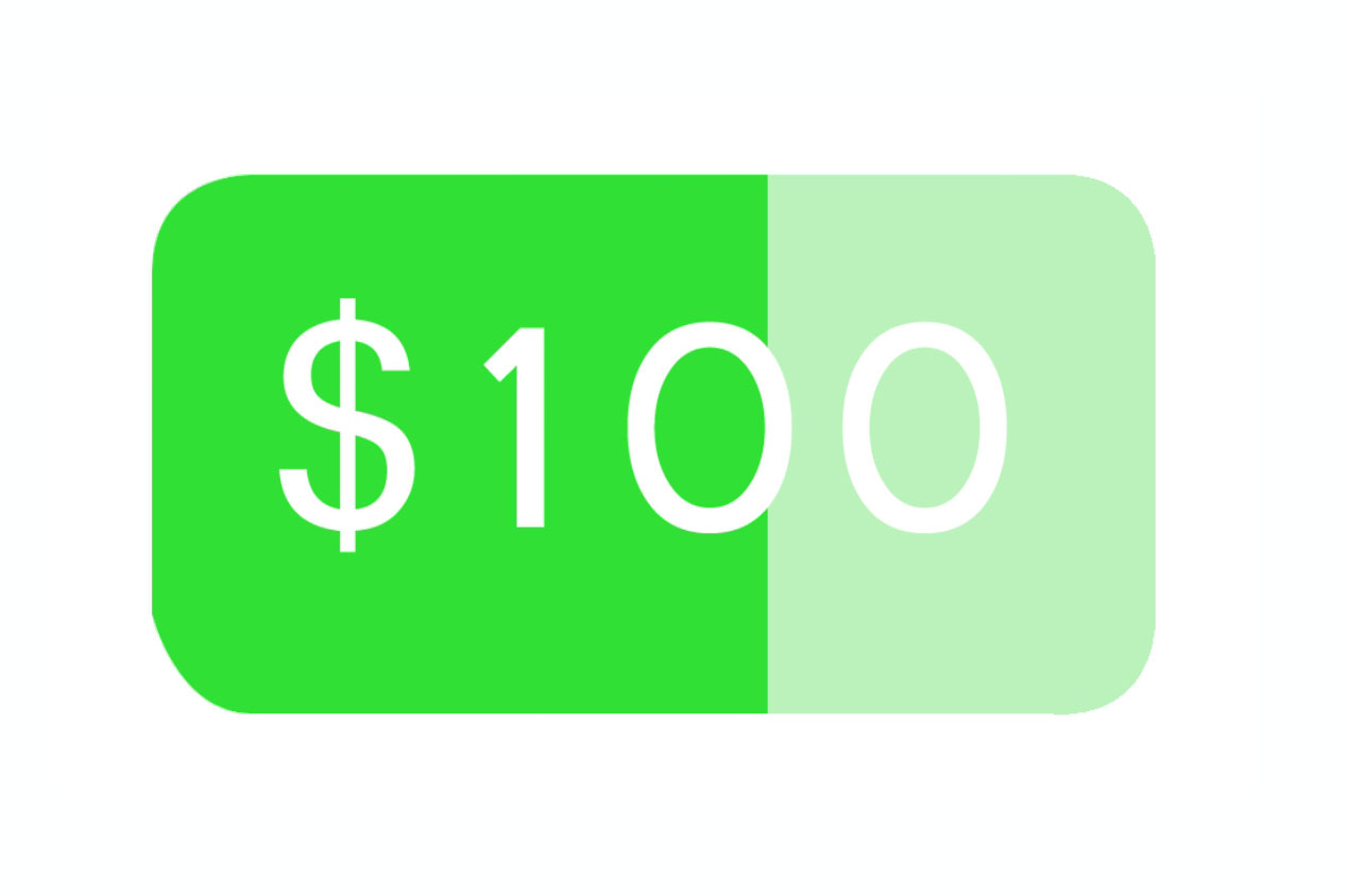
We need to show the user the process of accumulating loans with the progress of the battery with rounded corners from 0 to 1.
What are the possible solutions?

Option A. We do not need this icon. We must ask designers to redo the functionality. Let there simply be some text displayed.
Option B. Use bitmap masks. With the right mix, we get exactly what we need.

Option C: Just take a few icons, hardcode them on the client and show one of them.

In our case, we came to solutions B and C. We will discuss in more detail.

Why not option A? We can solve this particular problem, it is not complicated. We use the same design in iOS and the mobile web. Accordingly, there is no reason to refuse and say that we do not do this and we need to come up with a different design.

Bitmap masks ( option B ) are an ideal solution to this problem. We can easily draw a rounded rectangle. We can easily draw a regular rectangle on the percentage of filling we need. It remains to mix them and set the correct settings. After that, both corners on the left will disappear.
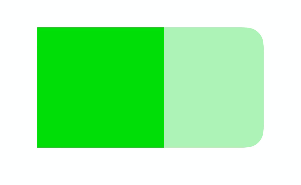
In code, it looks something like this:
I deleted most of the code. Read more about bitmap masks in the article: https://habr.com/ru/company/badoo/blog/310618/ . You will also learn from it how to mix masks, what effects to achieve and how it works in terms of performance.
This solution 100% meets our requirements, that is, it makes it possible to show progress from 0 to 1.
The only negative: if you have never done this before, then you will have to spend time figuring out bitmap masks. In addition, you still have to play with them, see edge cases, and test. I think that overall it will take about four hours.
Option C. We just take a few fixed types of icons and depending on the progress we show one of them. For example, if the user's progress is less than 0.5, an empty icon will be displayed. Obviously, this solution does not 100% satisfy the requirements. But for its implementation, you need to write only five lines of code and get three icons from the designer.
In addition, this solution is optimal in conditions of severe lack of time (as we had when we released the livestream functionality). It does not take much time - you just roll it out and replace it with the correct beautiful solution in the next release. Actually, as we did in our time.
The next example is entering a phone number. Distinctive features:

Let's think about how this can be implemented.

Option A: write a custom TextWatcher that implements the desired logic. It will hold this prefix, hold a space, control the cursor position.
Option B: split this component into two independent fields. From the point of view of the UI, it will be the same component.
Option C: ask for a different design to make it easier for us.
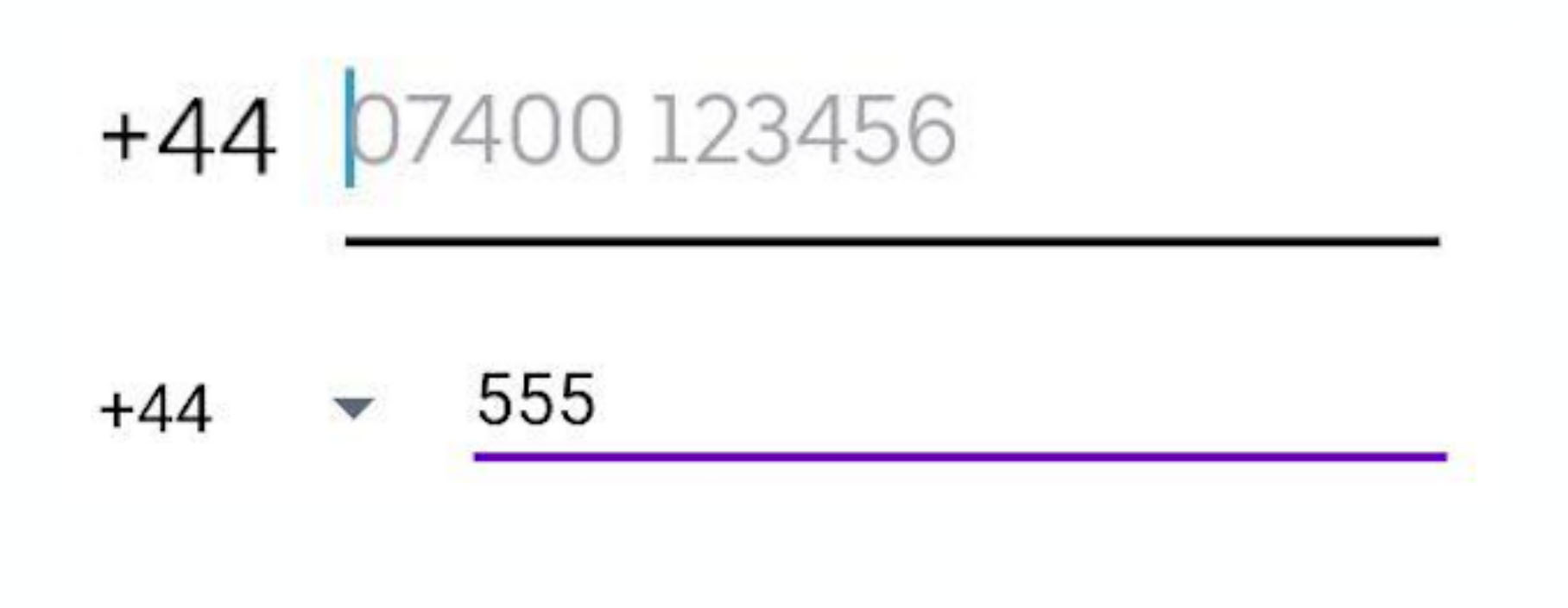
We decided to implement option B. Consider in more detail.

To ask for a different design (option C) is the first thing we tried to do. However, the products insisted on the initial idea. And if the business insists on some kind of functionality, then our task is to implement it.
Custom TextWatcher (option A) only at first glance seems to be a simple solution, but in fact there are many edge cases that need to be handled. For example, you need:
To do all this, of course, is possible, but rather difficult. It seems that there is an easier option.
And he really was found:
We simply divided this component into two parts: TextView and EditText. Programmatically on TextView, we set the background in such a way as to get exactly the design that the products expect.
The only thing to think about is that in Android, by default, the width of the bottom line increases when the EditText is in focus. But we easily subscribe to a change in focus and change the background at the prefix. Nothing complicated:
This solution has several advantages:
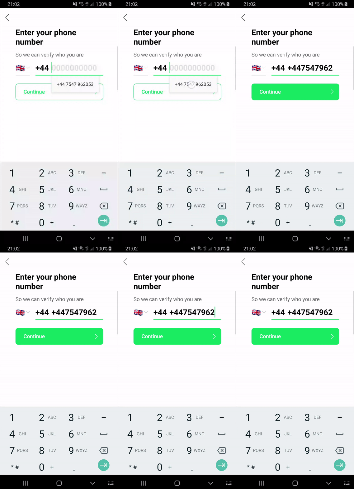
As you can see in the animation on the left, autocomplete does not work as we would like. We would like everything to look like the animation on the right.

Let's think about what we can do about it.

Option A: It seems that this is a rare case that no one fixes. Why don't we do the same?
Option B: Custom TextWatcher will do much better and solve all our problems.
Option C: remove the limit on the number of characters (as seen in the animation, we have a certain number of characters in this component). We will send the entire phone number with a prefix to the server, and then let the server decide whether the number is valid or not.
Option D: take N characters from the end.
We settled on option D.

Option A. I looked in several large applications. Nobody seems to fix it.
Nevertheless, in the future more and more fields will be filled with an autophile. The sooner you solve this problem, the more loyal your users will be and the more pleasant it will be to use the application yourself. For example, I am very pleased when I go through the entire screen with two clicks.
Option B. It is really easier to implement custom TextWatcher, since there aren’t as many edge scripts as in the previous example. You can easily intercept the inserted text. There is only one small problem: in some countries there are local aliases. For example, +44 and 0 mean the same thing.
Custom TextWatcher can not help here. In this case, you need to write additional logic, and also ask the server to return all possible local aliases for this country. To solve this problem, you will have to make changes to the communication protocol with the server and then implement this functionality on the server. This will take more time than doing something on the client. It seems that there is a simpler solution (and we will come to it).
Option C. We remove the limit on the number of characters - and then the server validates. This is a great option. It's okay that the prefix is displayed twice. If the user proceeds to the next step and the phone number is validly determined, then, in principle, no problems.
But still there is one snag. Imagine that the user does not use autocomplete, but simply enters his phone number. In this case, if there is a limit on the number of characters, it will be much more difficult for him to accidentally duplicate a digit - in the end he will see that the last digit has not been printed. Therefore, we decided not to use this method.
Option D. Using N characters from the end seemed to us a suitable solution.
We have the maximum length of a phone number that can be inserted. We write one simple class, it is encapsulated and can be reused in other places. In addition, when any other developer sees the code, he will quickly figure out what's what. But there are two other problems.
Firstly, there are countries with different phone numbers. In such cases, our solution will display an extra digit from the prefix. Secondly, if a user inserts a prefix for another country with an auto-file, the same situation may occur. The second case seems to us rare, because the server initially returns the phone number depending on the country where the user is located. However, if we understand that this is a problem, we will have to change the protocol on the server so that it returns a list of all numbers at once, and write additional logic (now we do not consider this necessary).
Designers and products want to see a mask for entering a date as follows:
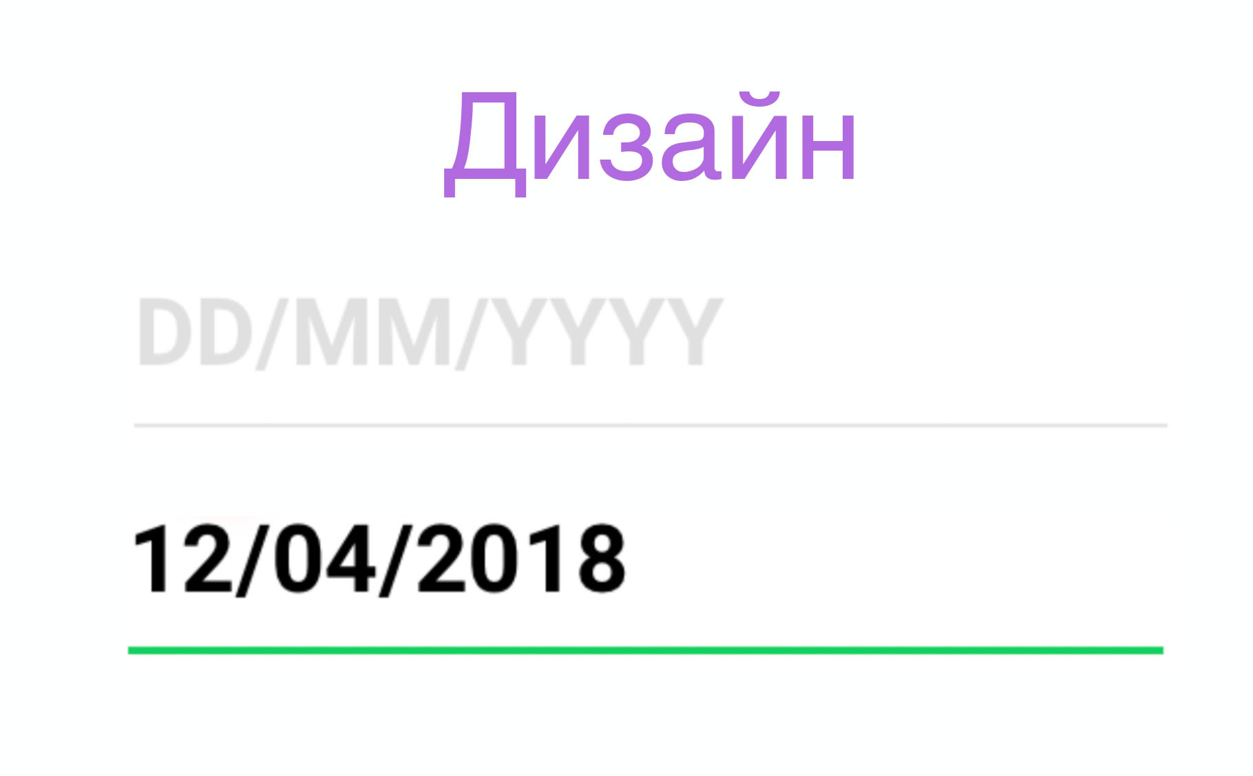
Let's think about how this can be implemented.

Option A: just do it. The task looks simple, it is easy to solve, no problems should arise.
Option B: use the mask library. She suits us in this situation.
Option C: disable control of cursor position. Thus, we simplify the requirements a little and it will be easier for us to implement this functionality.
Option D: use the standard date input component that is on Android and which we all saw.
We arrived at option C.

Option A. The task seems simple. Surely we are not the first to implement this functionality. Why not see if there is a suitable solution on the Internet.
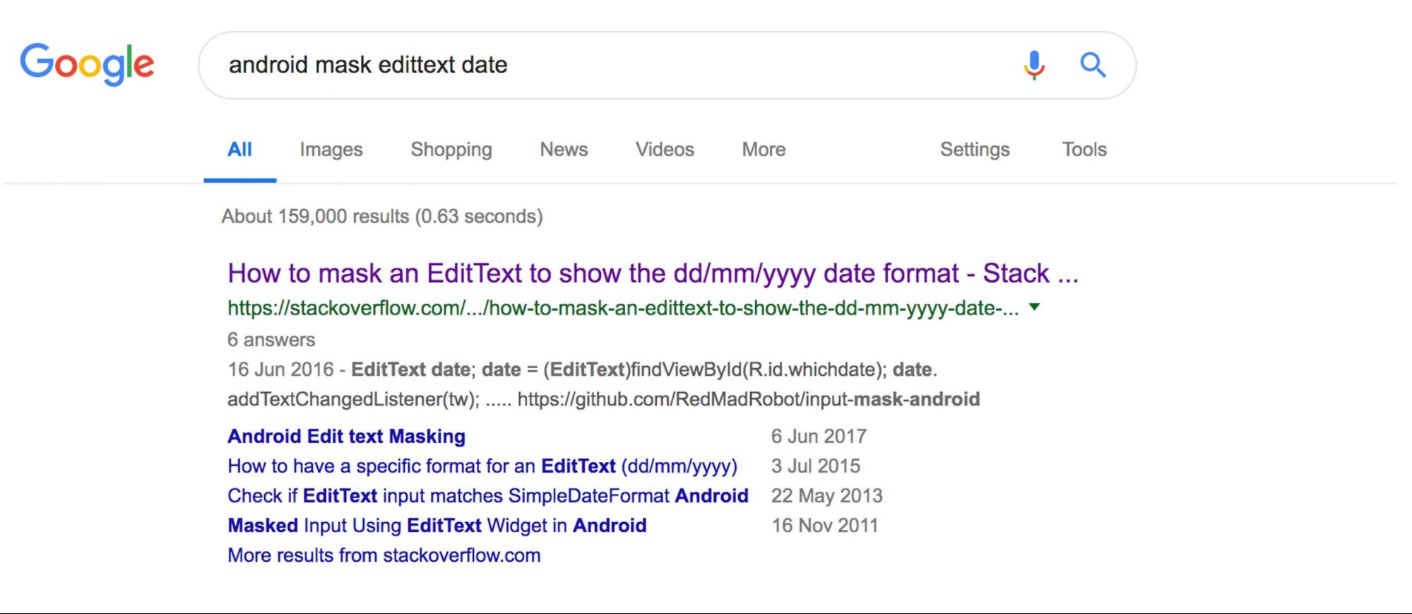
We take this solution, add it to the code, run it. We begin to test:
At first glance it seems that it more or less suits us. True, there are problems with the fact that the cursor position jumps to the end after each change. Then we begin to test more carefully and understand that everything is not so good and there are unaccounted scenarios.
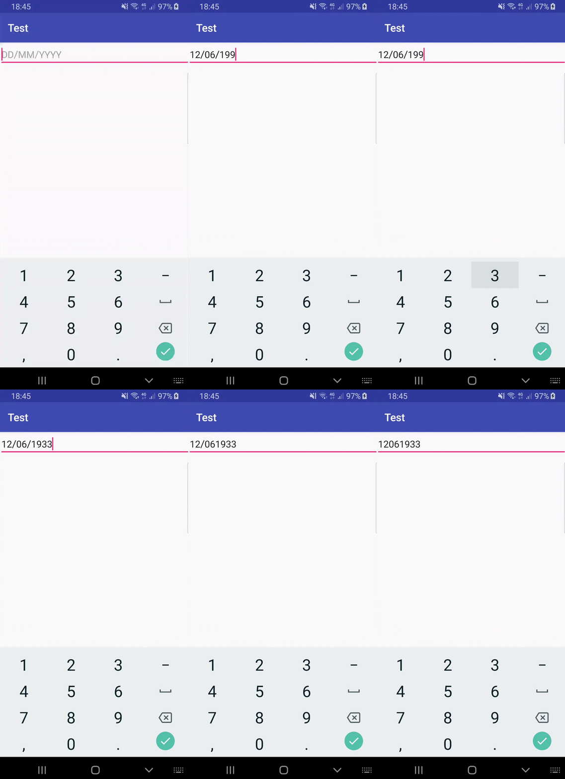
We all need to refine this. I would like to avoid this, because then this is the work of testers, and then again ours is by fixing bugs, etc.
Option B. Why not use a ready-made library for decoro masks or input-mask-android ? They tested all the scenarios, you can just reuse everything and enjoy life. If you have a library for masks in your project or you are ready to add it, then this is a great solution.
We did not have a library. And to drag it into the project for the sake of one small component that is not used anywhere else seemed superfluous.
Option D. Use the standard date entry component.
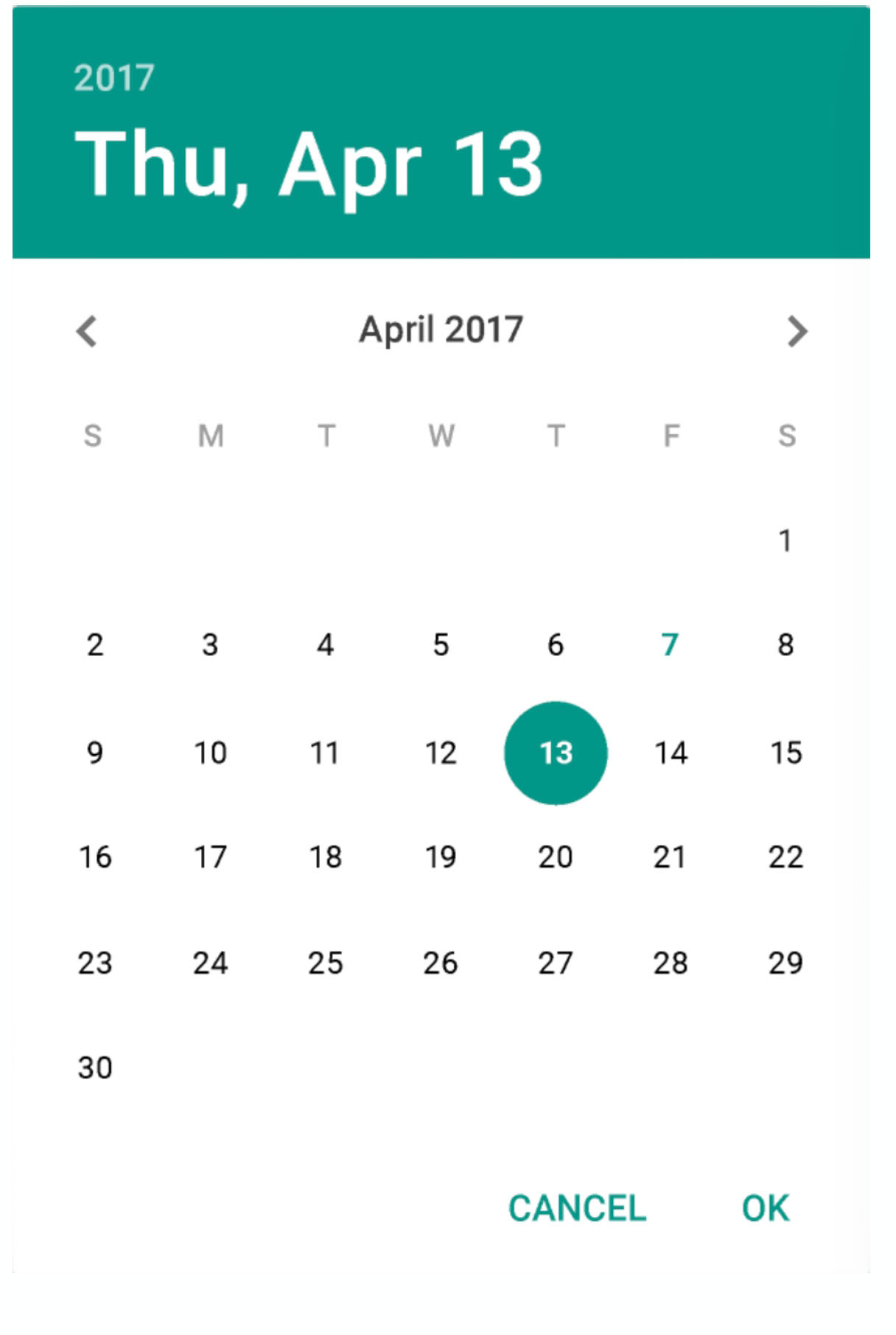
This seems like the smartest solution. Everything is fine with him, except for one small flaw. When you open this component, you already have some predefined value, some valid date. If you set a valid date to go to the next step, for example, January 1, 1980, then you will receive millions of users who were born on that day. Otherwise, you will get many identical errors: the user cannot register because he is too old or too young.
For this reason, we at one time abandoned the standard dialog for entering dates on the registration form in Badoo. The number of errors about an invalid date has been reduced three times.
And one more small minus. It seems that only advanced users can move from the first state to the second:
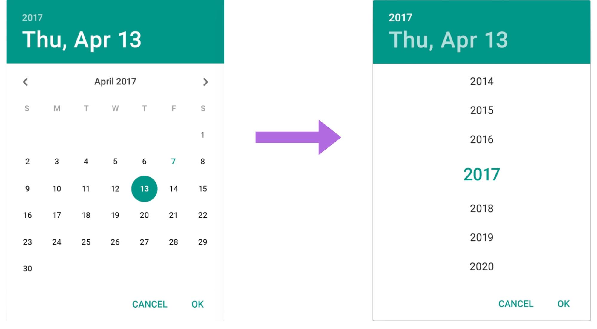
If not only advanced users use your application, then they will sort through month after month in search of the desired date.
Therefore, we decided that option A is not so bad. You just need to refine it and simplify it a bit:
The disadvantages of option A began to appear when the user changed the cursor position. And we thought: “Why give the opportunity to move this cursor?” And simply forbade it to be done.
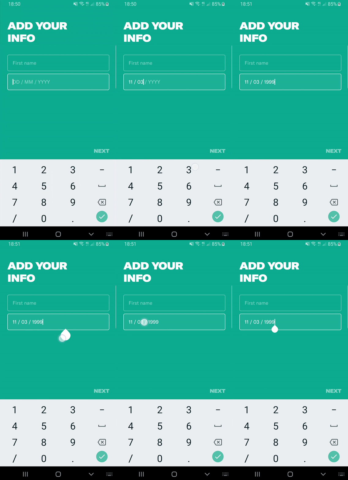
So we solved all the problems. Products got an implementation that suits them. And if in the future they decide that you still need to give the opportunity to remove characters from the middle, we will do it.
When starting video streaming, the products wanted to show tooltips for teaching users how to use the functionality.
At the time of the feature implementation, we had six types of tooltips. At the same time there should not be more than one on the screen. Tooltips dynamically arrived at random time from the server. Some had to be repeated. If the tooltip appeared, but the user did not click on it, then after N minutes it should have appeared again.
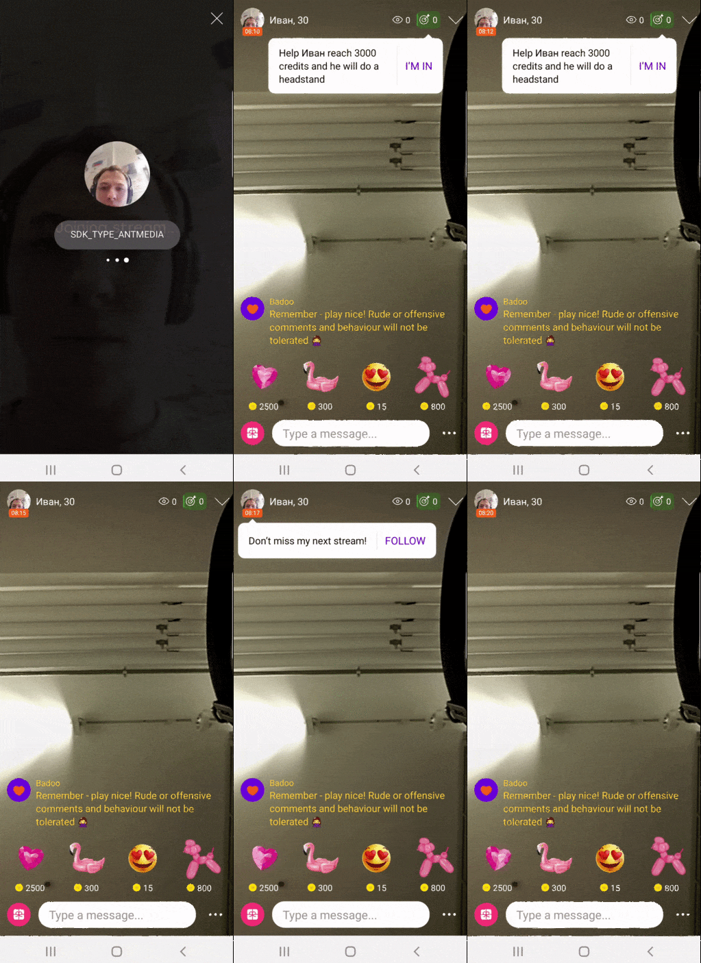
All this seemed rather difficult to implement. We asked the product for a few things.
First, add a classifier, prioritizing tooltips. In any case, we will have situations when both the tooltip wants to appear at the same time and one of them needs to be chosen. Accordingly, we need priorities. Secondly, we asked for a small simplification: to maintain a timer only for the highest priority tooltip.
Previously, tooltip repetition timers were independent:

We asked to maintain a timer only for the highest priority tooltip:

Accordingly, we only had a timer for tooltip 1. As soon as tooltip 1 appeared, it was removed and the next one started to process.

Thus, we simplified the requirements: it became much easier for us to implement the feature, and for testers it was easier to test it. As a result, we realized that this decision suits everyone.
We came up with such a design:
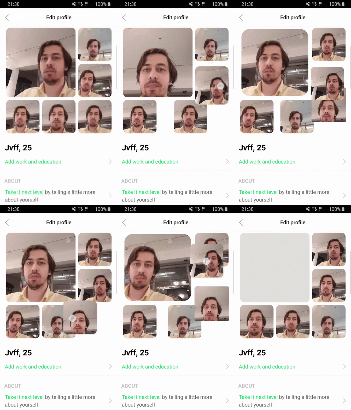
We came to the conclusion that it is quite difficult to implement, it will take three days to develop, and thought: “Why should we do this if we don’t know if the user needs it?” We proposed to start the simplified one version and evaluate how much this feature is in demand.
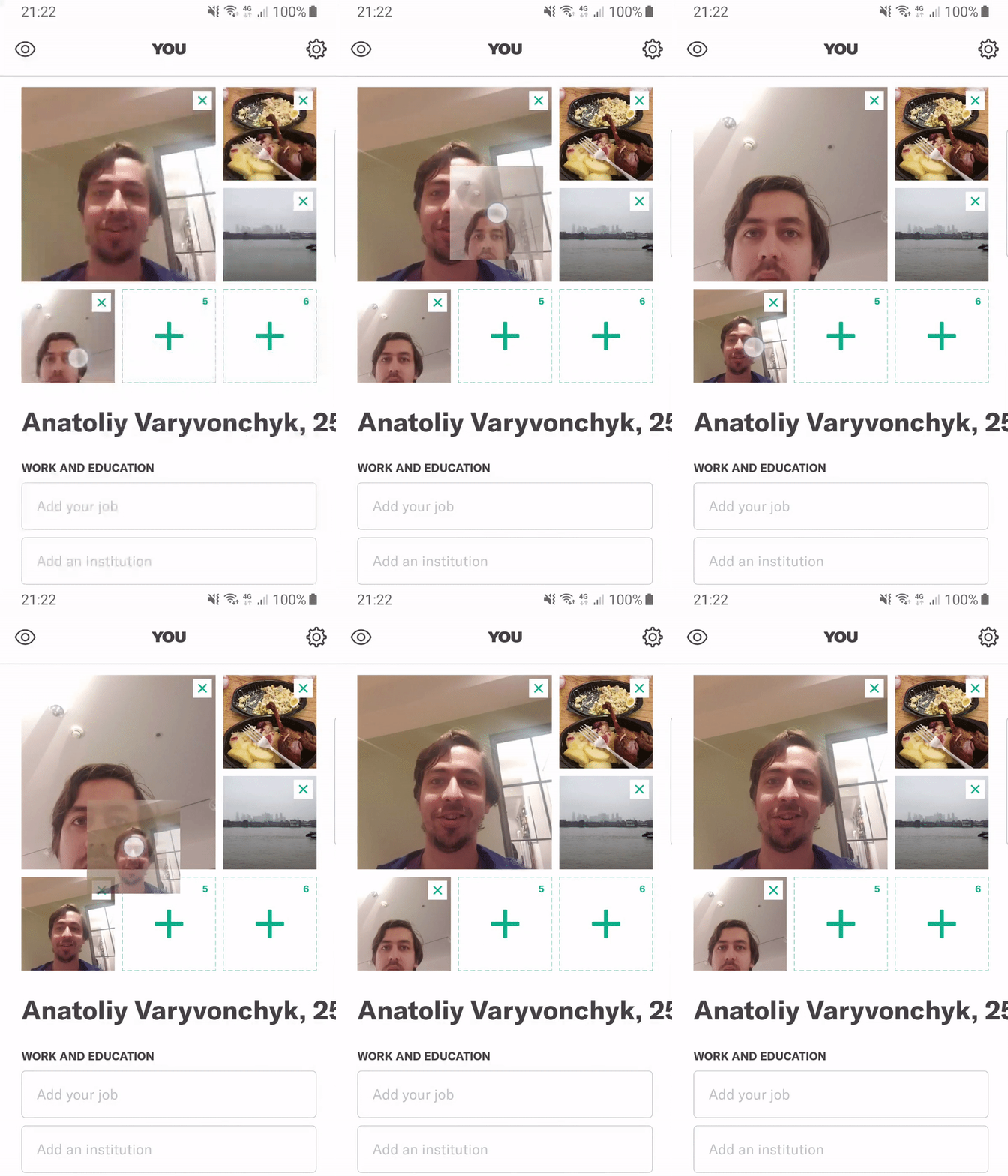
It turned out that users are interested in this functionality. After that, we improved the re-rendering to the state that was on the original design.
Total:
We are developing not only the Badoo application - we also have other applications with a completely different design. And in all three applications we use the same component of entering the PIN code:
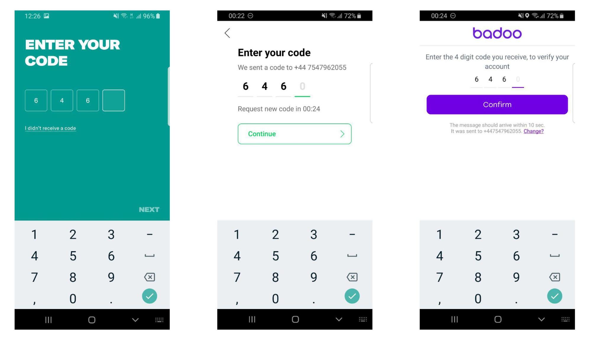
From the point of view of UX, the component should behave the same. Nevertheless, in different applications, different fonts, indents, even different backgrounds. I would like not to copy this into each application, but to reuse it. The design system can help us with this.
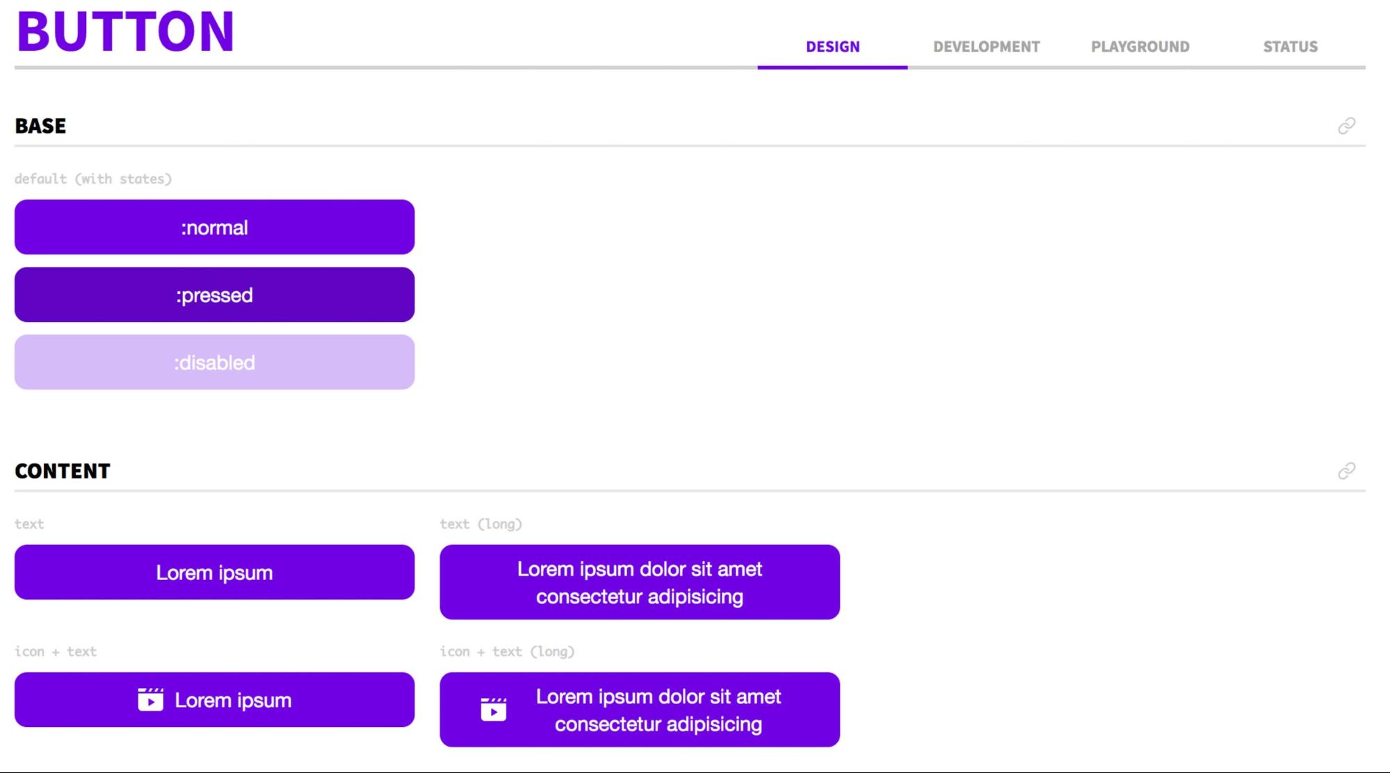
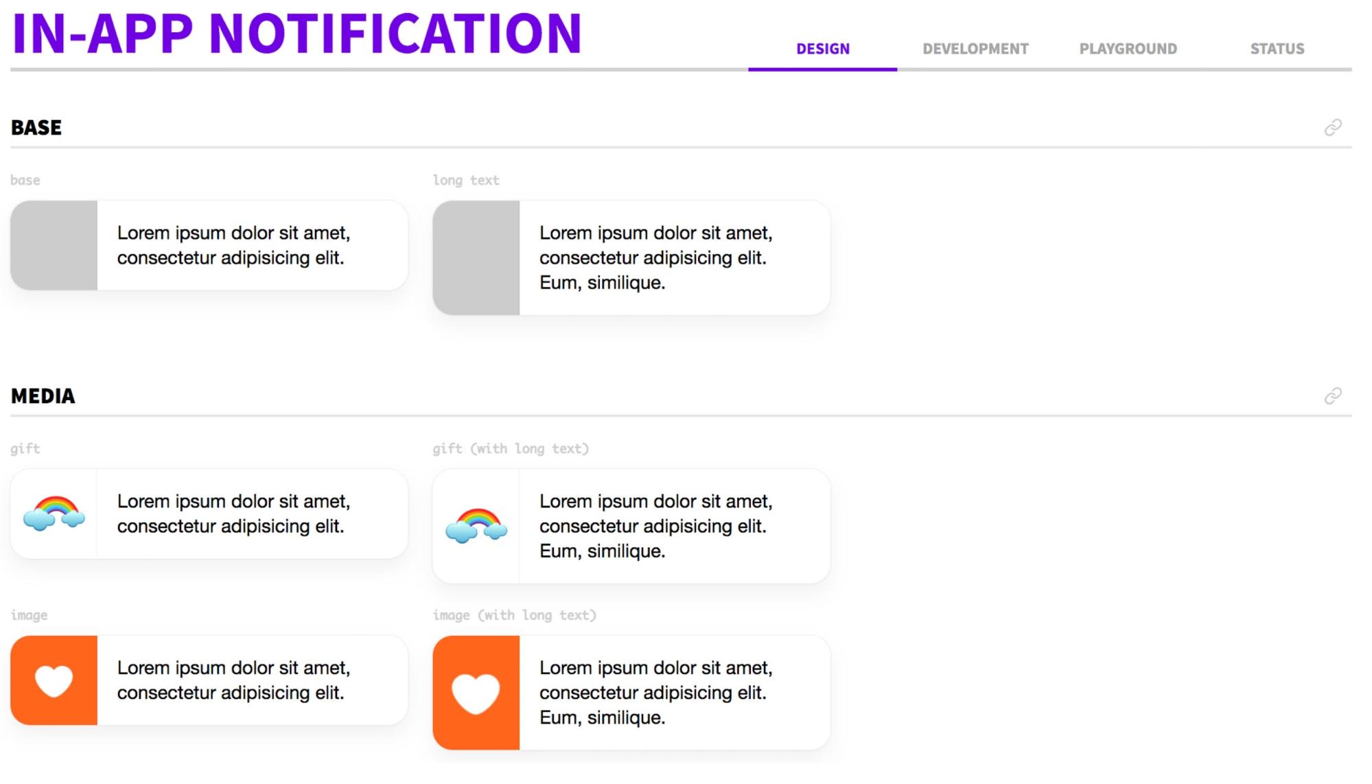
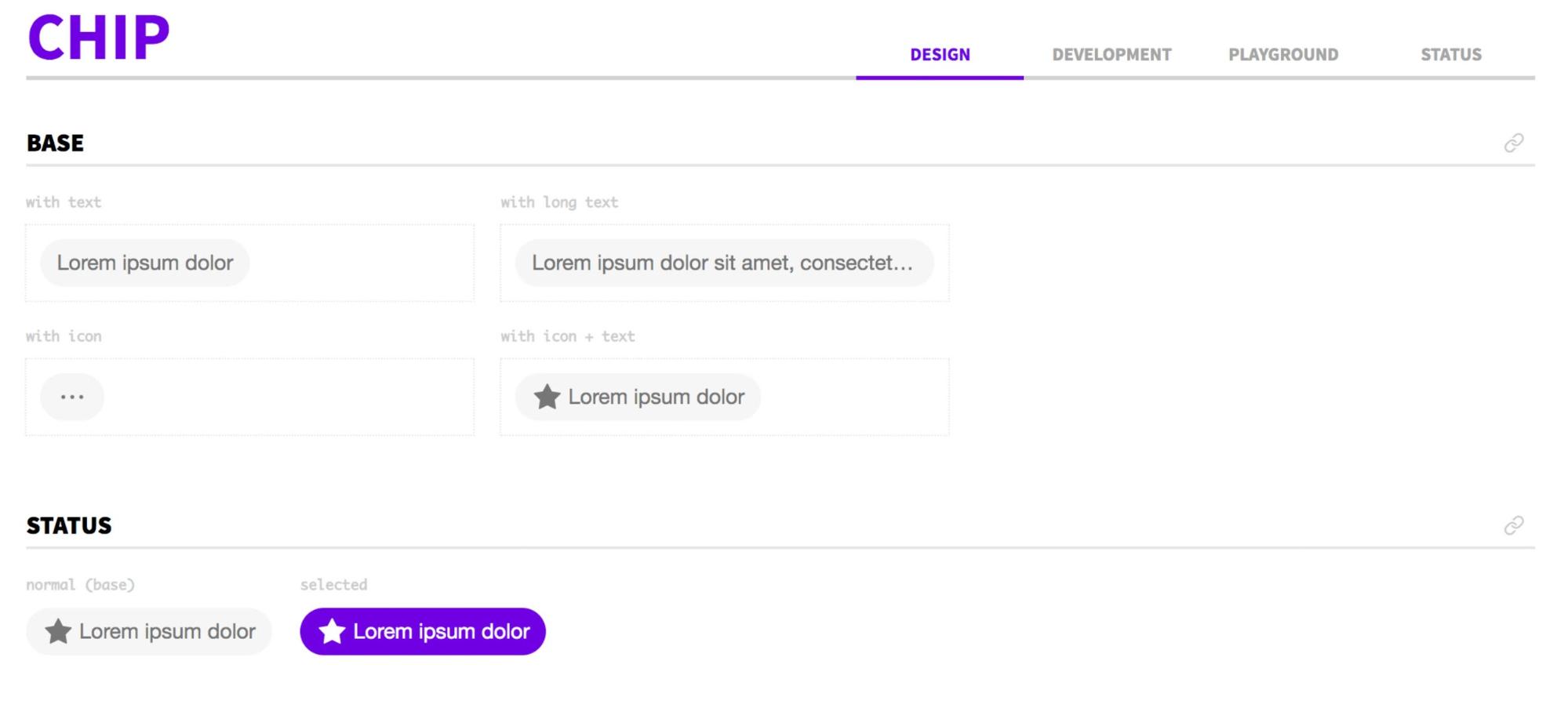
You can learn more about the design system from the report of Rudy Artyom .
In the meantime, back to the PIN input component. What would we like?
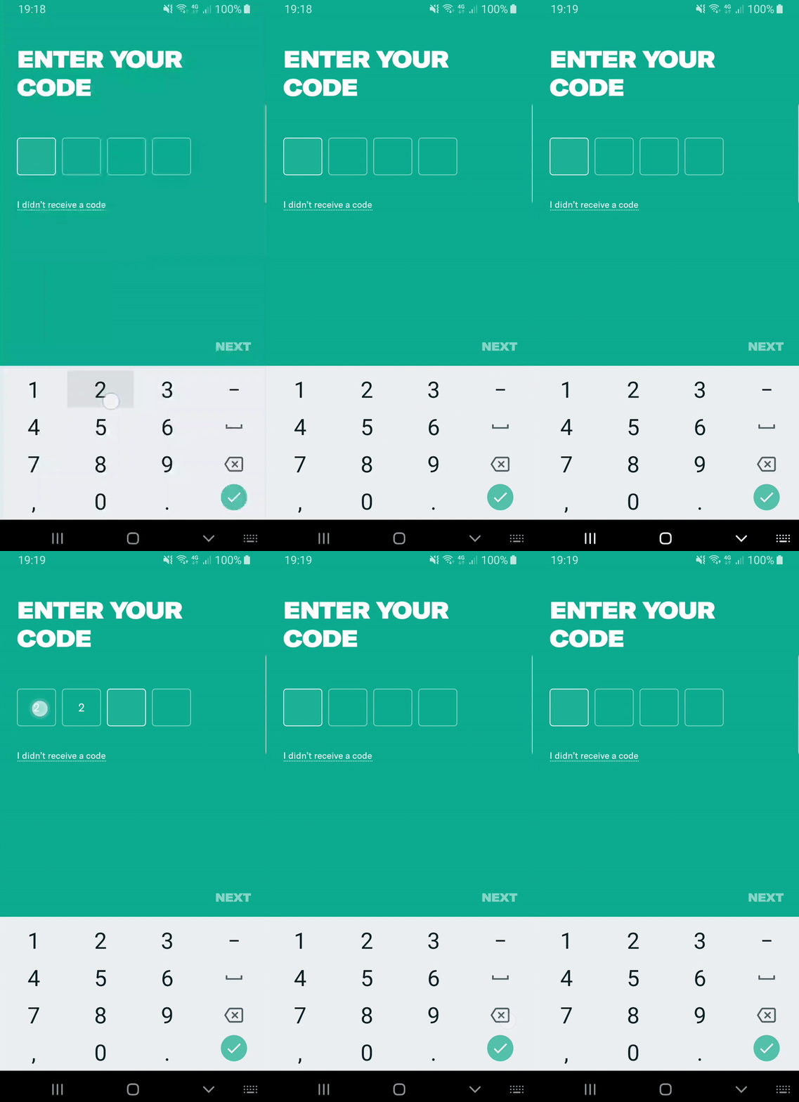
What were our solution options?

Option A: Use four separate EditText, where each PIN element will be a separate EditText.
Option B: use one EditText, add some creativity - and get what you need.
We chose option B.

Option A. There are problems with four separate EditTexts. Android adds extra padding on all sides, which we will need to handle correctly. In addition, you will need to implement a long tap back so that the user can delete the entire PIN code. We will have to manually work with focus and handle character deletion. It seems rather complicated.
Therefore, we decided to cheat a little and created an invisible EditText of size 0 by 0, which will be the data source:
Each digit of the PIN code will be added programmatically. Due to this, we can draw any kind of UI, put any indentation, etc. After the user clicks on the component, we put the focus in our EditText. Thus, we get a correctly working keyboard.
In addition, we subscribe to change the text of the invisible EditText and display it on the UI. After that, it’s easy for us to get out the data stream from this component. In fact, we reused the standard Android EditText, just added the necessary logic a little.
These principles are not always applicable. I’ll give you the conditions under which they will work well.
How to use these principles? Unfortunately, out of context it is difficult to give any recommendations. However, I can advise you to pay attention to the following things.
You may have problems with UI / UX, as in most examples, or you may have problems with business logic, as in the tooltip example. You need to try to decompose your task into several small subtasks, and then evaluate them.
After that, you can find out exactly where the problems will be. Next, you discuss with colleagues how to solve them. Maybe something can be simplified. Or maybe you just don’t know about some simple solution that your colleagues already know. At the next stage, you coordinate with the products an alternative solution. If they are satisfied, then implement your offer.
I want to add that all people sometimes make mistakes. Perhaps the products have set a task that does not solve their real problem. Perhaps the designers sent you a design for iOS. Perhaps the communication protocol between the server and the client is absolutely inconvenient for the client. We need to talk about all these things, we need to discuss them and give feedback. Thus, you will increase your value as a developer and your usefulness for the company. That is, it is Win-Win for both parties.
Links to contact me:
PS Undoubtedly, these tasks have other solutions. Perhaps you know the ones that are better than those suggested. The purpose of the article is to show how we make decisions in real life and what kind of logic we follow. Maybe you know better solutions for these tasks? Share examples in the comments.
In my practice, my colleagues and I often face the need to test ideas as quickly and simply as possible. We do not want to spend a lot of effort on implementation, because we know that if the experiment is unsuccessful, then we will throw out the code.
In this article, I will show with real examples how we act in such situations and what principles help us make a choice in favor of a particular solution to the problem. The analysis of examples should help to understand our pattern of thinking: how can you sometimes cut corners, speeding up development.

The plan is this:
- Principles of development approach in Badoo.
- Case studies.
- Design system.
- When to apply the principles described.
This article is a text version of my report on AppsConf, the video can be viewed here .
Development Approach Principles
Hundreds of millions of people use Badoo, so we can’t roll out new functionality if we are not sure that users will like it and prove to be useful.
Our development approach is influenced by several factors.
Using A / B Tests
We have dozens of A / B tests active on mobile platforms today, while several hundred are completed. Accordingly, if you take the Badoo application on two different devices, then with a high degree of probability there will be some differences between them, possibly imperceptible at first glance.
Why do we need A / B tests? It is important to understand: what product managers consider necessary, and even what seems obvious to us, is not always useful in reality. Sometimes we have to delete code that we wrote just a month or two ago. Sometimes it makes sense to test the idea of a new functional in order to understand whether it is suitable or not. And if users liked the functionality, then we can already invest time in its development.
Reduce development costs
Of course, we want everything to work quickly and be beautiful. However, it is not always possible to achieve this in a short time. Sometimes it takes a lot of days. To avoid these problems, we try to help product managers by pre-evaluating the cost of tasks and indicating what is difficult for us to do and what is easy.
Most User Rule
Imagine that you have a functional that works perfectly under all scenarios on all devices, but at the same time there is a group of users with Chinese devices, where it does not work exactly as expected. In this case, it may not be worth fixing the problem as quickly as possible, since you most likely have more important tasks.
How do we speed up development
Let's look at a few examples that illustrate how these principles work. Here we will present real cases that we encountered in our work, as well as considered solution options.
To begin with, I suggest you think for yourself how to solve this case. And then I will consider each of the options with an explanation of why it fit / not fit in our case.
Example 1. The progress accumulation button
We need to show the user the process of accumulating loans with the progress of the battery with rounded corners from 0 to 1.

What are the possible solutions?

Option A. We do not need this icon. We must ask designers to redo the functionality. Let there simply be some text displayed.
Option B. Use bitmap masks. With the right mix, we get exactly what we need.

Option C: Just take a few icons, hardcode them on the client and show one of them.

In our case, we came to solutions B and C. We will discuss in more detail.

Why not option A? We can solve this particular problem, it is not complicated. We use the same design in iOS and the mobile web. Accordingly, there is no reason to refuse and say that we do not do this and we need to come up with a different design.

Bitmap masks ( option B ) are an ideal solution to this problem. We can easily draw a rounded rectangle. We can easily draw a regular rectangle on the percentage of filling we need. It remains to mix them and set the correct settings. After that, both corners on the left will disappear.

In code, it looks something like this:
dataclassGoalInProgress(val progress: Float)
privateval unchargedPaint = Paint().apply {
   xfermode = PorterDuffXfermode(PorterDuff.Mode.MULTIPLY)
}
privatefunmixChargedAndUncharged(canvas: Canvas) {
   drawFullyCharged(canvas)
   drawUnchargedPart(canvas)
}
I deleted most of the code. Read more about bitmap masks in the article: https://habr.com/ru/company/badoo/blog/310618/ . You will also learn from it how to mix masks, what effects to achieve and how it works in terms of performance.
This solution 100% meets our requirements, that is, it makes it possible to show progress from 0 to 1.
The only negative: if you have never done this before, then you will have to spend time figuring out bitmap masks. In addition, you still have to play with them, see edge cases, and test. I think that overall it will take about four hours.
Option C. We just take a few fixed types of icons and depending on the progress we show one of them. For example, if the user's progress is less than 0.5, an empty icon will be displayed. Obviously, this solution does not 100% satisfy the requirements. But for its implementation, you need to write only five lines of code and get three icons from the designer.
fungetBackground(goal: GoalInProgress) =
   when (goal.progress) {
       in0.0..0.5 -> R.drawable.ic_not_filled
       in0.5..0.99 -> R.drawable.ic_half_filled
       else -> R.drawable.ic_full_filled
   }
In addition, this solution is optimal in conditions of severe lack of time (as we had when we released the livestream functionality). It does not take much time - you just roll it out and replace it with the correct beautiful solution in the next release. Actually, as we did in our time.
Example 2. Phone number input line
The next example is entering a phone number. Distinctive features:
- the country prefix is to the left;
- the prefix cannot be deleted;
- there is an indent;
- the prefix is non-clickable.

Let's think about how this can be implemented.

Option A: write a custom TextWatcher that implements the desired logic. It will hold this prefix, hold a space, control the cursor position.
Option B: split this component into two independent fields. From the point of view of the UI, it will be the same component.
Option C: ask for a different design to make it easier for us.

We decided to implement option B. Consider in more detail.

To ask for a different design (option C) is the first thing we tried to do. However, the products insisted on the initial idea. And if the business insists on some kind of functionality, then our task is to implement it.
Custom TextWatcher (option A) only at first glance seems to be a simple solution, but in fact there are many edge cases that need to be handled. For example, you need:
- somehow intercept clicks on the prefix, then to change the cursor position;
- additionally indent;
- prohibit deletion so that the user cannot delete either the space or the prefix of the country.
To do all this, of course, is possible, but rather difficult. It seems that there is an easier option.
And he really was found:
<merge xmlns:android="http://schemas.android.com/apk/res/android"
   tools:parentTag="android.widget.LinearLayout">
   <TextView
       android:id="@+id/country_code" />
   <EditText
       android:id="@+id/phone_number" />
</merge>
We simply divided this component into two parts: TextView and EditText. Programmatically on TextView, we set the background in such a way as to get exactly the design that the products expect.
The only thing to think about is that in Android, by default, the width of the bottom line increases when the EditText is in focus. But we easily subscribe to a change in focus and change the background at the prefix. Nothing complicated:
phoneNumber.setOnFocusChangeListener { _, hasFocus ->
    countryCode.setBackgroundResource(background(hasFocus))
}
privatefunbackground(hasFocus: Boolean) =
    when (hasFocus) {
        true -> R.drawable.phone_input_active
        false -> R.drawable.phone_input_inactive
    }
This solution has several advantages:
- no need to handle clicks on the prefix;
- no need to work with the cursor position - it is always in a separate field.
- Much less edge cases and problems arise with such an implementation.
Example 3. Problem with autocomplete
As you can see in the animation on the left, autocomplete does not work as we would like. We would like everything to look like the animation on the right.


Let's think about what we can do about it.

Option A: It seems that this is a rare case that no one fixes. Why don't we do the same?
Option B: Custom TextWatcher will do much better and solve all our problems.
Option C: remove the limit on the number of characters (as seen in the animation, we have a certain number of characters in this component). We will send the entire phone number with a prefix to the server, and then let the server decide whether the number is valid or not.
Option D: take N characters from the end.
We settled on option D.

Option A. I looked in several large applications. Nobody seems to fix it.
Nevertheless, in the future more and more fields will be filled with an autophile. The sooner you solve this problem, the more loyal your users will be and the more pleasant it will be to use the application yourself. For example, I am very pleased when I go through the entire screen with two clicks.
Option B. It is really easier to implement custom TextWatcher, since there aren’t as many edge scripts as in the previous example. You can easily intercept the inserted text. There is only one small problem: in some countries there are local aliases. For example, +44 and 0 mean the same thing.
Custom TextWatcher can not help here. In this case, you need to write additional logic, and also ask the server to return all possible local aliases for this country. To solve this problem, you will have to make changes to the communication protocol with the server and then implement this functionality on the server. This will take more time than doing something on the client. It seems that there is a simpler solution (and we will come to it).
Option C. We remove the limit on the number of characters - and then the server validates. This is a great option. It's okay that the prefix is displayed twice. If the user proceeds to the next step and the phone number is validly determined, then, in principle, no problems.
But still there is one snag. Imagine that the user does not use autocomplete, but simply enters his phone number. In this case, if there is a limit on the number of characters, it will be much more difficult for him to accidentally duplicate a digit - in the end he will see that the last digit has not been printed. Therefore, we decided not to use this method.
Option D. Using N characters from the end seemed to us a suitable solution.
classDigitsTrimStartFilter(privateval max: Int) : InputFilter {
   overridefunfilter(...): CharSequence? {
       val s = source.subSequence(start, end).filter { it.isDigit() }
       val keep = max - (dest.length - (dend - dstart))
       returnwhen {
           keep <= 0 -> ""
           keep >= s.length -> null// keep originalelse -> s.subSequence(s.length - keep, s.length)
       }
   }
}
We have the maximum length of a phone number that can be inserted. We write one simple class, it is encapsulated and can be reused in other places. In addition, when any other developer sees the code, he will quickly figure out what's what. But there are two other problems.
Firstly, there are countries with different phone numbers. In such cases, our solution will display an extra digit from the prefix. Secondly, if a user inserts a prefix for another country with an auto-file, the same situation may occur. The second case seems to us rare, because the server initially returns the phone number depending on the country where the user is located. However, if we understand that this is a problem, we will have to change the protocol on the server so that it returns a list of all numbers at once, and write additional logic (now we do not consider this necessary).
Example 4. Date entry component
Designers and products want to see a mask for entering a date as follows:

Let's think about how this can be implemented.

Option A: just do it. The task looks simple, it is easy to solve, no problems should arise.
Option B: use the mask library. She suits us in this situation.
Option C: disable control of cursor position. Thus, we simplify the requirements a little and it will be easier for us to implement this functionality.
Option D: use the standard date input component that is on Android and which we all saw.
We arrived at option C.

Option A. The task seems simple. Surely we are not the first to implement this functionality. Why not see if there is a suitable solution on the Internet.

We take this solution, add it to the code, run it. We begin to test:
overridefunonTextChanged(s: CharSequence, start: Int, before: Int, count: Int) {
   if (edited) {
       edited = falsereturn
   }
   var working = getEditText()
   working = manageDateDivider(working, 2, start, before)
   working = manageDateDivider(working, 5, start, before)
   edited = true
   input.setText(working)
   input.setSelection(input.text.length)
}
At first glance it seems that it more or less suits us. True, there are problems with the fact that the cursor position jumps to the end after each change. Then we begin to test more carefully and understand that everything is not so good and there are unaccounted scenarios.

We all need to refine this. I would like to avoid this, because then this is the work of testers, and then again ours is by fixing bugs, etc.
Option B. Why not use a ready-made library for decoro masks or input-mask-android ? They tested all the scenarios, you can just reuse everything and enjoy life. If you have a library for masks in your project or you are ready to add it, then this is a great solution.
We did not have a library. And to drag it into the project for the sake of one small component that is not used anywhere else seemed superfluous.
Option D. Use the standard date entry component.

This seems like the smartest solution. Everything is fine with him, except for one small flaw. When you open this component, you already have some predefined value, some valid date. If you set a valid date to go to the next step, for example, January 1, 1980, then you will receive millions of users who were born on that day. Otherwise, you will get many identical errors: the user cannot register because he is too old or too young.
For this reason, we at one time abandoned the standard dialog for entering dates on the registration form in Badoo. The number of errors about an invalid date has been reduced three times.

And one more small minus. It seems that only advanced users can move from the first state to the second:

If not only advanced users use your application, then they will sort through month after month in search of the desired date.
Therefore, we decided that option A is not so bad. You just need to refine it and simplify it a bit:
classDateEditText : AppCompatEditText(context, attrs, defStyleAttr) {
   privatevar canChange: Boolean = falseprivatevar actualText: StringBuilder = StringBuilder()
   overridefunonSelectionChanged(selStart: Int, selEnd: Int) {
       super.onSelectionChanged(selStart, selEnd)
       if (!canChange) return
       canChange = false
       setSelection(actualText.length)
       canChange = true
   }
}
The disadvantages of option A began to appear when the user changed the cursor position. And we thought: “Why give the opportunity to move this cursor?” And simply forbade it to be done.

So we solved all the problems. Products got an implementation that suits them. And if in the future they decide that you still need to give the opportunity to remove characters from the middle, we will do it.
Example 5. Tools on the video streaming screen
When starting video streaming, the products wanted to show tooltips for teaching users how to use the functionality.
At the time of the feature implementation, we had six types of tooltips. At the same time there should not be more than one on the screen. Tooltips dynamically arrived at random time from the server. Some had to be repeated. If the tooltip appeared, but the user did not click on it, then after N minutes it should have appeared again.

All this seemed rather difficult to implement. We asked the product for a few things.
First, add a classifier, prioritizing tooltips. In any case, we will have situations when both the tooltip wants to appear at the same time and one of them needs to be chosen. Accordingly, we need priorities. Secondly, we asked for a small simplification: to maintain a timer only for the highest priority tooltip.
Previously, tooltip repetition timers were independent:

We asked to maintain a timer only for the highest priority tooltip:

Accordingly, we only had a timer for tooltip 1. As soon as tooltip 1 appeared, it was removed and the next one started to process.

Thus, we simplified the requirements: it became much easier for us to implement the feature, and for testers it was easier to test it. As a result, we realized that this decision suits everyone.
Example 6. Reordering photos
We came up with such a design:

We came to the conclusion that it is quite difficult to implement, it will take three days to develop, and thought: “Why should we do this if we don’t know if the user needs it?” We proposed to start the simplified one version and evaluate how much this feature is in demand.

It turned out that users are interested in this functionality. After that, we improved the re-rendering to the state that was on the original design.
Total:
- We have protected ourselves and the company from the risk of spending too much working time on a feature that may be useless;
- product requirements as a result were fully implemented.
Example 7. PIN input component
We are developing not only the Badoo application - we also have other applications with a completely different design. And in all three applications we use the same component of entering the PIN code:

From the point of view of UX, the component should behave the same. Nevertheless, in different applications, different fonts, indents, even different backgrounds. I would like not to copy this into each application, but to reuse it. The design system can help us with this.
A design system is a set of UX rules about how certain components should behave. For example, we clearly state that each button must have certain states and that it must behave in a certain way.


You can learn more about the design system from the report of Rudy Artyom .
In the meantime, back to the PIN input component. What would we like?
- Correct keyboard behavior;
- the ability to fully customize the UI so that it looks different in different applications;
- receive a standard stream of data from this component, as from a regular EditText.

What were our solution options?

Option A: Use four separate EditText, where each PIN element will be a separate EditText.
Option B: use one EditText, add some creativity - and get what you need.
We chose option B.

Option A. There are problems with four separate EditTexts. Android adds extra padding on all sides, which we will need to handle correctly. In addition, you will need to implement a long tap back so that the user can delete the entire PIN code. We will have to manually work with focus and handle character deletion. It seems rather complicated.
Therefore, we decided to cheat a little and created an invisible EditText of size 0 by 0, which will be the data source:
privatefuncreateActualInput(lengthCount: Int) = EditText(context)
   .apply {
       inputType = InputType.TYPE_CLASS_NUMBER
       isClickable = false
       maxHeight = 0
       maxWidth = 0
       alpha = 0F
       addOrUpdateFilter(InputFilter.LengthFilter(lengthCount))
   }
privatefuncreatePinItems(count: Int) {
   actualText = createActualInput(count)
   actualText.textChanges()
       .subscribe {
           updatePins(it.toString())
           pinChangesRelay.accept(it)
       }
   overlay.clicks().subscribe { focus() }
}
Each digit of the PIN code will be added programmatically. Due to this, we can draw any kind of UI, put any indentation, etc. After the user clicks on the component, we put the focus in our EditText. Thus, we get a correctly working keyboard.
In addition, we subscribe to change the text of the invisible EditText and display it on the UI. After that, it’s easy for us to get out the data stream from this component. In fact, we reused the standard Android EditText, just added the necessary logic a little.
Summary
These principles are not always applicable. I’ll give you the conditions under which they will work well.
- The developer has the ability to influence the functionality . Otherwise, he just needs to complete the task.
- The developer works for a product company , where features actively split up and quickly release , and hypotheses regarding these features are quickly checked . In such circumstances, these principles are manifested in full force, because again, from the very beginning, we cannot be 100% sure which updates will please users and which ones will not.
- The developer has the ability to decompose tasks . These principles are a logical solution in a situation where product managers and developers have two-way communication, which allows both parties to find what can and should be redone.
- Outsourcing . In rare cases, the customer may be interested in a proposal, for example, to reduce the time it takes to complete a task by simplifying part of the functionality.
How to use these principles? Unfortunately, out of context it is difficult to give any recommendations. However, I can advise you to pay attention to the following things.
You may have problems with UI / UX, as in most examples, or you may have problems with business logic, as in the tooltip example. You need to try to decompose your task into several small subtasks, and then evaluate them.
After that, you can find out exactly where the problems will be. Next, you discuss with colleagues how to solve them. Maybe something can be simplified. Or maybe you just don’t know about some simple solution that your colleagues already know. At the next stage, you coordinate with the products an alternative solution. If they are satisfied, then implement your offer.
I want to add that all people sometimes make mistakes. Perhaps the products have set a task that does not solve their real problem. Perhaps the designers sent you a design for iOS. Perhaps the communication protocol between the server and the client is absolutely inconvenient for the client. We need to talk about all these things, we need to discuss them and give feedback. Thus, you will increase your value as a developer and your usefulness for the company. That is, it is Win-Win for both parties.
Links to contact me:
- GitHub: https://github.com/Nublo ;
- Telegram: https://t.me/anatolv ;
- blog about moving to London (as an ad :)): https://vk.com/london_relocate .
PS Undoubtedly, these tasks have other solutions. Perhaps you know the ones that are better than those suggested. The purpose of the article is to show how we make decisions in real life and what kind of logic we follow. Maybe you know better solutions for these tasks? Share examples in the comments.
