IT for seniors: tablet software, application modules
We are talking about software that makes a standard tablet convenient for an elderly person. In a previous publication, I talked about a separate configuration module, and now I will describe the rules on which the user part is developed - launcher and application modules.
BASIC PRINCIPLES
I have already started writing about these principles in my response to Ambrose's detailed commentary. : if we offer an elderly person to use such a system as a tablet with software, it is necessary to describe to him a model of this system in terms of objects and relationships, familiar to his age and past experience. No directories, files, tracks, applications, click links, etc. Instead, books, photo albums, musical compositions, paging left and right, etc. Metaphors of physical objects and metaphors of relevant managerial influences. Below I will show this in detail using one of the application modules as an example.
Our launcher is installed on the tablet, which insures the user from getting into unexpected situations due to accidentally clicking on something that is not part of our software. Launcher is the easiest:
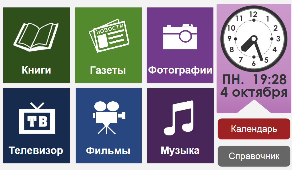
We focused on a basic art design that reflects the principles of building software. The design can and should be improved from the point of view of UX, and this is a topic for another discussion, which I will return to later. In the meantime, I will draw your attention to the following solutions:
- a set of modules is optional. In this case, these are the modules for the first version, as I wrote, for users from the “75+; without Internet".
- The watch dial is chosen just for easy perception by an elderly person.
- we tried to make the icons on the buttons as appropriate as possible to specific physical objects and concepts, but we did not stop there and added a text description of each button.
The main goal: a person who receives a tablet with such a screen and has only the most general idea of its purpose should quickly find out what he can do and how to proceed with this. Everything is simple and clear, no reason for fear.
For the target audience “75+; without the Internet ”, we completely abandoned the keyboard and gesture control. Only a small number of control buttons, only clicks.
APPLIED MODULE
I will demonstrate the principles on which application modules are designed using a music player as an example. By clicking on the “Music” button in the launcher, the user enters such a screen.
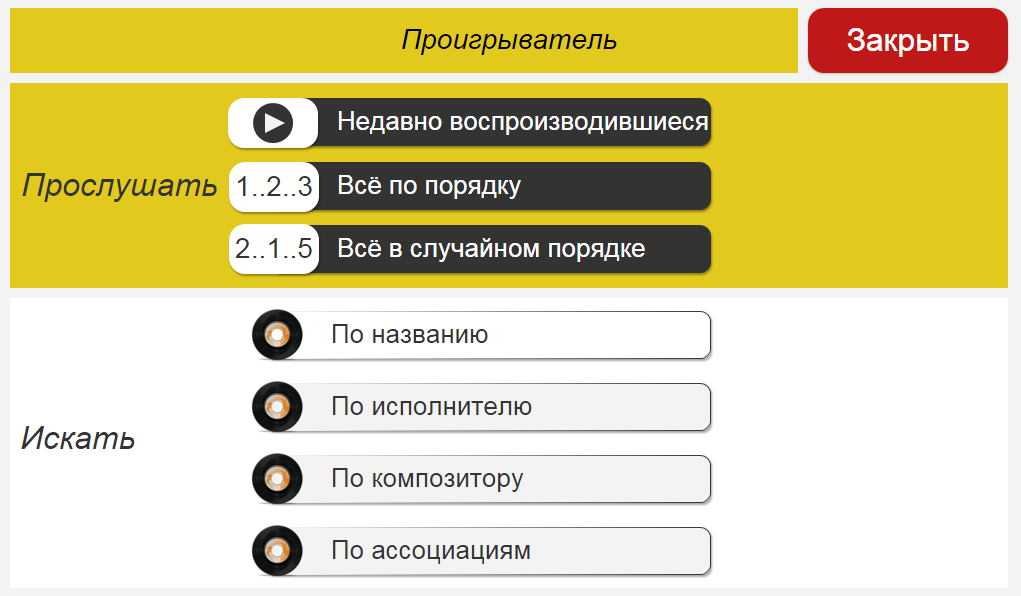
Let's go through it from top to bottom:
- At the very top is the title and the Close button. The button is red, with the name of the action, not with a cross. In all applications, it is exactly the same and is located in the same place.
- Below are two blocks. In the first, you can sort the works before listening, and in the second, you can select a specific work.
- The action of the buttons of the first block will be considered using the example of pressing “Recently played”:
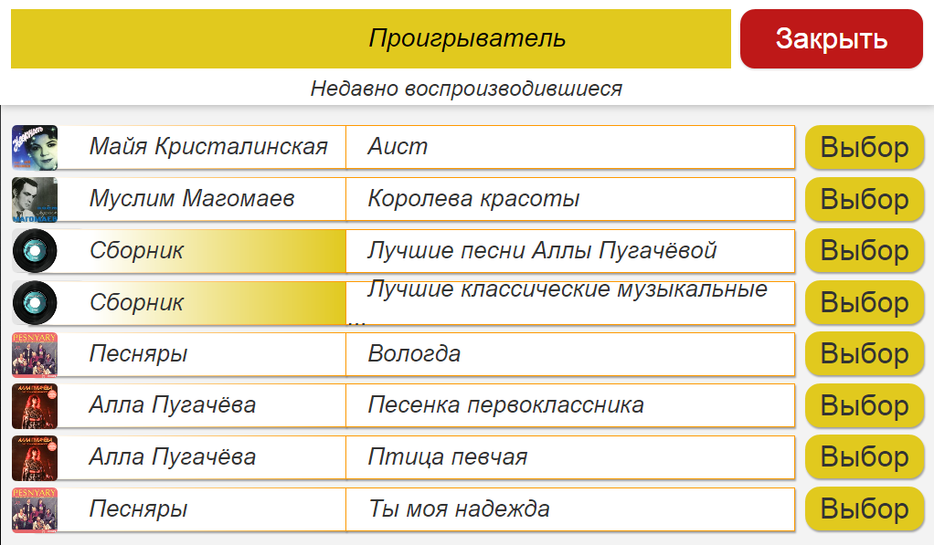
In addition to the already described information structure, the “Select” buttons appeared here. Important: individual buttons are responsible for the action; the name of the action is written on the button; on all screens the “Select” button will look just like that.
4. Go to the second block on the player’s main screen - selecting a specific piece. We refused the keyboard, therefore, we implemented a certain directory in which you can search for a work by one of the parameters. To the obvious parameters “Name”, “Artist” and “Composer” we added “By Associations”. The fact is that with age-related disorders, associative memory often remains the most reliable. Therefore, when recording information on a tablet (compiling a music library), an elderly person’s assistant can ask the future user what to write to him and tag the tracks with tags that are associations with this music in the elderly person.
The action of the “Name”, “Artist” and “Composer” buttons will be shown by the example of pressing the “Name” button:
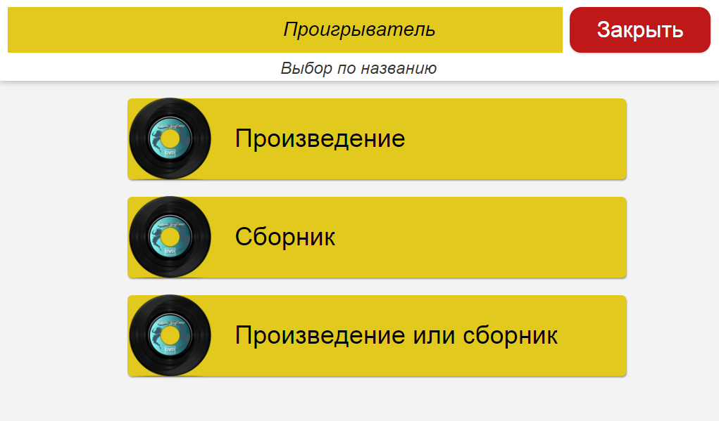
Here, a person needs to decide what he wants to listen to: a work (song, opera, operetta, etc.) or a collection (analogue of a record). Let's click on “A work or a collection”:
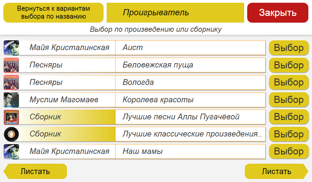
To the buttons already described by me here in the upper left is added a button “Return to the selection by name”. This is an analogue of the Previous or Back familiar to us, but the button action is described as definitively and contextually independently. This is important: a person may not remember what was on the previous screen and / or the concept of “Back” or “Back” may not be alien or unusual to him when applied not to physical directions.
At the bottom of the screen, the “Scroll” buttons were added. All information that does not fit on one screen, in all applications, we scroll left or right like pages of a notebook, booklet or book. No screen pulls up and down, no swipes.
Pressing the “Select” button in any branch of the player leads to the same screen, which I will show at the end, but for now we will consider the “Select by associations”.
5. If you click on “Select by association” on the player’s main screen, this screen will appear:
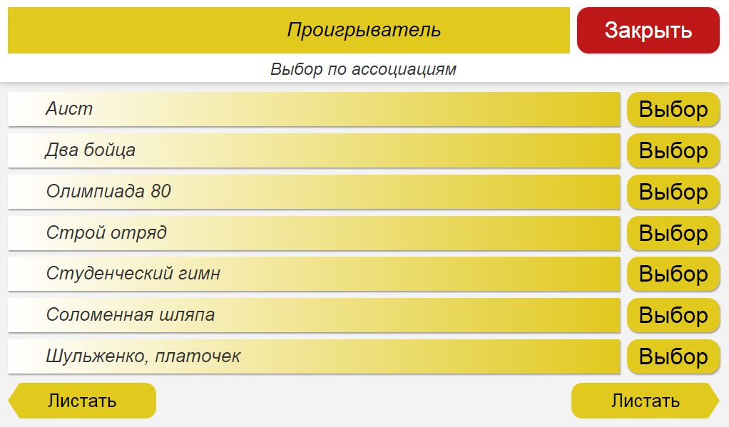
Associations, as I mentioned above, are entered when filling out the device for a specific person.
6. After going through any branch of the menu, we finally get to the “Select” button, clicking on which gives such a screen:
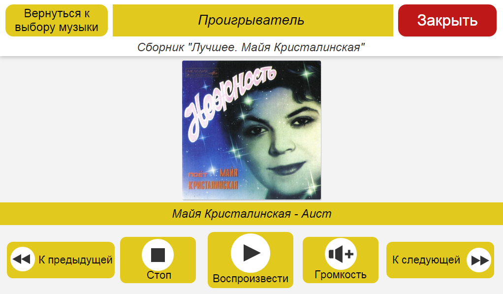
On the player’s control buttons are icons that repeat those that were on tape recorders. In addition, an action is written on each button that will be performed when this button is pressed.
This concludes the illustration of how our software implements the basic principles of convenience for the elderly. I just want to draw your attention once again to two circumstances:
1. In all modules, those parameters were applied that were entered during the settings described in the previous post : color scheme, fonts, volume levels, compensation for violations of fine motor skills.
2. When designing the interfaces, we were based on a fundamental principle: the actions that can be performed on this screen should be understood by an elderly person. They are clear either because they are similar to what he had done in other devices in such cases before, or because they are fully described on this screen, without the need to remember what was on the previous one or to know some general principles for organizing interfaces of this kind.
OTHER APPLICATION MODULES
Application versions will differ in a set of modules. First of all, we plan to add the following modules:
- IP video calling. First, we’ll do this using the Skype URI, so that the person does not get confused in the complicated Skype menus, but calls simply by clicking on the photo of the subscriber. In the future, perhaps Microsoft will open the Skype API, and in this case we will customize the Skype UI to the needs of an elderly audience.
- Brainfitness. Games and puzzles are very important for training and maintaining brain health.
- Reminders via the calendar - about the need to drink pills, that will bring a pension, etc.
- News feed. Filtered news from reliable sources - without banners and, as far as possible, without yellowness.
- Radio. Several preset radio stations.
- Health monitoring through connected devices with the transfer of information to interested parties - relatives and, possibly, doctors.
That's all for now. In the next publication, I will turn to the story about practical things - about how we see the distribution and actual use of our software.
============================
Project on the Internet:
https://planeta.ru/campaigns/poni
https: //www.facebook. com / ponytablet /
http://vk.com/ponytablet