 November 29, 2017 at 15:09
Impressions of developers and designers from the iPhone X - and the notch
- Transfer
Developers of iPhone applications and games acquired iPhone X smartphones and shared their impressions with us.

The main thing for the iPhone X is third-party applications. From augmented reality to the TrueDepth sensor, new features should stimulate creativity and push the community of developers to launch innovative new applications for iPhone X users. But although Apple gives developers new toys for testing, she must make sure that she does not break the old ones.
The iPhone X is the most significant iPhone change in a few years. It has an increased resolution and a different screen shape. He got rid of the Home button, added new ones or changed old gestures. Each of these changes can add work to designers and developers ... and then there's a notch. It can be expected that other smartphone makers will follow Apple's example. But how to get around this thing in design? How difficult is it to adapt the application for it? Is this true, as some critics say, an example of poor design?
To find out, I talked with designers and developers of applications and games for iOS, who recently completed the process of updating their applications for iPhone X. I wanted to ask them some of these questions, but overall I wanted to hear how the transition to a new smartphone for everyone went, who work in the industry.
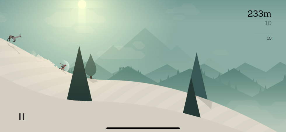
Alto's Adventure on iPhone X
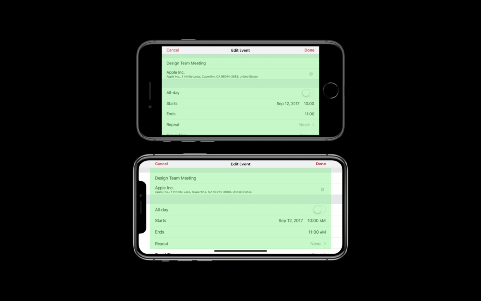
To begin, consider the changes and problems associated with the display of a different shape and size, and how Apple recommends solving them. Since iOS runs on devices with different screen resolutions, Apple and developers measure user interfaces at “points” rather than pixels — which, however, is a pretty standard concept in design. The iPhone X display has the same width in points as the iPhone 7 and 8 (375 pixels), but it is 145 points higher. It is for the reason that the iPhone X corresponds to the regular iPhone, and not to the Plus models, the extended landscape mode interfaces are not supported here, as in the Plus models.
IPhone X display with rounded edges and a sensor housing, also known as a notch. Click to enlarge .
IOS apps need to support different resolutionsresources (assets) to clearly look on the screen of each model; for three levels of resource resolution, the signs @ 1x, @ 2x or @ 3x are used. Apple recommends creating resources in PDF format, as it is resolution independent. If you still need bitmap images, then at the moment they need to be provided at @ 2x and @ 3x resolutions, which used to correspond to the standard sizes of modern retina iPhones and Plus models, respectively. iPhone X uses @ 3x.
None of the developers with whom I spoke expressed any problems with a good display of resources on a new screen. Philippe Levy, co-founder of the infltr photo editing software company , even liked the new approach:
Yak & Co's art director Mark White (a studio known for Agent A's adventure game ) said his team did a good job of resource transfer too, and he drew a lesson from this that you should always expect the unexpected and develop the app accordingly: “At an early stage We deliberately made efforts to develop everything in the most flexible way, because you really cannot predict what resolutions or screen forms will appear in the future, ”he said.
But iPhone permissions have changed in a routine before. There are three other changes to the iPhone X that developers have not encountered before. These are rounded corners of the screen, while other iPhones have corners of the correct shape. The controversial cutout - Apple calls it the sensor housing - introducing the camera and other equipment onto the screen in the top middle. And finally, the new Home indicator, which is always present at the bottom of the screen.
Previously, most of the time, the entire screen of the iPhone belonged to applications - the only exceptions were the status bar and notifications - but now the situation has changed. Applications had to give part of their ownership to a notch at the top and a Home indicator at the bottom.
Apple has already offered a set of rules and tools called Auto Layout to help iOS developers avoid potential pitfalls using busy screen areas on previous iOS devices. The company describes this as follows:
Developers who have already used Auto Layout, the transition to the iPhone X was much easier than those who relied mainly on custom templates. “My application uses Auto Layout in almost all of the display code,” says Galley Foods lead programmer Chris Anderson. - So I had only minimal work to adapt the application to new screen proportions. Recompile the version for iOS 11, place the instructions 'if iOS 11' to point the application to the new safe layout system provided by Apple, and almost nothing else needs to be done. ”

This is how the safe area assigned by Apple in portrait mode on iPhone X looks like. Developers are warned to keep important content and UI elements within the green area
Comparison of safe areas in landscape mode on iPhone 8 and iPhone X
In iOS 11, Apple expanded Auto Layout functionality with a Safe Area. Developers should place content and critical UI elements in a safe area - in those parts of the screen where they will not interfere with hardware or system software. For other iPhone models, essentially the entire visible area was safe. However, the iPhone X is getting harder. In portrait mode, the safe area is offset from the top of the visible area and from the bottom. At the top there is space for the status bar and the sensor housing, and at the bottom there is a wide space for the Home indicator.
The Home indicator is a thin panel that almost always appears at the bottom of the screen to remind the user that he can swipe the screen from bottom to top to exit the application or access the multi-tasking interface. Since the Home button under the screen used to be responsible for this functionality, the indicator in a sense can be considered as a new Home button. Apple allows you to automatically hide the indicator, but only when viewing passive full-screen content, such as video.
Alternatively, you can activate Edge Protection. Then the indicator is not so striking, and the user needs to do two swipe instead of one to swipe the application off the screen. This is recommended in cases where a swipe from the bottom up is part of the basic functionality of the application, although it is obvious that such an action is best replaced with another if possible. However, Apple recommends distributing vertical scroll views to the very bottom of the screen, despite the presence of an indicator.
If you placed UI elements like navigation buttons at the very bottom of the screen, you may need to move them if they are outside the safe area. Anderson from Galley Foods says that despite his relatively simple migration, this has become the biggest problem in his application:
The more literally developers follow Apple’s design guidelines, the easier it is for them to make the transition. But Anderson still says that in his opinion, Apple could provide better recommendations on how to deal with the lower bar in a visually attractive way: “Judging by the giant shortcuts and the empty space under the on-screen keyboard, I think Apple itself did not understand how to do this” - he added.
At the top of the screen, developers will have to battle the cutout and the status bar. The latter no longer changes its height depending on various background tasks, such as map services or incoming calls. But it is in any case higher than the old one. Applications can still hide the status bar and capture the upper space, but they will have to deal with rounded edges and, of course, with a notch.
For most of the developers I spoke with, the cutout didn't cause any trouble: “I think the cutout emphasizes the updated style of iOS 11 with a very high status bar, short and thick headers,” said Basecamp designer Tara Mann. “The neckline looks better, the bigger the negative space around.”
To avoid the sensor housing, you should also stick to the safe area and follow Apple’s design guidelines. For applications that rely on Apple’s standard Auto Layout practices, the aforementioned extension of the background material will be painless, even if the navigation buttons are attached to corners. But in games, the original UI is almost always used, so if anyone has problems, it’s with developers and game designers. On the other hand, Ryan Cash (director of Snowman Studios) said that the problems did not affect Alto's Adventure too much .
But Mark White said that Agent A had to make some changes. In fact, it was necessary to structure the game UI differently: “ Agent A uses a dock with items that the player collects; this dock was attached to the edge of the screen, along with some UI buttons, ”he explains. “To comply with the new rules, I had to rethink our templates a bit, and as a result, I had to simplify a lot.”
He says that the developers already wanted to simplify the interface, so he was glad about the opportunity.
In addition to the practical consequences, I asked each developer about their attitude towards the noisy criticism of the notch, which is even called an example of poor design. Cash said his studio does not share the critics' concerns, and they see Apple’s choice as an example of smart design. “Face ID needs a front-facing camera, but it goes against the goal of covering the entire surface with a screen,” he said. “That design is a compromise, and I think it's a good choice.”
As a designer, Mann also designated this as a reasonable compromise:
So despite the indignant screams on some forums and on social media, the bulk of the developers and designers with whom we spoke seem completely indifferent to the cut.
Apple does not want black bars next to applications, except for a certain type of video content, where the aspect ratio, obviously, cannot be changed. But how do those designed for the iPhone X look on the iPhone 8, and vice versa?
If developers strictly adhere to Auto Layout and a safe area, completely without using their own templates, then the application will be easy to update. In many cases, the background material expands to the upper and lower areas in accordance with the design style that is already used there. This automatically moves the lower buttons above the prohibition line and releases the Home indicator, as shown in the illustration.
If developers used Apple’s standard UI tools, the background material automatically expands and fills the screen. Click to enlarge.
When using background graphics, there are some additional considerations. Backgrounds created for iPhone 8 will be clipped left and right if you scale it to fill the screen, or on top if you scale to fit. However, Apple recommends delivering background graphics that match the display of the iPhone X. In this case, the resource will either be trimmed from the top and bottom on the iPhone 8, or, worse, placed in a frame with black stripes (pillarbox).
Obviously, this is not the best option, especially taking into account the fact that the iPhone 8 LCD screen is not able to make these strips really black so that they merge with the case. Therefore, Apple recommends that designers arrange critical graphics and UIs so that they are preserved after cropping on the iPhone 8.
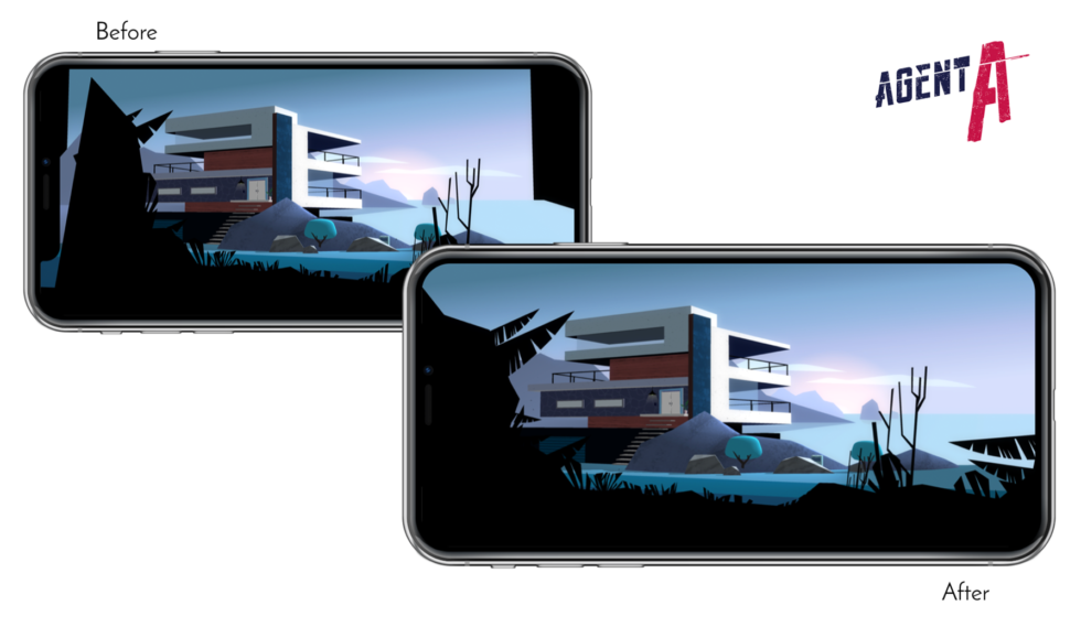
Agent Aon iPhone X, before and after the changes Yak & Co made to keep the content up to
date Yak & Co took advantage of this opportunity to offload Agent A's interface
In Agent A, White and the rest of the game’s developers had to make some changes to adapt to increasing the screen height . The game goes in landscape mode, and some scenes did not completely fill the iPhone X screen in its original version. “We adjusted about ten scenes to expand them and fill the space created by the new resolution,” he said. Fortunately, "about 95% of the game is 3D, where much of the 3D is masked in 2D style," so White says it took only 30 minutes to scale several grids.
Alto's Adventure on the aspect ratio of iPhone 7
Alto's Adventure on the aspect ratio of iPhone X
Upon adaptation, Snowman Studios accidentally broke Alto's Adventure on older phones, but the problem was more complicated than just placing UI elements in the wrong places. As the cache explains:
The developers quickly fixed the problem and released an update.
In general, developers or designers do not need to make much effort to make applications look good on the OLED screen. It seems to me that Alto's Adventure looks noticeably cooler on the iPhone X than on the iPhone 7 or 8, so I asked Cache how they did it. The cache referred to enlarging the screen to the entire surface and increasing contrast. “We did not optimize any graphics when preparing the update,” he said and added that the developers of Alto's Adventure have not yet completed work to support a wider color gamut.
When I asked Mann about the new approaches or possible consequences that OLED brings to application designers, she mentioned the effect of deeper black and increased contrast on dark themes. “I think it will create cool classroom content,” she said. “There is no dark theme in our application now, but I believe that many applications with dark themes will make them darker using a deeper black to take advantage of OLED.”
Typically, Apple teaches developers and designers about important considerations during the summer at the Worldwide Developers Conference (WWDC). And Apple introduced some concepts that later turned out to be important for the iPhone X, such as the safe area. This year, the company also posted online after the release of the iPhone X video tutorial , which provides additional details.
Mann says that other resources provided by Apple have come in handy for her and other Basecamp developers:
A key element is the mentioned simulator. Xcode is a development environment that iOS developers typically use to create applications. It makes it possible to preview on a virtual iPhone, which looks like a window in the "poppy". The window rotates into portrait and landscape modes and in reality shows a black insert where there should be an insert in the physical device. Philippe Levyu called the simulator “excellent” and said that he felt prepared thanks to the documentation and videos.
“Apple wanted a little more clarity when the GM version of iOS became available and when we were allowed to submit applications,” he added. - For example, infltr to its fullest uses a True Depth camera. But the software interfaces for accessing the camera became available only in iOS 11.1. " Uncertainty about the release schedule made the iPhone X update “pretty tense” for the infltr team.
Updating on the iPhone X could easily become one of the most difficult for application developers, but it looks like Apple is well prepared. Elegant decisions and important fundamental principles were laid out at WWDC and iOS 11, and it only remained to find out when the phone itself will be presented and when sales will begin.
Not a single developer and designer who agreed to an interview with us expressed any concerns about the notch. Looking at their applications, as well as other applications in the App Store, it seems that the Home indicator, rather than the cutout, caused more problems. The gesture supported by the indicator essentially corresponds to the gesture that the Control Center opens on other iPhones, so it’s not clear why Apple now felt the need to add this indicator.
If we move away from issues of strange design, then everything goes to the point where it remains to wait a while until competent developers update their applications for the iPhone X - if they do not show excessive creativity with the original templates. And as for the cutout, this will not be the last phone with such a compromise solution, that's okay. Apparently, this is not a fly in the ointment, as many feared. It's time to get used to it.
The main thing for the iPhone X is third-party applications. From augmented reality to the TrueDepth sensor, new features should stimulate creativity and push the community of developers to launch innovative new applications for iPhone X users. But although Apple gives developers new toys for testing, she must make sure that she does not break the old ones.
The iPhone X is the most significant iPhone change in a few years. It has an increased resolution and a different screen shape. He got rid of the Home button, added new ones or changed old gestures. Each of these changes can add work to designers and developers ... and then there's a notch. It can be expected that other smartphone makers will follow Apple's example. But how to get around this thing in design? How difficult is it to adapt the application for it? Is this true, as some critics say, an example of poor design?
To find out, I talked with designers and developers of applications and games for iOS, who recently completed the process of updating their applications for iPhone X. I wanted to ask them some of these questions, but overall I wanted to hear how the transition to a new smartphone for everyone went, who work in the industry.
Developer apps in this review
Alto's Adventure on iPhone X
Other
Agent A on iPhone X

Basecamp on iPhone X

Galley Foods on iPhone X
infltr on iPhone X
Agent A on iPhone X
Basecamp on iPhone X
Galley Foods on iPhone X
infltr on iPhone X
Resolution increase
To begin, consider the changes and problems associated with the display of a different shape and size, and how Apple recommends solving them. Since iOS runs on devices with different screen resolutions, Apple and developers measure user interfaces at “points” rather than pixels — which, however, is a pretty standard concept in design. The iPhone X display has the same width in points as the iPhone 7 and 8 (375 pixels), but it is 145 points higher. It is for the reason that the iPhone X corresponds to the regular iPhone, and not to the Plus models, the extended landscape mode interfaces are not supported here, as in the Plus models.
IPhone X display with rounded edges and a sensor housing, also known as a notch. Click to enlarge .
IOS apps need to support different resolutionsresources (assets) to clearly look on the screen of each model; for three levels of resource resolution, the signs @ 1x, @ 2x or @ 3x are used. Apple recommends creating resources in PDF format, as it is resolution independent. If you still need bitmap images, then at the moment they need to be provided at @ 2x and @ 3x resolutions, which used to correspond to the standard sizes of modern retina iPhones and Plus models, respectively. iPhone X uses @ 3x.
None of the developers with whom I spoke expressed any problems with a good display of resources on a new screen. Philippe Levy, co-founder of the infltr photo editing software company , even liked the new approach:
We at infltr use vector resources, they are in PDF. We did not have to make any changes to the iPhone X. Everything works incredibly. You need only one PDF resource that will compile for @ 1x, @ 2x, @ 3x.
Yak & Co's art director Mark White (a studio known for Agent A's adventure game ) said his team did a good job of resource transfer too, and he drew a lesson from this that you should always expect the unexpected and develop the app accordingly: “At an early stage We deliberately made efforts to develop everything in the most flexible way, because you really cannot predict what resolutions or screen forms will appear in the future, ”he said.
But iPhone permissions have changed in a routine before. There are three other changes to the iPhone X that developers have not encountered before. These are rounded corners of the screen, while other iPhones have corners of the correct shape. The controversial cutout - Apple calls it the sensor housing - introducing the camera and other equipment onto the screen in the top middle. And finally, the new Home indicator, which is always present at the bottom of the screen.
Home indicator
Previously, most of the time, the entire screen of the iPhone belonged to applications - the only exceptions were the status bar and notifications - but now the situation has changed. Applications had to give part of their ownership to a notch at the top and a Home indicator at the bottom.
Apple has already offered a set of rules and tools called Auto Layout to help iOS developers avoid potential pitfalls using busy screen areas on previous iOS devices. The company describes this as follows:
Auto Layout dynamically calculates the size and position of all views in your view hierarchy based on their limitations. For example, you can restrict a button so that it is horizontally centered in the Image view and that the top border of the button always remains at 8 points below the bottom of the image. If the size or location of the image in the view changes, then the location of the button automatically adjusts to it.
Developers who have already used Auto Layout, the transition to the iPhone X was much easier than those who relied mainly on custom templates. “My application uses Auto Layout in almost all of the display code,” says Galley Foods lead programmer Chris Anderson. - So I had only minimal work to adapt the application to new screen proportions. Recompile the version for iOS 11, place the instructions 'if iOS 11' to point the application to the new safe layout system provided by Apple, and almost nothing else needs to be done. ”
This is how the safe area assigned by Apple in portrait mode on iPhone X looks like. Developers are warned to keep important content and UI elements within the green area
Comparison of safe areas in landscape mode on iPhone 8 and iPhone X
Other examples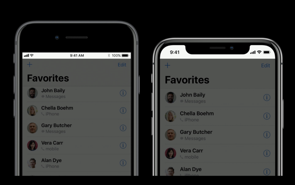
At the top of the iPhone X, the status bar expands more downwards than on previous iPhones, but its size does not change anymore.
Apple warns against using images that may clumsily crop when displayed on other iPhone models with a different aspect ratio.
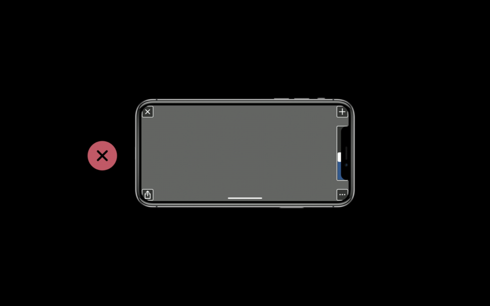
Placement of UI elements outside the safe area or in corners of the screen can cause problems due to a cutout or rounded corners.
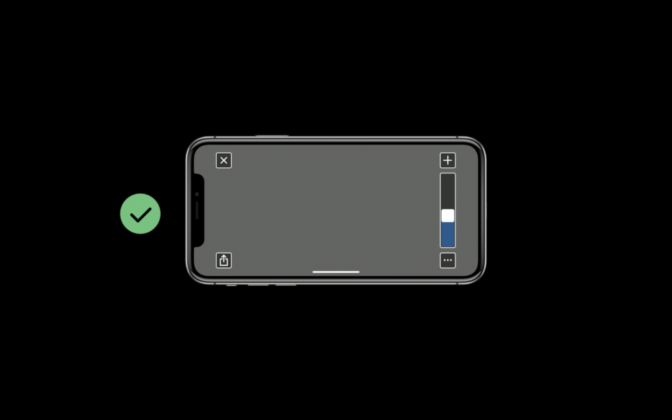
Therefore, Apple recommends moving UI elements from corners into a safe area.
Some resources are specially designed to be placed in a corner - and x need to be redone for iPhone X. This is especially true for games where custom templates are usually used
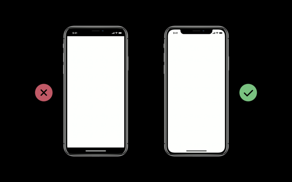
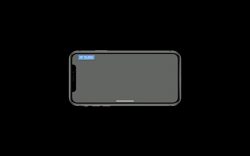
Apple recommends that you do not put delimiters (back bar) on top or bottom, which is why the iPhone X starts to look like old iPhones
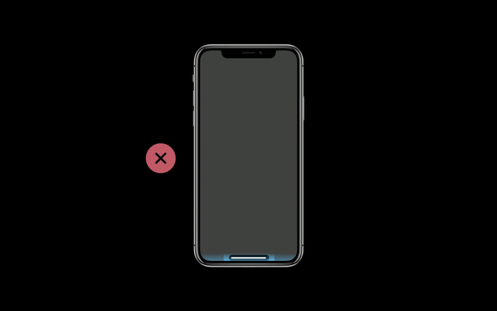
Apple also forbids developers to highlight the Home indicator bar in any way
At the top of the iPhone X, the status bar expands more downwards than on previous iPhones, but its size does not change anymore.
Apple warns against using images that may clumsily crop when displayed on other iPhone models with a different aspect ratio.
Placement of UI elements outside the safe area or in corners of the screen can cause problems due to a cutout or rounded corners.
Therefore, Apple recommends moving UI elements from corners into a safe area.
Some resources are specially designed to be placed in a corner - and x need to be redone for iPhone X. This is especially true for games where custom templates are usually used
Apple recommends that you do not put delimiters (back bar) on top or bottom, which is why the iPhone X starts to look like old iPhones
Apple also forbids developers to highlight the Home indicator bar in any way
In iOS 11, Apple expanded Auto Layout functionality with a Safe Area. Developers should place content and critical UI elements in a safe area - in those parts of the screen where they will not interfere with hardware or system software. For other iPhone models, essentially the entire visible area was safe. However, the iPhone X is getting harder. In portrait mode, the safe area is offset from the top of the visible area and from the bottom. At the top there is space for the status bar and the sensor housing, and at the bottom there is a wide space for the Home indicator.
The Home indicator is a thin panel that almost always appears at the bottom of the screen to remind the user that he can swipe the screen from bottom to top to exit the application or access the multi-tasking interface. Since the Home button under the screen used to be responsible for this functionality, the indicator in a sense can be considered as a new Home button. Apple allows you to automatically hide the indicator, but only when viewing passive full-screen content, such as video.
Alternatively, you can activate Edge Protection. Then the indicator is not so striking, and the user needs to do two swipe instead of one to swipe the application off the screen. This is recommended in cases where a swipe from the bottom up is part of the basic functionality of the application, although it is obvious that such an action is best replaced with another if possible. However, Apple recommends distributing vertical scroll views to the very bottom of the screen, despite the presence of an indicator.
If you placed UI elements like navigation buttons at the very bottom of the screen, you may need to move them if they are outside the safe area. Anderson from Galley Foods says that despite his relatively simple migration, this has become the biggest problem in his application:
Firstly, in my application there were many buttons and actions attached to the bottom of the screen; all of them required manual intervention (even with Auto Layout) so that the indicator line did not close the buttons. Secondly, in order for the interval to look normal, it was necessary to manually tinker with the templates for the iPhone X and other iPhone models. And finally, I’m still tormented about how best to design the design around the Home indicator. With the button attached at the bottom, you can either spread the color of the button to the surrounding part, or cut off above the line. Both options are a bit scary. Rounded edges require you to leave a lot of space above the round; so these extra borders appear that don't look very good.
The more literally developers follow Apple’s design guidelines, the easier it is for them to make the transition. But Anderson still says that in his opinion, Apple could provide better recommendations on how to deal with the lower bar in a visually attractive way: “Judging by the giant shortcuts and the empty space under the on-screen keyboard, I think Apple itself did not understand how to do this” - he added.
Cutaway
At the top of the screen, developers will have to battle the cutout and the status bar. The latter no longer changes its height depending on various background tasks, such as map services or incoming calls. But it is in any case higher than the old one. Applications can still hide the status bar and capture the upper space, but they will have to deal with rounded edges and, of course, with a notch.
For most of the developers I spoke with, the cutout didn't cause any trouble: “I think the cutout emphasizes the updated style of iOS 11 with a very high status bar, short and thick headers,” said Basecamp designer Tara Mann. “The neckline looks better, the bigger the negative space around.”
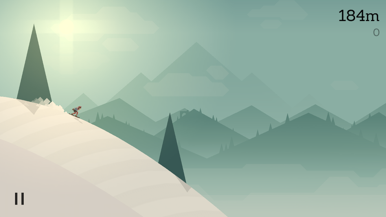
To avoid the sensor housing, you should also stick to the safe area and follow Apple’s design guidelines. For applications that rely on Apple’s standard Auto Layout practices, the aforementioned extension of the background material will be painless, even if the navigation buttons are attached to corners. But in games, the original UI is almost always used, so if anyone has problems, it’s with developers and game designers. On the other hand, Ryan Cash (director of Snowman Studios) said that the problems did not affect Alto's Adventure too much .
Design with the new sensor housing was simple. Alto's Adventure can render its world at any aspect ratio, and the sensor case does not intersect with critical gameplay elements (such as Alto himself), so there are no obstacles of immediate concern. After we set the values for the edge of the screen so that the UI is away from the edges, everything began to look good.
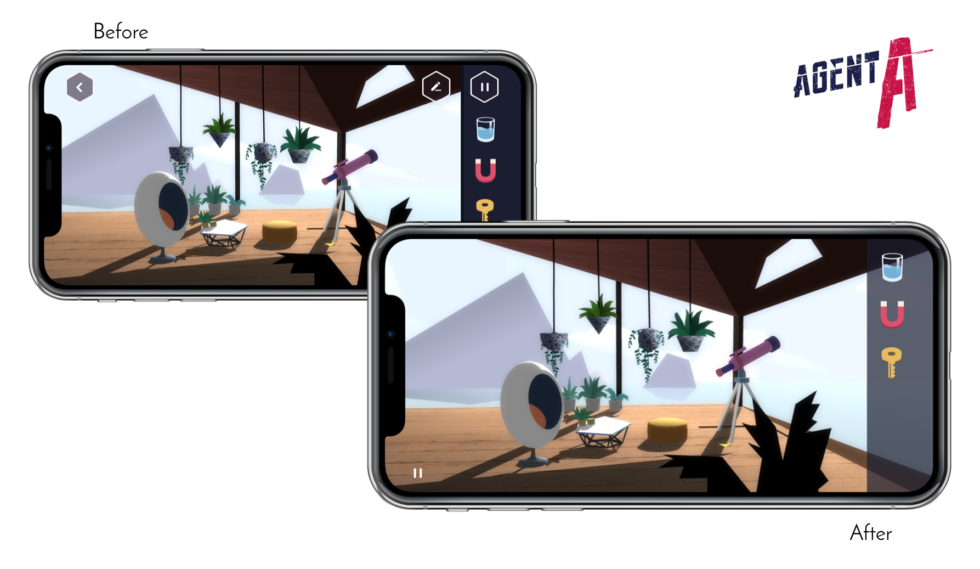
But Mark White said that Agent A had to make some changes. In fact, it was necessary to structure the game UI differently: “ Agent A uses a dock with items that the player collects; this dock was attached to the edge of the screen, along with some UI buttons, ”he explains. “To comply with the new rules, I had to rethink our templates a bit, and as a result, I had to simplify a lot.”
He says that the developers already wanted to simplify the interface, so he was glad about the opportunity.
To comply with the new design guidelines for the iPhone X, including the safe areas and margins around the corners for the entire UI, I had to rethink our templates, which were largely based on edge attachment. One of the key improvements was the implementation of the gesture back instead of the corresponding button. We noticed that this thing is very popular with testers due to its intuitive nature, so we completely excluded the "Back" button from the interface.
An additional advantage of cleaning the user interface from junk is that beautiful graphics have come to the fore and are no longer closed by obsessive UI buttons. The new iPhone X recommendations made us rethink UX, resulting in a better and more beautiful game.
In addition to the practical consequences, I asked each developer about their attitude towards the noisy criticism of the notch, which is even called an example of poor design. Cash said his studio does not share the critics' concerns, and they see Apple’s choice as an example of smart design. “Face ID needs a front-facing camera, but it goes against the goal of covering the entire surface with a screen,” he said. “That design is a compromise, and I think it's a good choice.”
As a designer, Mann also designated this as a reasonable compromise:
The neckline doesn't bother me at all. Of course, the phone would have been better without it, but its presence does not impede working with X. It really stands out only when entering and exiting applications, because when navigating the OS, the screen is under it. I would probably choose the appearance of Face ID now with a cutout than waiting for three years for Face ID without a cutout.
So despite the indignant screams on some forums and on social media, the bulk of the developers and designers with whom we spoke seem completely indifferent to the cut.
Changed aspect ratio
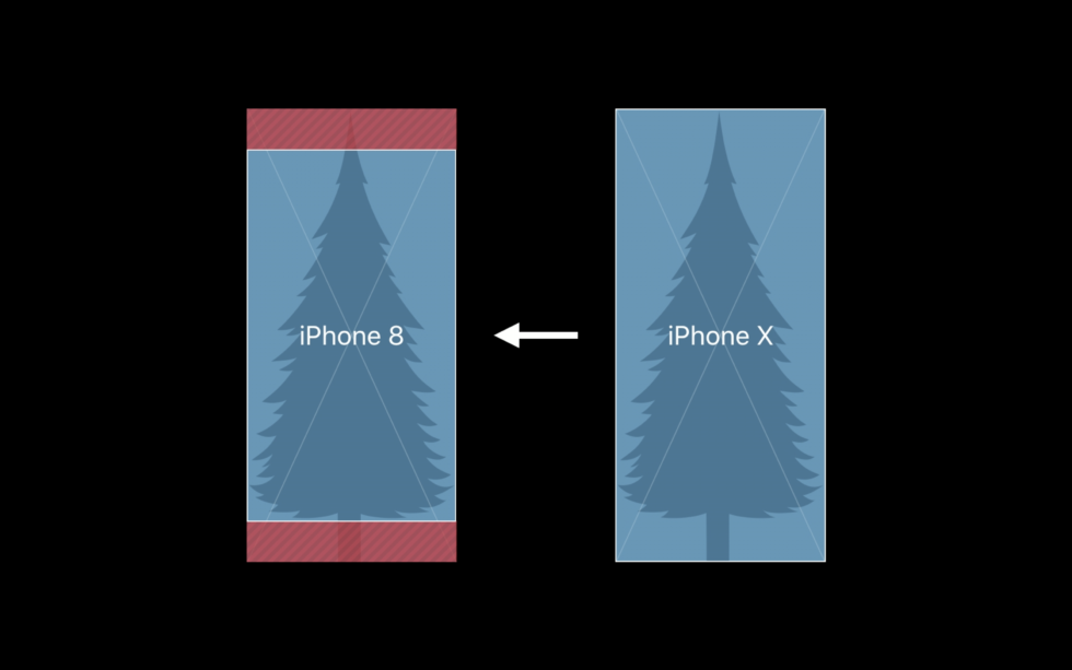
Apple does not want black bars next to applications, except for a certain type of video content, where the aspect ratio, obviously, cannot be changed. But how do those designed for the iPhone X look on the iPhone 8, and vice versa?
If developers strictly adhere to Auto Layout and a safe area, completely without using their own templates, then the application will be easy to update. In many cases, the background material expands to the upper and lower areas in accordance with the design style that is already used there. This automatically moves the lower buttons above the prohibition line and releases the Home indicator, as shown in the illustration.
If developers used Apple’s standard UI tools, the background material automatically expands and fills the screen. Click to enlarge.
When using background graphics, there are some additional considerations. Backgrounds created for iPhone 8 will be clipped left and right if you scale it to fill the screen, or on top if you scale to fit. However, Apple recommends delivering background graphics that match the display of the iPhone X. In this case, the resource will either be trimmed from the top and bottom on the iPhone 8, or, worse, placed in a frame with black stripes (pillarbox).
Obviously, this is not the best option, especially taking into account the fact that the iPhone 8 LCD screen is not able to make these strips really black so that they merge with the case. Therefore, Apple recommends that designers arrange critical graphics and UIs so that they are preserved after cropping on the iPhone 8.
Agent Aon iPhone X, before and after the changes Yak & Co made to keep the content up to
date Yak & Co took advantage of this opportunity to offload Agent A's interface
In Agent A, White and the rest of the game’s developers had to make some changes to adapt to increasing the screen height . The game goes in landscape mode, and some scenes did not completely fill the iPhone X screen in its original version. “We adjusted about ten scenes to expand them and fill the space created by the new resolution,” he said. Fortunately, "about 95% of the game is 3D, where much of the 3D is masked in 2D style," so White says it took only 30 minutes to scale several grids.
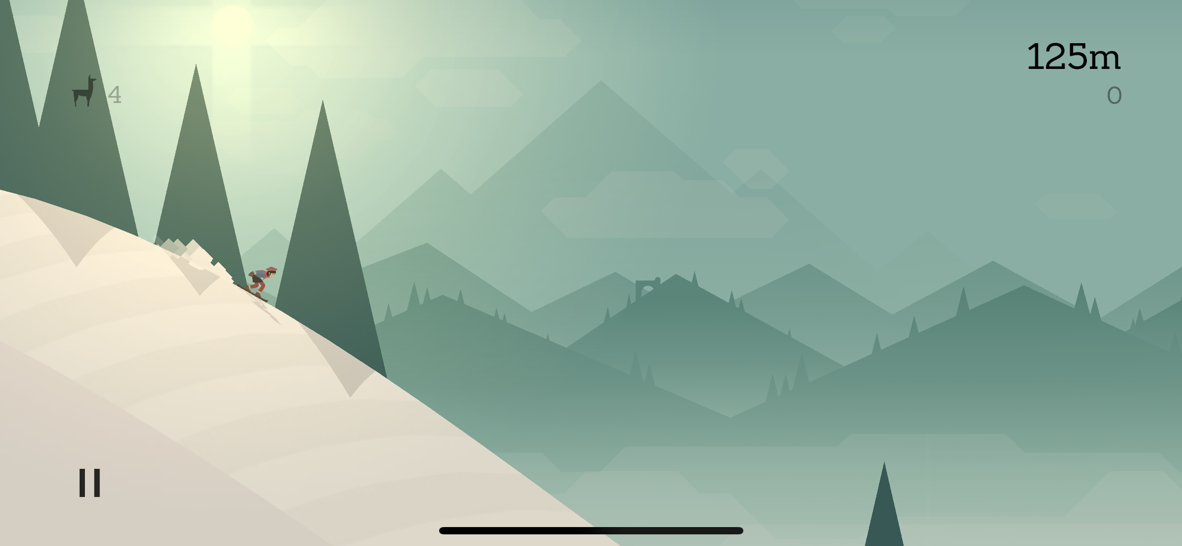
Alto's Adventure on the aspect ratio of iPhone 7
Alto's Adventure on the aspect ratio of iPhone X
Other screenshots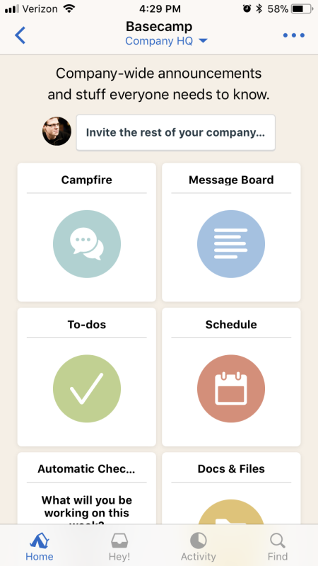
Basecamp on the aspect ratio of iPhone 7
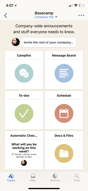
Basecamp on the aspect ratio of iPhone X
Basecamp on the aspect ratio of iPhone 7
Basecamp on the aspect ratio of iPhone X
Upon adaptation, Snowman Studios accidentally broke Alto's Adventure on older phones, but the problem was more complicated than just placing UI elements in the wrong places. As the cache explains:
The root problem was the incorrect value of the screen border, which was calculated on 32-bit devices. Alto's Adventure uses Unity, so I had to translate the values from Objective-C to C # using UIKit. The message -[UIView safeAreaInsets]returned a UIEdgeInsets structure. This structure in UIKit is defined as four `CGFloat` elements, and` CGFloat` is defined as `float` on 32-bit devices, but as` double` on 64-bit devices. The equivalent C # structure always expects a `double`. Oops!The developers quickly fixed the problem and released an update.
OLED and HDR
In general, developers or designers do not need to make much effort to make applications look good on the OLED screen. It seems to me that Alto's Adventure looks noticeably cooler on the iPhone X than on the iPhone 7 or 8, so I asked Cache how they did it. The cache referred to enlarging the screen to the entire surface and increasing contrast. “We did not optimize any graphics when preparing the update,” he said and added that the developers of Alto's Adventure have not yet completed work to support a wider color gamut.
When I asked Mann about the new approaches or possible consequences that OLED brings to application designers, she mentioned the effect of deeper black and increased contrast on dark themes. “I think it will create cool classroom content,” she said. “There is no dark theme in our application now, but I believe that many applications with dark themes will make them darker using a deeper black to take advantage of OLED.”
How Apple Prepared Developers and Designers
Typically, Apple teaches developers and designers about important considerations during the summer at the Worldwide Developers Conference (WWDC). And Apple introduced some concepts that later turned out to be important for the iPhone X, such as the safe area. This year, the company also posted online after the release of the iPhone X video tutorial , which provides additional details.
Mann says that other resources provided by Apple have come in handy for her and other Basecamp developers:
In addition to presentations, Apple has an excellent selection of design elements available for download; there are vector versions of all elements of iOS UI. We were able to accurately design layouts for the iPhone X even before its release. Of course, the simulator in Xcode, which also allows you to run the application on the iPhone X, but for the designer it was nice to actually start marking up the UI on the iPhone X, just to feel this logic of a higher screen.
A key element is the mentioned simulator. Xcode is a development environment that iOS developers typically use to create applications. It makes it possible to preview on a virtual iPhone, which looks like a window in the "poppy". The window rotates into portrait and landscape modes and in reality shows a black insert where there should be an insert in the physical device. Philippe Levyu called the simulator “excellent” and said that he felt prepared thanks to the documentation and videos.
“Apple wanted a little more clarity when the GM version of iOS became available and when we were allowed to submit applications,” he added. - For example, infltr to its fullest uses a True Depth camera. But the software interfaces for accessing the camera became available only in iOS 11.1. " Uncertainty about the release schedule made the iPhone X update “pretty tense” for the infltr team.
Conclusion
Updating on the iPhone X could easily become one of the most difficult for application developers, but it looks like Apple is well prepared. Elegant decisions and important fundamental principles were laid out at WWDC and iOS 11, and it only remained to find out when the phone itself will be presented and when sales will begin.
Not a single developer and designer who agreed to an interview with us expressed any concerns about the notch. Looking at their applications, as well as other applications in the App Store, it seems that the Home indicator, rather than the cutout, caused more problems. The gesture supported by the indicator essentially corresponds to the gesture that the Control Center opens on other iPhones, so it’s not clear why Apple now felt the need to add this indicator.
If we move away from issues of strange design, then everything goes to the point where it remains to wait a while until competent developers update their applications for the iPhone X - if they do not show excessive creativity with the original templates. And as for the cutout, this will not be the last phone with such a compromise solution, that's okay. Apparently, this is not a fly in the ointment, as many feared. It's time to get used to it.