October 22, 2017 at 12:16
Creating a component library using a Storybook
- Tutorial
- Recovery mode
Introduction
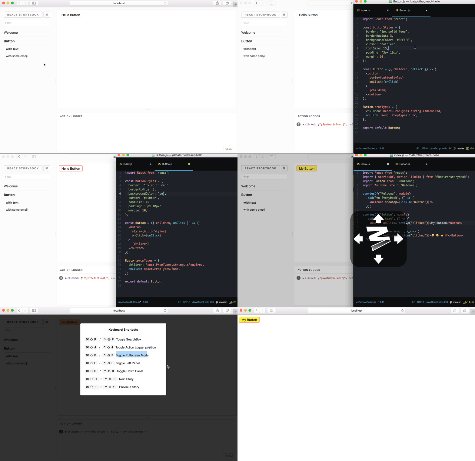
Nowadays, developing an interface is quite a costly process that requires effort from a lot of people, developers, designers, testers, product managers, and so on.
Companies are increasingly resorting to writing an interface consisting of many independent components that can be reused. Many designers create a design project that describes every detail of the design. They use a number of interface documentation tools, the first that come to mind are axshare.com and zeplin.com. The same photoshop, in which they are all laid out strictly by dad. This allows them to easily work on the design of the project, update and add new pages, simply copying existing experience.
And as for the developers? Yes, we have Angular, React, Vue, Ember, Polymer. All these tools to one degree or another allow us to create components with their subsequent reuse. But tell me how, can you look at the project in the same way as a designer does? Where can I see all the components that are used in the project, find out their properties or just try it? How can I find out if the component I need is implemented? Such questions are already beginning to arise in medium-sized projects. Of course, I can go and ask a colleague, but this is excessive communication, which is ineffective for many reasons. A colleague simply may not understand the essence of your problem and point you to a similar component that you will finish for a long time.
A typical situation is when you are at the stage of evaluating new functionality, going through the documentation of a new page that you have to develop, all the components look familiar, they are all already in use somewhere, and you evaluate a new task by betting that some components have already been implemented. Having agreed on the deadlines and started a new sprint, having rummaged a bit in the code, you are horrified to realize that reusing the component will not work, that it depends purely on other components, and in general this is all conceptually wrong.
You only have two exits
- Copy-paste and create another similar component.
- Development of a new component, a multifunctional component.
Of course, there is a third option, to improve / expand the old component. But as experience tells me, it’s even more expensive than writing a new one. The effort to correct errors is growing with each new stage in the development of the project. The more fundamental the underconfiguration, the more expensive it is to fix it.
A good choice would be to develop a new component. But here you are given the baton of that unscrupulous developer. Given that the deadlines are on, you may have time to develop a new component, but you will no longer have time to make it common.
The question why this happened can be answered as follows:
- The developer who developed the component is an egoist and did not think about the future fate of the component.
- It was not planned to reuse this component anywhere else before.
- You did not know that this component cannot be reused.
- You did not know about the existence of a more suitable component.
With a growing trend towards distributed development and reusable components, additional tools are needed. There are a huge number of different tools for various tasks and front-end developers are needed.
In this article, I would like to cover the React Storybook for components written using React.js and Vue.js or even React Native. Using it in a project, you can easily avoid the situations described above.
Storybook is an environment for developing UI components. Storybook lets you browse the component library, see the various states of the components, and interactively develop and test components.
Storybook launches separately from your application. This allows you to develop components in isolation, which improves the ability to reuse components, testability and speed of their development. You can create new components quickly and without any dependencies of the main project.Let's look at the use of the Storybook from the perspective of the various actors involved in the creation process and the minor processes supporting the application interface.
Here you can see examples of using the Storybook https://storybook.js.org/examples /
Storybook has many extensions and a rich API to expand its functionality, as well as support for React Native.
As a UI \ UX Designer
You will have the opportunity to try live and check the component implemented by the developer. See all the possible state of the component and provide a full feedback.
As a developer
You will have a library of components, you will no longer wonder if you have such or such a component or not, you can try, play with the component and find out the possibilities of its use within the framework of your current task. This is very important for the developer, to be able to see all the components that are used in the project and to know all their features. Of course, you can spend a lot of time studying the source code, but it will be much easier to find the right component with the right properties visually, and then go into details.
You will be able to develop components in an isolated environment that does not require lifting the entire project locally. An isolated environment does not explicitly encourage you to develop components with a more elaborate API and with the idea of the possibility of its reuse in any part of the project. You think about the input parameters, from the point of view of the user and understand what parameters would be convenient for the potential user. You also think about isolating styles. Among other things, you get a real workbench for developing components. You can customize your Storybook environment as you wish and use things like HMR out of the box.
As a tester
You will have the opportunity to test each component individually and independently of the others. There is no need to run an entire project. You can simply open the Storybook with the components you are interested in and conduct absolutely any E2E tests.
As a product manager
The product manager often works together with the designer, because it is he who says what kind of functionality he would like to see. As a product manager, working on a new page it will be useful for you to know existing elements and be able to try them interactively. And like a designer, sketch a new sketch from existing pieces.
Installation
As the Storybook finds in the node / npm ecosystem, this is very simple. You can install the main cli tool using one of your favorite Yarn or NPM package managers.
yarn global add @storybook/cliNow you can use this tool to initialize the Stroybook in your project.
For experiments, we need a project. As an example, take a blank from create-react-app. I will omit the description and features of create-react-app, this is a very useful and easy-to-understand tool, you can read more details here .
Install and create a new project using create-react-app
yarn global add create-react-appiCreate a project
create-react-app my-appLet's go to the project directory
cd my-appAnd run it
yarn startA fresh project created using create-react-app will open in the browser.
We now have a Storybook experimentation app, so let's get started.
In order to initialize the Storybook, run the following command while at the root of the project
getstorybookЭта команда определяет тип проекта, делает необходимые проверки и устанавливает зависимости
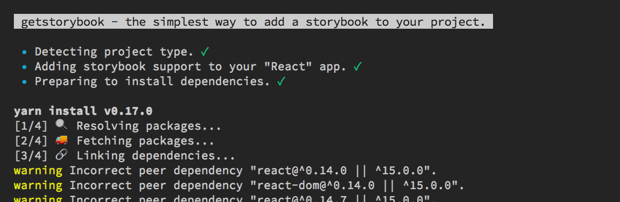
После чего в проекте появится новосозданные папки .storybook и stories
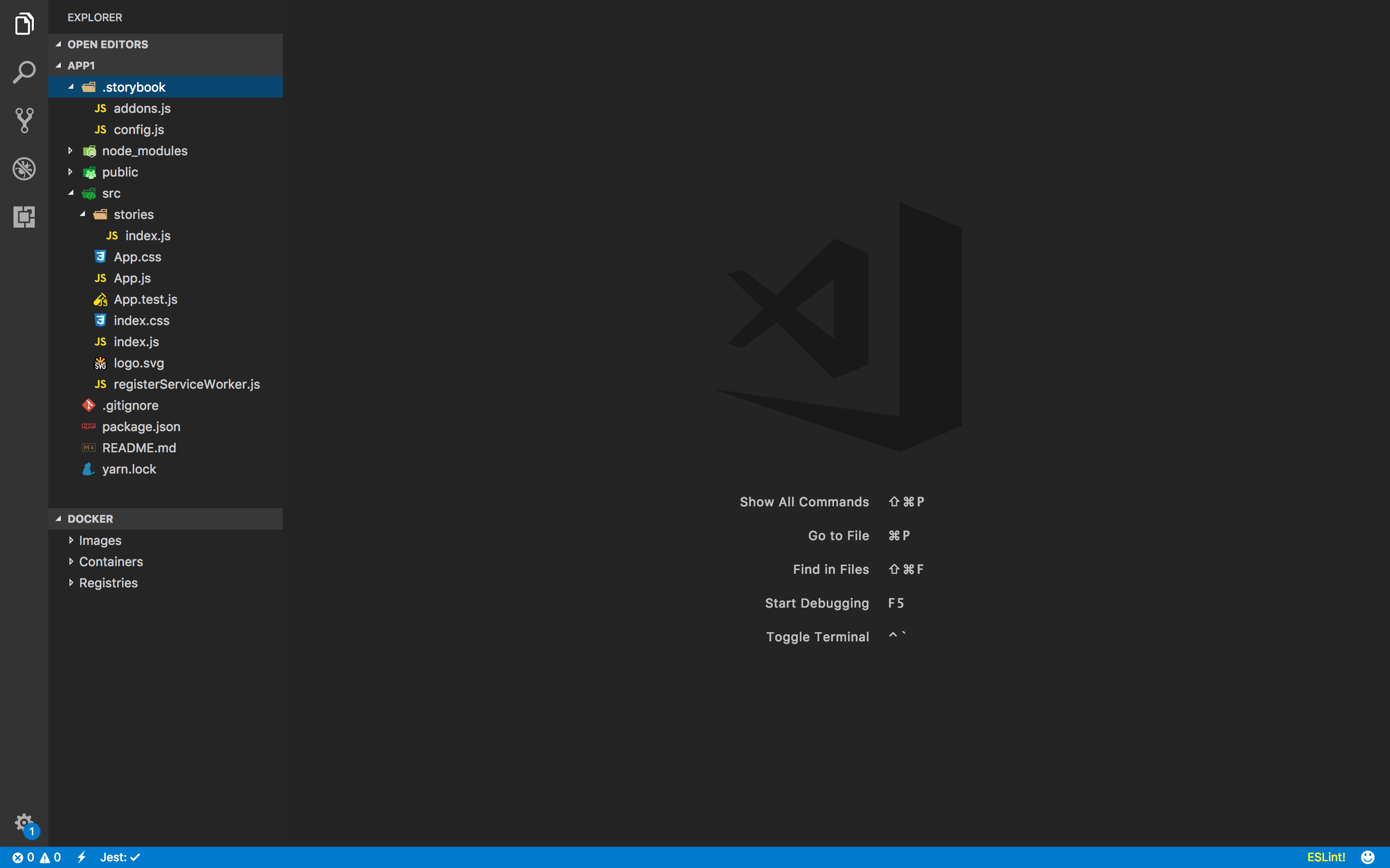
Папка .storybook содержит всевозможные конфигурационные файлы. С ними мы разберемся позже. На данный момент нас интересует папка stories.
В ней хранится библиотека компонентов. После инициализации Storybook в проекте, по умолчанию создается файл с одним примером. Давайте запустим Storybook и посмотрим на него.
yarn storybookThe Storybook will be available at http: // localhost: 6006 / The
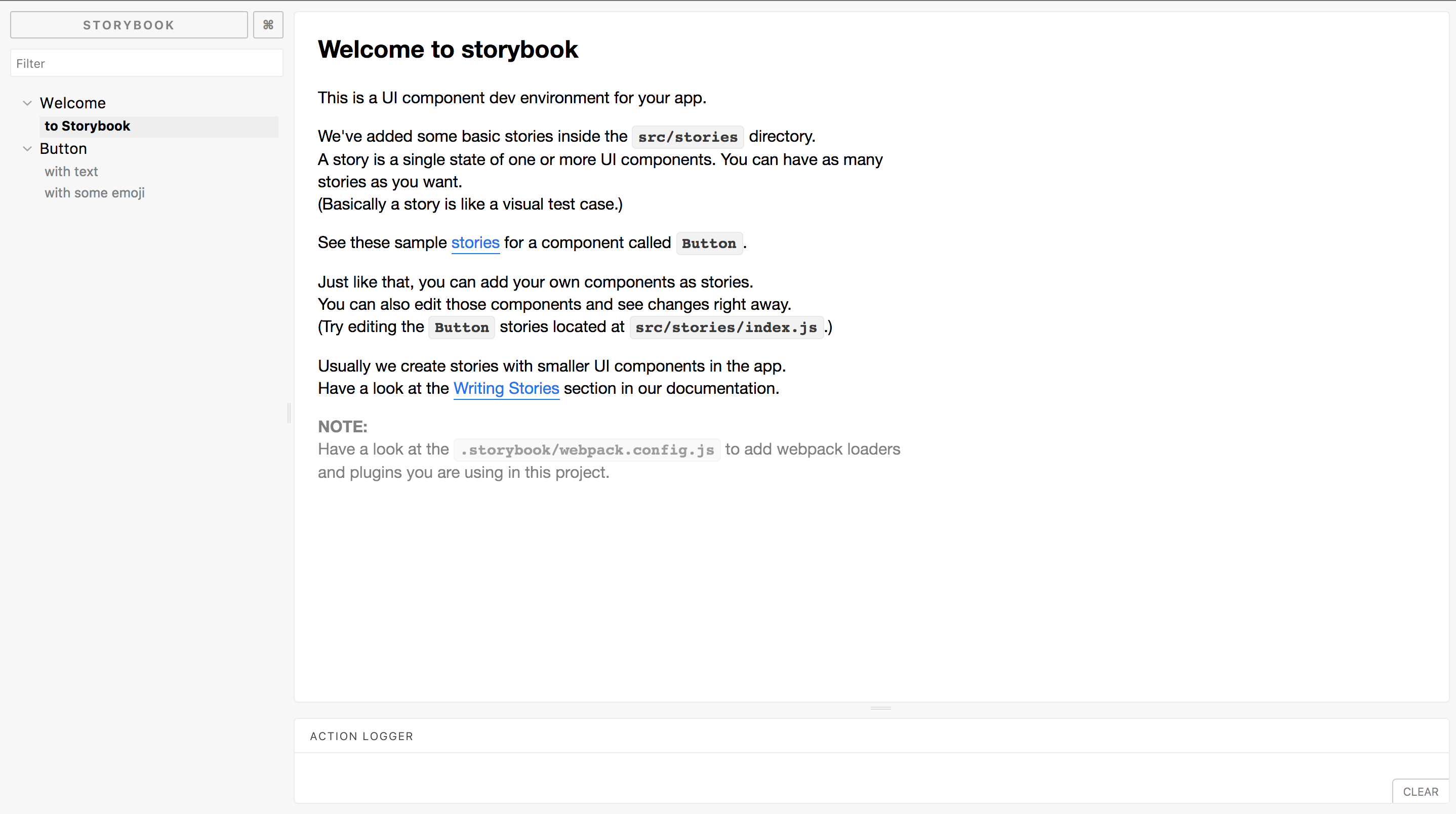
page has a simple interface. On the left we see a panel with hierarchical folders of components with the ability to search. On the right is a fairly large workspace in which your components and other information will be displayed.
And the panel below which is used as an interactive tool on which you can display various information and component controls. The location of these panels is configurable.
And so, let's take some kind of component as a basis, so as not to waste time and not write your own.
I chose react-select
yarn add react-selectCreate a Select folder with index.js in src as follows
import React, { Component } from 'react';
import Select from 'react-select';
import 'react-select/dist/react-select.css';
class SelectWrapper extends Component {
state = {
value: null
}
onChange = (value) => {
this.setState({
value,
})
this.props.onChange(value)
}
render() {
return (
)The code is intuitive. storiesOf creates a category into which you can add various components.
Let's add react-select to our multi-select Storybook
storiesOf("React select", module)
.add('General', () => ) // Мультивыбор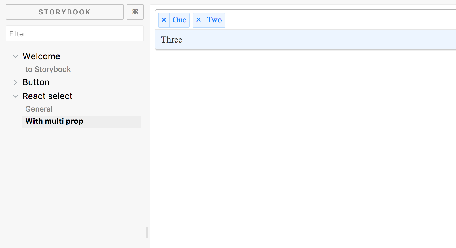
Build storybook
An important feature is the ability to assemble the Storybook into static files, which can, for example, be published on a website or used internally as documentation.
Just run
yarn build-storybookBy default, files are added to storybook-static . You can open them in any browser.
Webpack and other configuration
By default, the Storybook tries to figure out your surroundings and use a number of settings that let you build and display the Storybook. But there are times when you can not do without an additional configuration.
You can add webpack.config.js to the .storybook directory.
Often this configuration will be very simple.
// you can use this file to add your custom webpack plugins, loaders and anything you like.
// This is just the basic way to add additional webpack configurations.
// For more information refer the docs: https://storybook.js.org/configurations/custom-webpack-config
// IMPORTANT
// When you add this file, we won't add the default configurations which is similar
// to "React Create App". This only has babel loader to load JavaScript.
const mainConfig = require('../webpack.config')
module.exports = {
  plugins: [
    // your custom plugins
  ],
  module: mainConfig.module
};
As you can see, this is just importing the config from the main project. You will not need this config in our experiments.
Using add-ons
Storybook has a number of recommended add-ons.
- storyshots - Snapshot testing
- actions - Logging actions
- links - Create links between Storybook pages
- comments - Commenting
- info - Component Summary
- knobs - Editing component components
- options - Customizing the UI Storybook
Let's go back and look at the default examples.
storiesOf('Welcome', module).add('to Storybook', () => );
storiesOf('Button', module)
.add('with text', () => )
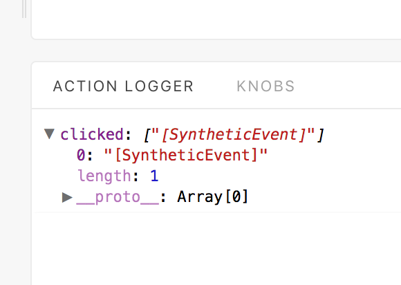
.add('with some emoji', () => ) addition action , creates a kind of function, the result of which you will see in Action Logger. This can be convenient for logging parameters like onApply or onClick.
The so-called knobs are quite useful . They allow you to edit the passed parameters to the component.
yarn add @storybook/addon-knobsYou must import the installed module into addons.js in the .storybook directory
import '@storybook/addon-knobs/register'And in stories / index.js import the knobs we need
import { withKnobs, text, boolean, number } from '@storybook/addon-knobs';Let's add the ability to interactively manipulate the button
storiesOf('Button', module)
.addDecorator(withKnobs)
.add('with text', () => )
.add('with some emoji', () => )
.add('Interactive demo', () => )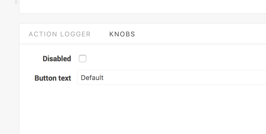
Now we can change the text of the button and use boolean to set the state of the button.
Another very useful add-on is Info, this add-on automatically documents the external API of the component.
yarn add @storybook/addon-infoImport the module
import { withInfo } from '@storybook/addon-info';
And let's change the code of our button a little
.add('Interactive demo 2', withInfo('doc string about my button component')(() =>
)A button will appear on the right, with which you can open detailed information about the component.
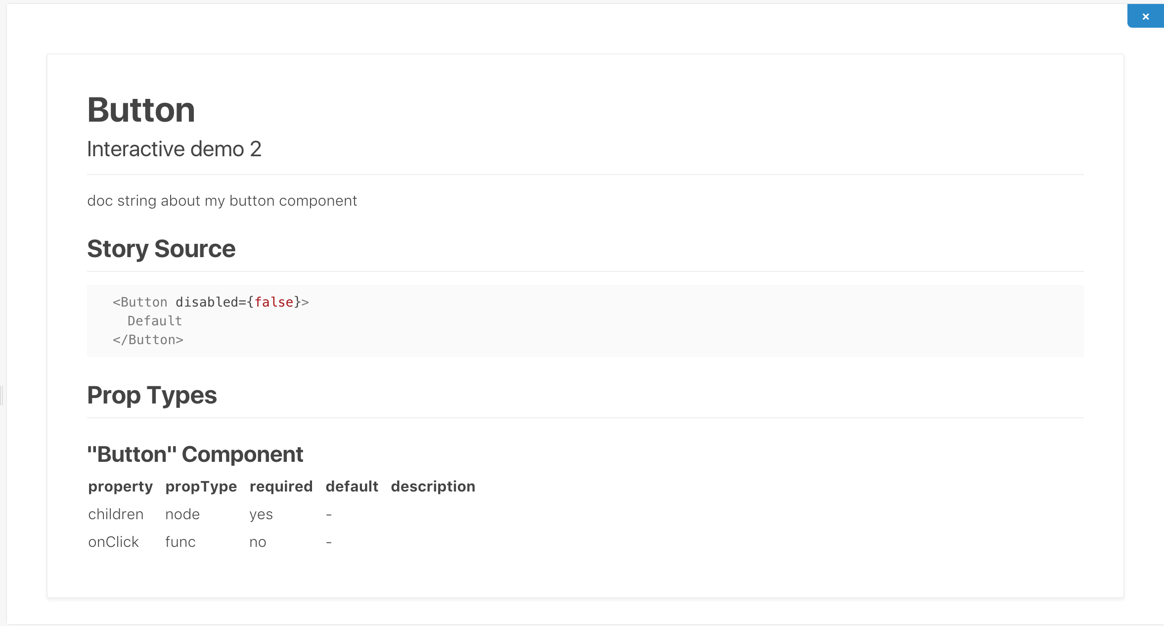
You can also display this information without having to open it, right on the workspace with the component.
.add('Interactive demo 3', withInfo({
text: 'doc string about my button component',
inline: true,
})(() =>
))Conclusion
React Storybook, as you can see, is very easy to use, has a lot of various settings, add-ons and allows you to solve problems with component library support. The remaining team members can see and try the component before it is screwed to the page, which allows you to receive feedback from designers much earlier. Beginners in the team will no longer be at a loss as to whether you have this or that component and whether it can be used as part of the current task.