Data: beautiful and terrible
- Transfer

Data is everywhere. And that is wonderful. They change our lives , reinvent storytelling and have an impact on almost all sectors - business, art, entertainment, music, technology.
Here are some striking examples ...
News journalism
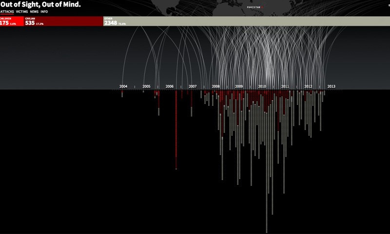
Absolutely terrifying infographics. The project, entitled “Out of sight, out of mind” , is a chronology of unmanned drone strikes in Pakistan from July 2004 to December 2013.
Since 2004, the United States has practiced a new type of underground military operation. The use of unmanned aerial vehicles to destroy enemy targets seemed attractive, since it eliminated the risk of losing the US military and was politically much easier to do. The efficiency indicator turned out to be extremely low, and losses among adult and child civilians are very high. The whole world could remain ignorant of what is really happening, and, as they say, out of sight, out of mind. This project helps highlight the topic of unmanned aerial vehicles, without speaking for or against. After examining the data, you can decide for yourself whether you can support this use of unmanned aerial vehicles or not.
Visualization is created in HTML5 and JavaScript
drones.pitchinteractive.com
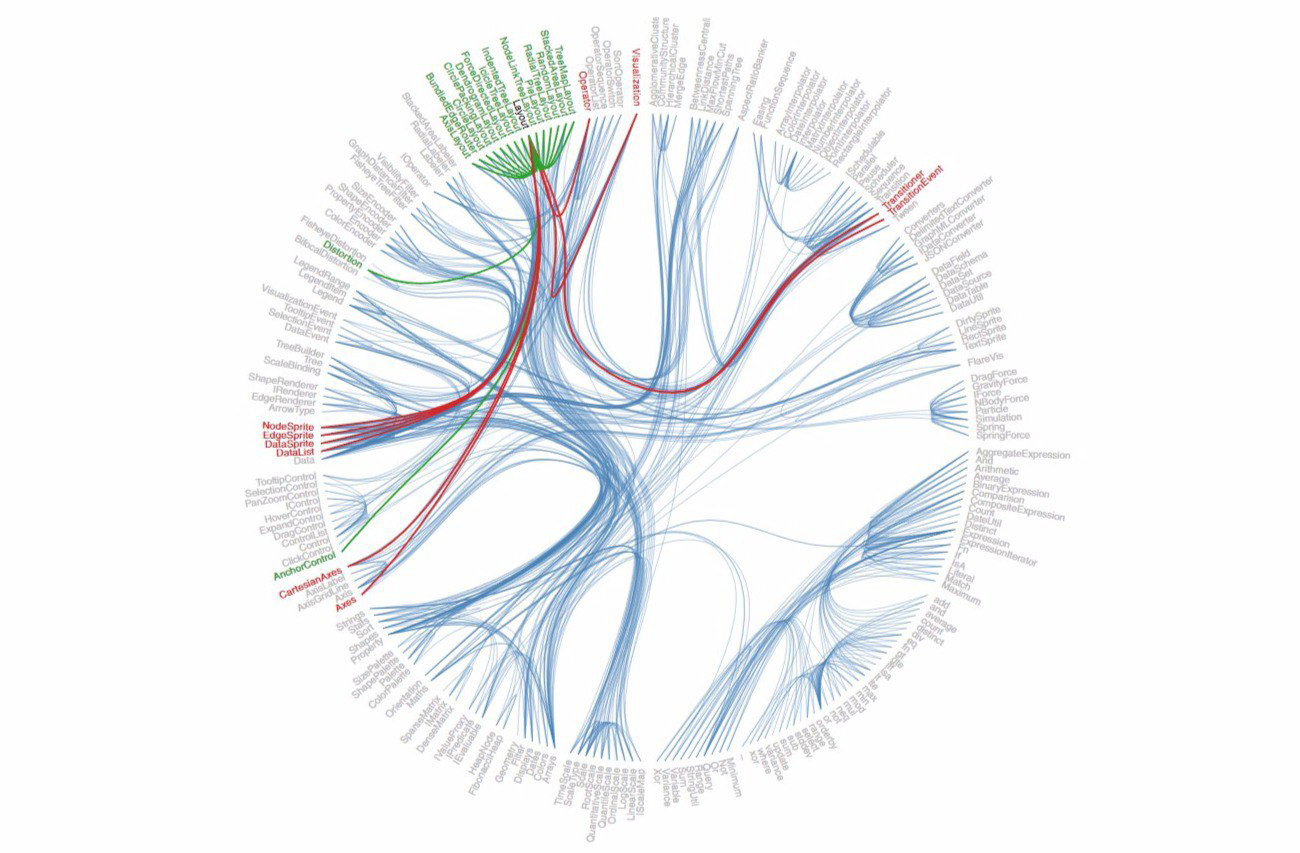
The talk about data visualization would not really be complete without mentioning d3.js , an amazing javascript library created by Mike Bostok , who was previously responsible for visualizing the New York Times data ( see the link for a collection of his work with code). Most of the data visualization projects that you see on the Internet today are built using d3.js.
For news publications, creating interactive stories can be difficult, but once they see it, readers expect them more and more. Related links:
Hans Rosling , who unfortunately passed away earlier this year, in his famous TED Talk lecture, presented data that debunked several myths about world development. It was unrealistically cool:
He also had his own show on the BBC, The Joy of Stats:
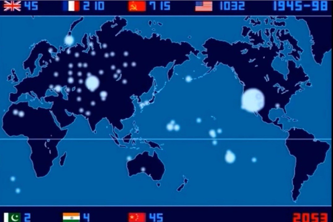
Temporary map of each nuclear explosion since 1945. Fearfully. Especially a lot of questions remain to the Soviet government, which conducted tests at various training grounds scattered throughout the country, unlike, for example, the United States. We recommend watching videos in accelerated playback mode.
Here is the final map:
More interesting examples with d3.js:
- U.S. firearm deaths map: data.huffingtonpost.com/2013/03/gun-deaths
- Data visualization from the 2012 NBA Finals: www.nytimes.com/interactive/2012/06/11/sports/basketball/nba-shot-analysis.html
- How old are you left to live: flowingdata.com/2015/09/23/years-you-have-left-to-live-probably
- Famous Creative People Day Modes: podio.com/site/creative-routines
- Google Music Timeline: research.google.com/bigpicture/music
Quantitative self-determination
Nicholas Feltron, one of Facebook’s leading timeline designers, has been collecting a lot of data about himself for many years, initially carefully describing his life on paper and then creating an application. As a result, these data were turned into annual reports. You can find them here: feltron.com
More examples:
- ericboam.com/Seven-Months-of-Sleep-1
- ericboam.com/2014-A-Year-In-New-Music
- jehiah.cz/one-four
- Federico Zannier sold his personal data for $ 2 a day . Using Kickstarter, he managed to earn $ 2,733. Federico offered everyone an archive that contains: GPS tracking information, all the sites he visited, information about keystrokes, mouse movements, and even screenshots of his face every 30 seconds. www.kickstarter.com/projects/1461902402/a-bit-e-of-me/description
- Data coup helps you sell your personal data. Datacoup.com
- Personal Data Cost Calculator: www.ft.com/cms/s/2/927ca86e-d29b-11e2-88ed-00144feab7de.html#axzz2z2agBB6R
GPS and tracking

Just Landed is a visualization of tweets of people traveling around the world on an airplane. Jerome Thorpe’s project searches for tweets containing the phrases “just landed ...” or “just arrived ...” and then visualizes the journey depending on the location at the time of the tweet and the person’s place of residence.
datavisualization.ch/showcases/just-landed-a-twitter-visualization-in-processing
More works by Jerome Thorpe
- www.fastcodesign.com/1669702/explore-the-galaxy-using-the-actual-minority-report-interface
- intotheokavango.org
Micro geolocation:
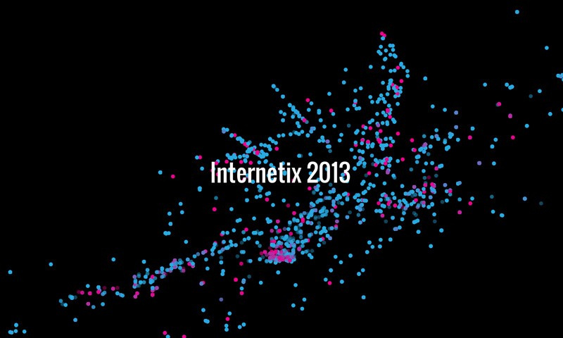
Tracking conference delegates over Wi-Fi and visualizing their movements and connections is a project that George Gully did several years ago. Wi-Fi can really be used to pinpoint people’s location.
radarboy.com/george/internetix.php
More GPS visualization:
- One day in the life of a taxi: nyctaxi.herokuapp.com
- Visualization of the Metropolitan Transportation Authority (New York):
Storytelling with visualization
Scale of the Universe: htwins.net
Simple but effective visualization of the length of time: hereistoday.com
Visualization of data on the consequences of the division of Germany by the Berlin Wall: zeit.de/feature/german-unification-a-nation-divided
Data as art:

Dillon Marsh creates compositions for visualizing production data on South African mines: www.dillonmarsh.com
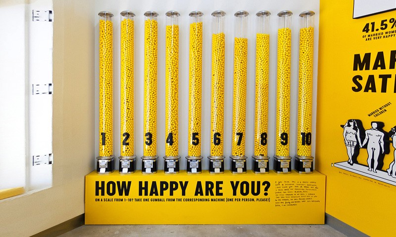
Stefan Sagmeister's “Happy Show” - an exhibition whose goal is to measure and control the level of happiness: www.thisiscolossal.com/2013/08/the-happy- show-by-stefan-sagmeister
We hope you enjoy this selection of visualizations. Do you know many more vivid examples? share with everyone in the comments.