Landing Page as a replacement for the entire site

Hello, dear Habrausers! I suggest to talk about landing page. Many of you have heard, but most likely, most of you know what it is. But still I would like to draw a little attention to this.
Landing page (Landing page) is an opportunity for a seller or service to tell the most important thing about its products and services in a few seconds, and for a potential client - to make sure that he’s hit "right on target". One of the tasks of creating landing pages is the formation of a positive perception of advertising and the replacement of the “standard” trick, based on various implications, with a full-fledged information block.
Today, with the development of the development of Internet resources, it is very difficult to stand out in the market, especially for a web studio. Since it is necessary to offer the user something different, unlike analogues in this direction. For a web studio, it is important to create your own personal, creative website to attract customers and demonstrate their own capabilities.
Taking into account all of the above, it was decided to develop a one-page website, but with a well-structured structure for the convenience of the user: so that the search for the information he needs does not take a long time. The choice fell on a one-page site because clicking on links takes some time, but I would like to avoid this and give the user all the content at once.
I would like to talk about the process of creating such a resource, what tools were chosen, why the choice fell on these tools, etc. And I want to share this on the basis of comments and feedback from users and people from the outside.
Development process
Like any development process, it all started with the choice of design and the right tools. The reason why this design was chosen, I will not talk about, because this article is not about that. It will be about the development itself.
So, after the approval of the design, we decided to think which stack will be used in development. For styling the site, it was decided to use self-styled styles, as the design is individual and the frameworks did not fit. To revitalize the site, the jQuery library was chosen, because with its help you can quite easily manipulate elements on the page, create animations. The most important tool that helped us with the development is fullPage.js. This plugin helped to implement the main idea and create scrolling full-screen sections.
Writing styles
We settled on a self-styled style sheet, because the content that was placed in the sections had to change depending on the resolution of the screens.
Using CSS media queries, at different screen resolutions, you can proportionally reduce the blocks, fonts and other elements on the page. Thanks to such manipulations, the same content looks equally good both on large screens and on small ones.
I will give below the code of a certain block, where, thanks to media queries, the reduction of blocks occurs.
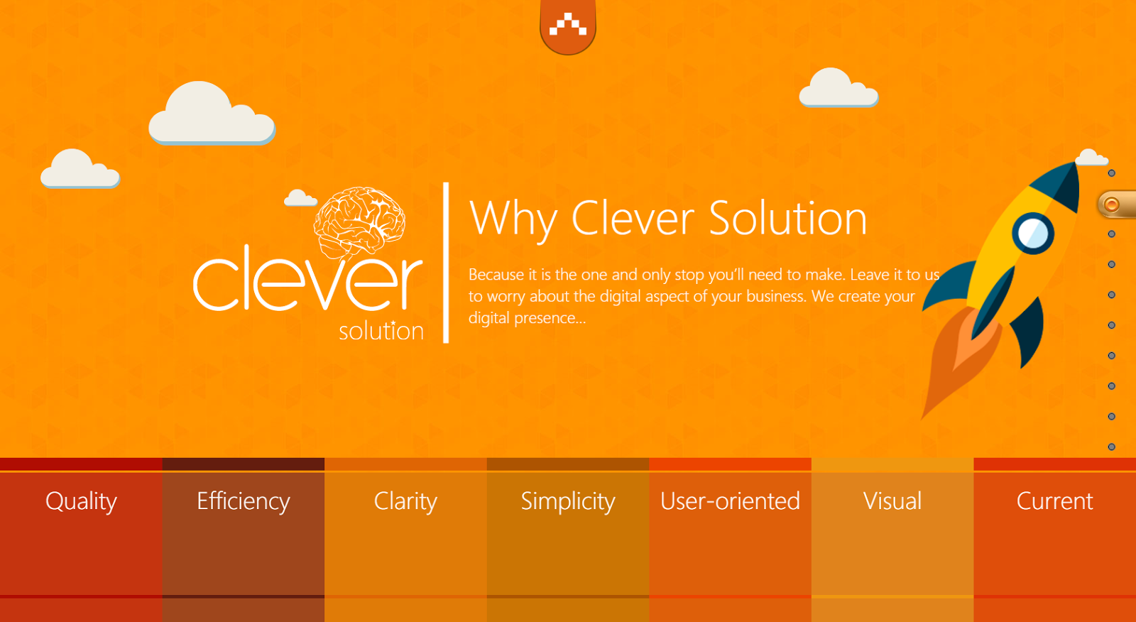
Figure 1
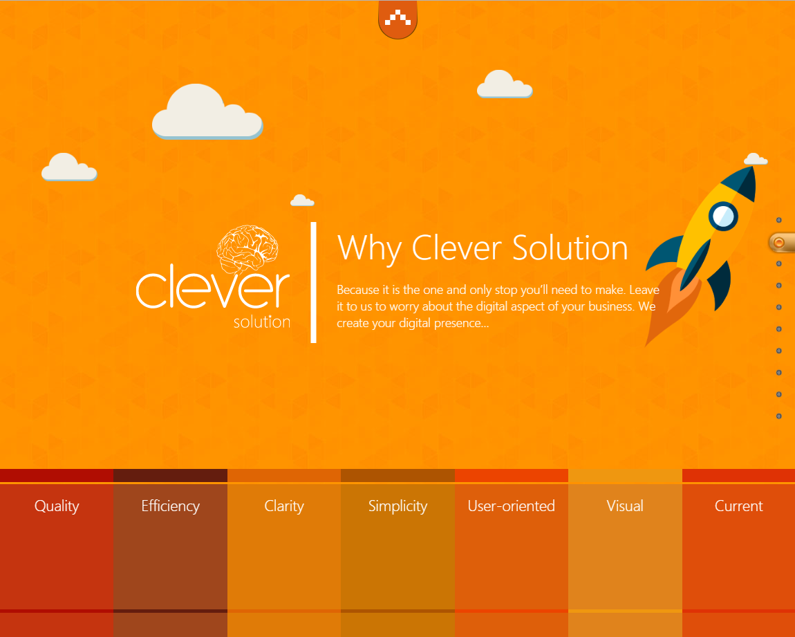
Figure 2
Let's look at the code:
.animation-box-2 {
  position: absolute;
  bottom: 0px;
  left: 0px;
  height: 24%;
  font-size: 36px;
}
@media (max-width: 1200px)
.animation-box-2 {
    font-size: 22px;
}
@media (max-width: 1400px)
.animation-box-2 {
    font-size: 26px;
}
@media (max-width: 1500px)
.animation-box-2 {
    font-size: 30px;
}
As you can see from the code above, at certain screen resolutions, the font in the block decreases or increases. The whole landing is built on this principle. This method is very convenient if you have content that should always be visible, but at some resolutions it is poorly displayed or does not fit into blocks. It is in such cases that media queries will come to your aid.
Plugin fullPage.js
Now I would like to talk about the most basic concept that was used in this project. This is jQuery plugin Fullpage.js .
When developing this project, the question arose about how to make the site fairly easy to manage, informative, but at the same time creative and memorable. After much thought, the idea came to mind - to place all the main sections on one page and make convenient navigation between screens. When choosing a stack for this task, many pages were viewed on Google, but at that time no worthy analogue in functionality was found (and even now, if you look, there are not so many similar plugins). I will give a couple of arguments why the choice fell on this tool:
- Easy setup
- Very flexible and diverse functionality
- Cross-browser compatibility (up to ie8)
- Excellent product documentation
- Updates
- Responding
The code below will show how easy it is to use:
      Some Content

      Some Content

      Some Content

      Some Content

      Some Content

      Some Content

Some Content

Some Content

Some Content
As you can see above, everything is very simple. When creating an HTML structure for this plugin, the main thing is that all sections that should be included in scrolling are wrapped in one “diva”, the class of which will call the plugin. As an example below:
$(document).ready(function() {
    $('.js-allscreens').fullpage(); // Вызов плагина по классу .js-allscreens
});
I would like to give the plugin settings, but since there are quite a lot of them, I will give the most relevant for development:
anchors- identifiers of links to sections (in the form of an array); allow you to quickly move to the desired section;menu- menu identifier; necessary to mark links corresponding to the selected section;scrollbar- if you pass the value TRUE to this setting, the vertical scroll bar of the browser will be displayed;scrollOverflow- necessary to display the scroll inside the section, in case the content goes beyond its borders;navigation- if you pass TRUE to this setting, the section navigation bar will be displayed;navigationTooltips- an array of tooltips; for each element of the navigation bar;slidesNavigation- if you pass TRUE to this setting, the slide navigation will display the slide navigation;navigationPosition- position of navigation through sections (supported values:leftandright);slidesNavPosition- position of navigation on slides (supported values:bottomandtop);loopTop- if you pass TRUE to this setting, the movement in sections will be infinite (but only in the upward direction - to the first slide). If you turn the mouse wheel forward on the first slide, it will move to the last slide.loopBottom- similar to the previous setting, only the downward direction.loopHorizontal- similar to the previous settings, only works for slides.
Conclusion
I do not want this article to be regarded as if they were trying to teach you something super complex or to impose your opinion. We just decided to share our experience on how to create a one-page website with an original look, nice design and informative content. We know that there is still not presentation quality, but, as an exchange of experience, we ask you to love and favor.
Thanks for attention!
Material prepared by: greebn9k (Sergey Gribnyak), V1pBoy (Vitaliy Kalashnikov), silmarilion (Andrey Khakharev)