March 18, 2016 at 17:28
ICQ Contest. Results of the mobile app redesign contest

In early December, we announced a mega-competition for the redesign of mobile ICQ . Every day he was gaining momentum, the work was getting more intense, and by the end of February 21, we already had 88 works! We got some interesting interface and ideological solutions for video communication, and a bonus curious parallels with trending services. There was also a fabulous madness with rainbow-colored unicorns in space, which we were looking forward to.
Task
The objective of the competition was to make a dream video chat. It was proposed to shift the emphasis in the product interface towards video communications (one-on-one calls, video conferences or online broadcasts), without disregarding the usual text communication. It is important that the user has the impression of simplicity and familiarity, everyday video communication.
goal
Good things for people are created with people. ICQ is developed by users and changes with them. We wanted to supplement our thoughts on the development of the product with an outside perspective, to hear fresh thoughts and ideas from both users who decided to directly change something and people who were not involved in the product.
Video calls have long been one of our key features, and we continue to think what more useful and interesting things can be offered. Of course, we have many of our own options for solving the problems of the competition, but we will keep them a secret and will open them in subsequent major updates.
Jury
Designers and ICQ managers evaluated the work. Pavel Loucker and Konstantin Rubtsov (product managers). Kolya Kuchkarov (designer) put a lot of minuses, Joe McGreen (designer) talked about logos and walked through trolls, and I, Alexander Smetanka (grocery designer), took over the UI / UX and other things. The organizers of the competition Vera Bondareva (designer) and Dima Pleshakov (product manager) helped us in the assessment.
Work
Of 88 designers, about half fell into the task. Non-trivial solutions were proposed by about 20 participants. The most daring ideas in one form or another are found in other services, but there were also fresh finds, which pleases.
From the minuses: sometimes in interesting-looking concepts it is not completely clear what the elements on the screen mean and, unfortunately, this is not explained in any way. Of course, there were those who copied the current design by changing colors and icons.
As a result, we analyzed the concepts into separate interesting ideas, trends in video communication, interface techniques, evaluated the approach to the task and presentation.
Non-trivial video chat
The leaders were ideas that went beyond the usual interface of video calls (both well-developed concepts and some interesting mechanics).
Danial Siddiki proposed “Moments” - a common video tape from which you can proceed to communicate with the author. Well emphasized the button in the tab bar that launches the camera.

Of the disastrous minuses - access to viewing the “Moments”: it is poorly visible, it is far from “under the finger” as we would like. There is an excess in everyday use obstacle "Enter the name of the moment."
Alexander Kochevanov also made Moments, but in a different format: they are available from the profile, as well as on the interactive map. Under the moments you can leave comments.

Misha bilenkopassed the usual call scenario by quickly turning on the video while chatting.

Yarik Bright wanted to record calls and broadcasts.

Oleg Mishkorudnyy created a selection of pictures taken during the call, which comes into the chat after it is completed.

Most of all, the favorite Russian Design Cup Denis Shoomov came off with the interface . I did a lot of things, from a gorgeous presentation to animations. In the case of video, he suggested a number of formats.
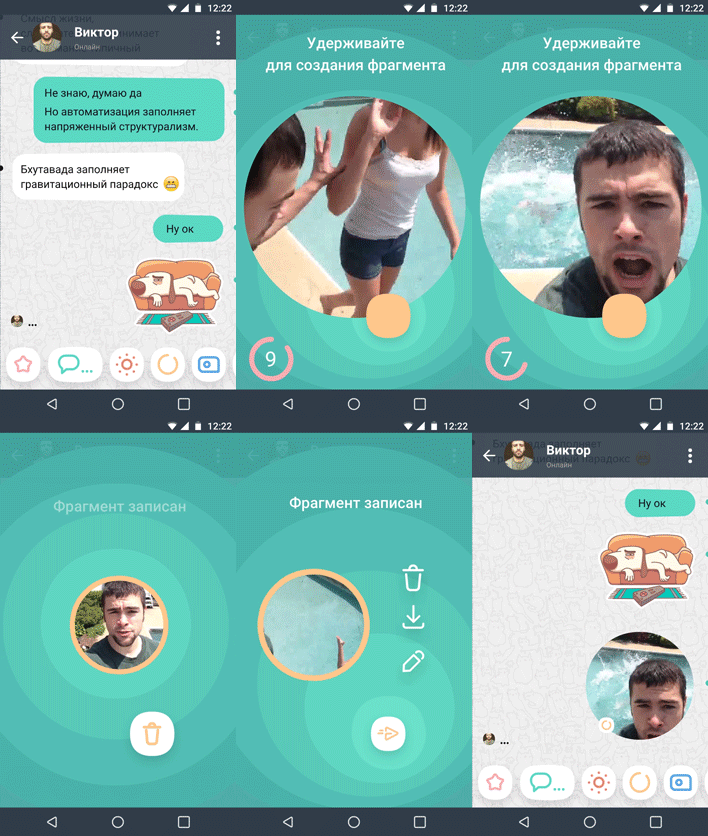
A snippet that allows you to instantly shoot a video moment of up to 10 seconds and send it to friends, interlocutors or save to your video stream. We are familiar with video messages, but a smart and nice interface gives this process a special charm.
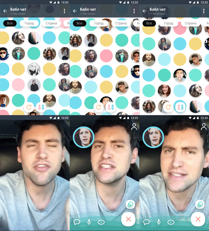
Grandma is a space with infinite (whatever that means) video chat and the ability to sort infinity.
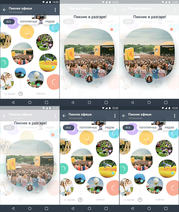
Pulse - a stream of broadcasts with reference to places, topics, events, cities. The pulse is dynamic and tied to a timeline. Cool stuff.
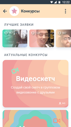
Video contests.
Broadcasts
The popularity of streaming is gaining momentum. New services that allow streaming grow like mushrooms, and existing ones acquire such an opportunity. About a third of all works provide for the possibility of broadcasting with simultaneous chat on top of the video. The design copies applications of this type.

The broadcast option, which differs not only in the color of the points, was proposed by Dmitriy Ivanov . In its version, the broadcast is in SplitView mode with two cameras simultaneously turned on.

Denis Shoomov made a showcase similar to the Apple Watch interface.

Video call
With video calls the same story as with broadcasts, but in this case, the courage of the participants was a little more.
For example, some tried to brighten up the communication with video effects.
Alex Ovs and Vladislav Solomaha added emotional masks to calls and messages
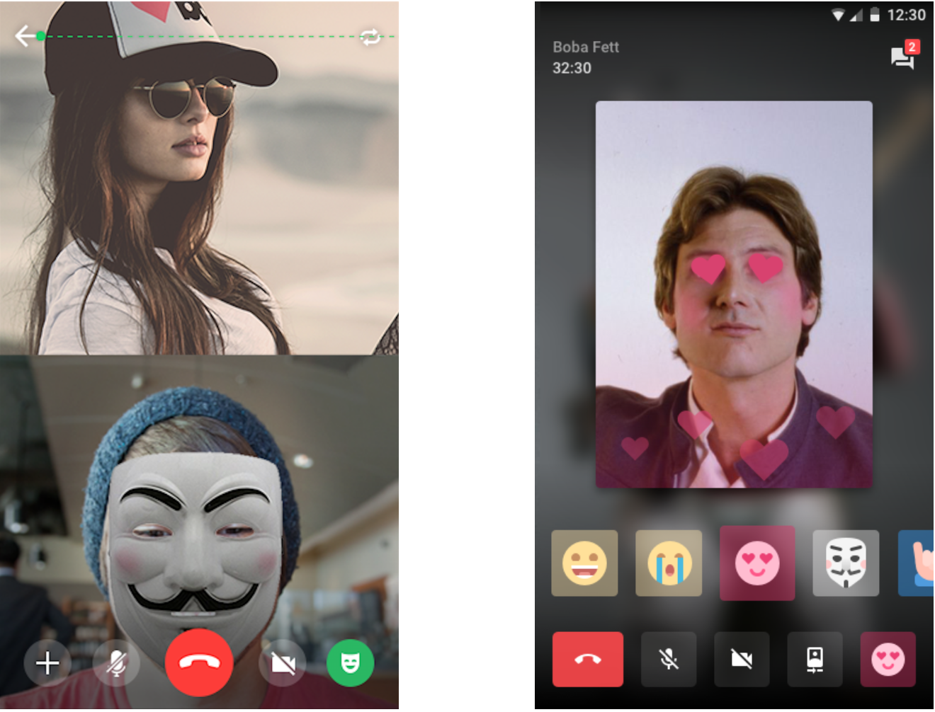
Danial Siddiki offered hearts and shared content viewing.

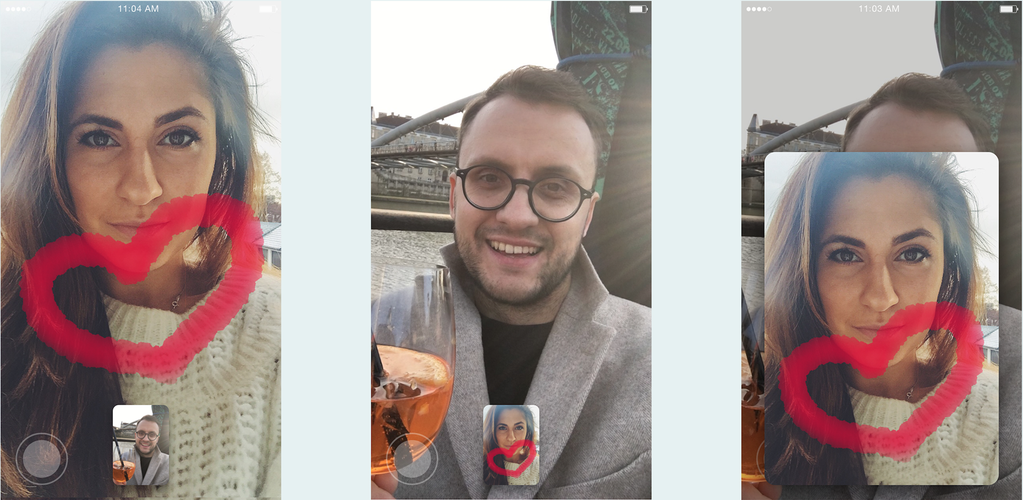
Pavel Zametniy allowed to draw during a call.
The way to video chat
The most obvious way to position a product is through an interface: easy-to-access tools and icons with clear associations. In our case, this is a camera: if you select it properly, put it in a tab bar - and it becomes clear what this application is about. Almost half of the participants did this trick.
The loosest of all was Arsen Kolyba with a nostalgic tube design.

Ico Maker with gigantomania still favorably carried her to the chat.

Very simple and nice at myinterface , neat at Danil Siddiki and Vitaly Tamashin .

It became more difficult due to the icons and details of Dmitriy Ivanov , Kirill Yarovenko and Pavel Karpov

There were also games with the logo turning into a camera and control. So did
Vova Sharapov and of Edward Bed and .

Another obvious trick is putting the camera on a list of chats or contacts. It was used by Dmytriy Kravchenko Pavel Anpleenko Khokim Sharipov Alex Martinov Alex Kurlaev Ivan Demenev .

Fliqle , like Pavel Anpleenko above, also added a camera and defined the space around the icon, making it a rather large button, which is good.
The main focus is that the chat unfolds directly from the card. But what will happen when the keyboard opens, we never found out.
A chat list in the form of cards is not the only idea, but it turned out pretty stylishly against a dark background and with colored stripes.

A little bit about cards
Speaking of cards. They are in trend, they are used a lot and in different ways, not limited to what the guidelines for material design prescribe.
Sascha Yeryomin excellently highlighted new inboxes and used chat cards. Looks like a game!
By the way, he is one of the few who did not make a red button during a call (more on this below).

Slava Kornilov used cards everywhere, the live chat and broadcasts were especially attractive.

Angela Rybina used flashcards to browse people and generally did an interesting search.

Kirill Yarovenko , Fliqle , Alexander Kochevanov and Pinkten used cards in calls.

Ilya Gruzhevskifilled with cards calls and broadcasts, it turned out seamlessly and pleasantly.

Evgeny Pershin used cards in calls and chat windows.

Andrey Inozemtsev used the technique in the presentation and effectively designed the window displays of live chat.

Entry field
Changing the input field can also be a profitable decision. The bravest ones were able to play this.
Vladislav Mikhailov made a call near the input field.

Several participants added a camera with the corresponding icon to quickly send video messages: Slava Kornilov (flying outgoing bubble with neon lights!), Astract (andr.novojilov) and Vyacheslav Nazarov .

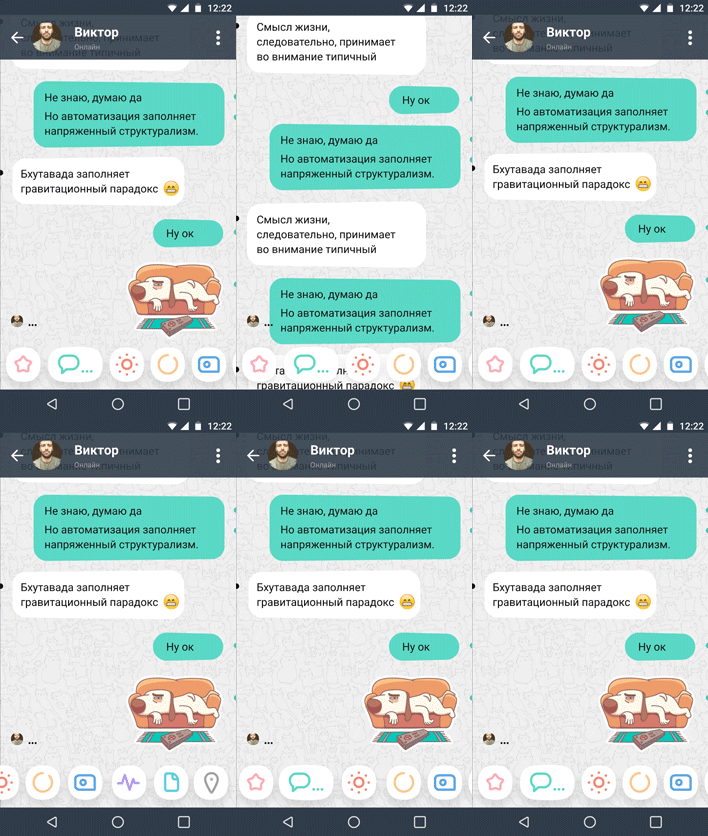
The most interesting with the input field was created by Denis Shoomov . He allowed to do anything from the input field and (attention!) Did not create the second row of buttons below it, but completely removed the standard text field, making the button smaller (the input field, in fact, is a button, a large one).
Red tube
The tube icon in the modern world deserves a whole study and dissertation, as does the floppy disk icon. The phenomenon of the red tube is amazing: three quarters of the designers emphasized the completion button in video calls. Even in concepts filled with interesting solutions, this moment was not beaten in any way, as if they had completely forgotten about it.
Most solutions are standard - a tube in a circle, in the middle or with the edge, surrounded by controls or without, with minor differences.
For example, Nikita Kokarev , Roman Kryzhanovskyi , Sergey Korneev . Well, you get the point.
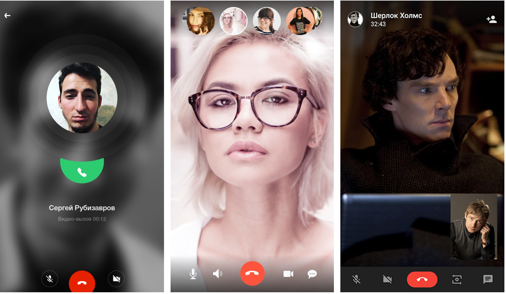
Bogdan Pavlik , Extremal and Nick Voloshyn made the radiant end of the video call.

Alex BogomazovInvented the non-trivial fastening of the interlocutor to the edge of the screen, but did not reinvent the handset. Now this is the champion tube!

Even in fairly loaded solutions, the pipe is at the center of everything - so at Grisha Uglanov .

Nazar Moravskyi acted differently and raised the end of the call to the upper right corner, maybe already far away.

Aesthetics, entertaining details and space
Vitaly Tamashin successfully put the emphasis, in general, it turned out easy and colorful.

Slava Kornilov did everything nicely and polished, but the logic suffers. An interesting move with a gradient when choosing an action with a bell, but it is unclear how this works. Looks like swiping can change the buttons.

Kitya Toropovsky pleased with the incomprehensible unicorns in space. Firstly, it is beautiful.

Igor Kus offers to spin the drum to find friends.

Leon Bakadorov added an interface to photography. Found a lot of beautiful photos, different!
Alas, 99.99% of users have no such beautiful photos. You should always try to work with real content.

Tinplate
Tab bar with eggs from Sasha Red .

Pavel Anpleenko conquered our minds.

Ninja swipe from the swipe king Daniil Antipin .



Mikhailov ... ihor

Alex Kurlaev

of Edward Bed and . reminded all of the past! By the way, many of our users no longer know what it was, they are young and young.

Logo
Many guys brought the idea of video communication into the logo. Hence, the expected metaphors - camera, Play button, lens and aperture, crossed with a flower.

Nostalgic diaphragms from Vyacheslav Nazarov and Den Kulinich .

I would like to note the designers who tried to do something very strange.
Ivan Baryshev , Alexander Dadaev , Alexandr Pesenka , Vadim Zlygastev .
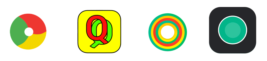
And our undisputed favorite is Pavel Anpleenko . So the flower has never fluttered!

Interesting feed
Alexander Kochevanov surprised with a detailed description of the analytical process. He compared competitors, identified key functions, described the structure, substantiated the proposed solutions and made a prototype . Read, this is interesting, but the post title is cheeky!

Eugene Kazakov bribed with a visual approach to the concept.

Denis Shoomov did everything that was possible, and even more: cool animations, a good promotional site, described everything as it should. Good girl, in general!

The most colorful presentation was made by Andrey Kravchuk . Thrash animation and 8-bit notes did their job and won the hearts of fans of the “ Half-liter mouse ”. On the style! Fitz approves.

www.facebook.com/dlyareganasaytah/videos/1710084605871808
Winners
We carefully looked through all the works, and then again, each jury member had to give an assessment considering getting into the task, thoughtful interface and aesthetics.
Favorites are uniquely identified. We simply did not give up and more than once questioned their decisions within the team, but they survived.
1st place: Denis Shoomov
He approached the matter on a large-scale and high quality and did a great job.
The task of making a messenger with a bias in the video is brilliant. Denis came up with many interesting formats, in which one way or another, video messages, streaming, video calls and the only one who made a unique design appear. I was pleased with numerous interface solutions such as rethought chat chat, seamless video calls, cool icons, unusual list patterns. The main thing is that the concept is organically inscribed in the format of a classic messenger. At the exit, we get a middle ground - this is not space, in which we need to understand and not a dull template application.
Luxurious presentation site deserves special attention. He brought all the ideas, put them on the shelves, accompanied them with wonderful animations, icons, gifs. Fire!
Cons
Winners we decided to not only praise, but also little to criticize, they have earned.
There are nit-picking and flaws. The bold design is certainly beautiful. But it’s important not to go too far with courage. Retrogrades may call the application too fun and windy, and it can just scare someone away. You can find fault with the metaphors of some icons - you still need to seriously work on them. There were no particular problems, but sometimes I had to figure out what this could mean. The most surprising drawback is the complication of sending the fragment. A quick start to the shooting and a catastrophic process with several iterations before a video chat message. “Download” in percent negated all efforts. For everyday functions, this is a failure.
2nd place: Danial Siddiki
A detailed and fully functional concept. Moments, the way they are created and viewed, broadcasts and emotions in calls can all be implemented even now quite simply into the current client. I liked the idea with petals-entertainment on the logo.
Cons
The interface is designed in a too classic style, as if it were a test task, and not a competition for creating a concept.
The complication is the simple way to create a moment in the form of a proposal to enter its name. The logo during a call is absolutely wild and incomprehensible in terms of functionality.
3rd place: Misha Bilenko
Misha took one important problem, realized it very correctly, described it and perfectly solved it. Erased the border and made a seamless video chat. It can be seen that in the first place I was thinking not about choosing the color of the icons, but about the practice of chatting.
Cons
You can complain about the dubious location of the control, including video in the chat. The disappearance of some messages during a call is quite sudden and discouraging.
conclusions
The work turned out to be surprisingly many. It turned out that even collecting them is not easy: they were sent to the contest not through rebound in Dribbble. As a result, we collected work from various file hosting and services. It seems that the mechanism of the competition was not as simple as it seemed. Thanks to the energetic Yura Vetrov for help in organizing the contest, he smoothed many corners.
Evaluation and analysis of decisions took a huge amount of time, many judges had to deal only with this. Most of all, it took to systematize the ideas proposed in the concepts and evaluate their adequacy in relation to real tasks.
Will we still conduct such experiments? So far the question remains open.
List of participants