Responsive design: preserving the shape of markup elements
One of the techniques of responsive web design is to set the size of the markup elements
as a percentage relative to the size of the container containing them. Thereby, proportional resizing of all elements is achieved when the browser window is resized. If only horizontal dimensions are specified, as, for example, during page layout, when it is important to correctly place the elements horizontally, we can clearly predict what the actual horizontal dimensions of the elements will be. At the same time, however, we probably cannot say anything in advance about their vertical dimensions (of course, if the heights are not explicitly set). This implies the next task - how to keep the proportions of the elements?
A simple example from practice. The page consists of three columns: the left vertical menu, a picture, the right vertical menu.
When resizing the window, the picture should stretch (shrink), remaining in the space between the left and right menu. In turn, the menu items should be represented by square areas, which when resizing the window should remain square:
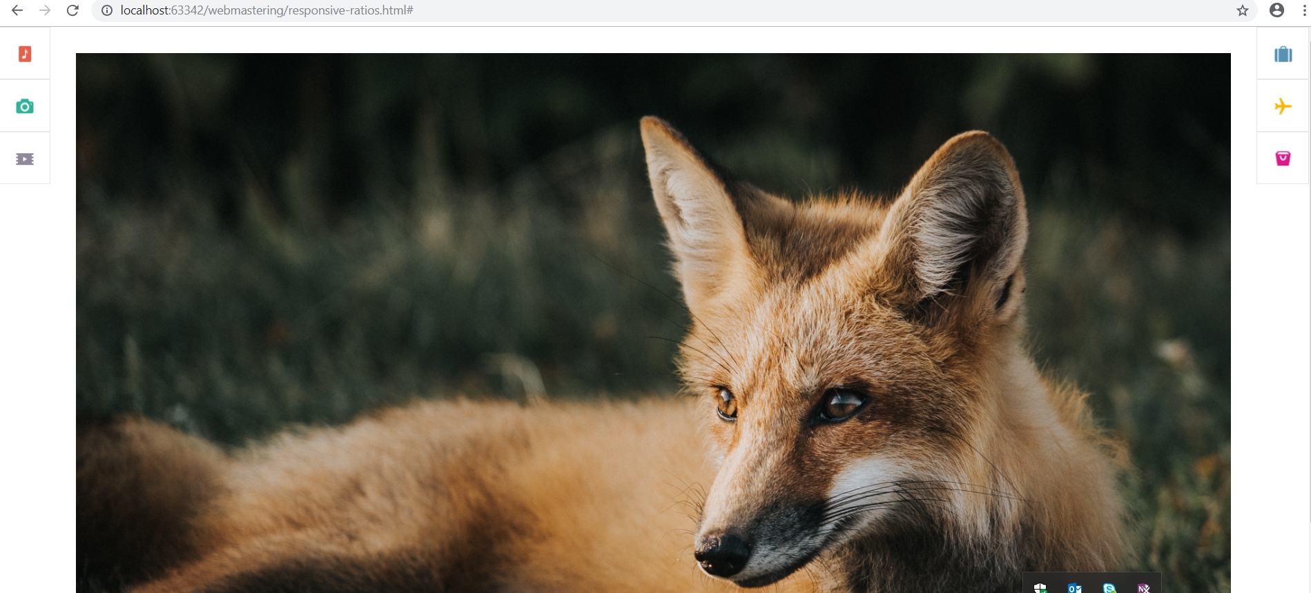
We can present our page with two unordered lists and an image in the middle:
setting the width of lists by 4%:
and pictures 92%:
As a result, the page will look like this:
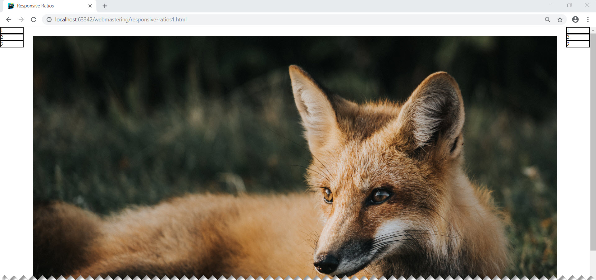
The image and menu will change their size when the window is resized, however, it is
clear that the menu items are not square. This is natural, because all that we have done is to set the width of the menu in percent, leaving the height of the points to be set at the mercy of the rendering algorithm.
You can, of course, set the size of the menu item explicitly in absolute units. They will get the desired square shape, but the layout will lose its adaptive properties. Just specify the height as a percentage:
It is also not a solution, because the width and height of the parent element (and in our case, this body), as a rule, are not the same.
The solution of this problem is based on the partly paradoxical fact that the paddings inside the markup element, if expressed as a percentage, are calculated relative to the width of this element. The paradox is that this statement is true not only in relation to horizontal indents:
, but also vertical indents:
The next thing we need is a pseudo-selector :: after. It will add a zero-height pseudo-element inside our expandable element. If we set padding-top or padding-bottom for this pseudo-element to 100%, then the indent value will be set to the width of the parent (the stretchable element, - li in our case).
As a result, the height of the stretchable element will become equal to its width and the menu items will become square:
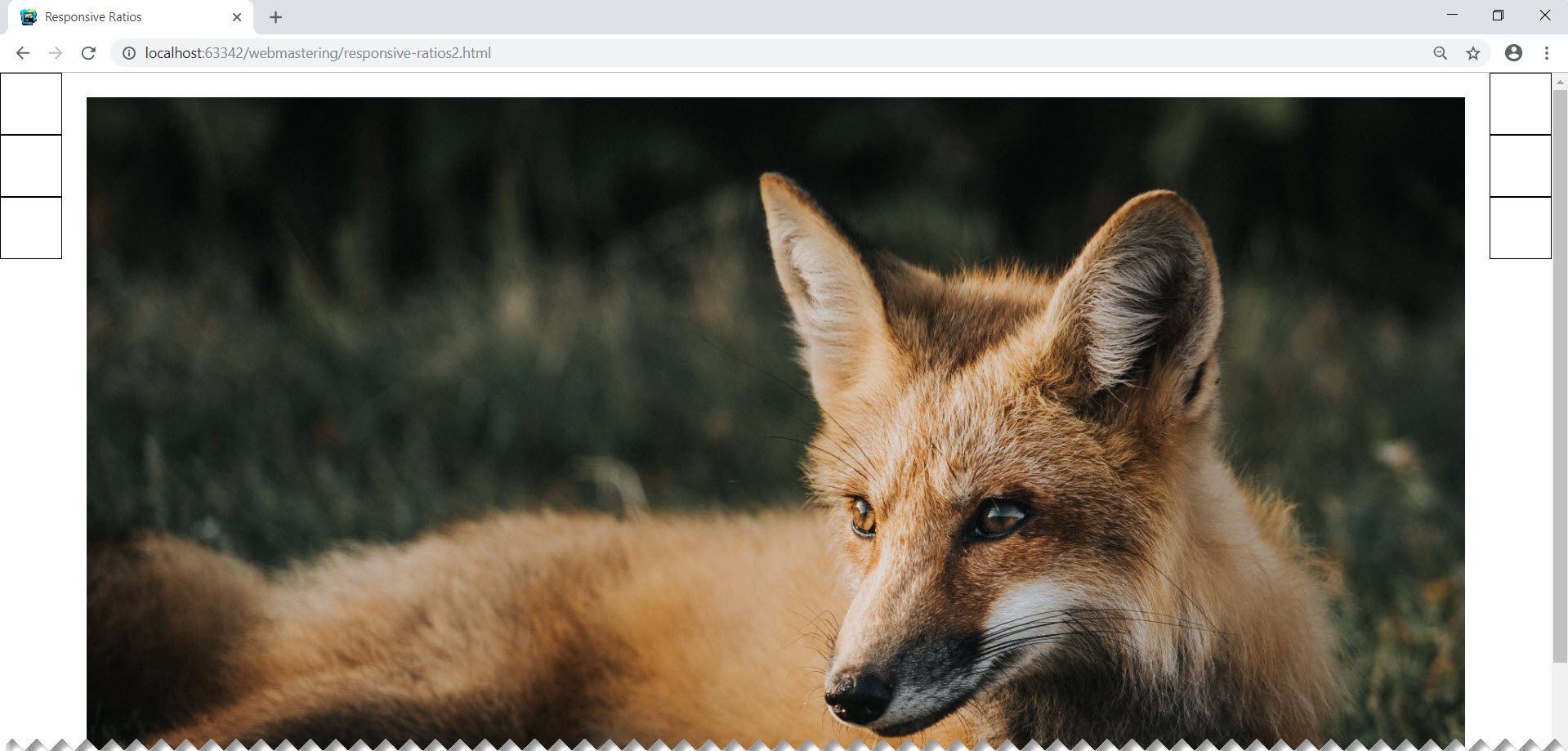
To add content inside the menu item, we use absolute positioning:
As a result, the page will take the desired form:

And most importantly, the menu items will remain square when the window is resized.
as a percentage relative to the size of the container containing them. Thereby, proportional resizing of all elements is achieved when the browser window is resized. If only horizontal dimensions are specified, as, for example, during page layout, when it is important to correctly place the elements horizontally, we can clearly predict what the actual horizontal dimensions of the elements will be. At the same time, however, we probably cannot say anything in advance about their vertical dimensions (of course, if the heights are not explicitly set). This implies the next task - how to keep the proportions of the elements?
A simple example from practice. The page consists of three columns: the left vertical menu, a picture, the right vertical menu.
When resizing the window, the picture should stretch (shrink), remaining in the space between the left and right menu. In turn, the menu items should be represented by square areas, which when resizing the window should remain square:
We can present our page with two unordered lists and an image in the middle:
<ulclass="left-navigation"><li>
            menu 1
        </li><li>
            menu 2
        </li><li>
            menu 3
        </li></ul><divclass="picture"><imgsrc="img/fox.jpg"></div><ulclass="right-navigation"><li>
            menu 1
        </li><li>
            menu 2
        </li><li>
            menu 3
        </li></ul>
setting the width of lists by 4%:
.left-navigation, .right-navigation {
    width: 4%;
    list-style: none;
    float: left;
    padding-left: 0;
    margin: 0;
}
.right-navigation {
    float: right;
}
.left-navigationli, .right-navigationli {
    border: 1px solid black;
    cursor: pointer;
}
and pictures 92%:
.picture {
    box-sizing: border-box;
    padding: 30px;
    width: 92%;
    float: left;
}
.pictureimg {
    width: 100%;
}
As a result, the page will look like this:
The image and menu will change their size when the window is resized, however, it is
clear that the menu items are not square. This is natural, because all that we have done is to set the width of the menu in percent, leaving the height of the points to be set at the mercy of the rendering algorithm.
You can, of course, set the size of the menu item explicitly in absolute units. They will get the desired square shape, but the layout will lose its adaptive properties. Just specify the height as a percentage:
width: 4%;
height: 4%;
It is also not a solution, because the width and height of the parent element (and in our case, this body), as a rule, are not the same.
The solution of this problem is based on the partly paradoxical fact that the paddings inside the markup element, if expressed as a percentage, are calculated relative to the width of this element. The paradox is that this statement is true not only in relation to horizontal indents:
padding-left, padding-right, but also vertical indents:
padding-top, padding-bottomThe next thing we need is a pseudo-selector :: after. It will add a zero-height pseudo-element inside our expandable element. If we set padding-top or padding-bottom for this pseudo-element to 100%, then the indent value will be set to the width of the parent (the stretchable element, - li in our case).
.left-navigationli:after, .right-navigationli:after {
    content: '';
    display: block;
    padding-bottom: 100%;
}
As a result, the height of the stretchable element will become equal to its width and the menu items will become square:
To add content inside the menu item, we use absolute positioning:
.left-navigationlia, .right-navigationlia {
    position: absolute;
    margin-left: 2%;
    margin-top: 2%;
}
.left-navigationliaimg, .right-navigationliaimg{
    transform: translate(-50%, -50%);
}
As a result, the page will take the desired form:
And most importantly, the menu items will remain square when the window is resized.