View statistics on the number of errors in the project, or “Wow, graphs have appeared in PVS-Studio!”
This note will be of interest primarily to project managers and technical managers, whose teams use the PVS-Studio code analyzer . The tool has the ability to track the effectiveness of using a static analyzer in commands. Now you can prove in figures to the boss that the analyzer purchased for several thousand dollars brings real, visible benefits. But this article is not about ROI, do not be alarmed.
So, what is the problem with static analysis tools besides the fact that they are expensive? Not always the team that acquired the tool can boast that errors are corrected with its help. And we are more than anyone interested in the effective use of our tool. We will not be satisfied if the client simply buys a license and puts it on a shelf. After all, more than half of our customers renew their licenses for the next year. Therefore, our task is to show the effectiveness of using our tool for those who decide to renew the license.
Therefore, in PVS-Studio 5.27 it became possible to build graphs of the number of errors detected by the analyzer during project verification. The idea behind this feature is very simple:
- If you want to fix all the errors that PVS-Studio produces, then over time your schedule should come to zero.
- If you are ready to put up with old mistakes, but rule all new ones, then your schedule should not grow much up.
- Otherwise, developers simply do not use PVS-Studio. Unfortunately, both for us (we will not receive a license renewal) and for you (you have wasted your money on the license).
Each time the entire code is checked (Check Solution command), the analyzer saves a small XML file in which the number of messages is recorded in the% AppData% \ Roaming \ PVS-Studio \ Statistics folder. The PVS-Studio menu has the Analysis Statistics command, which opens the statistics display settings dialog. Choose a time interval, select the analyzers that are of interest to us and the importance of messages. Then the “Show in Excel” button opens the Microsoft Excel installed on the machine, in which the desired schedule is built.
It makes no sense to talk about this dialogue for a long time, everything is described in the documentation. Therefore, let's better look at possible situations with examples.
What does the graph look like when, after implementation, all errors (both old and new) are corrected?
Consider the first example. The company bought PVS-Studio, begins to implement it. Let us be interested in the errors of the General Analysis (GA) class, and for starters only the most important and average in importance. At the first start, PVS-Studio displays approximately 1800 messages. First, developers deal with the most obvious false positives. For example, disable them through suppression in macros. Simpler errors, which are easy, correct. Over time, the speed of messaging slows down a bit. That is why the graph is not a straight line, but arched.There are fewer and fewer errors, finally sometime there are 0. Here is a graph describing this mode of the team working on PVS-Studio errors:

Figure 1 - First, minor errors are corrected, then more complicated and the most complex ones remain at the end.
Everything, all analyzer operations are worked out, 0 errors are issued. Is it possible to relax? Not. After all, if you relax and turn off the analyzer further (do not correct new errors, then over time the number of errors will begin to increase. An example of such a graph is shown in Figure 2.
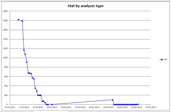
Figure 2 - After all the errors were fixed at first, the developers relaxed and stopped responding to the analyzer messages.
You see, this graph shows an increase in the number of messages? This is due to the fact that, having brought the number of hits to zero, the developers stopped correcting errors in the new code. Fortunately, the project manager caught himself in time and noticed that BKI is not right. So after talking with the team in the project was again 0 errors. And so many and maintained on a daily basis.
An example of an incorrect conclusion about the results of a team based on a graph
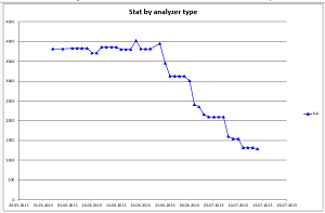
Okay, what about the graph in Figure 3?
Figure 3 - Example of a graph with a double interpretation.
At first glance, we can say that the team spilled over, nothing rules, and its number of errors is growing. And quite strongly - from 2700 to 3700 per period. But this conclusion can be made by a person who is not at all familiar with the project. If you know what people are doing, it becomes clear. A large amount of new code was added to the project (new project files were connected to the general solution .sln). And there is nothing wrong with such a schedule. After all, the number of projects will stabilize further, errors will not grow much, if the team starts to edit them on time.
This graph is given as an example of the fact that it is impossible to “interpret” statistics data, you also need to understand what the team is doing at one time or another.
Where do the steps come from?
Often the correct view of the graph with uniform operation resembles steps as in Figure 4.
Figure 4 - Step graph.
Such a step-by-step schedule is the most correct, because it means the uniform work of the error correction team. Guess where the steps come from when the number of errors does not decrease? Of course this is a weekend.
What is the graph of “only new” errors?
Well, before that there were examples when the team worked on fixing all the errors that the code analyzer gives out. But the essence of the “ mass error suppression ” function is to say: “Okay, we know that we have many PVS-Studio messages to the old code. But now we want to close our eyes to him and correct errors only in the new code. ” What will the error chart look like in this case? Figure 5 answers this question.
Figure 5 - Graph of the number of errors for only the new code.
Although at first glance the graph looks chaotic, this is exactly what a normal workflow using a code analyzer should look like. What is meant? Pay attention to the scale along the Y axis. The maximum value here is 8 - this is the maximum how many errors (analyzer operations) were added in one day. Say it's a lot? But if we are talking about a team of 50 developers and 9 million lines of code, then you must agree that this is a very good result. But more importantly, these are corrected the next day.
What is the right scenario for using PVS-Studio so that the “schedule is perfect”?
So, we understood what the “wrong” graphs look like and how the “correct” ones look. But how should the development process be built so that the PVS-Studio error graphs are “correct”? What should a project manager or technical manager organize?Here are the steps that will lead to the most effective result:
- Set up daily code verification using PVS-Studio on the build server. This will help you control the error correction process and accumulate a history that is then easy to visualize.
- Install PVS-Studio for all developers and enable incremental analysis mode . In this mode, PVS-Studio monitors what files the developer corrects on his machine. And after their successful compilation, it automatically checks. If errors are found, they will of course be shown. The advantage of this mode is that the developer does not need to explicitly run the analyzer. And seeing the message from him, he can immediately correct the code. In this case, the erroneous code does not even get into the version control system.
- If, nevertheless, the erroneous code falls into the version control system, then it will be detected during the night check. It is very important that developers see a report on the results of an overnight launch in the morning. Then they can fix the mistakes. PVS-Studio automatically generates a report file with the errors found in the .html format, which can be sent to interested parties.