Chasing yourself, or a great way to start your day
- Transfer
Translation of Mariusz Jankowski's post " A Rat Race, or a Great Way to Start the Day ".
The code in the article can be downloaded here . Many
thanks to Kirill Guzenko KirillGuzenko for help with the translation.
Not so long ago, when winter was raging, clearing the entrance to the house from snow blockages, I decided to recall the good weather by examining my cycling route to work using Wolfram Language .
Last year, I decided to engage in such a very common activity as recording my activity data. I noted that over the past few years, my trips have become faster and easier for me as the season draws to a close, so it became interesting for me to make sure that there are such improvements in my physical condition. Using only a smartphone and the corresponding application, I recorded 27 trips between home and work, and then used Wolfram Language to read, analyze and visualize the results.
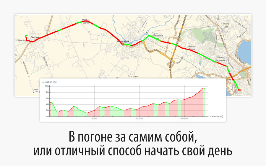
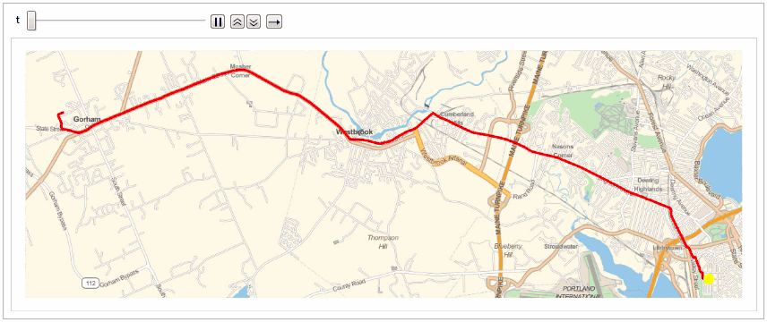
Here is a Google Earth image showing my morning bike route, having a little less than 18 km, running from east to west.

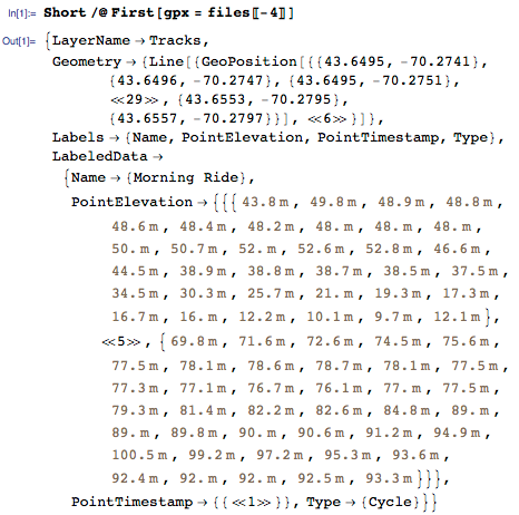
To transfer data from a smartphone, I used GPX (GPS Exchange Format) - a file format supported by major manufacturers of GPS devices and available in most applications. A regular GPX file includes location and elevation data with time stamps, and Wolfram Language returns this data in the form of a list of rules with the spelling names Geometry , PointElevation and PointTimestamp .
Here's a snippet from one of the GPX files:
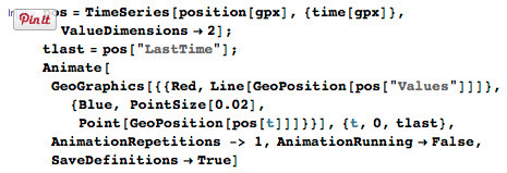
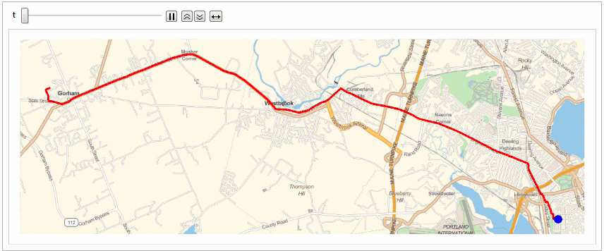
Using the new geolocation features in Wolfram Language and the available time and position data, I was able to quickly and easily create a day trip animation (more details are available in the Initialization section of the included CDF).
A little more effort, and here’s something interesting: I combined all the morning trips of the season in one animated race - these are the “rat races” for work! The season leader is shown in yellow, of course!
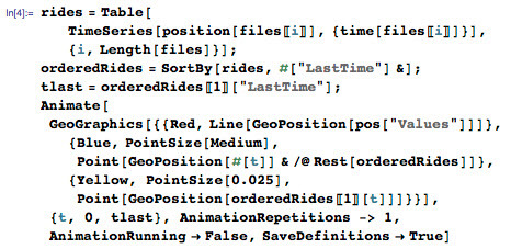
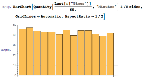
Here are the results of this “race”:
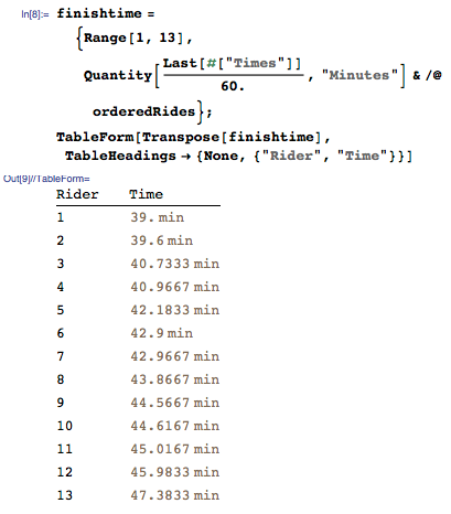
Now consider trips in chronological order. It turns out that my assumption about improving the trip time closer to the end of the season and as the mileage traveled increased was correct.
And let the previous calculations and visualizations are good enough, but we can do something more. GPX files contain altitude data with reference to time, but not only this will make it easy to visualize the general profile of the road, but also something else: detecting areas of ascent and descent by means of new functionality from the scope of signal processing - detecting peaks.
Let's start with the standard road profile:

To determine the ups and downs, I smoothed the data on the ups in order to record only the largest local maximums and minimums in the signal. To do this, I first built a linear interpolation of the entire function to get rid of too unstable intervals in the recorded data, and then smoothed it out using the GaussianFilter .
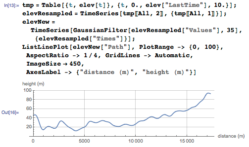
The smoothing operation removes “spurious" peaks and slopes in the elevation data. I determined the remaining large peaks using FindPeaks and divided the route into ascending and descending sections.
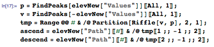
We visualize the sections of the ascents and descents of the morning trip on the height graph:
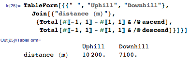
But a slightly more useful visualization is the sections of the ascents and descents of the route on the map: The
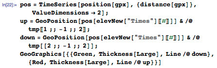
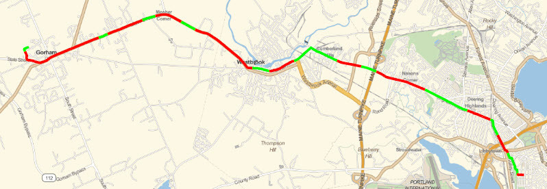
approximate distances of the sections of ascents and descents are available from the lists of ascents and descents calculated earlier. The following result confirms the simple truth that going to work is always harder (i.e., uphill), and therefore less pleasant than coming back from it.
I already look forward to the next season and all sorts of interesting facts in the analysis of my data using Wolfram Language.