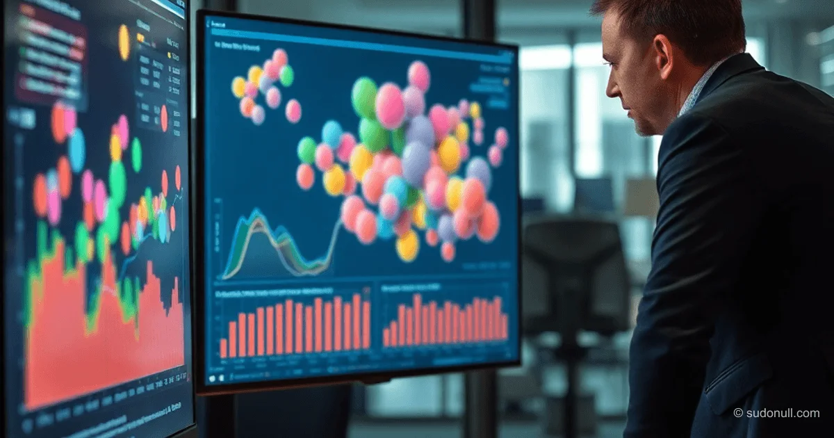
Enhancing Bubble Charts: Tackling Overlap, Color, and Time Dynamics
In dense datasets with 15–20 regions, bubbles in bubble charts overlap, labels clash, and visualization effectiveness drops. We're circling back to the warehouse inventory table from part one, where coordinates represent regions, size shows stock levels, color indicates redemption rates, and zones reflect CTR.
Three approaches to fix overlap:
- Transparency (opacity): Semi-transparent bubbles reveal overlaps. Larger ones don't completely hide smaller ones. Great for moderate density, but heavy data turns it into a blurry mess.
- Zoom-to-detail: Click an area to zoom in on clusters while keeping precise coordinates. Requires zooming out for the big picture.
- Clustering: Nearby points merge into a single bubble that expands on click. Keeps charts clean with big data but adds an interaction step.
Best combo: Baseline transparency to show density + zoom for close-ups. Use clustering in dashboards for that first clean view.
Color Coding as an Extra Dimension
Color turns a static chart into a powerhouse analytic tool. Add product categories: now you spot distribution by item types across regions and uncover imbalances.
Color filtering: Click a category to dim the rest. The chart shifts from overview to targeted analysis—like hunting electronics slumps or clothing shortages.
Rules for color schemes:
- Stick to 5–7 categories—eye's limit for distinction.
- Use proven palettes like ColorBrewer.
- Neutral background to keep focus sharp.
Color is a full dimension, not just decoration. Get it wrong, and you wreck the whole perception.
Adding Dynamics: Timelines and Trajectories
A static snapshot answers 'what now,' but animation reveals 'how we got here.' A timeline slider moves bubbles month by month: spot seasonal dips in Siberia, Moscow's steady performance, Ural spikes.
Trails: Trajectories show change direction—improvement or decline in regions.
Two modes:
- Full animation for anomaly hunting.
- Pause + color for deep-dive cause analysis.
This loop speeds up analysis way faster than spreadsheets.
Key Improvements and Best Practices
Solution summary:
| Issue | Solution |
|-------|----------|
| Overlap | Transparency + zoom + clustering |
| Color limits | Category coding + filters |
| Static view | Timeline + animation + trails |
| Perception complexity | Interactivity |
Bubble charts evolve into dashboard workhorses for meetings and presentations. Interactivity lowers the entry barrier.
Key takeaways:
- Pair transparency and zoom for baseline overlap control.
- Cap colors at 5–7 categories with filtering for precision.
- Timelines with trails unlock time-based change dynamics.
- Interactivity turns visuals into decision-making tools.
- Test on real data: 15+ regions demand clustering.
Next up: Visuals that answer user questions, becoming full-fledged interfaces.
— Editorial Team










No comments yet.