Cognitive Biases in UX Design: 5 Key Pitfalls for Interfaces
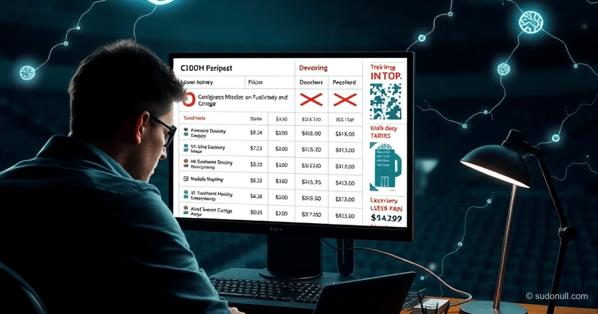
The anchoring effect, described by Tversky and Kahneman, causes the brain to fixate on initial information—price, plan, or feature. Subsequent evaluations are adjusted relative to this anchor, often ignoring objective data.
UX manifestations:
- Strikethrough prices set an anchor for 'normal' cost, amplifying perceived discounts.
- Monthly equivalents of annual subscriptions (e.g., ₽3490/year as ₽291/month) shift focus from total cost.
- 'Popular plan' or 'limited-time offer' labels trigger impulsive purchases with high churn.
Counter-strategies:
- Be transparent about anchors: specify duration, terms, and source of the 'original' price.
- Align visual weight of final totals across time periods for fair comparison.
- Add context: clear inclusions/exclusions, usage scenario recommendations.
This reduces manipulation, builds trust, and minimizes post-purchase regret.
Cognitive Overload: The Limits of Working Memory
Sweller’s cognitive load theory highlights the limited capacity of working memory—about 4±1 items. Interfaces overloaded with options cause errors, frustration, and abandonment.
Common issues:
- Forms with too many fields, no step-by-step progression.
- Dashboards with dozens of metrics lacking hierarchy.
- Campaign settings with interdependent parameters on a single screen.
Solutions to reduce load:
- Use progressive disclosure: show core options first, details on demand.
- Implement defaults and templates to minimize initial decisions.
- Add real-time validation, tooltips, and input examples.
In government services or admin panels, this prevents incomplete forms and 'burned' budgets.
Illusion of Control: Anxiety from Uncertainty
Ellen Langer’s research shows users crave a sense of control—even if illusory. Lack of feedback fuels anxiety.
Harms UX like this:
- Spinners without progress indicators after a click.
- Tracking with discrete statuses and no explanation for delays.
- Live courier maps that trigger compulsive refreshes.
Corrective tactics:
- Show ETA ranges with probabilities, not fixed times.
- Break processes into phases instead of linear progress bars.
- Offer real controls: pause, cancel, redirect.
This builds trust and reduces complaints.
Decision Fatigue: Paralysis by Choice
Ariely and Lepper’s studies reveal how too many options can paralyze decision-making. More alternatives mean higher abandonment.
Examples in products:
- Hundreds of plans with no filters.
- Catalogs with thousands of SKUs lacking personalization.
- Multi-level settings with no curated paths.
Optimization methods:
- Limit visible choices to 3–5 options, with top recommendations.
- Use wizards for sequential decision-making.
- Include a 'quick start' with smart defaults.
Availability Heuristic: What You See Is What Matters
Users overestimate the frequency or importance of visible elements (Tversky’s availability bias).
UX risks:
- Dominant CTAs obscure alternative actions.
- Top positions in lists are assumed to be best.
Fixes:
- Balance visual prominence across options.
- Add metrics (ratings, reviews) for objectivity.
- Run A/B tests under equal conditions.
What Matters Most
- Anchors manipulate pricing: transparency and context are essential for retention.
- Overload kills conversion: progressive disclosure + defaults solve the problem.
- Illusion of control builds trust: honest feedback reduces anxiety and churn.
- Choice fatigue paralyzes: curating options boosts completion rates.
- Availability distorts priorities: balance and data correct perception.
Accounting for these biases improves usability by 20–30% in retention and satisfaction metrics.
— Editorial Team










No comments yet.