 March 2, 2015 at 19:12
The magic of one div. Masterclass from the creator of a.singlediv.com
- Transfer
Why Single Div?
In May 2013, I attended CSSConf and heard Leah Veru talking about taming the border-radius property. It was instructive and allowed me to understand something about CSS that I did not understand before. It reminded me of the times when I studied fine arts, when I was constantly striving to improve my professional level. My CSS level can be called average, so I challenged myself to find out everything I can by researching and experimenting with properties.
But why just one DIV?
When I learned to draw, my class did an exercise in which we got colors by mixing the three main ones: red, yellow, and blue. The goal of this lesson was to study the behavior of materials and understand the strength of the combination. Of course, you can buy green paint, but you can also get it by mixing blue and yellow. The greater number of available solutions to the problem makes us reconsider our usual solutions.
I decided to launch the a.singlediv.com project , where I intended to post something new every few days created using CSS. I set a restriction on using only one DIV.
Tools
It might seem that using only one element and properties supported by browsers is too limited a tool. But this is not so, if you do not limit yourself to their basic purpose.
Pseudo-Elements
One DIV in HTML allows you to work with three elements through the use of pseudo-elements. Thus, with div, div: before, and div: after, we can get something like this:

For simplicity, you can think of these elements as three layers. It looks something like this:

Forms
Using CSS and one element, we got three main forms. We can use the width and height properties to create squares / rectangles, as well as border-radius to create circles / ellipses, and border to create triangles / trapezoids.

There are other forms that we can create with CSS, but most things can be simplified to some combination of basic forms. In this form, complex forms are much easier to manage.
Multiplicity of form
With several box-shadows, we can create many versions of the same form, in one or another size, color, or use blur. Using the x and y axes gives us almost infinite variations.

We can use box-shadows for box-shadows. Pay attention to the order of the announcement. Here, the image of the layers is also appropriate.
Gradients
Gradients can be used to add shading and depth, implying a light source. This makes simple, flat shapes more realistic. The background-images property allows you to use several types of gradient to get a more complex element.

Visualization
The most difficult part is the visualization of how to assemble all these parts into a single whole, into a recognizable pattern. This part of the process is critical. To help myself with this, I often look at the photo of the subject, and mentally divide it into components, all shapes and all colors. I am breaking the big picture into smaller shapes or color blocks that I can create using CSS.
Example
Let's take a closer look at the two figures and highlight some of the parts that make up large objects.
First, take a green pencil:
A pencil consists of two main shapes: a rectangular body and a triangular tip.

I had to implement the following things in order to achieve realism: a
multi-colored wrapper;
graphics and words on the wrapper;
the illusion of roundness;
glossiness that emphasizes shape and simulates the influence of a light source.
So, first I created the main body of the pencil:

Please note I am using a mix of black (a) and white (a) instead of RGBA
Then I added a linear gradient at both ends to create a wrapper. It has an alpha value of 0.6, so the bottom fill shows up a bit.

Next, I used the same gradient technique to create stripes on the pencil.

And for applying an ellipse, the radial gradient works great!

I split the code to demonstrate each element, but keep in mind: the image will actually look like this:
So after completing the div, I used the before pseudo-element to create a three-way tip. Using the solid and transparent properties, I created a triangle and placed it next to the div

It looks a little flat, but it will be fixed with the after pseudo-element. In doing so, I added a linear gradient to create a gloss effect that covers the entire width of the pencil.

As a final touch, I added text with after, and placed it on the pencil:

Another example (camera) :
Here is the camera body created using background-image and border-image.
Here is a GIF illustrating some elements that will be added using pseudo-elements and box-shadows.
Next stage:

A bit complicated, but as you can see, several box-shadows can add a lot of detail to a single element.
Serious Challenges The
two biggest hurdles that I have encountered are the limitations of creating a triangle and the behavior of gradients.
The problem with triangles.
The technique of creating triangles limits the possible actions. Adding a gradient using border-image affects all the borders of the object, not one specific side. Box-shadows apply to the shape of the block, not to its borders. All this makes it difficult to create multiple triangles with a single object. Here is an example of what it looks like:

Gradient
layering. Gradient tends to fill the whole element. This is solved by applying several gradients to each other. It will take a little time to think about transparency and the Z-index, as well as to understand what exactly will be visible and what will not. But the effective use of this technique will give your drawings a high level of detail.
Here's a drawing in the making, showing gradients that span the entire width of the container.

Using gradients from left to right and right to left, I can hide part of the gradient:
As a result, an illusion is created that the object is made of many elements.
Theory in action The
great thing that has been a byproduct of this project is the Chrome extension called CSS Gradient Inspector. It allows you to turn on and off the display of each of the gradients, similar to the visibility of layers in Photoshop.
In May 2013, I attended CSSConf and heard Leah Veru talking about taming the border-radius property. It was instructive and allowed me to understand something about CSS that I did not understand before. It reminded me of the times when I studied fine arts, when I was constantly striving to improve my professional level. My CSS level can be called average, so I challenged myself to find out everything I can by researching and experimenting with properties.
But why just one DIV?
When I learned to draw, my class did an exercise in which we got colors by mixing the three main ones: red, yellow, and blue. The goal of this lesson was to study the behavior of materials and understand the strength of the combination. Of course, you can buy green paint, but you can also get it by mixing blue and yellow. The greater number of available solutions to the problem makes us reconsider our usual solutions.
I decided to launch the a.singlediv.com project , where I intended to post something new every few days created using CSS. I set a restriction on using only one DIV.
Tools
It might seem that using only one element and properties supported by browsers is too limited a tool. But this is not so, if you do not limit yourself to their basic purpose.
Pseudo-Elements
One DIV in HTML allows you to work with three elements through the use of pseudo-elements. Thus, with div, div: before, and div: after, we can get something like this:
  div { background: red; }
  div:before { background: yellow; }
  div:after { background: blue; }
For simplicity, you can think of these elements as three layers. It looks something like this:
Forms
Using CSS and one element, we got three main forms. We can use the width and height properties to create squares / rectangles, as well as border-radius to create circles / ellipses, and border to create triangles / trapezoids.
There are other forms that we can create with CSS, but most things can be simplified to some combination of basic forms. In this form, complex forms are much easier to manage.
Multiplicity of form
With several box-shadows, we can create many versions of the same form, in one or another size, color, or use blur. Using the x and y axes gives us almost infinite variations.
div {
    box-shadow: 170px 0 10px yellow,
                330px 0 0 -20px blue,
                330px 5px 5px -20px black;
}
We can use box-shadows for box-shadows. Pay attention to the order of the announcement. Here, the image of the layers is also appropriate.
Gradients
Gradients can be used to add shading and depth, implying a light source. This makes simple, flat shapes more realistic. The background-images property allows you to use several types of gradient to get a more complex element.
div {
    background-image : linear-gradient (to right,  gray,  white,  gray,  black),
}
div :after {
    background-image : radial-gradient (circle,  yellow  50%,  transparent  50%),
                      linear-gradient (to right,  blue,  red),
}
Visualization
The most difficult part is the visualization of how to assemble all these parts into a single whole, into a recognizable pattern. This part of the process is critical. To help myself with this, I often look at the photo of the subject, and mentally divide it into components, all shapes and all colors. I am breaking the big picture into smaller shapes or color blocks that I can create using CSS.
Example
Let's take a closer look at the two figures and highlight some of the parts that make up large objects.
First, take a green pencil:
A pencil consists of two main shapes: a rectangular body and a triangular tip.
I had to implement the following things in order to achieve realism: a
multi-colored wrapper;
graphics and words on the wrapper;
the illusion of roundness;
glossiness that emphasizes shape and simulates the influence of a light source.
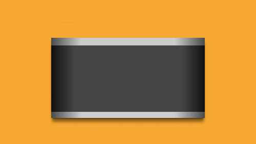
So, first I created the main body of the pencil:
Please note I am using a mix of black (a) and white (a) instead of RGBA
div {
    background :  #237449,
    background-image : linear-gradient (to bottom,
                                  transparent  62%,
                                  black (.3)  100%),
    box-shadow :  2px  2px  3px  black (.3),
}
Then I added a linear gradient at both ends to create a wrapper. It has an alpha value of 0.6, so the bottom fill shows up a bit.
div {
    background-image : linear-gradient (to right,
                                  transparent  12px,
                                  rgba (41, 237, 133, .6)  12px,
                                  rgba (41, 237, 133, .6)  235px,
                                  transparent  235px),
}
Next, I used the same gradient technique to create stripes on the pencil.
div {
    background-image : linear-gradient (to right,
                                  transparent  25px,
                                  black (.6)  25px,
                                  black (.6)  30px,
                                  transparent  30px,
                                  transparent  35px,
                                  black (.6)  35px,
                                  black (.6)  40px,
                                  transparent  40px,
                                  transparent  210px,
                                  black (.6)  210px,
                                  black (.6)  215px,
                                  transparent  215px,
                                  transparent  220px,
                                  black (.6)  220px,
                                  black (.6)  225px,
                                  transparent  225px),
}
And for applying an ellipse, the radial gradient works great!
div {
    background-image: radial-gradient(ellipse at top,
                                  black(.6) 50px,
                                  transparent 54px);
}
I split the code to demonstrate each element, but keep in mind: the image will actually look like this:
div {
                      // эллипс
    background-image: radial-gradient(ellipse at top,
                                  black(.6) 50px,
                                  transparent 54px),
                      // полосы
                      linear-gradient(to right,
                                  transparent 25px,
                                  black(.6) 25px,
                                  black(.6) 30px,
                                  transparent 30px,
                                  transparent 35px,
                                  black(.6) 35px,
                                  black(.6) 40px,
                                  transparent 40px,
                                  transparent 210px,
                                  black(.6) 210px,
                                  black(.6) 215px,
                                  transparent 215px,
                                  transparent 220px,
                                  black(.6) 220px,
                                  black(.6) 225px,
                                  transparent 225px),
                      // обертка
                      linear-gradient(to right,
                                  transparent 12px,
                                  rgba(41,237,133,.6) 12px,
                                  rgba(41,237,133,.6) 235px,
                                  transparent 235px),
                      // оттенение
                      linear-gradient(to bottom,
                                  transparent 62%,
                                  black(.3) 100%)
}
So after completing the div, I used the before pseudo-element to create a three-way tip. Using the solid and transparent properties, I created a triangle and placed it next to the div
div :before {
    height :  10px,
    border-right :  48px  solid  #237449,
    border-bottom :  13px  solid  transparent,
    border-top :  13px  solid  transparent,
}
It looks a little flat, but it will be fixed with the after pseudo-element. In doing so, I added a linear gradient to create a gloss effect that covers the entire width of the pencil.
div :after {
    background-image : linear-gradient (to bottom,
                                    white (0)  12px,
                                    white (.2)  17px,
                                    white (.2)  19px,
                                    white (0)  24px),
}
As a final touch, I added text with after, and placed it on the pencil:
div :after {
    content :  'green',
    font-family : Arial,  sans-serif,
    font-size :  12px,
    font-weight :  bold,
    color :  black (.3),
    text-align :  right,
    padding-right :  47px,
    padding-top :  17px,
}
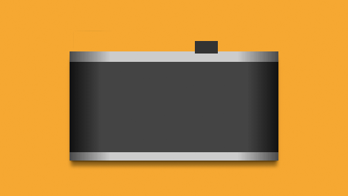
Another example (camera) :
Here is the camera body created using background-image and border-image.
Here is a GIF illustrating some elements that will be added using pseudo-elements and box-shadows.
div :before {
    background :  #333,
    box-shadow :  0  0  0  2px  #eee,
                -1px  -1px  1px  3px  #333,
                -95px  6px  0  0  #ccc,
                30px  3px  0  12px  #ccc,
                -18px  37px  0  46px  #ccc,
                -96px  -6px  0  -6px  #555,
                -96px  -9px  0  -6px  #ddd,
                -155px  -10px  1px  3px  #888,
                -165px  -10px  1px  3px  #999,
                -170px  -10px  1px  3px  #666,
                -162px  -8px  0  5px  #555,
                85px  -4px  1px  -3px  #ccc,
                79px  -4px  1px  -3px  #888,
                82px  1px  0  -4px  #555,
}
Next stage:
div :after {
    background : linear-gradient (45deg,  #ccc  40%,  #ddd  100%),
    border-radius :  50%,
    box-shadow :  0  3px  2px  #999,
                1px  -2px  0  white,
                -1px  -3px  2px  #555,
                0  0  0  15px  #c2c2c2,
                0  -2px  0  15px  white,
                -2px  -5px  1px  17px  #666,
                0  10px  10px  15px  black (.3),
                -90px  -51px  1px  -43px  #aaa,
                -90px  -50px  1px  -40px  #888,
                -90px  -51px  0  -34px  #ccc,
                -90px  -50px  0  -30px  #aaa,
                -90px  -48px  1px  -28px  black (.2),
                -124px  -73px  1px  -48px  #eee,
                -125px  -72px  0  -46px  #666,
                -85px  -73px  1px  -48px  #eee,
                -86px  -72px  0  -46px  #666,
                42px  -82px  1px  -48px  #eee,
                41px  -81px  0  -46px  #777,
                67px  -73px  1px  -48px  #eee,
                66px  -72px  0  -46px  #666,
                -46px  -86px  1px  -45px  #444,
                -44px  -87px  0  -38px  #333,
                -44px  -86px  0  -37px  #ccc,
                -44px  -85px  0  -34px  #999,
                14px  -89px  1px  -48px  #eee,
                12px  -84px  1px  -48px  #999,
                23px  -85px  0  -47px  #444,
                23px  -87px  0  -46px  #888,
}
A bit complicated, but as you can see, several box-shadows can add a lot of detail to a single element.
Serious Challenges The
two biggest hurdles that I have encountered are the limitations of creating a triangle and the behavior of gradients.
The problem with triangles.
The technique of creating triangles limits the possible actions. Adding a gradient using border-image affects all the borders of the object, not one specific side. Box-shadows apply to the shape of the block, not to its borders. All this makes it difficult to create multiple triangles with a single object. Here is an example of what it looks like:
 div {
    border-left :  80px  solid  transparent,
    border-right :  80px  solid  transparent,
    border-bottom :  80px  solid  red,
}
div :before {
    border-left :  80px  solid  transparent,
    border-right :  80px  solid  transparent,
    border-bottom :  80px  solid  red,
    border-image : linear-gradient (to right,  red,  blue),
}
div :after {
    border-left :  80px  solid  transparent,
    border-right :  80px  solid  transparent,
    border-bottom :  80px  solid  red,
    box-shadow :  5px  5px  5px  gray,
}
Gradient
layering. Gradient tends to fill the whole element. This is solved by applying several gradients to each other. It will take a little time to think about transparency and the Z-index, as well as to understand what exactly will be visible and what will not. But the effective use of this technique will give your drawings a high level of detail.
Here's a drawing in the making, showing gradients that span the entire width of the container.
Using gradients from left to right and right to left, I can hide part of the gradient:
As a result, an illusion is created that the object is made of many elements.
Theory in action The
great thing that has been a byproduct of this project is the Chrome extension called CSS Gradient Inspector. It allows you to turn on and off the display of each of the gradients, similar to the visibility of layers in Photoshop.
Useful Paysto solutions for Habr readers:
→ Get paid by credit card right now. Without a site, IP and LLC.
→ Accept payment from companies online. Without a site, IP and LLC.
→ Accepting payments from companies for your site. With document management and exchange of originals.
→ Automation of sales and servicing transactions with legal entities. Without an intermediary in the calculations.
→ Accept payment from companies online. Without a site, IP and LLC.
→ Accepting payments from companies for your site. With document management and exchange of originals.
→ Automation of sales and servicing transactions with legal entities. Without an intermediary in the calculations.