11 basic principles of effective landing
So, you launched an advertising campaign, and the traffic went to landing pages. In order to convert visitors into buyers / subscribers, etc. (depending on the goals), your task is to create the visitor all the conditions for the desired action. Before you look for secrets and tricks that will increase the conversion, it’s worth going through the basic principles.
The basic elements of a landing page can be conditionally grouped as “design” and “copywriting” components. Design is the heart, it will generate emotions, direct attention and attract to the most important thing - to the call to action. Copywriting is a brain, a textual presentation of arguments and facts, a description of a proposal that will either incite the visitor to perform a certain action, or make you close the page and reject your valuable proposal forever. Where to start?

1. Send the user to a relevant, targeted page
What type of advertising messages do you attract a user?
Both SEO-traffic and contextual, banner advertising have a common goal - to bring targeted traffic to a specific page. Use a simple formula: one goal - one message - one action - one page.
Have you already segmented your visitors and have several segments? Then plot a separate route for each type of audience on a specific landing page. Let the advertising message correspond to the type of audience and the expected action from the visitor. When setting goals in analytics, the rule also applies: one goal - one landing page.
2. No surprises.
Hot evening, vacation, Thailand. You meet a beautiful lady, stroll into your room. And suddenly, it turns out that she ... it's not her at all. Fright, disappointment, frustration ... Deceived expectations are not welcome anywhere.
Provide the user with uniformity: visual, textual. By the time a person clicks on your banner or link, you have already formed a certain expectation in him. Justify it.
In the design of both a banner and a landing page, start from a brand or a specific offer / product. Corporate colors and fonts in advertising and on landing pages will help to connect them together in the user's head.
In the case of contextual advertising, the uniformity of the user experience that you create will be expressed in a high or low indicator of the quality of keywords (Quality Score). The higher it is, the more advertising messages and keywords correspond to the content of the page from the point of view of the search engine.
When creating advertising campaigns, selecting keywords and linking landing pages to them, segment. Segment the types of customers and the sources from which you lead them to specific pages.
3. Focus on the headline and subheadings.
Imagine yourself walking past a newsstand. You pause for a split second to view large headlines. If any of them attracts your attention, you will stop for a few seconds to read. And if it turns out to be interesting enough, you even buy this edition, right?
Make the title clear, visible, and relevant, as it is the most important text element on the page, along with a call to action. Only a fifth of visitors who read the headline will read something else on the page.
In terms of content, most often three types of headings are used on landing pages:
- A manual demonstrating a positive effect, an advantage
- An appeal appealing to fear of loss (or loss of profit)
- Question
In practice, the most powerful is the demonstration of benefits, and the worst is the question . An appeal to negative consequences works well if you offer a solution to a very specific problem that bothers the user. Creativity is generally better left to other activities. Creative headlines are usually converted much worse than simple ones.
9 signs of a good headline:
- names advantages, not characteristics
- simple, understandable, focused
- uses public opinion and reviews
- promises to receive benefits on a specific date
- a plausible and feasible result
- presents potential relief and convenience to the user
- appeals to an “authoritative opinion”
- creates a feeling of limited goods, time, etc.
- Contains keywords, optimized for search engines
4. Get rid of unnecessary
First, landing page does not need navigation. Secondly, as few external links as possible. When designing your landing page, it’s important to consider both the goals of the business and the customer. They may intersect. If any of the elements does not serve any of them, perhaps it is better to remove it.
Remember that you have already paid for the visitor to appear on this page? Focus it on important information and action. If the visitor is really interested in additional information about your company or location on the map, he may visit your site another time. Do not put links leading away from the action.
5. Less text?
The world has captured the tendency to reduce the length of text everywhere. Journalists refuse long materials, sites split text content as they can, advise to reduce landing page too. Allegedly, the visitor is a nerd, is not ready to process more than 500 characters, and generally reads with difficulty, so you need to reduce it so that it is like on Twitter ... The argument is convincing, but.
There is an unwritten rule - the closer to the purchase, the longer the text. If you need subscribers, contacts, then a short text will be enough. If the goal of the conversion is to buy, which is also not the cheapest one (and we are not talking about essentials like the iPhone 6+), then it’s better to think about a longer and more convincing text. To disclose the value of the proposal, you need time, which in this case is equivalent to the length of the landing.
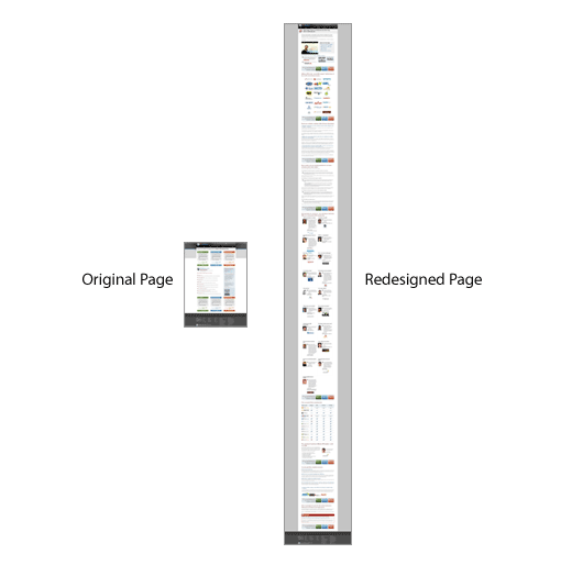
An example of how “6 times longer, 52% more efficient” from Rand Fishkin
6. The fold - scroll, scroll
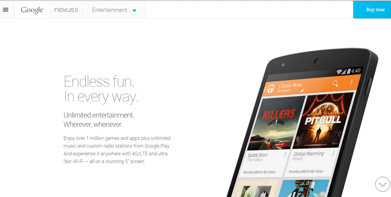
And vice versa, do not create unreasonable difficulties for the user in finding information about your business. Report on what you are doing on the first screen (until you need to scroll), if possible.
Contrary to the popularity of footcloths - infinitely long landing pages of 5-8 screens - the study of heatmaps shows that much more attention is focused on the first screen.
Convincing text content, interest in a product or service, emotional involvement will make the visitor scroll down and find the treasured button in the depth of several screens. But ... On long landing pages, it is better to leave the CTA (Call to action) button fixed or repeating on each screen. It is not always possible to predict at what point the visitor is “ready”. Therefore, the call to action must be in sight.
A few words about perception
Climbing a visitor directly into the brain, we find there standard processes. General rules for the perception of web content and IT tracking say that the page is scanned using the F-pattern / grid model. The flow of important information should be located on the left, since there most of the attention is concentrated. The F-grid means that the user first looks at the top row, then moves down the left side of the screen, making a second horizontal movement in the middle, slightly shorter than the first.

Eye tracking center, Institute for Software ergonomics and usability AG
On e-commerce sites, the second horizontal glide is slightly lower than usual due to product image scanning. Users also linger for a considerable time in the upper right part of the page where the price and the “add to cart” button are placed.
Data from nngroup.com research on IT tracking suggests that attention is distributed as follows:
- The left side of the screen is 69% of user time
- The right side of the screen is 30% of user time
As for scrolling, key points should certainly be brought to the first screen , since the time that the user spends on viewing is distributed as follows:
- Before scrolling 80.3%
- Below scrolling 19.7%
7. Consistency and emotionality
All elements of design and text should correspond to the values of your brand.
Logo is the face of your landing page.
The visitor should at least remember him at the next meeting.
Tastefully decorated and placed logo is an integral attribute of absolutely any landing page. The logo should convey the spirit of your brand and its personality - both to old and new customers. The logo, in itself, is able to reveal the essence of the company’s business ... Well, or kill everything ...

Usually the logo is located at the top of the page, this is another cliche, tested by experience. If everyone knows your brand, even children, then what are you doing here, then branding can not be abused. In general, use marketing wisely!
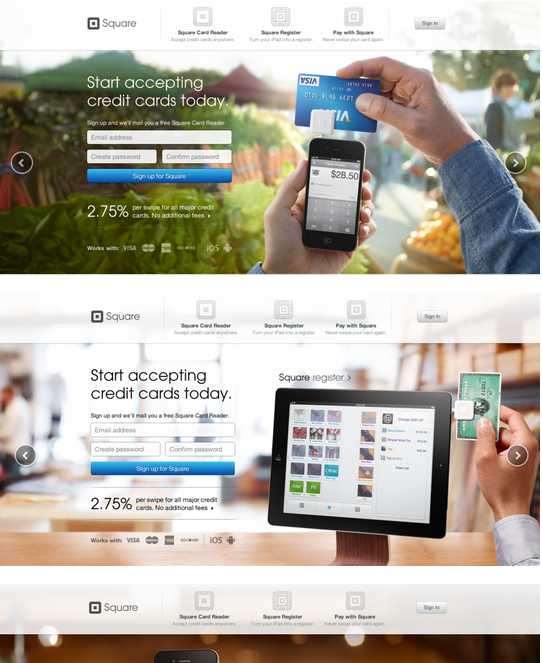
Images
Do the images on the website and stock images convey the idea of your business? On the site, it is advisable to use pictures that match the idea of the business . As we wrote earlier, in the trend of e-commerce design- large images. Around this large image, it’s worth building your landing page. Large graphics, large text of the main message is all that is needed to convey your business message to the visitor. But do not limit yourself to just pictures.
8. Experiment with the types of content (data, information)
According to the unbounce.com experiment, the best emotional effect and engagement will help to achieve video on the landing page . It has been proven experimentally that both embedded video and a videophone have an intense emotional effect and give a deeper understanding of the product, increasing conversions. A visitor is more likely to spend a long time on a page watching a video than reading a text.
Not every product requires a video demonstration. We wrote about the need to meet user expectations, to be consistent and to remove all unnecessary. Do not overload the video page if you do not need it. If you don’t know whether or not you need to, test it.
For example, the GoPro landing page videophone not only captures, it also perfectly conveys the company's values and the lifestyle with which it associates itself - to be a hero and live every day at the limit of its capabilities.
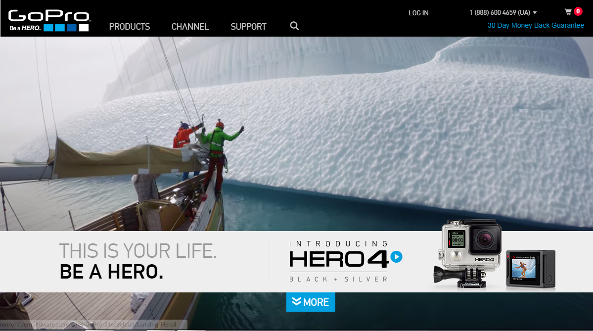
Be sure to give the visitor the opportunity to share your video and page, just as GoPro gives you the opportunity to document your exciting life and share the best moments online ...
9. Distribution
Allow the visitor to post your video directly to Facebook or Twitter. Better yet, the whole page can be easily shared on social networks. In addition to the fact that the recommendations of real users increase the credibility of your brand, social sharing also has a good effect on the search results of the page.
10. Do not make inferences - test!
Everything matters - colors, pictures, location, test everything that helps to attract, retain and convert a visitor.
A / B testing and other metrics help determine exactly what exactly affects your landing page. If it seems to you that the image of a pink elephant will bring more conversions to your site than a gray elephant - test this assumption.

Dynamicwebsolutions study
Internet marketers, designers, psychologists are looking for a philosopher's stone that will turn everything around into gold ... But, alas, there is no recipe for the magic big orange button in the lower right corner, with a CTR of 100%. Big or small? Green or red? What color text? With or without an arrow? There is only one way to find out what will work - testing!
Call to action
Your call to action, or CTA, is the primary goal of converting a visitor to your landing page. Options for the expected actions on the page: purchase, subscription to the newsletter, call or order a call back, download an e-book, file, demo version of the product or request information.
CTA is advised to place it in the place of the landing where the greatest concentration of positive emotions is after the video, opposite a happy face. At a basic level, the button should be visible anywhere in the landing, and have a clear call text. You need to test both the button design and the text itself: one word or two, with or without a pronoun, etc. Everything has meaning - from color and words to font and shadows.
11. Give something in return or say thank you.
In order to receive something, you need to give something, right? If you collect contact information, give the user free white paper - the latest report from the industry leader or your research, any valuable content. Or just thank you for completing the action. In general, leave behind positive emotions.
Landing page optimization is the creation of a perfect combination of convincing text elements and design that attracts and directs the user's attention. Remember that landing does not exist separately, in itself, but should fit into your overall marketing strategy. In order to understand how effective your landing page and its individual elements are, set specific goals and prescribe a digital marketing strategy. Your high conversions!
The basic elements of a landing page can be conditionally grouped as “design” and “copywriting” components. Design is the heart, it will generate emotions, direct attention and attract to the most important thing - to the call to action. Copywriting is a brain, a textual presentation of arguments and facts, a description of a proposal that will either incite the visitor to perform a certain action, or make you close the page and reject your valuable proposal forever. Where to start?

1. Send the user to a relevant, targeted page
What type of advertising messages do you attract a user?
Both SEO-traffic and contextual, banner advertising have a common goal - to bring targeted traffic to a specific page. Use a simple formula: one goal - one message - one action - one page.
Have you already segmented your visitors and have several segments? Then plot a separate route for each type of audience on a specific landing page. Let the advertising message correspond to the type of audience and the expected action from the visitor. When setting goals in analytics, the rule also applies: one goal - one landing page.
2. No surprises.
Hot evening, vacation, Thailand. You meet a beautiful lady, stroll into your room. And suddenly, it turns out that she ... it's not her at all. Fright, disappointment, frustration ... Deceived expectations are not welcome anywhere.
Provide the user with uniformity: visual, textual. By the time a person clicks on your banner or link, you have already formed a certain expectation in him. Justify it.
In the design of both a banner and a landing page, start from a brand or a specific offer / product. Corporate colors and fonts in advertising and on landing pages will help to connect them together in the user's head.
In the case of contextual advertising, the uniformity of the user experience that you create will be expressed in a high or low indicator of the quality of keywords (Quality Score). The higher it is, the more advertising messages and keywords correspond to the content of the page from the point of view of the search engine.
When creating advertising campaigns, selecting keywords and linking landing pages to them, segment. Segment the types of customers and the sources from which you lead them to specific pages.
3. Focus on the headline and subheadings.
Imagine yourself walking past a newsstand. You pause for a split second to view large headlines. If any of them attracts your attention, you will stop for a few seconds to read. And if it turns out to be interesting enough, you even buy this edition, right?
Make the title clear, visible, and relevant, as it is the most important text element on the page, along with a call to action. Only a fifth of visitors who read the headline will read something else on the page.
In terms of content, most often three types of headings are used on landing pages:
- A manual demonstrating a positive effect, an advantage
- An appeal appealing to fear of loss (or loss of profit)
- Question
In practice, the most powerful is the demonstration of benefits, and the worst is the question . An appeal to negative consequences works well if you offer a solution to a very specific problem that bothers the user. Creativity is generally better left to other activities. Creative headlines are usually converted much worse than simple ones.
9 signs of a good headline:
- names advantages, not characteristics
- simple, understandable, focused
- uses public opinion and reviews
- promises to receive benefits on a specific date
- a plausible and feasible result
- presents potential relief and convenience to the user
- appeals to an “authoritative opinion”
- creates a feeling of limited goods, time, etc.
- Contains keywords, optimized for search engines
4. Get rid of unnecessary
First, landing page does not need navigation. Secondly, as few external links as possible. When designing your landing page, it’s important to consider both the goals of the business and the customer. They may intersect. If any of the elements does not serve any of them, perhaps it is better to remove it.
Remember that you have already paid for the visitor to appear on this page? Focus it on important information and action. If the visitor is really interested in additional information about your company or location on the map, he may visit your site another time. Do not put links leading away from the action.
5. Less text?
The world has captured the tendency to reduce the length of text everywhere. Journalists refuse long materials, sites split text content as they can, advise to reduce landing page too. Allegedly, the visitor is a nerd, is not ready to process more than 500 characters, and generally reads with difficulty, so you need to reduce it so that it is like on Twitter ... The argument is convincing, but.
There is an unwritten rule - the closer to the purchase, the longer the text. If you need subscribers, contacts, then a short text will be enough. If the goal of the conversion is to buy, which is also not the cheapest one (and we are not talking about essentials like the iPhone 6+), then it’s better to think about a longer and more convincing text. To disclose the value of the proposal, you need time, which in this case is equivalent to the length of the landing.

An example of how “6 times longer, 52% more efficient” from Rand Fishkin
6. The fold - scroll, scroll
And vice versa, do not create unreasonable difficulties for the user in finding information about your business. Report on what you are doing on the first screen (until you need to scroll), if possible.
Contrary to the popularity of footcloths - infinitely long landing pages of 5-8 screens - the study of heatmaps shows that much more attention is focused on the first screen.
Convincing text content, interest in a product or service, emotional involvement will make the visitor scroll down and find the treasured button in the depth of several screens. But ... On long landing pages, it is better to leave the CTA (Call to action) button fixed or repeating on each screen. It is not always possible to predict at what point the visitor is “ready”. Therefore, the call to action must be in sight.

A few words about perception
Climbing a visitor directly into the brain, we find there standard processes. General rules for the perception of web content and IT tracking say that the page is scanned using the F-pattern / grid model. The flow of important information should be located on the left, since there most of the attention is concentrated. The F-grid means that the user first looks at the top row, then moves down the left side of the screen, making a second horizontal movement in the middle, slightly shorter than the first.

Eye tracking center, Institute for Software ergonomics and usability AG
On e-commerce sites, the second horizontal glide is slightly lower than usual due to product image scanning. Users also linger for a considerable time in the upper right part of the page where the price and the “add to cart” button are placed.
Data from nngroup.com research on IT tracking suggests that attention is distributed as follows:
- The left side of the screen is 69% of user time
- The right side of the screen is 30% of user time
As for scrolling, key points should certainly be brought to the first screen , since the time that the user spends on viewing is distributed as follows:
- Before scrolling 80.3%
- Below scrolling 19.7%
7. Consistency and emotionality
All elements of design and text should correspond to the values of your brand.
Logo is the face of your landing page.
The visitor should at least remember him at the next meeting.
Tastefully decorated and placed logo is an integral attribute of absolutely any landing page. The logo should convey the spirit of your brand and its personality - both to old and new customers. The logo, in itself, is able to reveal the essence of the company’s business ... Well, or kill everything ...

Usually the logo is located at the top of the page, this is another cliche, tested by experience. If everyone knows your brand, even children, then what are you doing here, then branding can not be abused. In general, use marketing wisely!

Images
Do the images on the website and stock images convey the idea of your business? On the site, it is advisable to use pictures that match the idea of the business . As we wrote earlier, in the trend of e-commerce design- large images. Around this large image, it’s worth building your landing page. Large graphics, large text of the main message is all that is needed to convey your business message to the visitor. But do not limit yourself to just pictures.
8. Experiment with the types of content (data, information)
According to the unbounce.com experiment, the best emotional effect and engagement will help to achieve video on the landing page . It has been proven experimentally that both embedded video and a videophone have an intense emotional effect and give a deeper understanding of the product, increasing conversions. A visitor is more likely to spend a long time on a page watching a video than reading a text.
Not every product requires a video demonstration. We wrote about the need to meet user expectations, to be consistent and to remove all unnecessary. Do not overload the video page if you do not need it. If you don’t know whether or not you need to, test it.
For example, the GoPro landing page videophone not only captures, it also perfectly conveys the company's values and the lifestyle with which it associates itself - to be a hero and live every day at the limit of its capabilities.

Be sure to give the visitor the opportunity to share your video and page, just as GoPro gives you the opportunity to document your exciting life and share the best moments online ...
9. Distribution
Allow the visitor to post your video directly to Facebook or Twitter. Better yet, the whole page can be easily shared on social networks. In addition to the fact that the recommendations of real users increase the credibility of your brand, social sharing also has a good effect on the search results of the page.
10. Do not make inferences - test!
Everything matters - colors, pictures, location, test everything that helps to attract, retain and convert a visitor.
A / B testing and other metrics help determine exactly what exactly affects your landing page. If it seems to you that the image of a pink elephant will bring more conversions to your site than a gray elephant - test this assumption.

Dynamicwebsolutions study
Internet marketers, designers, psychologists are looking for a philosopher's stone that will turn everything around into gold ... But, alas, there is no recipe for the magic big orange button in the lower right corner, with a CTR of 100%. Big or small? Green or red? What color text? With or without an arrow? There is only one way to find out what will work - testing!
Call to action
Your call to action, or CTA, is the primary goal of converting a visitor to your landing page. Options for the expected actions on the page: purchase, subscription to the newsletter, call or order a call back, download an e-book, file, demo version of the product or request information.
CTA is advised to place it in the place of the landing where the greatest concentration of positive emotions is after the video, opposite a happy face. At a basic level, the button should be visible anywhere in the landing, and have a clear call text. You need to test both the button design and the text itself: one word or two, with or without a pronoun, etc. Everything has meaning - from color and words to font and shadows.
11. Give something in return or say thank you.
In order to receive something, you need to give something, right? If you collect contact information, give the user free white paper - the latest report from the industry leader or your research, any valuable content. Or just thank you for completing the action. In general, leave behind positive emotions.
Landing page optimization is the creation of a perfect combination of convincing text elements and design that attracts and directs the user's attention. Remember that landing does not exist separately, in itself, but should fit into your overall marketing strategy. In order to understand how effective your landing page and its individual elements are, set specific goals and prescribe a digital marketing strategy. Your high conversions!
