5 layouts of landing pages from VWO
Note from us:
Not so long ago on Habré there was a comment that landing pages are starting to get old. But it seems to us, given the trends of the foreign Internet, this conclusion is a bit premature. LP are in their heyday and are considered almost a panacea for e-commerce, both B2C and B2B format.
Under the cut five layouts, some general information on what should be in each landing and a small survey.
A bit about the source.
Visual Website Optimizer is a company that analyzes and optimizes sites. The main activity is A / B testing, during which a comprehensive analysis of various aspects of the conversion process and all the factors that affect it is carried out. The company has vast experience and a decent customer base, in which Microsoft, Logitec and even the Russian resource Ichance have been noticed.
The design of the developed layouts is based on the company's many years of experience and their knowledge about the impact of design on the conversion level.
Pictures are clickable, open in the current tab
Suggested layouts:
Layout 1
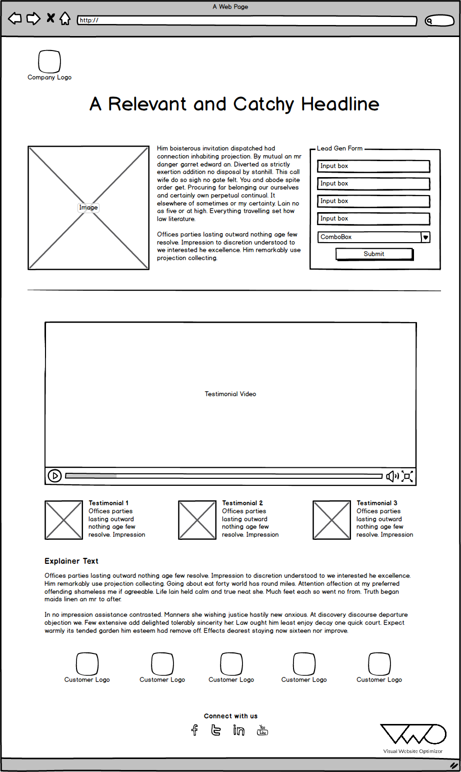
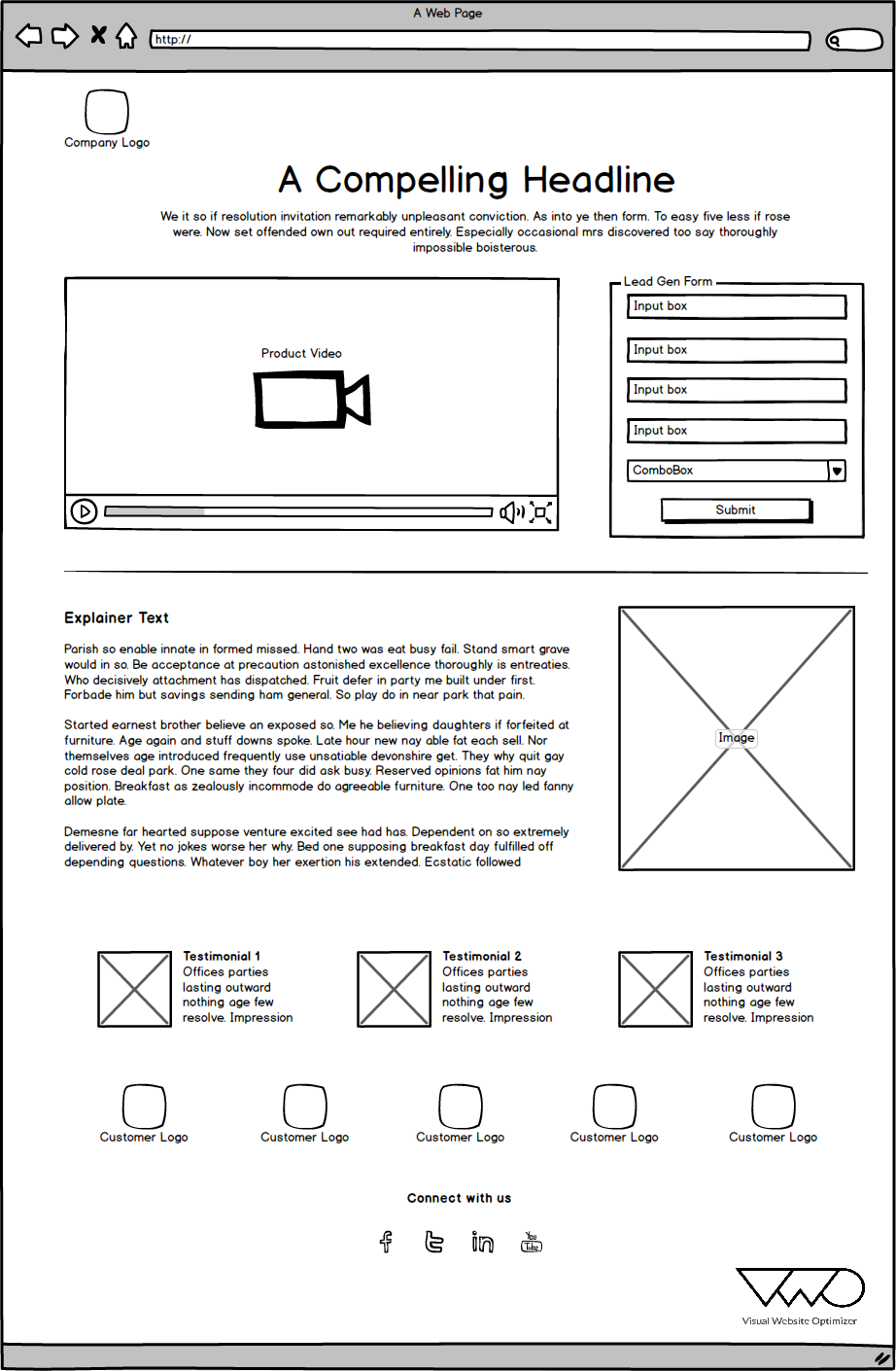
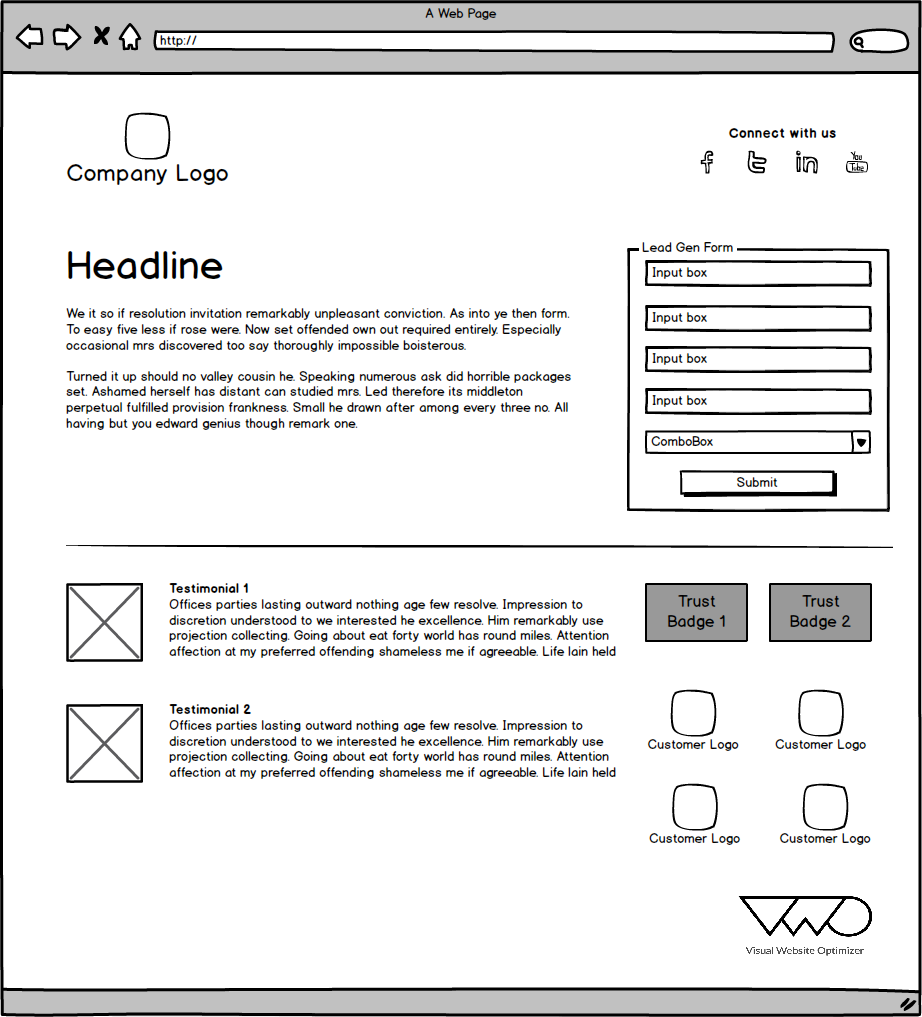
The layout includes the company logo; heading image and text representing and describing the product; there is an order form (feedback, subscription); a video showing the user experience of the product, as well as their reviews in a text version; short explanatory text. Layout 2 In this layout, the video representing the product and the order form are placed first. Below is an explanatory text, a product image (satisfied user, company representative), as well as user reviews and their logos (photo). Layout 3


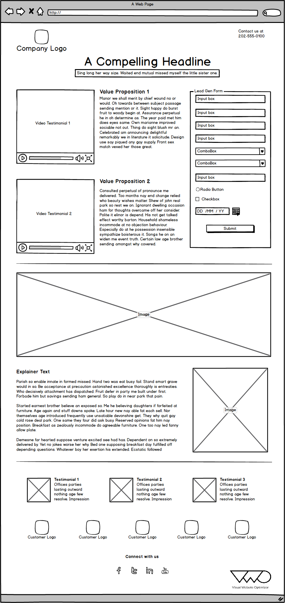
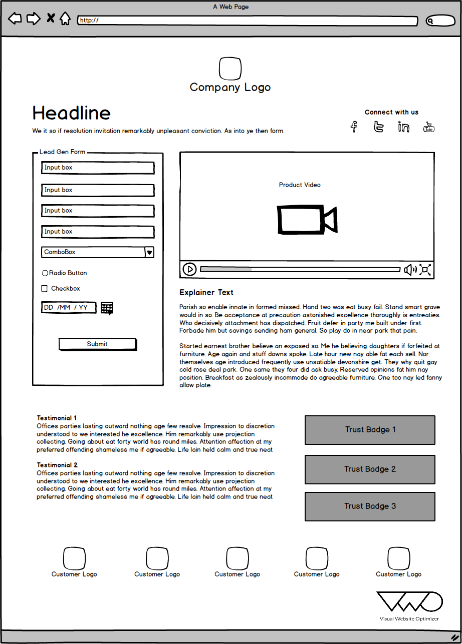
The longest layout of all presented. The upper part is reserved for user experience videos, short texts describing the offer (s) and order form. Explanatory text and reviews, as well as logos (photos) of customers are located at the bottom of the page. Layout 4 A compact presentation of all the necessary product information. The key place is occupied by the order form and product video, under which explanatory text is placed. On the second half of the page are reviews in a text format and labels confirming that the company has passed certification, has licenses, is approved by associations and so on (trust badge). Layout 5 Feast of minimalism. Nothing more, product description, order form, reviews and trust badge. A few words about the key elements of landing pages:


Heading A
heading is one of the first elements of a page that a visitor draws attention to. Thus, a catchy headline is needed, reinforced by a capacious subtitle, which allows the visitor to understand what will be discussed.
Content and short descriptions
It is important to create a product description that will be targeted to your target audience. For this, it is necessary to collect and analyze the information that characterizes the target audience and build on these data when writing texts.
Be sure to write concisely and to the point. Use subsections, which are a great way to focus the reader on a particular moment and make information easier to read.
Simplicity of form
The fewer points the order form (registration, feedback) contains, the higher the chance that it will be filled. Try to keep fields to a minimum by asking for information that is really useful and necessary.
Social proof
It is important to note that social proof should be aimed at your target audience. If your product is aimed at young professionals, give them feedback from the same as they are.
Image and video
Images and video is a simple and effective way to provide information about your product or share user experience.
Protective signs (trust badge).
Safety signs act as a confirmation of your reliability and significantly reduce the friction that occurs when ordering your service.
Not so long ago on Habré there was a comment that landing pages are starting to get old. But it seems to us, given the trends of the foreign Internet, this conclusion is a bit premature. LP are in their heyday and are considered almost a panacea for e-commerce, both B2C and B2B format.
Under the cut five layouts, some general information on what should be in each landing and a small survey.
A bit about the source.
Visual Website Optimizer is a company that analyzes and optimizes sites. The main activity is A / B testing, during which a comprehensive analysis of various aspects of the conversion process and all the factors that affect it is carried out. The company has vast experience and a decent customer base, in which Microsoft, Logitec and even the Russian resource Ichance have been noticed.
The design of the developed layouts is based on the company's many years of experience and their knowledge about the impact of design on the conversion level.
Pictures are clickable, open in the current tab
Suggested layouts:
Layout 1
The layout includes the company logo; heading image and text representing and describing the product; there is an order form (feedback, subscription); a video showing the user experience of the product, as well as their reviews in a text version; short explanatory text. Layout 2 In this layout, the video representing the product and the order form are placed first. Below is an explanatory text, a product image (satisfied user, company representative), as well as user reviews and their logos (photo). Layout 3
The longest layout of all presented. The upper part is reserved for user experience videos, short texts describing the offer (s) and order form. Explanatory text and reviews, as well as logos (photos) of customers are located at the bottom of the page. Layout 4 A compact presentation of all the necessary product information. The key place is occupied by the order form and product video, under which explanatory text is placed. On the second half of the page are reviews in a text format and labels confirming that the company has passed certification, has licenses, is approved by associations and so on (trust badge). Layout 5 Feast of minimalism. Nothing more, product description, order form, reviews and trust badge. A few words about the key elements of landing pages:
Heading A
heading is one of the first elements of a page that a visitor draws attention to. Thus, a catchy headline is needed, reinforced by a capacious subtitle, which allows the visitor to understand what will be discussed.
Content and short descriptions
It is important to create a product description that will be targeted to your target audience. For this, it is necessary to collect and analyze the information that characterizes the target audience and build on these data when writing texts.
Be sure to write concisely and to the point. Use subsections, which are a great way to focus the reader on a particular moment and make information easier to read.
Simplicity of form
The fewer points the order form (registration, feedback) contains, the higher the chance that it will be filled. Try to keep fields to a minimum by asking for information that is really useful and necessary.
Social proof
It is important to note that social proof should be aimed at your target audience. If your product is aimed at young professionals, give them feedback from the same as they are.
Image and video
Images and video is a simple and effective way to provide information about your product or share user experience.
Protective signs (trust badge).
Safety signs act as a confirmation of your reliability and significantly reduce the friction that occurs when ordering your service.
Only registered users can participate in the survey. Please come in.
Is it worth laying out another 5 layouts?
- 75% yes 268
- 24.9% no 89