50 shades of blue, or a tale about how we made True Image 2015 design

Initially, we were preparing another corporate post on how much percent the new Acronis True Image 2015 began to backup faster, but, since the task was entrusted to the designers, we’ll tell you something more interesting - today we will share the story of creating a new program interface, and also show what we ended up with.
Background
It is worth starting with the fact that over the past few years the interface of the program has not changed much - the concept, first introduced in the fall of 2010, was quite successful and quite suited both us and users. Naturally, we did not stand still - new little things were drawn, individual scripts were redesigned, icons were updated, but in fact all product improvements remained invisible to ordinary users (most of the new chips were “under the hood”).

Find 10 Differences
Finally, this year we decided to start with a white sheet and design True Image from scratch. Why did this happen just now? Here are some good reasons:
- Accumulated feedback from users. In some aspects, the product remained complex and incomprehensible to uninitiated users, as a heap of Salesforce tickets with Usability difficulty marks hinted at. And although we locally fixed each of the problems and even once again redrawed the old interface, we understood that our brainchild no longer meets the spirit of the times and everything had to be changed seriously in this release.
The same eggs, only in profile
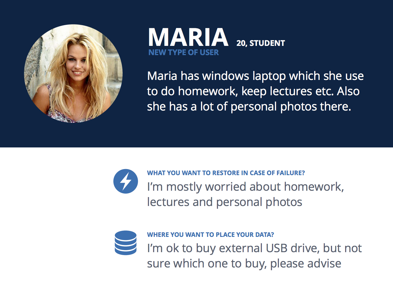
- The company has taken a new course: with the advent of a new CEO, our products should have become simpler, more understandable, more efficient. We became backup evangelists - if in the past backup was the lot of harsh IT and geeks, now it is an urgent need for everyone, including pensioners and housewives. Our list of persons for design was supplemented by Masha - a young beauty who does not care about backup, but who had a lot of data worthy of True Image protection.
Slide from the internal presentation
- The company has a completely new plague logo: strong, concise, with few decorations. As usual, the corporate identity and a stunning corporate color - # 00204D came with it. With such a logo, releasing a product with just goodthe interface was not permissible :)

- Today, almost all PCs are sold with Windows 8 on board, many of them are equipped with touchscreens. Needless to say, True Image 2014 on this OS did not look so hot, and was not particularly friendly with finger input.
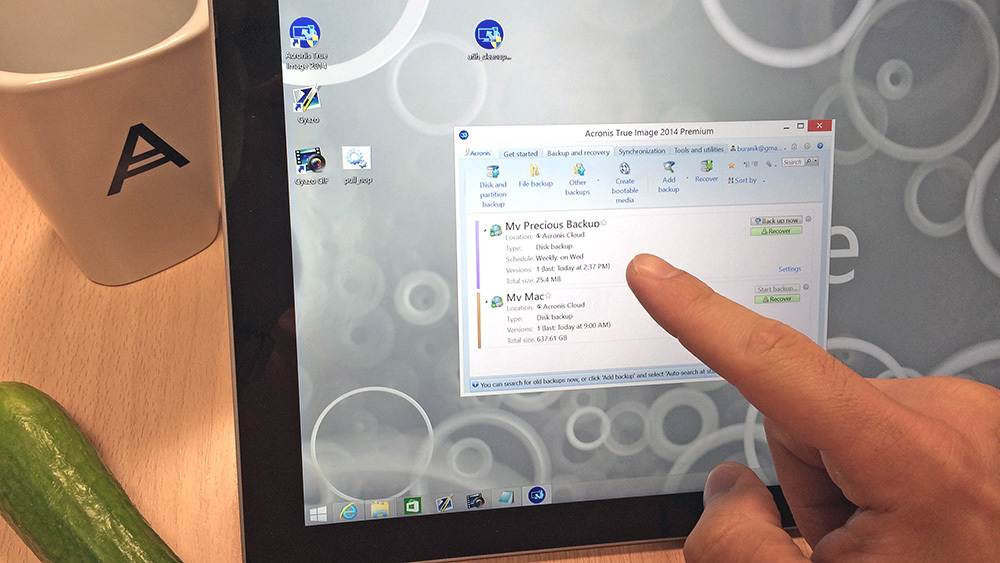
Cucumber, as it turned out, replaces the stylus quite well
What have we done?
They threw everything away and began to design each scenario from the beginning. True, before that we shoveled about 3200 tickets in Salesforce, collected (and even partially overslept) dozens of rallies with representatives of our wonderful support, read and analyzed hundreds of user posts on our forum. In general, we hunted for feedback as best we could and looked for problem spots in the current interface of the program. As a result, we had in our hands a detailed list of localized UI problems, each of which was accompanied by an importance factor and a detailed description.
Then came the period of fiery brain storms, on which we slowly but surely developed a new paradigm of the interface. After each rally, there were sketches on the whiteboards that we transferred to paper, and then to Axure (and then to Illustrator and Keynote - wherever we prepared presentable layouts for top management). A few weeks later, we began to clearly realize how the new True Image should work.

Guts
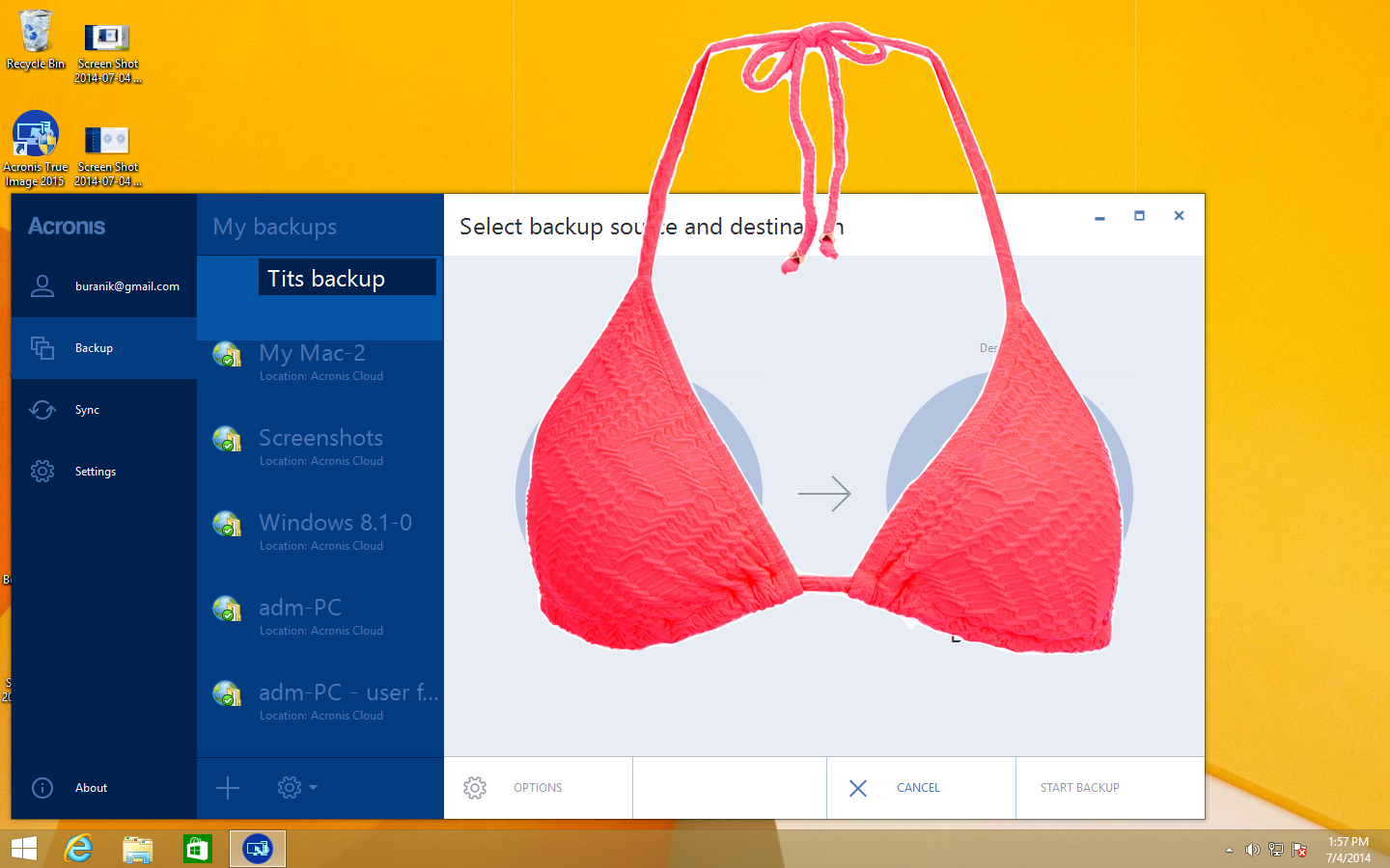
One of our main goals was to abandon the modality of the interface. We decided to remove the pop-ups and make an application where all interactions would be within the framework of a single window. This would allow focusing the user's attention on the current task, using the maximum of screen space to accommodate the necessary controls.
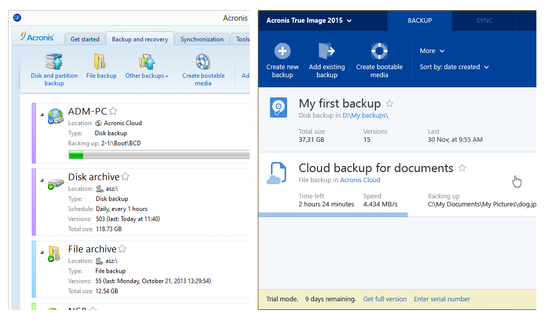
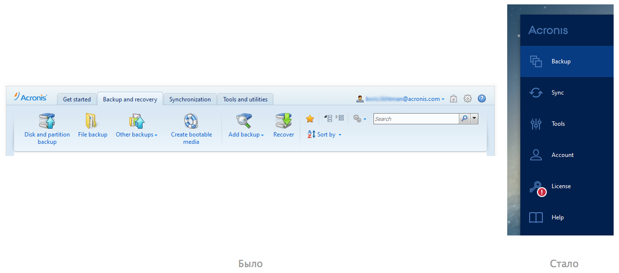
For the main entities that the user works with - backups and synchronizations - we used a three-panel view, where the left panel is the global navigation menu, the middle one is a list of user backups or syncs, and the rightmost, largest one is the backup or synchronization selected to the left, with all its attributes and controls. A similar approach is used in many applications - for example, in email clients.
Having defined the general paradigm of interaction, we took up the application navigation menu - the current tabs Backup, Synchronization, Tools and some important functions that were hidden in hidden corners of the interface in previous versions of the program should have got there. Inside the team, we could not come to a decision how this menu would look and work: whether there would be signatures for the icons, whether we would expand and hide it, whether dedicated sections were needed for licensing ... In the end, we came to the most familiar implementation: a static menu, where each item is represented by an icon and a signature. Perhaps it’s not very revolutionary, but everything has become more concise and users will definitely not get lost. Moreover, we inform about the most important events within the sections with nice notifier badges.
Feel the difference.
 Almost everything that didn’t appear on the menu was contextual - something related to backup management, something related to license resolution, etc. It was logical to transfer all this into the corresponding sections of the menu, which was done.
 We continue to move from left to right. The lists of backups and synchronizations have changed quite noticeably - now they are used only for selection (select), and all controls have also “left” in the right panel.
On backup dies, only the most important thing remains - the name of the backup, the location of the backup and its status. This is enough to assess the situation at a glance. Even if there are a lot of backups in the list, you can immediately see which of them work like a clock, and which of them are fake and require intervention.
For dessert - the most interesting :) We turn to the right-most column, where all the attributes of backup or synchronization are displayed and where all the controls are located. This area has become perhaps the most difficult to design. In disputes about what should be displayed there, a lot of copies were broken. No matter how crazy ideas are proposed, right up to showing illustrated Wikipedia articles about the dangers that user data can overtake if you don't get caught in time. But we were still able to curb the imagination and made, in our opinion, a simple and clear backup screen (and synchronization).
But we will not show it.
Result
Those
We need your feedback! We will present three authors of the most constructive comments with a program license.
PS And we also have a brand new beautiful installer!
Update : We’ve gotten it! You can try and purchase a new, fresh and juicy Acronis True Image 2015 here: www.acronis.com/en-us/personal/pc-backup
Product licenses have been assigned to persistent habruzers VenomBlood , sawser and GliX .