Each Landing Page. Sore
Either from the filing of Business Youth, or for other reasons, now only the lazy one does not offer Landing Page development. And there are reasons for that. According to the global idea, a landing page is such a special page that should technically turn visitors into leads with a much greater probability than the site can do in the usual sense.
Satire on most “landing pages”
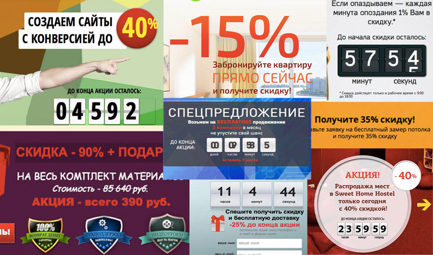
Like mushrooms after rain, more and more landingsites appear daily, offering everyone in need a professional landing page development costing from “three cents” to staggering amounts.
With the same speed, secrets of effective landing pages begin to spread on the Internet, which in general boil down to such a guide:
Particularly resourceful people sell bundles of templates of an “effective landing page”, but someone went even further and the market received universal online services for independent “designing” of a landing page.
More and more “specialists” are trying to assure us that they know how to make a conversion of 40%, explaining this withmagic with the right persuasion technology, a special sequence of presentation and understanding of the client’s pain (literal phrase).
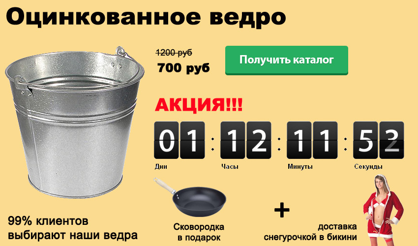
Unfortunately, usually, it all comes down to a horse-sized timer, during the period of which we are offered a 20-30-50-100% discount, a frying pan and delivery by a snow maiden in a bikini.
Of the good hundreds of landing pages viewed about landing pages, only a small part at least said something directly about the objects of influence themselves - you and me, those same mysterious consumers who should easily and unconstrained leave their contact or perform another desired action.
Almost every landing page maker will be happy to talk about persuasion techniques, large buttons, capacious headers, stylish timers, etc. But few people even think for what all this is done. The conviction to perform one or another action cannot be built solely on the ball (promotions, discounts) and other dubious techniques.
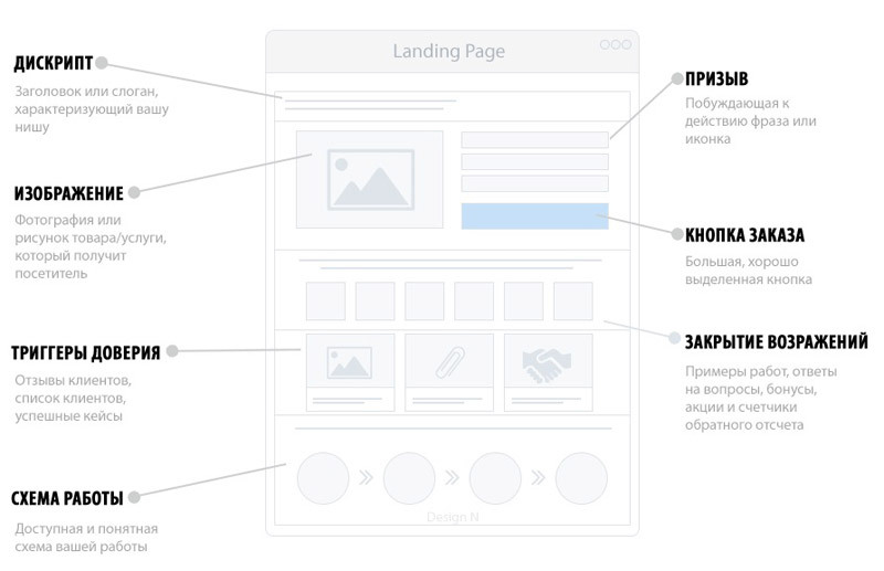
Here's a favorite of many western infographics CIS studios so that every third considers it his duty to place it on yoursite Landing.
As in the case of the classical design of interfaces (and there is essentially no difference here), at the center of the whole process is a collective image - a character with a name, a photograph and even a life story who has good reasons to visit your site. The character has a life experience: dreams, fears, doubts, thoughts and actions. When visiting a site, he wants to perform a certain task, for example, buy some product or order a service. He has certain ideas on this subject and depending on how the site will meet his expectations, he will perform or not perform the desired action for us (that is, he realizes or does not realize his goal on our website).
The task of an experienced designer is to identify these very characters from a variety of various audiences, determine their needs (expectations) and implement the appropriate interface solutions.
And in these interface solutions, there may well be no timer, no promotions, no discounts, but the landing page will work with higher returns.
The whole secret lies in correctly understanding the target audience of a product or service and giving appropriate answers that simply will not leave another choice how to be happy and click on the desired conversion button.
And against the backdrop of this simple but important action, all the pathetic attempts of most landing page makers simply come down to operating with other, lower, values. The thirst to get cheaper, to save, does not concern everyone and affects only a small fraction of the audience. Compensating in this way their own lack of education, these figures bring a rather dangerous audience into the business of their clients, the main value of which is the maximum sphere. And this audience will gladly betray the business and leave in a blink of an eye for another, unless an even greater discount is made.
Characters help to abstract from your personal experience, the personal experience of your colleagues and design the interface really for the target audience that will use it. The use of characters helps to better understand the needs of the target audience and identify unexpected solutions at first glance. It’s also convenient to use characters as a document in defense of interface decisions, when a designer, developer or god knows who suddenly decides to show imagination and make his own adjustments to the layout.
As in the case of ordinary childbirth, the character is the result of preliminary work, in our case, research.
First you need to conduct a series of interviews with all responsible parties. Such parties may include:
At the same time, if managers will be useful for identifying business tasks, then for future characters, those personalities who directly communicate with customers will be the most important. Often, consultants and sellers are more aware of the problems, needs and fears of customers than managers.
The most common mistake most companies make is trying to get brief information. So - do not waste paper in vain. You will never be able to get really important and valuable brief information. Each business is unique and has its own characteristics, which can be caught only in person. In addition, briefs are far from fun to fill out, so usually only short replies or information without any value appear in them.
It is also ideal to conduct an interview directly with the users of the product or service, but usually this task is difficult and increases the project budget at times, so that communication with consultants and sellers will be enough.
We will postpone the detailed nuances of interviewing a business until the next article (if you want one).
Based on the data obtained, it is quite simple to determine user groups similar in behavior and tasks and select from them those for which the interface will be designed. Each group is a character (collective image).
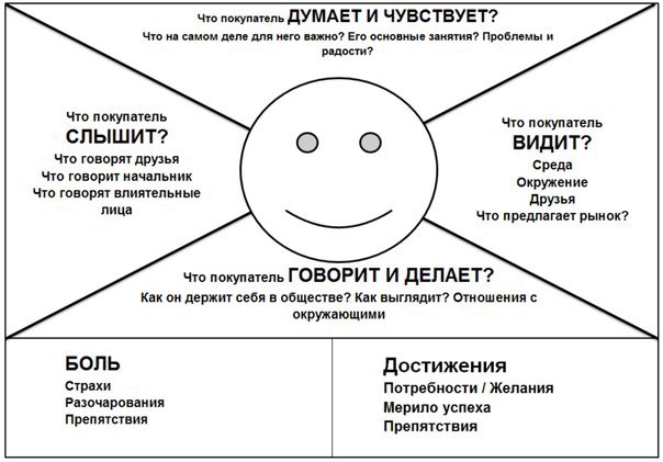
Now it's up to the Empathy Map. It is necessary for the formation of a full-fledged image of each character and looks something like this:
Filling it after the interview will be quite simple and it is better to do it together.
As a result, the very needs that are needed to create a cool landing page will be recorded in the empathy map. If a full-fledged site is being designed, then work should continue, creating a map of the ideal path (Customer Journey Map). But in the landing, after all, there is one page, so let’s omit it.
Now it remains only to prioritize the needs (the most important ones are closed right away, the rest along the way) and map interface solutions to them.
Now that there is an understanding of the target audience, the characters and their needs, a field for real activity appears. Instead of pushing standard blocks like “why 99% of customers choose us”, “rush to share”, etc., you can answer really exciting questions from users and capture a much more valuable audience than those looking for a ball.
And lastly, it should be said that in fact, any described technique, whether it is a timer, a discount offer, or something else can be an effective tool if used correctly.
For example, when designing a landing page for the SMS distribution service, we found that none of the many competitors offers anything more than just a distribution service. At the same time, the interview with the business clearly showed the need to help customers learn the right SMS marketing. Such training would not only increase customer loyalty, but also increase the profit of the business itself through more private mailings. Therefore, we suggested that the customer draw up a guide to effective SMS marketing and give it to each client who has replenished their account with a certain minimum amount. Thus, we formed UTP (a unique selling proposition). Next, two versions of the landing page were designed. In the first version, the manual is broadcast as one of the features of the service, in the second - as a UTP with a timer.
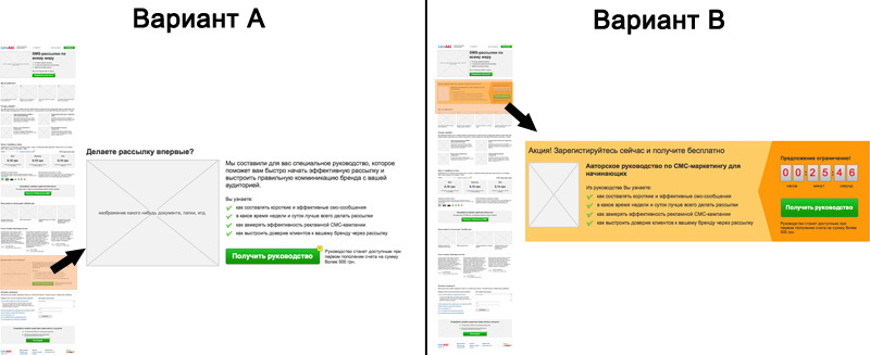
In this example, the use of a timer is quite justified, because the stock is not drained from the finger, but a proposal of real value is broadcast.
The main insider of this article is think ! Stop stamping template solutions without any analytics or preliminary work. Respect yourself and your client’s business.
Satire on most “landing pages”
Like mushrooms after rain, more and more landing
With the same speed, secrets of effective landing pages begin to spread on the Internet, which in general boil down to such a guide:
- articulate a clear sentence
- limit the offer
- describe why you are the best
- describe the work process
- give social confirmation
- mark the action clearly and visibly
Particularly resourceful people sell bundles of templates of an “effective landing page”, but someone went even further and the market received universal online services for independent “designing” of a landing page.
Is it as simple as 1-2-3?
More and more “specialists” are trying to assure us that they know how to make a conversion of 40%, explaining this with
Unfortunately, usually, it all comes down to a horse-sized timer, during the period of which we are offered a 20-30-50-100% discount, a frying pan and delivery by a snow maiden in a bikini.
Of the good hundreds of landing pages viewed about landing pages, only a small part at least said something directly about the objects of influence themselves - you and me, those same mysterious consumers who should easily and unconstrained leave their contact or perform another desired action.
Technological insanity
Almost every landing page maker will be happy to talk about persuasion techniques, large buttons, capacious headers, stylish timers, etc. But few people even think for what all this is done. The conviction to perform one or another action cannot be built solely on the ball (promotions, discounts) and other dubious techniques.
Here's a favorite of many western infographics CIS studios so that every third considers it his duty to place it on your
Let's remember about users
As in the case of the classical design of interfaces (and there is essentially no difference here), at the center of the whole process is a collective image - a character with a name, a photograph and even a life story who has good reasons to visit your site. The character has a life experience: dreams, fears, doubts, thoughts and actions. When visiting a site, he wants to perform a certain task, for example, buy some product or order a service. He has certain ideas on this subject and depending on how the site will meet his expectations, he will perform or not perform the desired action for us (that is, he realizes or does not realize his goal on our website).
The task of an experienced designer is to identify these very characters from a variety of various audiences, determine their needs (expectations) and implement the appropriate interface solutions.
And in these interface solutions, there may well be no timer, no promotions, no discounts, but the landing page will work with higher returns.
The whole secret lies in correctly understanding the target audience of a product or service and giving appropriate answers that simply will not leave another choice how to be happy and click on the desired conversion button.
And against the backdrop of this simple but important action, all the pathetic attempts of most landing page makers simply come down to operating with other, lower, values. The thirst to get cheaper, to save, does not concern everyone and affects only a small fraction of the audience. Compensating in this way their own lack of education, these figures bring a rather dangerous audience into the business of their clients, the main value of which is the maximum sphere. And this audience will gladly betray the business and leave in a blink of an eye for another, unless an even greater discount is made.
Characters help to abstract from your personal experience, the personal experience of your colleagues and design the interface really for the target audience that will use it. The use of characters helps to better understand the needs of the target audience and identify unexpected solutions at first glance. It’s also convenient to use characters as a document in defense of interface decisions, when a designer, developer or god knows who suddenly decides to show imagination and make his own adjustments to the layout.
How to “give birth” to a character?
As in the case of ordinary childbirth, the character is the result of preliminary work, in our case, research.
First you need to conduct a series of interviews with all responsible parties. Such parties may include:
- directors
- managers
- consultants
- sellers
- etc
At the same time, if managers will be useful for identifying business tasks, then for future characters, those personalities who directly communicate with customers will be the most important. Often, consultants and sellers are more aware of the problems, needs and fears of customers than managers.
The most common mistake most companies make is trying to get brief information. So - do not waste paper in vain. You will never be able to get really important and valuable brief information. Each business is unique and has its own characteristics, which can be caught only in person. In addition, briefs are far from fun to fill out, so usually only short replies or information without any value appear in them.
It is also ideal to conduct an interview directly with the users of the product or service, but usually this task is difficult and increases the project budget at times, so that communication with consultants and sellers will be enough.
We will postpone the detailed nuances of interviewing a business until the next article (if you want one).
Based on the data obtained, it is quite simple to determine user groups similar in behavior and tasks and select from them those for which the interface will be designed. Each group is a character (collective image).
Now it's up to the Empathy Map. It is necessary for the formation of a full-fledged image of each character and looks something like this:
Filling it after the interview will be quite simple and it is better to do it together.
We form needs
As a result, the very needs that are needed to create a cool landing page will be recorded in the empathy map. If a full-fledged site is being designed, then work should continue, creating a map of the ideal path (Customer Journey Map). But in the landing, after all, there is one page, so let’s omit it.
Now it remains only to prioritize the needs (the most important ones are closed right away, the rest along the way) and map interface solutions to them.
What to do with all this?
Now that there is an understanding of the target audience, the characters and their needs, a field for real activity appears. Instead of pushing standard blocks like “why 99% of customers choose us”, “rush to share”, etc., you can answer really exciting questions from users and capture a much more valuable audience than those looking for a ball.
And lastly, it should be said that in fact, any described technique, whether it is a timer, a discount offer, or something else can be an effective tool if used correctly.
For example, when designing a landing page for the SMS distribution service, we found that none of the many competitors offers anything more than just a distribution service. At the same time, the interview with the business clearly showed the need to help customers learn the right SMS marketing. Such training would not only increase customer loyalty, but also increase the profit of the business itself through more private mailings. Therefore, we suggested that the customer draw up a guide to effective SMS marketing and give it to each client who has replenished their account with a certain minimum amount. Thus, we formed UTP (a unique selling proposition). Next, two versions of the landing page were designed. In the first version, the manual is broadcast as one of the features of the service, in the second - as a UTP with a timer.
In this example, the use of a timer is quite justified, because the stock is not drained from the finger, but a proposal of real value is broadcast.
The main insider of this article is think ! Stop stamping template solutions without any analytics or preliminary work. Respect yourself and your client’s business.