 April 2, 2014 at 04:58
Controlling table cell overflow with max-width
- Tutorial
Suppose we want to make a two-column layout using the table-cell property. The left column will occupy the entire available width, while the right column can have two options in our case:
- we will give this column a fixed width;
- it will equal the minimum content width → minimum content width (MCW) .
The layout method on the columns has one significant minus → if the content inside the block goes beyond its scope, then the restriction set through width will not affect it, because the MCW in this case is greater. If we want to stretch the left column across the entire width, then we have to set its width to 100%. Accordingly, max-width: 100%; will not give any result, because MCW is already higher than this value. As a result, our entire layout will stretch and go beyond the container, no matter what restrictions we put.
Here is an example layout with the fixed column option on the right:
       Левая колонка

        Правая колонка
.leftBlock, .rightBlock
{
    display: table-cell;
    vertical-align: top;
}
.leftBlock
{
    width: 100%;
}
.rightBlock
{
    width: 200px;
    max-width: 200px;
    min-width: 200px;
}
An example on jsfiddle
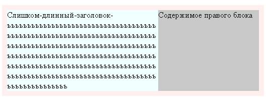
As you can see, there are no problems so far. Now let's add elements to the left column that will exceed the width of the container minus the column on the right:
Example on jsfiddle
The cell on the left has been stretched despite the limited width of the container, a scroll has appeared. It's time to introduce the hack. As I said earlier, max-width: 100%; it will have no effect here, but if we set max-width: 0; then the cell will occupy the entire available width, taking into account the width of the container and the cell on the right. Unfortunately, the specification does not clarify this effect, but it works the same in all browsers.
Do not forget to add overflow: hidden; and word-wrap: break-word ;, otherwise the content will crawl out of the container.
The final example on jsfiddle
In the second option with an unfixed right column, everything will be exactly the same, only without specifying any width parameters.