How bad UX helps developers lose money
- Tutorial

How the “curse of knowledge” affects UX
In the early nineties, an experiment was conducted in Stanford: one group was asked to tap a popular melody on the table, and the other to guess it. The absolute majority of the “drummers” were sure that it was easy to recognize the song, but the results were amazing: only 2.5% of the listeners guessed the melody.
The essence of the "curse" is that the "drummers" know exactly the melody that they tap, and are confident that others just MUST guess it. But others hear only arrhythmic sounds. This also applies to 70% of articles on Habré, which 2% of the pros are minus for appeasing, and in general any things that we take to be "taken for granted."
And if forum misunderstanding affects only CSW, then users' misunderstanding will easily bury your application. This article is a collection of life hacking in the wake of personal experience in dealing with informational imbalances and working through the weak points of UX.
From complex to simple
Long instructions (onboarding) do not enlighten, but anger users. We rarely read instructions in real life, and extensive instructions in the application cause it to be deleted. The first impression from use is not smoothed by any features.
Effective onboarding can increase LTV up to 500%, so here are a few things to keep in mind when developing instructions:
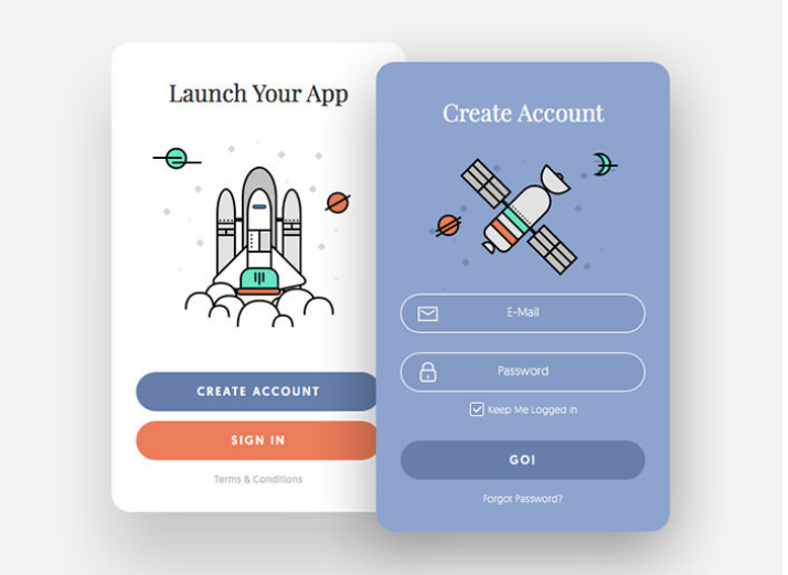
- Make login and account creation as simple as possible, do not overload it with additional fields and do not require passwords of more than 8 characters, with capital letters and symbols:

- Do not overload the application with long instructions before using - wait until the user gets to them and use the tooltips.
- Ask your friends 5-7 to test the registration process and watch their actions carefully.
Consistency and Design Sequence
Often, application developers collaborate with several designers on outsourcing at different stages. Therefore, the final application looks like Frankenstein, which does not add trust. To maintain engagement, users need consistency: navigation, application colors, fonts, and the overall style should not change.
There are three main things that the user ALWAYS pays attention to:
- High-quality graphics
- Concise and clear content
- The minimum size of clickable UI elements (do not use a size smaller than 44 × 44px)

Ask yourself - can users foresee the next step? Do they splash blood from their eyes at the sight of your cute color combination?
Rule one screen - one action is also not canceled.
Push notifications to the topic
Push notifications are an effective interaction tool that requires a thoughtful approach.
It is bad when notifications are configured for all users, without reference to the region:

But even worse - when the text and the message of the notification sound aggressive and do not correspond to the age of the user. Here is a bad example of push notifications that a MyPet game user came to when she was 9 years old on the phone:

There are a few simple tonal rules for push notifications:
- The right time - based on the behavior or location of the user. Notification of a comment or activity must arrive BEFORE the user responds to the comment or is active in the application.
- Important personalized message - push-notification is significant for a specific user.
- Motivation for action: the user understands what action to take.
Rich push notifications work very well, where you can add audio, gif or video to the message:

Request minimum access
In the official guide for android developers they write: the application must request the absolute minimum of access rights that are necessary for it to maintain the basic functionality.
If you need more data, explain why the application has access to additional user data:

Monetize correctly
Even the most successful application can be spoiled by inappropriate advertising. This is what happens when the monetization strategy is urgently customized to the existing UX, ignoring the user flow.
If the application is already finished, and I urgently want to monetize it right now, spend some time integrating user-friendly formats and searching for native placements in order not to distract the user's attention from the application.
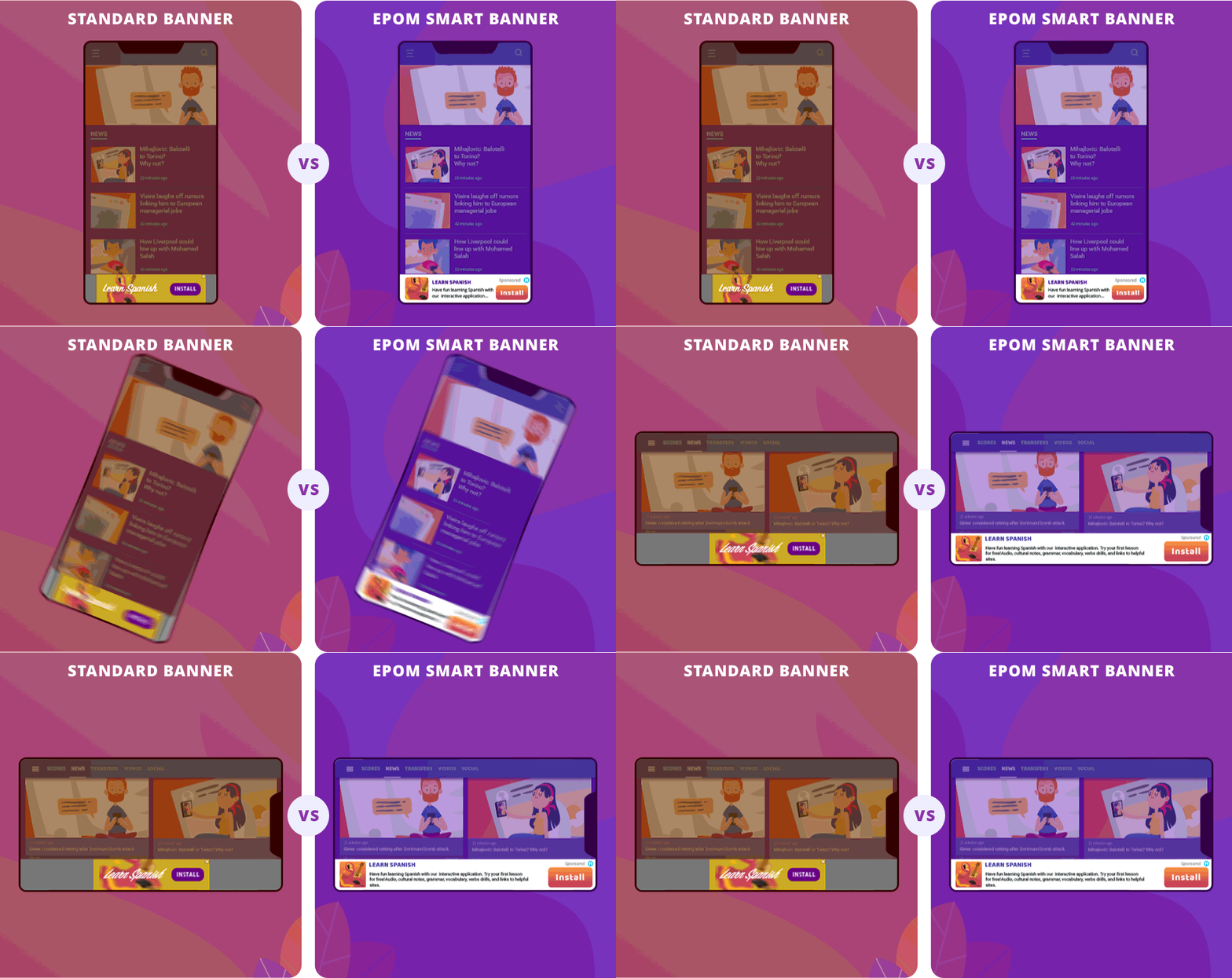
Among popular advertising formats, pay attention to a smart banner that adapts to the screen size - it is more efficient than a standard banner and looks much better:

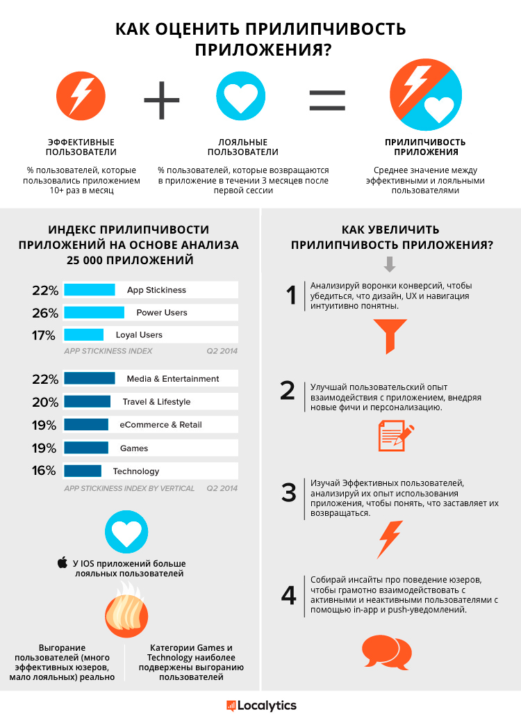
Pump up the "stickiness" of the application
Given the importance of the application's stickiness, it is surprising how little attention developers pay to it. The outflow of users of the application is constantly growing - 25% of users do not return to the application after installation. And if the application is opened only once a week, there is a 60% chance that it will be abandoned - too much competition for the user's attention.

No application in my memory was made IMMEDIATELY 100% user friendly and understandable. If you know that some aspects of the application can be improved - most likely it is. And even when everything works like a clock, it will not hurt to once again critically evaluate the UX of your application.
I'm sure each of you had your own UX-rake, share them in the comments :)
