January 22, 2014 at 10:48
Design review of Android 4.4 KitKat. Part 1
The first part of the article describes in detail all the main interface changes that the lock screen and desktops have undergone in comparison with previous versions of Android. Next up are a lot of pictures.
Lock screen
The lock screen is a very important part of the system interface that the user sees every time he turns on the phone. In Android 4.4, it has undergone significant changes.
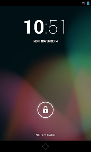
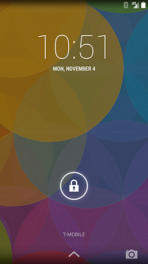
On the left is Android 4.3 Jelly Bean, on the right is Android 4.4 Kit Kat
First, the circle of dots at the bottom of the screen that activated Google Now in Jelly Bean has been replaced with an up arrow. The arrow may not be so elegant, but more intuitive.
A camera icon appeared in the lower right corner. It duplicates the corresponding widget of the lock screen (swipe from right to left), which, as before, gives quick access to the camera.
Also, the style of the lock screen widgets has changed a bit. And they can now be turned on / off in Settings> Security.

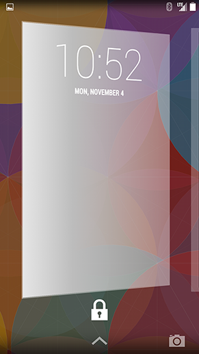
Left - Android 4.3 Jelly Bean, right - Android 4.4 Kit Kat
In addition, the watches in Kit Kat are made in the style of Thin, instead of Black: Thin (hours: minutes) in Jelly Bean. The same thing happened in the Clock system application, but more on that in the second part of the article.
When listening to music on the full lock screen, a large beautiful cover of the album being played is shown.
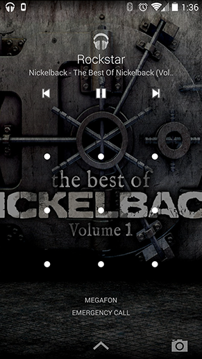
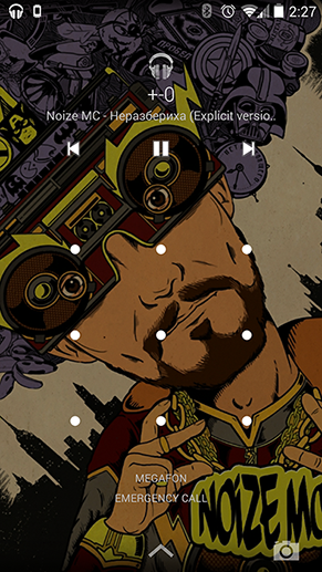
On the left - [NICKELBACK] The best of Nickelback, on the right - [NOIZE MC] Confusion
Work tables
So, after unlocking the device, we see the desktops. On Android 4.4, they have changed completely. But this applies only to Nexus 5, where Google Experience Launcher (GEL) is installed as the default launcher. Maybe in the near future it will appear on other devices of the Nexus series or as a separate application on Google Play. It remains only to be patient ... Either install GEL manually, as they say, at your own peril and risk.
What is new? Let's start at the top of the screen.

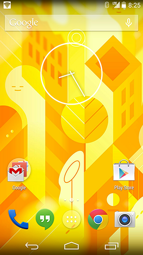
Left - Android 4.3 Jelly Bean, right - Android 4.4 Kit Kat
Status bar
Now it is almost transparent, with always white icons and a clock. This immediately catches the eye after Android 4.3, where the status bar was completely black with blue (# 33B 602) icons that turned gray in inactive states. In addition, small arrows of Internet connection activity were moved to the quick settings panel.
Google search
The search widget has been slightly improved: the redrawn microphone icon is now hollow when the phone is not listening, and completely flooded when voice commands can be used.

Android 4.4 Google Search
In addition, a new animation has been added to the search: if you click on the microphone, there will be a spectacular transition to the Speak Now screen, if on the input field, prompts from previous searches will appear, blocking the desktop with a translucent white background.
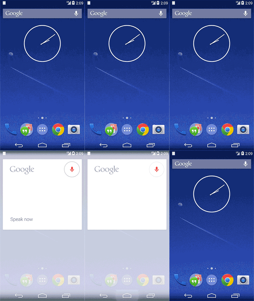

Android 4.4 - Google Search
An interesting point is that Google Search is both search and launcher. Maybe in the near future, Google will make it possible to replace the standard shells of Samsung, HTC, LG with its Google Experience Launcher. We'll wait and see ... but I would really like that!
Google now
In addition to the standard Google Now activation gesture in Android 4.3, now on GEL it can be opened by simply swiping from left to right.
At the bottom of the screen, new buttons have been added.

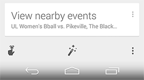
On the left is Android 4.3 Jelly Bean, on the right is Android 4.4 Kit Kat
Users can go from here to Reminders, customize cards or get to the standard settings through the “three points”.
The customization screen for Google Now cards is of particular interest, as there are a couple of new design tricks.
For example, the Action Bar header uses all-caps Roboto Condensed. According to Matias Duarte (chief designer of the Android platform) in an interview with The Verge, this improved font complemented the Roboto family in Android 4.4.
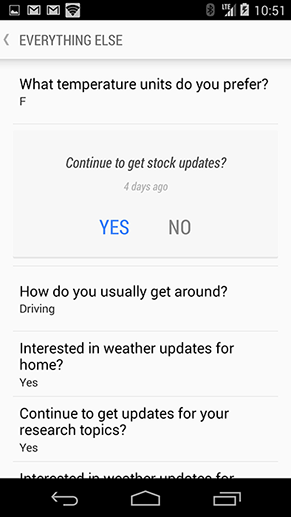
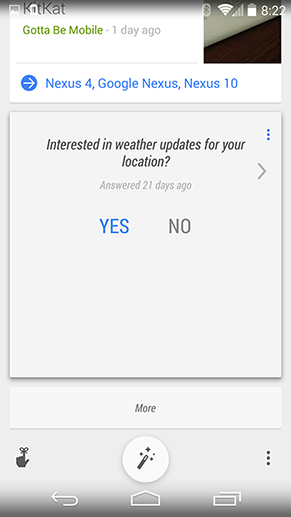
Android 4.4 - Google Now
In the screenshots above, you can notice a small feature - a new shade of blue (# 4285f4), which is used everywhere in Google Now instead of the standard Holo Blue (# 33Beller).

Android 4.4 - the new blue?
Icons and folders
The icons on the Nexus 5 are proportionally larger than their “colleagues” on the Nexus 4. It immediately catches the eye. These icons are obviously easier to get, Google tells us about this innovation. But let’s put a little more specificity in numbers.
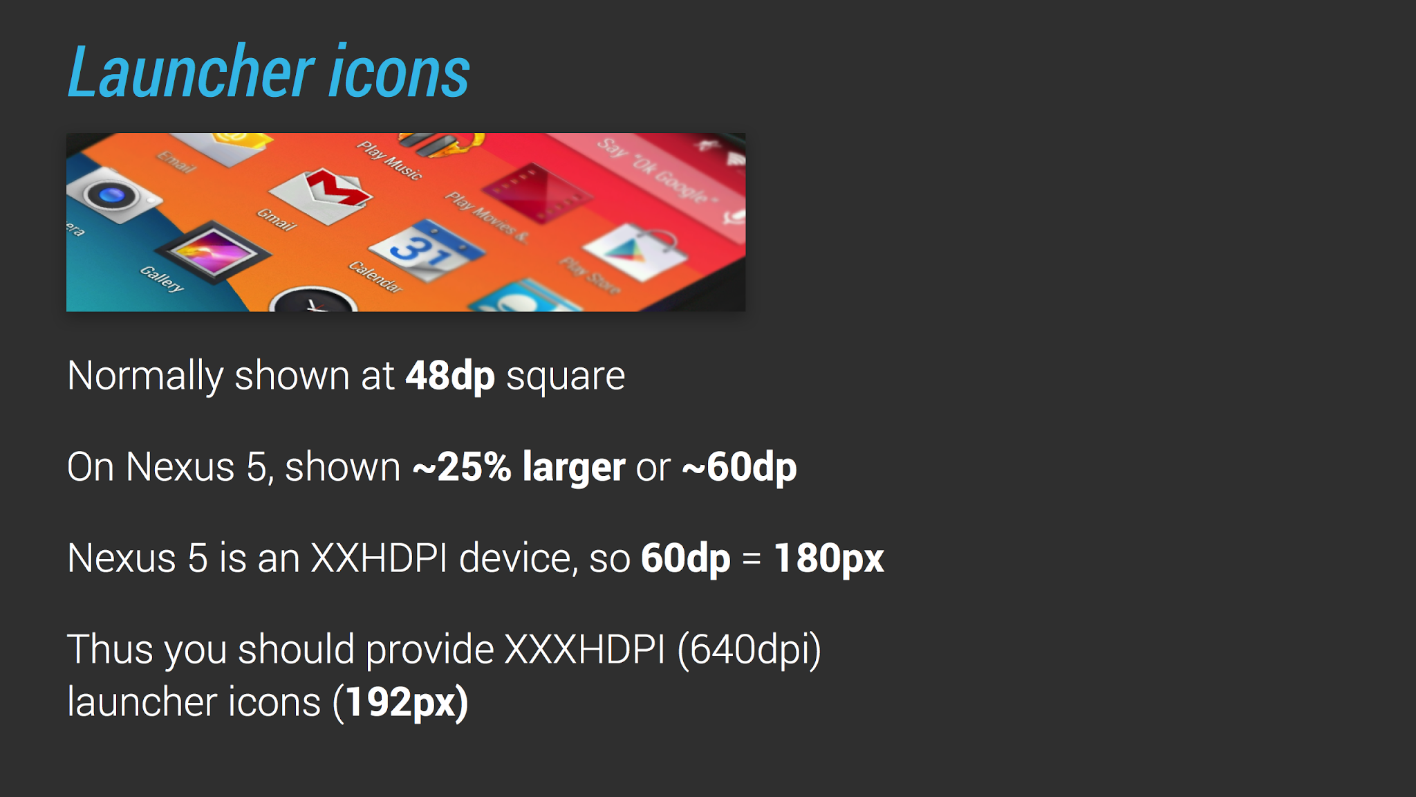
Android 4.4 - Desktop Icons
Colleagues from Android Design In Action in their videosdedicated to Android 4.4, there is a wonderful slide. We will analyze it in more detail. In previous versions of Android, the size of the icons on the desktop is 48 dp. But on Nexus 5, they decided to increase the icons by 25%, so the icon size was somewhere around 60 dp. That is, since the Nexus 5 screen has a density of XXHDPI, 60 dp = 180 px. Correspondingly, 48 dp x 4 (coefficient for XXXHDPI) = 192 px, so it turns out that the icon on the Nexus 5 looked dusty, you need to prepare its resources for the screen density XXXHDPI.
Folders have also undergone visual changes. The folder icon is now a translucent white circle. When you click on it, a translucent white pop-up pops up. By the way, folders can still only have 16 icons. The rumor about the icons hiding inside was not confirmed.
And one more subtle point. On Android 4.4, if the folder has more than 10 icons, then pop-up is located in the center of the desktop. Whereas on Android 4.3 it was pressed to that corner, closer to which was the folder.

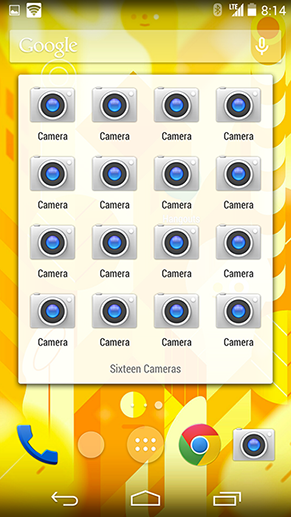
On the left is Android 4.3 Jelly Bean, on the right is Android 4.4 Kit Kat
And finally, the signatures for the icons are now made in Roboto Condensed. Obviously, more letters will fit into the signature, and the modified Roboto Condensed does not impair readability.
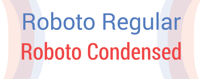
Android 4.4 - Roboto
Indicators
The horizontal divider for the quick action icons has disappeared. On Android 4.3, it also served as an indication of the selected desktop. But on Android 4.4, translucent white dots resembling an iOS solution are now located instead. When the user starts to move something, after the last point the + icon appears, symbolizing that you can create a new working screen.
The program menu call button, of course, was also redrawn. When pressed, it becomes more flooded, while on Android 4.3, the pressed state was accompanied by a slight blue glow.
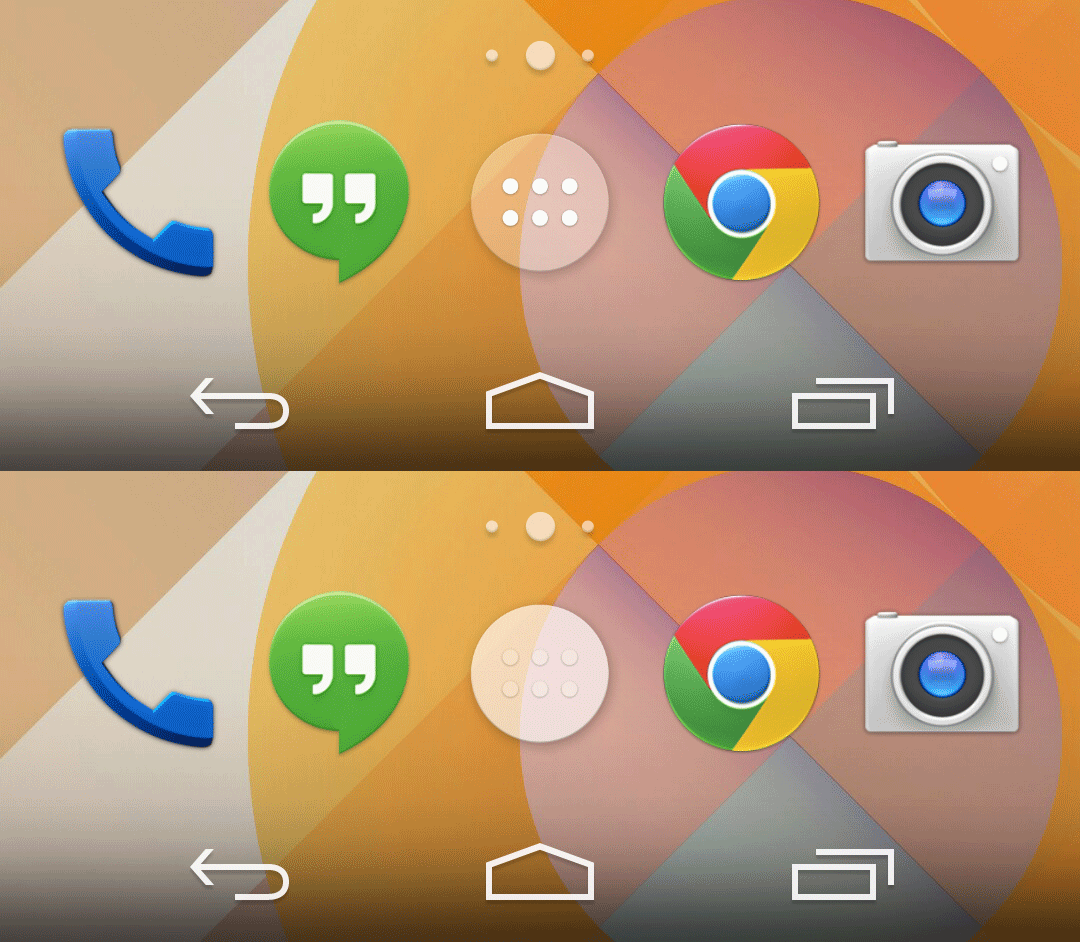
Android 4.4 - The App Drawer Button
As noted above, the icons in the status bar have turned white, and always, and this is a little confusing after Android 4.3. In Jelly Bean, when some service did not work, its icon in the status bar was repainted from Holo Blue to gray. Google explains this step in Kit Kat by the fact that only a small percentage of users understood the meaning of this change in the color of the icons. Now you can understand whether there is a connection with the services or not, only from the quick settings panel. In its absence, the icons are repainted from white to orange.
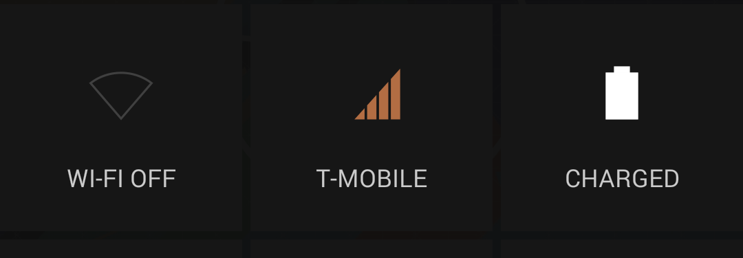
Android 4.4 - Quick Settings
Widgets and their editing
In Android 4.0, Google has moved widgets to the program menu. You could add a widget to your desktop either by selecting the Widgets tab, or by scrolling to the end of the screens with all installed programs.
In Android 4.4, Google again changed the order of adding widgets. Now you can change / add widgets, wallpapers, search settings through the long press on the desktop. The add-on interface remains the same - the same translucent cards, naturally, are white. If the user selects the widget and drags it, now it is possible to create a new desktop. By the way, through long press you can also change the position of the working screens.
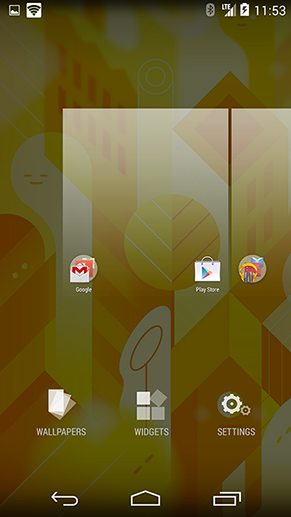
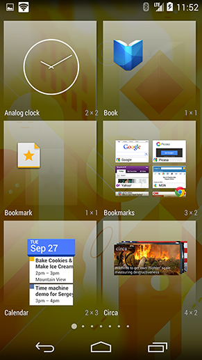
Android 4.4 - Setting widgets
Desktop wallpaper
Previously, in order to set a photo or a downloaded picture as wallpaper on your desktop, you had to go through the terrible crop-fit interface of the picture. On Android 4.4, the situation has changed for the better.
Firstly, all stock wallpapers, live wallpapers, your own pictures are now located in one long tape.
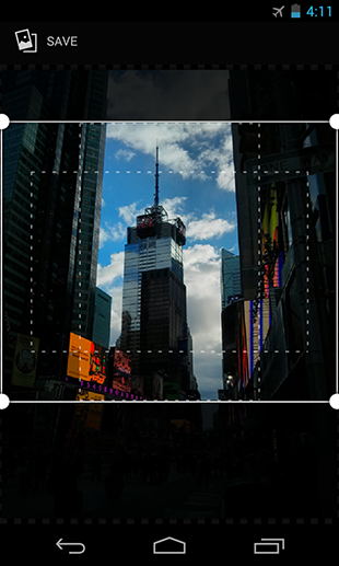
Android 4.3 Jelly Bean
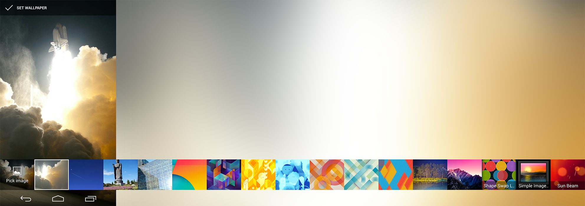
Android 4.4 Kit Kat
Secondly, when choosing a picture now there is no interface for cropping them. To fit the picture under the screen, a logical and convenient pinch-to-zoom is used.
Program menu
The most noticeable change in the program menu is that now there are only programs. The widget tab was removed for the reasons described above. And instead of the horizontal paginator, dots are used, as on the desktop screens.
In the second part of the article I will describe the updated stock programs and some additional functions and modes for designers / developers.
Based on stuff from Android Police