Some words about gradients
Hello! Today I want to talk a little about gradients, popular sites that give users the ability to choose and / or generate them, as well as a few gradients that I like and use in various projects. Perhaps some of you will like them too.
Today, few people know what gradients are and how to apply them in development. If you believe the articles, then in 2018, the use of bright and saturated gradients is a kind of trend.
What is a gradient?
Let's take a tick, remember what a gradient is.
Gradieant (from the Latin. Gradiens, genus. Case gradientis - walking, growing) - a vector that indicates the direction of the greatest increase of a certain value {\ displaystyle \ varphi} \ varphi, whose value changes from one point of space to another (scalar field), and the value (modulus) equal to the growth rate of this value in this direction
Gradients are used in various fields, but we are interested in the sphere of web development, where gradients are often used as the main background of sites and various containers, lines, quotes, blocks and even text.
Gradient notation in css
Let's take a quick look at what the classic gradient consists of.
Gradient can be written in two ways:
background: linear-gradient (36deg, # 0dd3ff, # 0389ff, # 1c79c0);
background-image: linear-gradient (36deg, # 0dd3ff, # 0389ff, # 1c79c0);
What form of record to use is up to you.
In the code above, we specify three values for the background properties :
- 1. What will be the gradient - linear-gradient - in this case it is linear. Later in the article we will talk about it.
- 2. Indicated the angle of inclination of the gradient line, which shows the direction of the gradient. There are two ways to indicate the direction: [<angle> | to <position>] , where the angle is measured in deg , that is, degree, or in the second way, by indicating the position from and to . For example, to top , to right , to bottom left , etc.
- The value of the color # ****** , which will begin and end the gradient.
All values are separated by commas, and the number of colors can be absolutely anything, from two to infinity. But, of course, within reason.
Writing color gradients
The color of the gradient can be written by any available designation:
- Hex Color Code - # 000000 or abbreviation # 000;
- RGB Color Code - rgb (0, 0, 0);
- Color Name - black;
- HSL Color Code - hsl (0, 0%, 0%);
You can also specify colors as a percentage by adding % after the color . For example, rgb (0, 0, 0) 0%, rgb (255,255,255) 100% .
That's all the basic knowledge necessary to apply gradients in web development. But surely not everyone knows that gradients can be used in other cases. Below about them.
Gradients with images
To record a combined gradient, with a picture as a background, you can use other background properties. Let's look at two examples:
In the first example, we created a gradient background (example 1), and in the second we added an image and superimposed our gradient on it (example 2).
Gradient for text
Sometimes you want to make the text of the link or title more vivid, noticeable and / or replace the plain text with some picture. CSS allows us to do this using the following properties:
- mix-blend-mode
- -webkit-text-fill-color in combination with -webkit- background-clip
Examples:
mix-blend-mode
background-clip
Similar actions can be performed by replacing the gradient with a link with an image.
The main thing to remember is that some properties are not supported by all versions of browsers. Check compatibility on the Can I use website.
Combining CSS Gradients in Background Blend Mode
More recently, three more new CSS properties have appeared that have received fairly good support in modern browsers. These properties include:
- background-blend-mode , for blending background images, gradients and background colors
- mix-blend-mode , to blend elements over other elements, and finally
- isolation , a less used property, is used in mix-blend mode, for mixing elements.
Let's talk a little about the first.
Functions such as linear-gradient () , radial-gradient () , and repeating-linear-gradient () , repeating-radial-gradient () and other types have wide support and more standardized syntax in all modern browsers. However, the background property can also include more than one gradient, with each function separated by a comma. Lea Verou demonstrated impressive patterns - patterns that can be created using this technique: from chess boards, to bricks, to stars. But now that we have the background-blend-mode property, we can create new gradients and patterns. Examples below.
Spectral background
We apply three gradients to create a background with an almost full range of colors that can be displayed on the monitor. And here we have a colorful background. Creating a similar effect was previously possible only with an image whose weight would be tens of kilobytes. But we just reproduced this effect through CSS for less than 200 bytes, not to mention saving the HTTP request.
.spectrum-background {

 background:

 linear-gradient(red, transparent),

 linear-gradient(to top left, lime, transparent),

 linear-gradient(to top right, blue, transparent);

 background-blend-mode: screen;

}
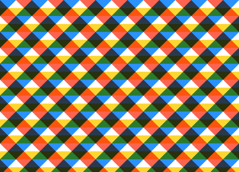
Create a blanket on css
We can also create interesting patterns with gradients using background-blend-mode. In the end, this is what we did
.plaid-background {

 background:

 repeating-linear-gradient(

 -45deg,

 transparent 0,

 transparent 25%,

 dodgerblue 0,

 dodgerblue 50%

 ),

 repeating-linear-gradient(

 45deg,

 transparent 0,

 transparent 25%,

 tomato 0,

 tomato 50%

 ),

 repeating-linear-gradient(

 transparent 0,

 transparent 25%,

 gold 0,

 gold 50%

 ), white;

 background-blend-mode: multiply;

 background-size: 100px 100px;

}
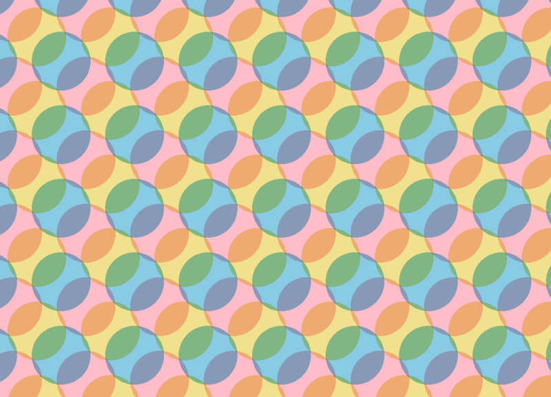
Website background with circles
How about one more, this time with a radial gradient: The result exceeds all expectations,
.circles-background {

 background:

 radial-gradient(

 khaki 40px,

 transparent 0,

 transparent 100%

 ),

 radial-gradient(

 skyblue 40px,

 transparent 0,

 transparent 100%

 ),

 radial-gradient(

 pink 40px,

 transparent 0,

 transparent 100%

 ), snow;

 background-blend-mode: multiply;

 background-size: 100px 100px;

 background-position: 0 0, 33px 33px, -33px -33px;

}
Night vision effect
Let's now try to recreate another effect with CSS blending modes and take a photo as if we were viewing it through the lens of night vision goggles.
Take the usual image
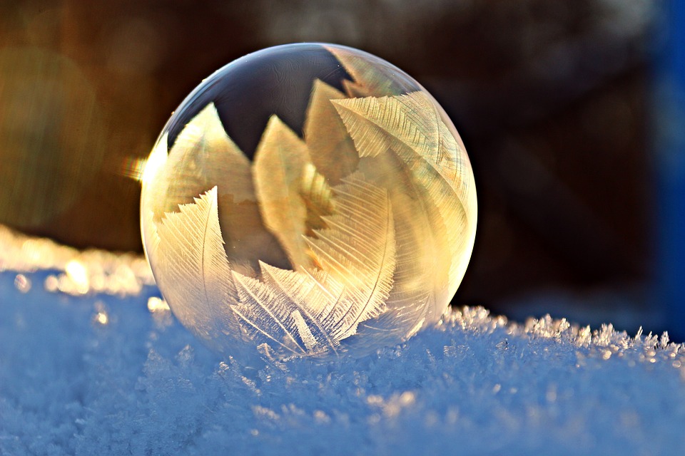
and impose on it a radial gradient and a gradient that we used when creating the plaid - repeating-linear-gradient And here is the result .
.night-vision-effect {

 background:

 url(https://wallpaperbrowse.com/media/images/soap-bubble-1958650_960_720.jpg),

 radial-gradient(

 rgba(0,255,0,.8),

 black

 ),

 repeating-linear-gradient(

 transparent 0,

 rgba(0,0,0,.2) 3px,

 transparent 6px

 );

 background-blend-mode: overlay;

 background-size: cover;

 }
Gradient Generator Sites
Below I will provide a selection of sites that allow you to generate the very gradients, make them canvas, png and svg formats and copy the code for installation in your projects.
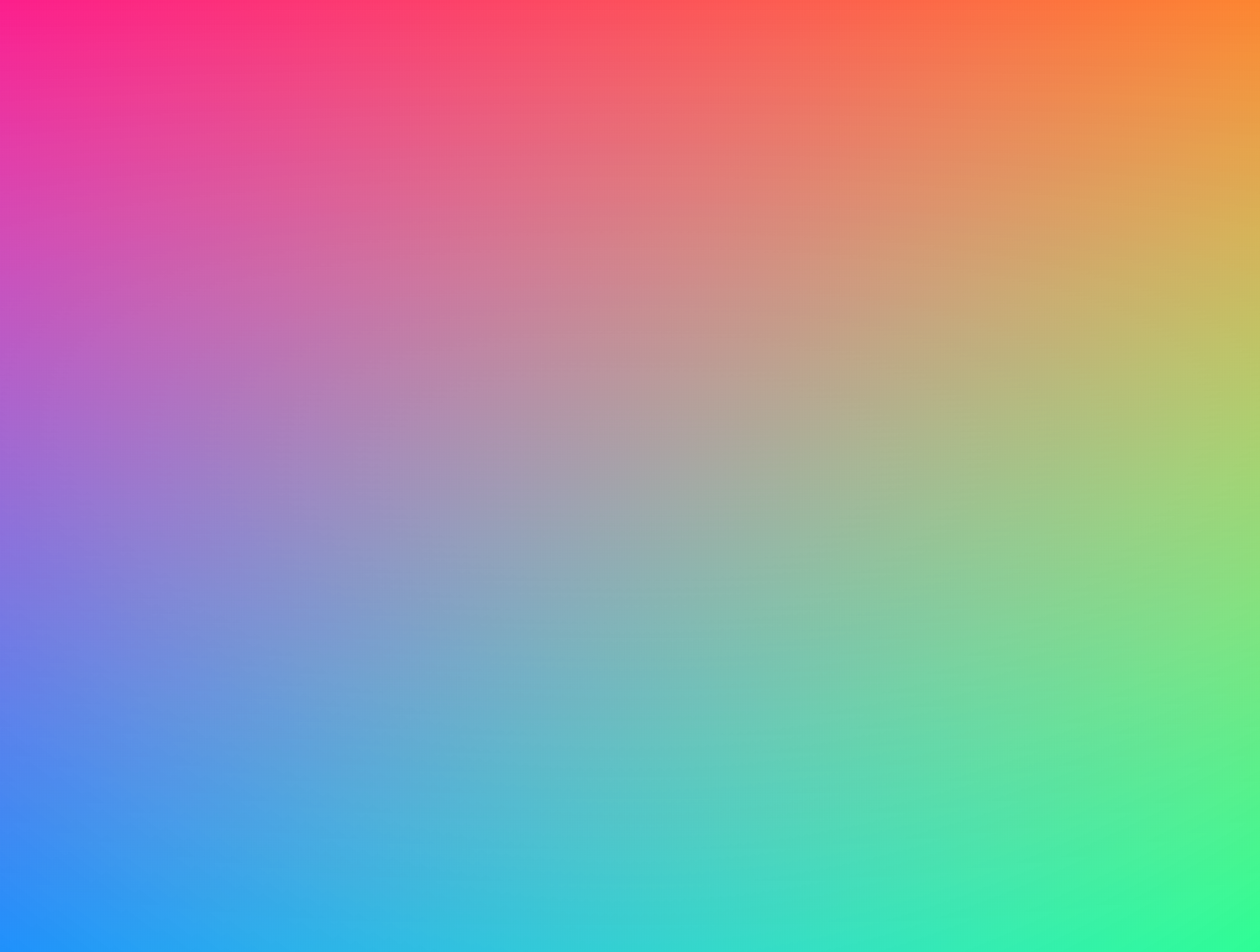
And finally, I want to share with you my selection of gradients that I really like and that I use in various projects and in website development.
Good luck and enjoy your creativity. Write your favorite gradients in the comments.