Recipe schemes for pizzeria cuisine. Fast food plus design
Take a pizzeria with up to a thousand orders per day. Multiply the number of orders by the number of pizzerias in different cities of Russia. Do not forget that often people come to fast food for part-time jobs, which is why it is necessary to quickly train people and just as quickly get them to work. This is the description of the company in which I work.
To make pizza, an employee in the kitchen must know her recipe.
My task was to come up with schemes, looking at which even a “person from the street”, being on the Pizza Assembly Line, would be able to assemble pizza without errors. As a result, schemes were created that will be used in different pizzerias from different cities, instructions are drawn and tests are carried out on “people from the street”. About how it was I want to tell.
To begin with, the pizzeria worked for a couple of years, when a new design of tables with recipes was needed. That is, recipes have already been placed above the pizza assembly line.
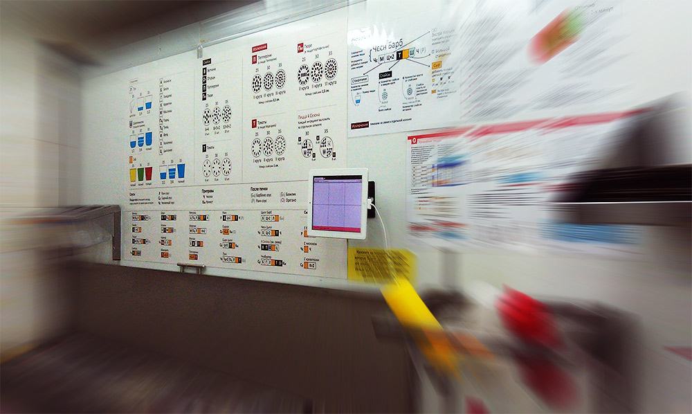
The line before the redesign.
Pizza recipes already existed. Why make a new design?
Firstly, the recipes themselves had to change in order to greatly unify the number of ingredients in different pizzas - this would increase the speed of memorizing recipes by pizza makers. Secondly, the existing recipe scheme was difficult for quick perception.
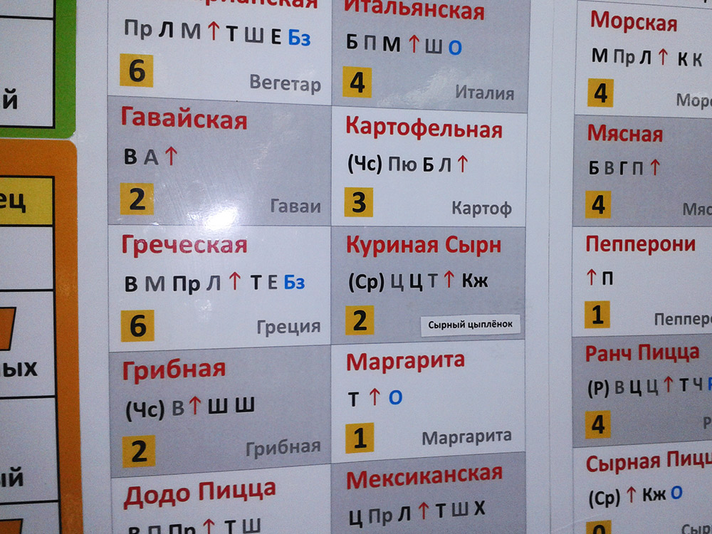
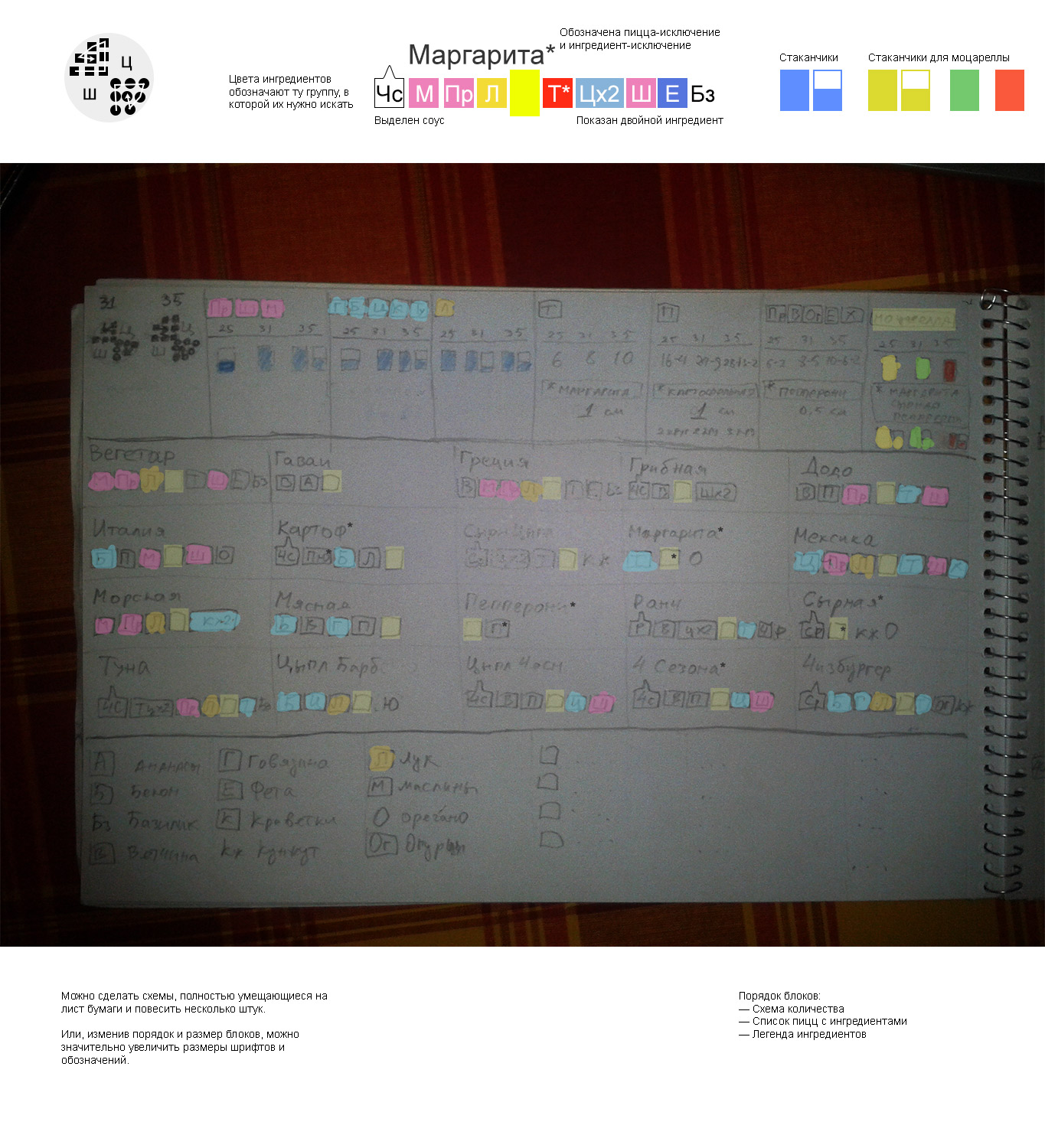
Pizza recipes. The block consists of the name of the pizza, the order of the ingredients, the sum of the ingredients in the pizza (needed to find the amount of the ingredient in the table with the quantities) and the abbreviated name in the IP. The arrow indicates Mozzarella cheese. A double serving is indicated by repetition of contraction. The alternation of black and gray colors of fonts (does not make logical sense), the blue color of the ingredients added after the oven.
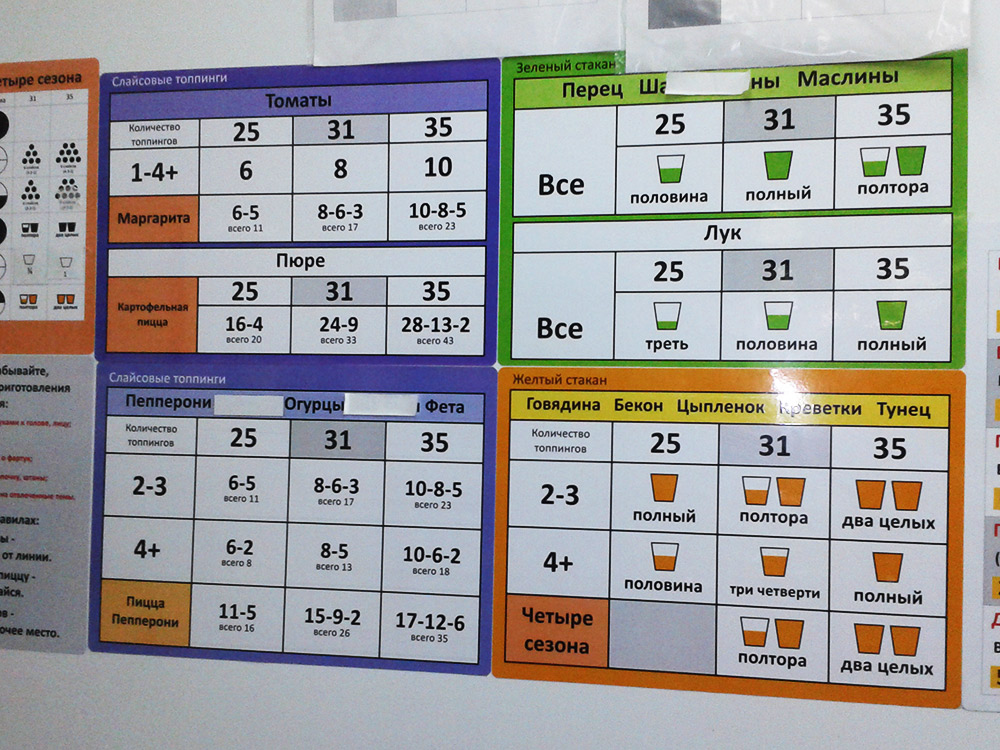
Tables with quantities of ingredients. There is a dependence on the size of the pizza and on the total number of ingredients in the pizza, but first you have to find the ingredient among all the others in the heading of the table.
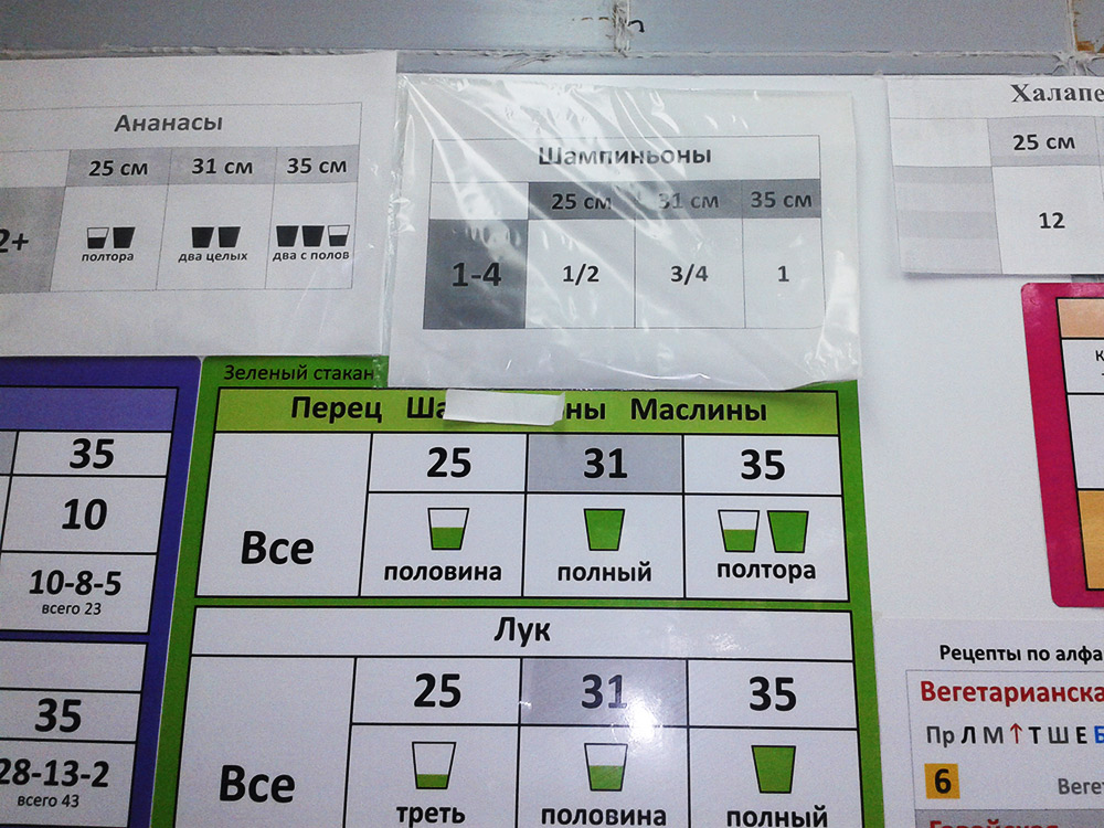
Example with champignons - the quantity in recipes has changed and for them they printed a separate sheet on the printer, covering the name of the ingredient in the old tables.
So, the essence of the problem:create a pizza recipe scheme that will be quickly read by an unprepared person and that will be easy to remember .
We worked on the tables together with Eugenia Savchuk, who is responsible in the pizzeria for recipes of products. She already had first ideas about future recipes for products.
The quantities for most of the ingredients are already known.
Most important - in the new recipes, the need to know the amount of ingredients for pizzas has disappeared, and the quantities of added ingredients have been averaged for all pizzas.
Soon the first sketches are born.
A pencil sketch on paper is photographed and processed in Photoshop. Colors and comments added.
Each ingredient is placed in a cell . Without cells there are sesame-type ingredients that are added after the oven. The sauce is proposed to indicate a separate icon
  (most pizzas are made in Pizza sauce, so it is not indicated).
It is already obvious that not all quantities for the ingredients can be unified, so there will be exceptions (indicated by an asterisk *).
There is an idea to get away from the icons of cups in order to more abstractly depict the quantity . The idea did not take root and the cup icons returned.
Based on the fact that the ingredients will be divided into groups by quantity and still focusing on the previous scheme, I propose to color the ingredients in different colors depending on the group. It immediately becomes clear that on the recipe chart such a number of colors will be very difficult to read.
Second approach. Here for the first time there appears a version with the division of cells into cups / slices through the background color (some ingredients are scooped up with cups, and some are laid out individually) - a dark background for sliced ingredients.

One of the sketches with explanations sent for discussion.
In the third approach, I am trying to find alternative options.
Another sketch with comments sent for discussion.
Here it is proposed to simply show the amount of all ingredients for each pizza in the pizza block itself, that is, combine recipes and quantity schemes. As it turned out later, Papa John's recipes are organized exactly on this principle. Its disadvantage is that you have to remember the recipe for each existing pizza separately.
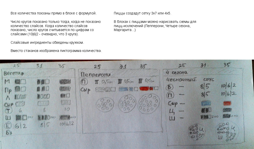
The final sketch. Most of the details and approaches as a result are used exactly as shown here.
First Cleaner
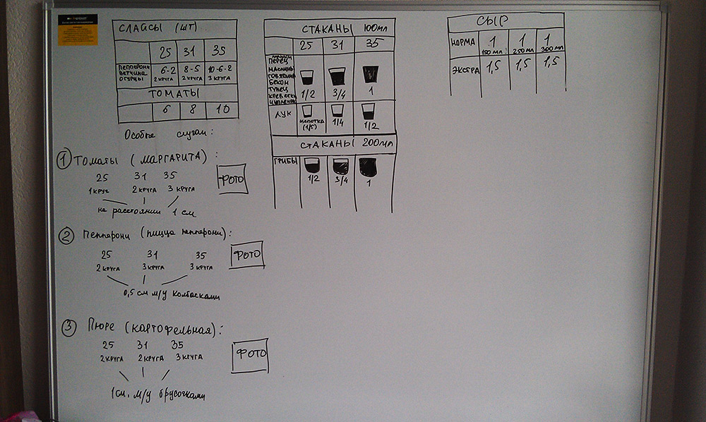
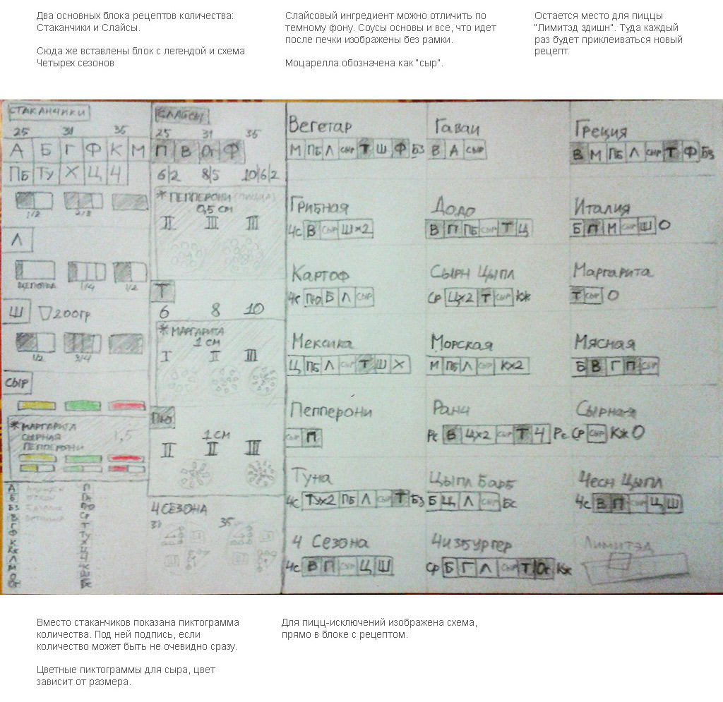
Here the recipes and quantities fit on one printed sheet. Instead of cups, pictograms, and abbreviations are deciphered in a separate block at the bottom left.

A well-developed version of the first design with explanations.
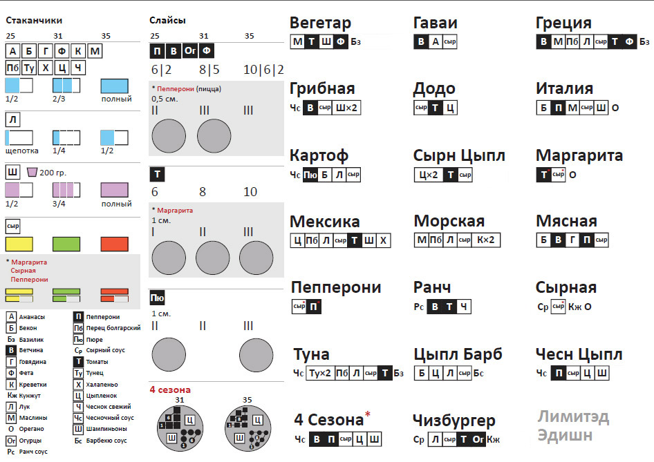
Now you need to place the diagram on the "wall". In the process, new solutions arise in the format and size of blocks.

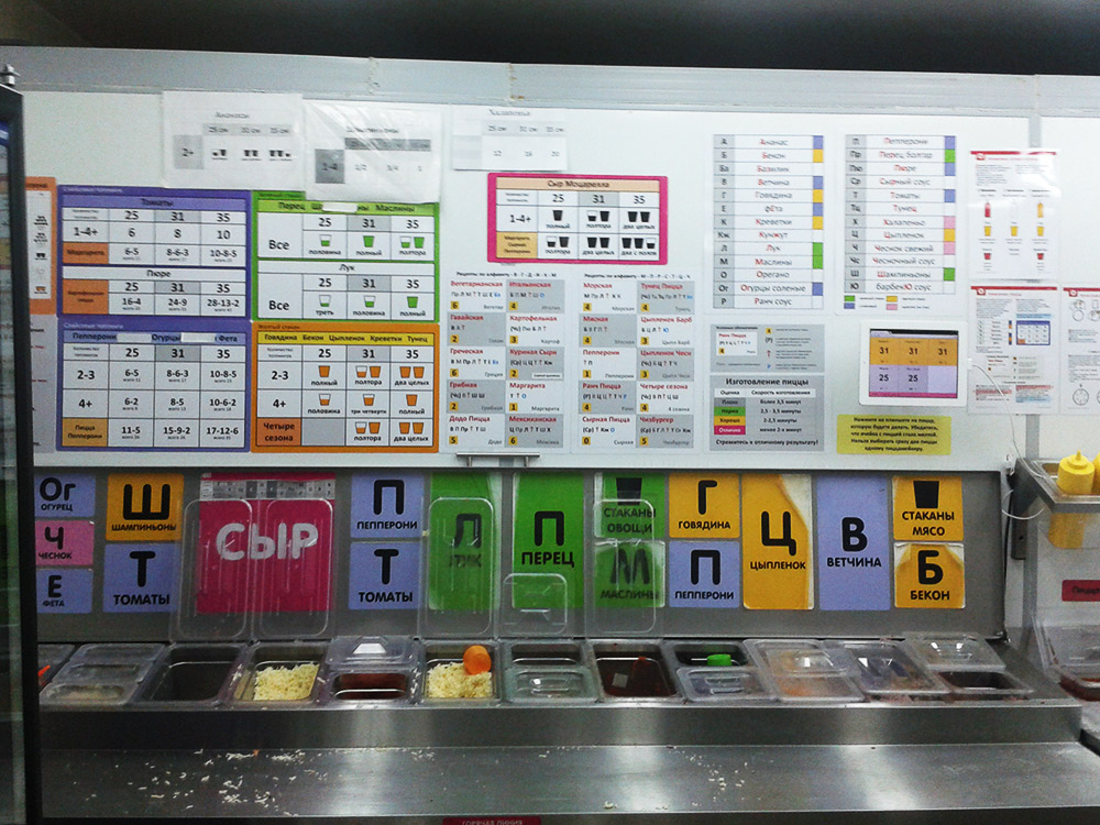
Pizza recipes begin to separate from the number schemes.
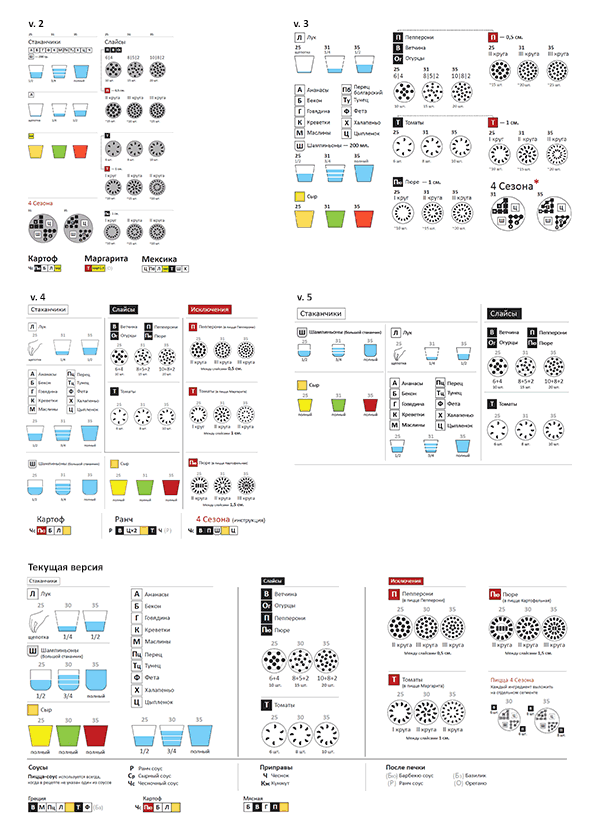
Subsequently, there were many options for placement. Changes to the layout involved changes in the format and size of instructions. Major changes from version to version (click to enlarge)
So, the schemes came to the form in which they are now placed in pizzerias. I want to talk about why changes were made to the changes, how the version testing process went, and how the instructions for the schemes looked in different versions.
To make pizza, an employee in the kitchen must know her recipe.
My task was to come up with schemes, looking at which even a “person from the street”, being on the Pizza Assembly Line, would be able to assemble pizza without errors. As a result, schemes were created that will be used in different pizzerias from different cities, instructions are drawn and tests are carried out on “people from the street”. About how it was I want to tell.
To begin with, the pizzeria worked for a couple of years, when a new design of tables with recipes was needed. That is, recipes have already been placed above the pizza assembly line.
The line before the redesign.
Pizza recipes already existed. Why make a new design?
Firstly, the recipes themselves had to change in order to greatly unify the number of ingredients in different pizzas - this would increase the speed of memorizing recipes by pizza makers. Secondly, the existing recipe scheme was difficult for quick perception.
Pizza recipes. The block consists of the name of the pizza, the order of the ingredients, the sum of the ingredients in the pizza (needed to find the amount of the ingredient in the table with the quantities) and the abbreviated name in the IP. The arrow indicates Mozzarella cheese. A double serving is indicated by repetition of contraction. The alternation of black and gray colors of fonts (does not make logical sense), the blue color of the ingredients added after the oven.
Tables with quantities of ingredients. There is a dependence on the size of the pizza and on the total number of ingredients in the pizza, but first you have to find the ingredient among all the others in the heading of the table.
Example with champignons - the quantity in recipes has changed and for them they printed a separate sheet on the printer, covering the name of the ingredient in the old tables.
So, the essence of the problem:create a pizza recipe scheme that will be quickly read by an unprepared person and that will be easy to remember .
Search for a solution
We worked on the tables together with Eugenia Savchuk, who is responsible in the pizzeria for recipes of products. She already had first ideas about future recipes for products.
The quantities for most of the ingredients are already known.
Most important - in the new recipes, the need to know the amount of ingredients for pizzas has disappeared, and the quantities of added ingredients have been averaged for all pizzas.
Soon the first sketches are born.
A pencil sketch on paper is photographed and processed in Photoshop. Colors and comments added.
Each ingredient is placed in a cell
. Without cells there are sesame-type ingredients that are added after the oven. The sauce is proposed to indicate a separate icon (most pizzas are made in Pizza sauce, so it is not indicated).It is already obvious that not all quantities for the ingredients can be unified, so there will be exceptions (indicated by an asterisk *).
There is an idea to get away from the icons of cups in order to more abstractly depict the quantity
. The idea did not take root and the cup icons returned. Based on the fact that the ingredients will be divided into groups by quantity and still focusing on the previous scheme, I propose to color the ingredients in different colors depending on the group. It immediately becomes clear that on the recipe chart such a number of colors will be very difficult to read.
Second approach. Here for the first time there appears a version with the division of cells into cups / slices through the background color (some ingredients are scooped up with cups, and some are laid out individually) - a dark background for sliced ingredients.
One of the sketches with explanations sent for discussion.
In the third approach, I am trying to find alternative options.
Another sketch with comments sent for discussion.
Here it is proposed to simply show the amount of all ingredients for each pizza in the pizza block itself, that is, combine recipes and quantity schemes. As it turned out later, Papa John's recipes are organized exactly on this principle. Its disadvantage is that you have to remember the recipe for each existing pizza separately.
The final sketch. Most of the details and approaches as a result are used exactly as shown here.
Refinement of the solution
First Cleaner
Here the recipes and quantities fit on one printed sheet. Instead of cups, pictograms, and abbreviations are deciphered in a separate block at the bottom left.
A well-developed version of the first design with explanations.
Now you need to place the diagram on the "wall". In the process, new solutions arise in the format and size of blocks.
Pizza recipes begin to separate from the number schemes.
Subsequently, there were many options for placement. Changes to the layout involved changes in the format and size of instructions. Major changes from version to version (click to enlarge)

So, the schemes came to the form in which they are now placed in pizzerias. I want to talk about why changes were made to the changes, how the version testing process went, and how the instructions for the schemes looked in different versions.