August 23, 2013 at 07:17
Proper adaptive typography with FlowType.JS
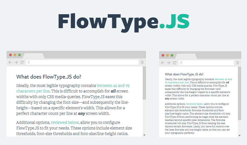
According to the rules of typography, the content of the page is well read if the line contains 45 to 75 characters. When developing responsive design, it is difficult to implement it only with the help of Media Queries. The jQuery FlowType plugin has appeared , which helps to achieve this ratio for any screen size and window width.
FlowType changes the font size and line spacing to fit the width of the content block. In addition, you can specify plug-in parameters, for example, the maximum and minimum window widths at which FlowType will work.
$('body').flowtype({
 minimum : 500,
 maximum : 1200
});
And also the font size limits on the page:
$('body').flowtype({
 minFont : 12,
 maxFont : 40
});
Due to the fact that all fonts are different, sometimes it is advisable to set a certain coefficient that will scale the font and line spacing on the page for better readability:
$('body').flowtype({
 fontRatio : 30,
 lineRatio : 1.45
});
FlowType is an open source project ( page on GitHub ), distributed under the MIT license . Demonstration where all content is scaled by the plugin.