Responsive images: CSS techniques that help save time
- Transfer
If you are engaged in web development, then there is a high probability that you know two monsters, which will be discussed in the article, the translation of which we are publishing today. We are talking about images and deadlines. Sometimes, for some reason, the pictures do not want to be placed in those places of the page layouts that are intended for them, and you can not spend a few hours trying to figure it out.
The author of this material says that he often encountered a similar problem, and these collisions taught him something. Here he wants to talk about the five approaches to managing the size of images that he likes most.

Friday. Five o'clock in the evening. You need to urgently finish a certain page. Everything is ready, the problem is only in the pictures, which can not be placed where they should be. If this happened to you - here is one magic tool that will help you out:
Looks familiar? We all did it once. Did this make you think about fraud?
The use of properties is
What if I say the property
That's all. Note that the property
Unfortunately,
Here are the details of the support for this feature, taken from here .

Object-fit support for desktop browsers
→ Here is an example of using object-fit
What we have just talked about may seem interesting, but in older browsers, without polyfills, it will not work. If you need something universal, perhaps, what we are going to talk about now will suit you. This method, one of my favorites, works everywhere.
It lies in the fact that the image must be placed in the parent element whose property
Here you might think that it is too difficult. However, after you understand the meaning of this technique, you realize that it is very simple and convenient. In addition, this technique is widely used , for example, in Netflix.
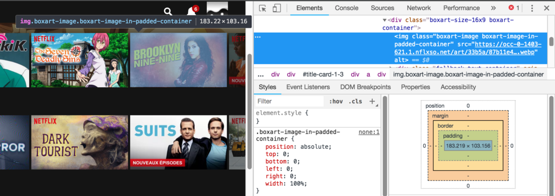
Take a look at the class names
→ Here is an example of the implementation of this technique
Here, the property is used to control the size of the image
This approach is applicable in most cases, when your layout is not too complicated.
→ Here is an example
By “performance”, I understand the page load time. A large image can load for a very long time, which will give the user the impression that your pages are slow, especially if they are viewed on mobile devices.
Do you know that in modern browsers you can change the source of the image depending on the width of the page? It is for this that the attribute exists
Similar attributes can be used in the HTML 5 tag
→ Here is an example
Let's sum up:
We hope that the approaches to working with images discussed here will be useful to you.

Approach # 1: background-image
Friday. Five o'clock in the evening. You need to urgently finish a certain page. Everything is ready, the problem is only in the pictures, which can not be placed where they should be. If this happened to you - here is one magic tool that will help you out:
.myImg {
  background-image: url("my-image.png");
  background-size: cover;
}
Looks familiar? We all did it once. Did this make you think about fraud?
The use of properties is
backgroundvery useful, they just do what is expected of them. However, it should be remembered that they should be used only for those images that are not part of the main content of the page, for images that replace text, and in some special cases .Approach # 2: object-fit
What if I say the property
object-fitapplies to elements <img>? It, by the way, works with video..myImg {
object-fit: cover;
width: 320px;
height: 180px;
}That's all. Note that the property
object-fitcan be assigned a value contain.▍About object-fit support
Unfortunately,
object-fitit will not work in IE and in older versions of Safari, however, there is a polyfill for such cases . Here are the details of the support for this feature, taken from here .
Object-fit support for desktop browsers
→ Here is an example of using object-fit
Approach # 3: The Way Netflix Uses
What we have just talked about may seem interesting, but in older browsers, without polyfills, it will not work. If you need something universal, perhaps, what we are going to talk about now will suit you. This method, one of my favorites, works everywhere.
It lies in the fact that the image must be placed in the parent element whose property
positionis set to a value relative, and the property paddingis set as a percentage. As a result, the image will occupy the entire free area of the parent element. It looks like this:.wrapper {
position: relative;
padding-top: 56.25%; /* 16:9 Aspect Ratio */
}
img {
position: absolute;
left: 0;
top: 0;
width: 100%;
height: auto;
}Here you might think that it is too difficult. However, after you understand the meaning of this technique, you realize that it is very simple and convenient. In addition, this technique is widely used , for example, in Netflix.
Take a look at the class names
→ Here is an example of the implementation of this technique
Approach # 4: height
Here, the property is used to control the size of the image
height: auto, and, moreover, the property max-width. It is possible that this technique is already familiar to you:img {
height: auto;
width: 100%;
/* свойство max-width, позволит лучше контролировать изображение */
max-width: 720px;
}This approach is applicable in most cases, when your layout is not too complicated.
→ Here is an example
Approach # 5: Image Management and Performance
By “performance”, I understand the page load time. A large image can load for a very long time, which will give the user the impression that your pages are slow, especially if they are viewed on mobile devices.
Do you know that in modern browsers you can change the source of the image depending on the width of the page? It is for this that the attribute exists
srcset. Similar attributes can be used in the HTML 5 tag
. В том случае, если браузер эту технологию не поддерживает, здесь предусмотрен запасной вариант с использованием тега <img>:<picture>
<sourcemedia="(max-width: 799px)"srcset="elva-480w.jpg">
<sourcemedia="(min-width: 800px)"srcset="elva-800w.jpg">
<imgalign="center"src="elva-800w.jpg"></picture>→ Here is an example
Results
Let's sum up:
- If your image is not part of the page content - use
background-image. - If IE support does not interest you - use
object-fit. - Container technology with a specially configured property
paddingused by Netflix works everywhere. - In most cases, to solve the problem with pictures, it is enough to use the property in the CSS
height: auto; - If you want to reduce page load times, use the attribute
srcsetto download smaller images on mobile devices.
We hope that the approaches to working with images discussed here will be useful to you.
Only registered users can participate in the survey. Sign in , please.