August 14, 2013 at 22:35
Model-View in QML. Part Two: Custom Views
Not always ready-made performances are ideal. Consider the components that allow you to create a fully customized view and achieve great flexibility in the construction of the interface. And from me a little bonus for patient readers :)
Model-View in QML:
This component partially belongs to the same group of ready-made displays, but the arrangement of elements is completely controlled by the user. This is achieved by the fact that the component allows you to arrange the elements along a specific path, which is composed of straight lines, curves and arcs. The path may be closed, but this is not necessary. Throughout the path, we can also control the properties of the elements. For example, you can make the element become larger in a certain place and it seems that it is closer to the user. In addition to this, those elements that should appear to be further away from the user can be made translucent. In general, there are many possibilities for adjusting the appearance of elements.
The main purpose of PathView is not just to display data, but also to make it look visually attractive. It is with this component that things such as CoverFlow (a popular option for displaying album covers in multimedia players) are done.
Let's start with a simple example by arranging the elements along a curve (to be completely accurate, a quadratic Bezier curve is used )
A path is described using an object of type Path, in which we place objects that describe parts of this path. In our case, the path consists of one section in the form of a curve.
The startX and startY parameters describe the coordinates of the start of the path. It ends where it ends its last section. For the plot, on the contrary, it is not the beginning that is set, but the end, using the parameters x and y. In our case, the curve is built on three points: in addition to the end and the beginning, we need one more coordinate, on which the bending will depend. Its coordinates are controlledX and controlY. For the path segment, the coordinates are set relative to the parent, i.e. the path object. There are also special properties that allow you to specify coordinates relative to the beginning of the path. Such properties have a relative prefix (for example, relativeControlY).
Let's see what we got:
Since all elements are placed in the PathView, we can drag the elements with the mouse and will move along the path.
In the previous example, the path is not closed. After an element reaches its path, it appears at the beginning. It is not much harder to make the path closed. To do this, it is necessary that the coordinates of its beginning and end coincide. The Path object even has a special closed property that reflects whether it is closed.
We will redo the first example a bit and make a closed path from two Bezier curves (PathQuad):
Each element of the path begins where the previous one ends. Our last segment ends where the whole journey begins.
As a result, we get this figure:
In addition to the considered curve, QtQuick has cubic Bezier curves - the same as quadratic, but with two control points (PathCubic), a curve with an arbitrary number of points (PathCurve), an arc - i.e. part of the circle (PathArk) and a straight line (PathLine). In addition, you can define a curve with a description in SVG format using the PathSvg component. All these components can be combined and made up of the desired path.
There are additional components that do not control the placement of elements and their parameters. One of them is PathPercent, which allows you to control the distribution of elements along sections of the path. By default, the elements are distributed evenly, but using this component, you can specify for the parts of the path how many elements will be located there. To do this, a PathPercent object is placed after the path section, the value parameter of which contains part of the elements for this path (for example, 0.5 for half of the elements).
Consider this with an example:
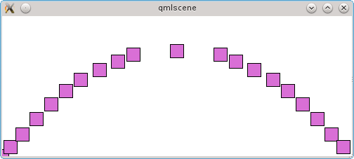
We make up a path of two arcs and one straight line in the middle. At the same time, we make sure that the elements are concentrated on the extreme parts of the path. And it turns out that the central section contains only one element:
Another additional element of the path is PathAttribute, which allows you to control the parameters of elements, depending on their location on the path. In the delegate, these parameters will be available through the attached PathView.name properties, where the name is set using the name property.
PathAttribute sets the values of the parameters at the point in the path in which it is located. The values of the parameters of the elements on the portion of the path that is located between the two PathAttribute objects will smoothly move from the values of one PathAttribute to another. If there is no this object on one side, then zero values will be taken.
Let’s make the central object twice as large and that the outermost elements are translucent:
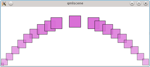
And we get elements in which size and transparency smoothly change:
If you do not need a smooth transition, but you just need to make elements of different sizes, you can surround each such section of the path with PathView objects, and between adjacent sections insert additional sections of the zero-length path, on which the transition from one parameter value to another will take place. But due to the zero size, there are no elements there and this will not be visible.
To demonstrate, we modify the previous example a bit and make each of the three parts of the path surrounded by PathAttribute objects, and place zero-length PathLine objects between these parts.
As a result, we get small translucent elements at the edges and one large and opaque element in the center:

At the beginning of the section, I mentioned CoverFlow. As a bonus to those who have read up to this place, a small example of implementation :)
To begin with, we will look at the resulting result, and then we will analyze the implementation. And we got something like this:

We rotate all elements except the central one around the Y axis. To do this, we set the rotation transformation for delegates using the Rotation component. In the axis property, set 1 for those axes around which the object will rotate.
For elements, we change several parameters: the rotation angle, the location along the Z axis and the turning point (origin). With the angle, everything is simple and obvious: the elements that are on the left rotate 60 degrees, and those on the right, respectively -60. But on the remaining parameters it is worth stopping in more detail.
The Z coordinate determines which element will be “above”, i.e. when two objects intersect in some place, that object with less than Z will be blocked by an object with Z coordinate greater. By default, in PathView, an element with a large index overrides the previous one. In CoverFlow, for elements on the left, you need the other way around: “higher” are those elements that are closer to the center. If nothing is done, then the last element will fit on the penultimate one, and that in turn will be on the element in front of it, etc. Therefore, we change the Z coordinate so that the farther the element is from the center, the “lower” it is. In our example, the sizes are such that the elements do not overlap, but if you slightly reduce the width of the window, then the overlap will immediately appear:
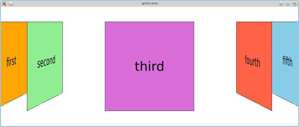
Finally, the turning point. We set the point on our rectangle around which the rotation will take place. By default, this is the upper left corner, i.e. point with coordinates (0, 0). Because If we rotate the element around the Y axis, then the Y coordinate itself does not matter here. But it’s worth paying attention to X. In the case of the elements on the left side, we set this coordinate to 0 and rotate the element around the left edge and it turns out that the right edge visually gets further. If we do the same for the elements on the right, it turns out that we rotate the elements on the left “from ourselves”, and the elements on the right - “to ourselves”, i.e. the left edge will be close, and the right side will become even closer and the right side will be larger. As a result, we get such a situation that the elements on the left and on the right will be of different sizes, which we do not need at all.
In the previous examples, PathView displayed all the elements from the model. The number of items displayed simultaneously can be limited using the pathItemCount parameter. Here I set it to six.
Summarizing, we can say that with the help of QML, such a popular way of presenting data as CoverFlow is quite easily implemented using elements from the standard library.
PathView is a component focused primarily on creating an attractive interface. This tool has great flexibility, allowing you to place elements not only in a straight line, but also on an arbitrary path, as well as change the parameters of the delegate depending on which part of the path it is located.
QML gives us the tools to make our presentation if we have such a need. This is not very difficult and is realized by combining simple elements.
First, we need to create delegate objects for each element of the model. To do this, we will use a special component - Repeater. He is exclusively engaged in the creation of elements, no positioning, etc. he does not do things. It is used in the same way as the * View components: we give it a model and a delegate and it will create delegate instances for each element of the model.
For positioning, we can use the Row and Column elements, in which we place our Repeater. Elements created using Repeater become children of its parent, i.e. in this case, Row or Column, which position their elements as a row or column, respectively.
Only the navigation task remains. If there will be so many elements that all of them cannot fit into the space allotted to them, we need to implement scrolling of the elements. It is done using the Flickable component, which processes the mouse wheel and gestures of the touch screen or the same mouse and scrolls the elements.
For example, let’s arrange the elements not vertically, but horizontally:
We set the height of the Row element to be fixed, and the width will automatically change, depending on the total width of its children. At Flickable we set contentWidth - this is, as you might guess, the width of its content. If it is larger than the width of Flickable itself, it will enable them to scroll. In our example, the last element just does not fit and you can make sure that scrolling works.

As you can see, the QtQuick library allows you to do without using ready-made views and create your own from simple components, which will also work well.
Standard components allow you to implement representations of various types: from tables to elements located along an arbitrary path. In addition to ready-made views, you can create completely your own from the basic components.
PathView is designed to create a display focused on a beautiful appearance and animation and allows you to set the trajectory of the elements, vary the parameters of the element, depending on its location and the density of the elements on different parts of the path.
Model-View in QML:
- Model-View in QML. Part zero, introductory
- Model-View in QML. Part One: Prebuilt Component Views
- Model-View in QML. Part Two: Custom Views
- Model-View in QML. Part Three: Models in QML and JavaScript
- Model-View in QML. Part Four: C ++ Models
1. PathView
This component partially belongs to the same group of ready-made displays, but the arrangement of elements is completely controlled by the user. This is achieved by the fact that the component allows you to arrange the elements along a specific path, which is composed of straight lines, curves and arcs. The path may be closed, but this is not necessary. Throughout the path, we can also control the properties of the elements. For example, you can make the element become larger in a certain place and it seems that it is closer to the user. In addition to this, those elements that should appear to be further away from the user can be made translucent. In general, there are many possibilities for adjusting the appearance of elements.
The main purpose of PathView is not just to display data, but also to make it look visually attractive. It is with this component that things such as CoverFlow (a popular option for displaying album covers in multimedia players) are done.
1) simple example
Let's start with a simple example by arranging the elements along a curve (to be completely accurate, a quadratic Bezier curve is used )
import QtQuick 2.0
Rectangle {
    width: 500
    height: 200
    PathView {
        id: view
        anchors.fill: parent
        model: 30
        path: Path {
            startX: 0
            startY: 0
            PathQuad {
                x: view.width
                y: 0
                controlX: view.width / 2
                controlY: view.height
            }
        }
        delegate: Rectangle {
            width: 20
            height: 20
            color: "orchid"
            border {
                color: "black"
                width: 1
            }
        }
    }
}
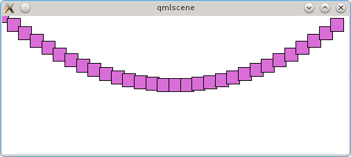
A path is described using an object of type Path, in which we place objects that describe parts of this path. In our case, the path consists of one section in the form of a curve.
The startX and startY parameters describe the coordinates of the start of the path. It ends where it ends its last section. For the plot, on the contrary, it is not the beginning that is set, but the end, using the parameters x and y. In our case, the curve is built on three points: in addition to the end and the beginning, we need one more coordinate, on which the bending will depend. Its coordinates are controlledX and controlY. For the path segment, the coordinates are set relative to the parent, i.e. the path object. There are also special properties that allow you to specify coordinates relative to the beginning of the path. Such properties have a relative prefix (for example, relativeControlY).
Let's see what we got:
Since all elements are placed in the PathView, we can drag the elements with the mouse and will move along the path.
2) closed path
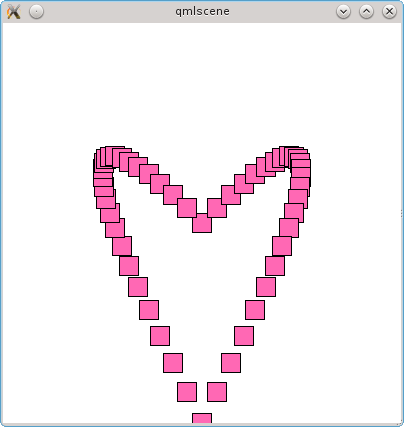
In the previous example, the path is not closed. After an element reaches its path, it appears at the beginning. It is not much harder to make the path closed. To do this, it is necessary that the coordinates of its beginning and end coincide. The Path object even has a special closed property that reflects whether it is closed.
We will redo the first example a bit and make a closed path from two Bezier curves (PathQuad):
import QtQuick 2.0
Rectangle {
    width: 400
    height: 400
    PathView {
        id: view
        anchors.fill: parent
        model: 50
        path: Path {
            startX: view.width / 2
            startY: view.height / 2
            PathQuad {
                relativeX: 0
                y: view.height
                controlX: view.width
                controlY: 0
            }
            PathQuad {
                relativeX: 0
                y: view.height / 2
                controlX: 0
                controlY: 0
            }
        }
        delegate: Rectangle {
            width: 20
            height: 20
            color: "hotpink"
            border {
                color: "black"
                width: 1
            }
        }
    }
}
Each element of the path begins where the previous one ends. Our last segment ends where the whole journey begins.
As a result, we get this figure:
3) path elements
In addition to the considered curve, QtQuick has cubic Bezier curves - the same as quadratic, but with two control points (PathCubic), a curve with an arbitrary number of points (PathCurve), an arc - i.e. part of the circle (PathArk) and a straight line (PathLine). In addition, you can define a curve with a description in SVG format using the PathSvg component. All these components can be combined and made up of the desired path.
There are additional components that do not control the placement of elements and their parameters. One of them is PathPercent, which allows you to control the distribution of elements along sections of the path. By default, the elements are distributed evenly, but using this component, you can specify for the parts of the path how many elements will be located there. To do this, a PathPercent object is placed after the path section, the value parameter of which contains part of the elements for this path (for example, 0.5 for half of the elements).
Consider this with an example:
import QtQuick 2.0
Rectangle {
    width: 500
    height: 200
    PathView {
        id: view
        anchors.fill: parent
        model: 20
        path: Path {
            startX: 0
            startY: height
            PathCurve {
                x: view.width / 5
                y: view.height / 2
            }
            PathCurve {
                x: view.width / 5 * 2
                y: view.height / 4
            }
            PathPercent { value: 0.49 }
            PathLine {
                x: view.width / 5 * 3
                y: view.height / 4
            }
            PathPercent { value: 0.51 }
            PathCurve {
                x: view.width / 5 * 4
                y: view.height / 2
            }
            PathCurve {
                x: view.width
                y: view.height
            }
            PathPercent { value: 1 }
        }
        delegate: Rectangle {
            width: 20
            height: 20
            color: "orchid"
            border {
                color: "black"
                width: 1
            }
        }
    }
}
We make up a path of two arcs and one straight line in the middle. At the same time, we make sure that the elements are concentrated on the extreme parts of the path. And it turns out that the central section contains only one element:
Another additional element of the path is PathAttribute, which allows you to control the parameters of elements, depending on their location on the path. In the delegate, these parameters will be available through the attached PathView.name properties, where the name is set using the name property.
PathAttribute sets the values of the parameters at the point in the path in which it is located. The values of the parameters of the elements on the portion of the path that is located between the two PathAttribute objects will smoothly move from the values of one PathAttribute to another. If there is no this object on one side, then zero values will be taken.
Let’s make the central object twice as large and that the outermost elements are translucent:
import QtQuick 2.0
Rectangle {
    property int itemSize: 20
    width: 500
    height: 200
    PathView {
        id: view
        anchors.fill: parent
        model: 20
        path: Path {
            startX: 0
            startY: height
            PathAttribute { name: "size"; value: itemSize }
            PathAttribute { name: "opacity"; value: 0.5 }
            PathCurve {
                x: view.width / 5
                y: view.height / 2
            }
            PathCurve {
                x: view.width / 5 * 2
                y: view.height / 4
            }
            PathPercent { value: 0.49 }
            PathAttribute { name: "size"; value: itemSize * 2 }
            PathAttribute { name: "opacity"; value: 1 }
            PathLine {
                x: view.width / 5 * 3
                y: view.height / 4
            }
            PathAttribute { name: "size"; value: itemSize * 2 }
            PathAttribute { name: "opacity"; value: 1 }
            PathPercent { value: 0.51 }
            PathCurve {
                x: view.width / 5 * 4
                y: view.height / 2
            }
            PathCurve {
                x: view.width
                y: view.height
            }
            PathPercent { value: 1 }
            PathAttribute { name: "size"; value: itemSize }
            PathAttribute { name: "opacity"; value: 0.5 }
        }
        delegate: Rectangle {
            width: PathView.size
            height: PathView.size
            color: "orchid"
            opacity: PathView.opacity
            border {
                color: "black"
                width: 1
            }
        }
    }
}
And we get elements in which size and transparency smoothly change:
If you do not need a smooth transition, but you just need to make elements of different sizes, you can surround each such section of the path with PathView objects, and between adjacent sections insert additional sections of the zero-length path, on which the transition from one parameter value to another will take place. But due to the zero size, there are no elements there and this will not be visible.
To demonstrate, we modify the previous example a bit and make each of the three parts of the path surrounded by PathAttribute objects, and place zero-length PathLine objects between these parts.
import QtQuick 2.0
Rectangle {
    property int itemSize: 20
    width: 500
    height: 200
    PathView {
        id: view
        anchors.fill: parent
        model: 20
        path: Path {
            startX: 0
            startY: height
            PathAttribute { name: "size"; value: itemSize }
            PathAttribute { name: "opacity"; value: 0.5 }
            PathCurve {
                x: view.width / 5
                y: view.height / 2
            }
            PathCurve {
                x: view.width / 5 * 2
                y: view.height / 4
            }
            PathAttribute { name: "size"; value: itemSize }
            PathAttribute { name: "opacity"; value: 0.5 }
            PathPercent { value: 0.49 }
            PathLine { relativeX: 0; relativeY: 0 } // разделитель
            PathAttribute { name: "size"; value: itemSize * 2 }
            PathAttribute { name: "opacity"; value: 1 }
            PathLine {
                x: view.width / 5 * 3
                y: view.height / 4
            }
            PathAttribute { name: "size"; value: itemSize * 2 }
            PathAttribute { name: "opacity"; value: 1 }
            PathPercent { value: 0.51 }
            PathLine { relativeX: 0; relativeY: 0 } // разделитель
            PathAttribute { name: "size"; value: itemSize }
            PathAttribute { name: "opacity"; value: 0.5 }
            PathCurve {
                x: view.width / 5 * 4
                y: view.height / 2
            }
            PathCurve {
                x: view.width
                y: view.height
            }
            PathPercent { value: 1 }
            PathAttribute { name: "size"; value: itemSize }
            PathAttribute { name: "opacity"; value: 0.5 }
        }
        delegate: Rectangle {
            width: PathView.size
            height: PathView.size
            color: "orchid"
            opacity: PathView.opacity
            border {
                color: "black"
                width: 1
            }
        }
    }
}
As a result, we get small translucent elements at the edges and one large and opaque element in the center:
4) CoverFlow
At the beginning of the section, I mentioned CoverFlow. As a bonus to those who have read up to this place, a small example of implementation :)
import QtQuick 2.0
Rectangle {
    property int itemAngle: 60
    property int itemSize: 300
    width: 1200
    height: 400
    ListModel {
        id: dataModel
        ListElement {
            color: "orange"
            text: "first"
        }
        ListElement {
            color: "lightgreen"
            text: "second"
        }
        ListElement {
            color: "orchid"
            text: "third"
        }
        ListElement {
            color: "tomato"
            text: "fourth"
        }
        ListElement {
            color: "skyblue"
            text: "fifth"
        }
        ListElement {
            color: "hotpink"
            text: "sixth"
        }
        ListElement {
            color: "darkseagreen"
            text: "seventh"
        }
    }
    PathView {
        id: view
        anchors.fill: parent
        model: dataModel
        pathItemCount: 6
        path: Path {
            startX: 0
            startY: height / 2
            PathPercent { value: 0.0 }
            PathAttribute { name: "z"; value: 0 }
            PathAttribute { name: "angle"; value: itemAngle }
            PathAttribute { name: "origin"; value: 0 }
            PathLine {
                x: (view.width - itemSize) / 2
                y: view.height / 2
            }
            PathAttribute { name: "angle"; value: itemAngle }
            PathAttribute { name: "origin"; value: 0 }
            PathPercent { value: 0.49 }
            PathAttribute { name: "z"; value: 10 }
            PathLine { relativeX: 0; relativeY: 0 }
            PathAttribute { name: "angle"; value: 0 }
            PathLine {
                x: (view.width - itemSize) / 2 + itemSize
                y: view.height / 2
            }
            PathAttribute { name: "angle"; value: 0 }
            PathPercent { value: 0.51 }
            PathLine { relativeX: 0; relativeY: 0 }
            PathAttribute { name: "z"; value: 10 }
            PathAttribute { name: "angle"; value: -itemAngle }
            PathAttribute { name: "origin"; value: itemSize }
            PathLine {
                x: view.width
                y: view.height / 2
            }
            PathPercent { value: 1 }
            PathAttribute { name: "z"; value: 0 }
            PathAttribute { name: "angle"; value: -itemAngle }
            PathAttribute { name: "origin"; value: itemSize }
        }
        delegate: Rectangle {
            property real rotationAngle: PathView.angle
            property real rotationOrigin: PathView.origin
            width: itemSize
            height: width
            z: PathView.z
            color: model.color
            border {
                color: "black"
                width: 1
            }
            transform: Rotation {
                axis { x: 0; y: 1; z: 0 }
                angle: rotationAngle
                origin.x: rotationOrigin
            }
            Text {
                anchors.centerIn: parent
                font.pointSize: 32
                text: model.text
            }
        }
    }
}
To begin with, we will look at the resulting result, and then we will analyze the implementation. And we got something like this:
We rotate all elements except the central one around the Y axis. To do this, we set the rotation transformation for delegates using the Rotation component. In the axis property, set 1 for those axes around which the object will rotate.
For elements, we change several parameters: the rotation angle, the location along the Z axis and the turning point (origin). With the angle, everything is simple and obvious: the elements that are on the left rotate 60 degrees, and those on the right, respectively -60. But on the remaining parameters it is worth stopping in more detail.
The Z coordinate determines which element will be “above”, i.e. when two objects intersect in some place, that object with less than Z will be blocked by an object with Z coordinate greater. By default, in PathView, an element with a large index overrides the previous one. In CoverFlow, for elements on the left, you need the other way around: “higher” are those elements that are closer to the center. If nothing is done, then the last element will fit on the penultimate one, and that in turn will be on the element in front of it, etc. Therefore, we change the Z coordinate so that the farther the element is from the center, the “lower” it is. In our example, the sizes are such that the elements do not overlap, but if you slightly reduce the width of the window, then the overlap will immediately appear:
Finally, the turning point. We set the point on our rectangle around which the rotation will take place. By default, this is the upper left corner, i.e. point with coordinates (0, 0). Because If we rotate the element around the Y axis, then the Y coordinate itself does not matter here. But it’s worth paying attention to X. In the case of the elements on the left side, we set this coordinate to 0 and rotate the element around the left edge and it turns out that the right edge visually gets further. If we do the same for the elements on the right, it turns out that we rotate the elements on the left “from ourselves”, and the elements on the right - “to ourselves”, i.e. the left edge will be close, and the right side will become even closer and the right side will be larger. As a result, we get such a situation that the elements on the left and on the right will be of different sizes, which we do not need at all.
In the previous examples, PathView displayed all the elements from the model. The number of items displayed simultaneously can be limited using the pathItemCount parameter. Here I set it to six.
Summarizing, we can say that with the help of QML, such a popular way of presenting data as CoverFlow is quite easily implemented using elements from the standard library.
Brief summary
PathView is a component focused primarily on creating an attractive interface. This tool has great flexibility, allowing you to place elements not only in a straight line, but also on an arbitrary path, as well as change the parameters of the delegate depending on which part of the path it is located.
2. Your submission
QML gives us the tools to make our presentation if we have such a need. This is not very difficult and is realized by combining simple elements.
First, we need to create delegate objects for each element of the model. To do this, we will use a special component - Repeater. He is exclusively engaged in the creation of elements, no positioning, etc. he does not do things. It is used in the same way as the * View components: we give it a model and a delegate and it will create delegate instances for each element of the model.
For positioning, we can use the Row and Column elements, in which we place our Repeater. Elements created using Repeater become children of its parent, i.e. in this case, Row or Column, which position their elements as a row or column, respectively.
Only the navigation task remains. If there will be so many elements that all of them cannot fit into the space allotted to them, we need to implement scrolling of the elements. It is done using the Flickable component, which processes the mouse wheel and gestures of the touch screen or the same mouse and scrolls the elements.
For example, let’s arrange the elements not vertically, but horizontally:
import QtQuick 2.0
Rectangle {
    width: 360
    height: 360
    ListModel {
        id: dataModel
        ListElement {
            color: "orange"
            text: "first"
        }
        ListElement {
            color: "lightgreen"
            text: "second"
        }
        ListElement {
            color: "orchid"
            text: "third"
        }
        ListElement {
            color: "tomato"
            text: "fourth"
        }
    }
    Flickable {
        anchors.fill: parent
        contentWidth: row.width
        Row {
            id: row
            height: parent.height
            Repeater {
                model: dataModel
                delegate: Item {
                    height: parent.height
                    width: 100
                    Rectangle {
                        anchors.margins: 5
                        anchors.fill: parent
                        color: model.color
                        border {
                            color: "black"
                            width: 1
                        }
                        Text {
                            anchors.centerIn: parent
                            renderType: Text.NativeRendering
                            text: model.text
                        }
                    }
                }
            }
        }
    }
}
We set the height of the Row element to be fixed, and the width will automatically change, depending on the total width of its children. At Flickable we set contentWidth - this is, as you might guess, the width of its content. If it is larger than the width of Flickable itself, it will enable them to scroll. In our example, the last element just does not fit and you can make sure that scrolling works.
As you can see, the QtQuick library allows you to do without using ready-made views and create your own from simple components, which will also work well.
conclusions
Standard components allow you to implement representations of various types: from tables to elements located along an arbitrary path. In addition to ready-made views, you can create completely your own from the basic components.
PathView is designed to create a display focused on a beautiful appearance and animation and allows you to set the trajectory of the elements, vary the parameters of the element, depending on its location and the density of the elements on different parts of the path.