Excel 2013 introduced a spectacular three-dimensional visualization of data on a map
For versions of Office Professional Plus 2013 and Office 365 ProPlus, Excel included the effective GeoFlow tool, which adds the ability to 3D-visualize data on the map in the form of various diagrams with animation capabilities - thus, the table processor received some distinctive features of geographic information systems such as ArcGis or AutoCad Map. Download the addon and evaluate its capabilities here .
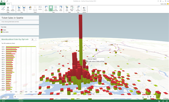
The essence of GeoFlow should be clear from the screenshot above and from the video demonstration under the cat. In fact, having some geographically distributed information, the author of an Excel workbook can attach it to real coordinates, choose a visualization method (for example, bar graphs) and immediately get a spectacular and really clear picture.
Of course, Bing is used as a cartographic engine, and it’s interesting to note that GeoFlow can bind data to a specific geographic point without coordinates - in the example in the video you can see that only the postal code is enough.
To manage data, GeoFlow uses layers, in each of which you can choose your type and chart properties. To display the dynamics of some indicators, you can use animation using a tool that resembles a timeline.
You can see how the add-on’s work looks in the video:
[ Source ]