 March 21, 2013 at 21:39
Useful Tips for Beginners in Android Design
- Transfer
- Tutorial
 This post will serve as a kind of start to a series of publications on the topic “How do I learn design for Android”. I never paid enough attention to the guidelines, considering them boring and uninteresting, but everything has changed. Now I'm starting to understand that the platform has reached its maturity and offers a number of interesting solutions.
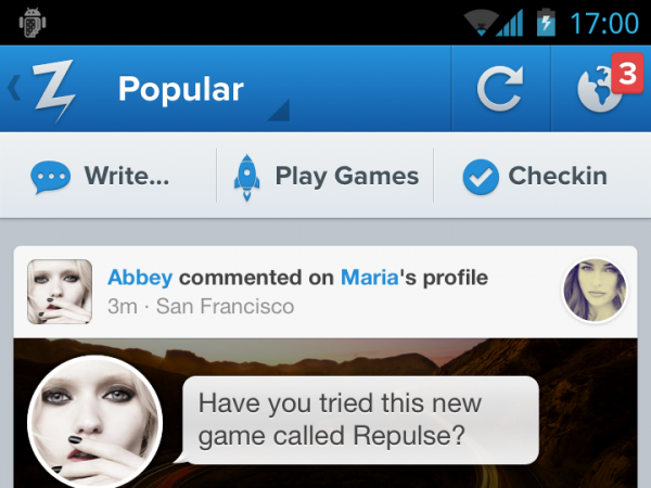
The Back Button
For a long time, back was the hardware button of Android devices; there was no point in adding a software analogue to the user interface. Now it’s fashionable to use the back button to navigate within applications. If we talk about the back button of the user interface (it is called the “up button”), then there is a slight difference between the hardware back and up. Up moves to one screen, within the application, while back to any application or content.
Resolution
The permission settings for Android are a bit confusing - xhdpi (2x), hdpi (1.5x) and mdpi (1x).
It sounds extremely technical. When I started working a year ago, no one really could explain to me what aspect ratio between them. After many interrogations and searches, it amounted to 720 × 1280, 540 × 960 and 360 × 640. When designing the layout design, do not forget to consider the hardware buttons and the status bar.
From a translator: In fact, what is described in this paragraph is not entirely true. By reference and in the table you will find a more accurate description.
Table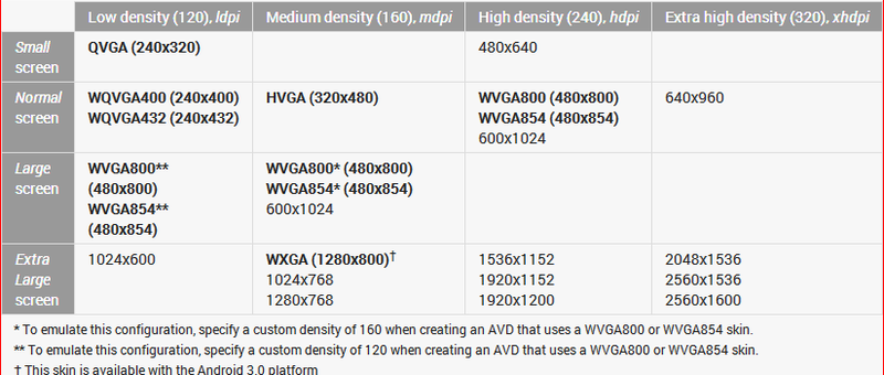
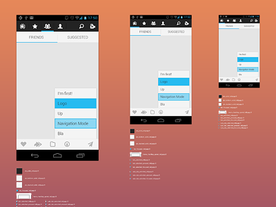
Starter Kit
Jeremy Sally, a designer at Telly , graphically showed the relationship between the three resolutions. You will need the Android Action Bar Style Generator to work with default themes. It will allow you to set basic color, style and save the settings in a zip file for all three resolutions. The best way to experiment.
9-slice scaling
Android has a peculiar way to scale graphic resources, which is not like CSS. 9-slicing allows you to specify which part of the image you want to scale. The rest, such as rounded corners, remains a fixed size even when scaling the entire resource. To do this, in the image file, you need to draw black lines 1px wide in the following areas:
- Top: An area that can be stretched horizontally.
- Left: same vertical
- Right: The vertical area in which the content will be located. This parameter can be used to specify indents.
- Bottom: Similarly Vertical
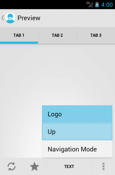
The action bar
Unlike the iPhone, where the name is usually in the middle of the title, on Android the name is in the upper left corner, next to the application logo. Clicking on a logo usually brings up a side menu or takes you back to the previous screen.

Under the name of the application, you can sometimes notice a triangular arrow, thanks to which navigation within the application is possible. Just like on the Internet, a very common way to display a drop-down menu on Android.

Finally, if you are serious about guidelines, all controls should be in the upper right corner. This also applies to the update function (pull to update as on iPhone, it is very rarely used in Android), the search, and the infamous “action” buttons, which ideally should be in the form of three points. Points are used for those actions that the Action Bar could not contain.
Fonts
Fonts, unfortunately, depend on the specifics of the device, so be prepared for incidents. Do not worry if you have to test the design on an old device. There were much worse days - remember IE6. The most popular font at the moment is Droid Sans . However, Roboto is gaining popularity, as it is present on new devices.
Dimensions
Starting with Android 2.x, the minimum element size should be: 28px for text, 96px for menus and headers, 116px for footers. This is a little more than iOS (24px, 88px and 100px). If we talk about the ratio of 116% of Android to iOS.
View your designed design on your Android device
Google’s Roman Nurik has developed a very useful Android Design Preview tool . The tool will help the designer see how the application layout drawn in the graphics editor on the computer will look like on a real device.
Android Design Preview can be installed on Windows, Mac OS X, or almost any of the * nix family of operating systems. The application is written in Java and is a regular JAR file. The Android Design Preview works as follows: the developer connects the smartphone to the computer via USB (ADT must be installed on the PC), launches the Design Preview, clicks “Select Mirror Region” in this program and sees a frame in front of it. He sets this frame on the layout and sees it on the smartphone screen.