Responsive layout: CSS & JS framework Skeleton
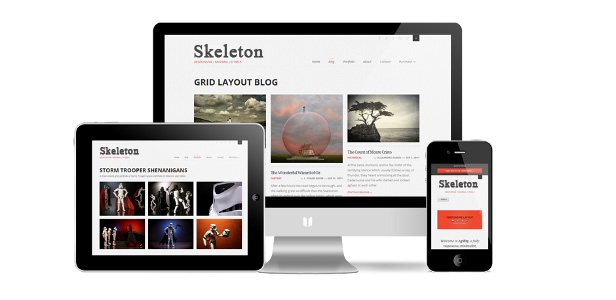
In continuation of a recent article about adaptive layout, I want to more fully disclose the topic. In reality, CSS frameworks are most often used for adaptive layouts. I would like to talk about one of them, or rather, to translate the manual for its use. It is called Skeleton.
What is Skeleton?
Skeleton is a CSS and JavaScript based framework. It allows you to layout sites in such a way that they look equally comfortable and beautiful both on the 17-inch monitor and on the display of smartphones and tablets.
Skeleton has a few basic principles:
Adaptive grid
The grid of this framework is based on the familiar 960-pixel grid, but it easily adapts to the size of the browser and display.
Ease of use
Skeleton is semantically correct. All elements are named in clear language and it will not be difficult for you to understand the framework. In addition, Skeleton immediately includes essential elements such as buttons, forms, tabs, etc.
Design Separation
Skeleton is not a UI framework. It does not force you to adapt to your design; on the contrary, it is easy to adapt to any design and user interface.
Framework grid
Skeleton is based on a 960-pixel grid, but the syntax is simple and the blocks easily adjust to the size of the browser. The grid has a 12-block system.

Thus, you need to understand that the system itself assumes that in one line you should have at least 12 small blocks, or consist of blocks of different widths, but the final "sum" should be at least 12.
The following is the markup syntax:
Full Width Column
............
-->......
Typography
Skeleton's typography is based on a strict hierarchy. The main font is Helvetica Neue, but it is, of course, easy to change. Paragraphs “p” are given in 14-pixel font and line spacing of 21 pixels.

Skeleton also has a built-in quotation tool. It is defined by the blockquote tag.
Buttons
Buttons also have their own style and animation. Moreover, in addition to the “button” tag, you can define buttons using styles.

Click MeClick MeTabs
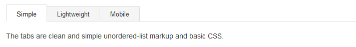
Skeleton also includes tabs by default. They are implemented using jQuery. They can be easily set using the regular ul list, denoting it with the tabs class, and their contents with the tabs-content class.
with class of "tabs" -->
's -->- Simple
- Lightweight
- Mobile
with class of "tabs-content" -->- The tabs are clean and simple unordered-list markup and basic CSS.
- The tabs are cross-browser, but don't need a ton of hacky CSS or markup.
- The tabs work like a charm even on mobile devices.
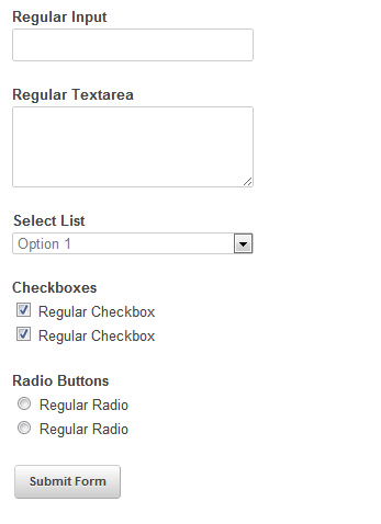
Forms
Shapes in Skeleton do not stand out much, they are just aligned on the grid.
Hard frames
Skeleton is focused on universal designs, however, creative thought can go further, and you may want to change the background, or other elements, depending on the position of the tablet, phone or their resolution. And here mini hacks will come to your aid:
- Smaller than 960 pixels: Smaller than a standard grid.
- If the tablet is rotated to portrait position: Between 768px and 959px.
- Showing elements intended for mobile versions: If the resolution is below 767px.
- For tablets only in a horizontal position: From 480px to 767px.
- Mobile only in upright position: Less than 479px.
/* Smaller than standard 960 (devices and browsers) */
  @media only screen and (max-width: 959px) {}
  /* Tablet Portrait size to standard 960 (devices and browsers) */
  @media only screen and (min-width: 768px) and (max-width: 959px) {}
  /* All Mobile Sizes (devices and browser) */
  @media only screen and (max-width: 767px) {}
  /* Mobile Landscape Size to Tablet Portrait (devices and browsers) */
  @media only screen and (min-width: 480px) and (max-width: 767px) {}
  /* Mobile Portrait Size to Mobile Landscape Size (devices and browsers) */
  @media only screen and (max-width: 479px) {}
Cross-browser compatibility
Skeleton supports the following browsers:
- Google Chrome (Mac / PC)
- Firefox 4.0, 3.6, 3.5, 3.0 (Mac / PC)
- Safari
- IE9, IE8, IE7
- iPhone (Retina)
- Droid (Charge / Original)
- iPad
You can download and familiarize yourself in the original on the official website .