At one time, it was necessary to make notes in the form of stickers for the website. As you know, there wasn’t much choice and my choice fell on all of us beloved CSS3. With his appearance, the implementation of the plan became possible without any bicycle construction. So, my solution to the problem is under the cut. In fact, the moped is not mine. They gave me just a ride.
This solution works in the latest browsers on the Webkit engine (Safari and Chrome), Firefox and Opera. In other browsers (read, IE) there is a chance to get a square yellow sticker without shadow and animation.
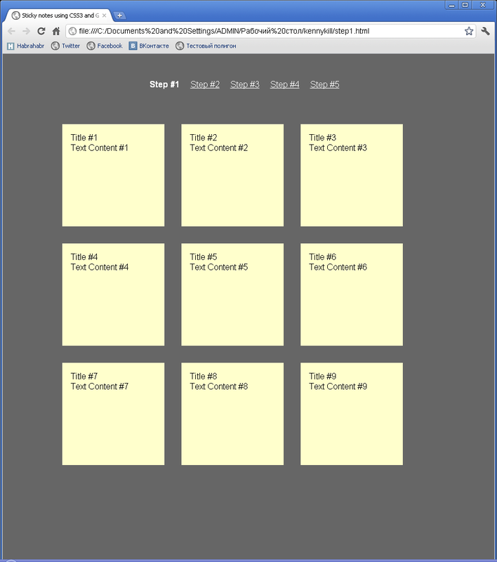
Step 1
Let's start with the simplest option, which will work in all browsers. In order to make a sticker, we will use HTML5 and CSS3, which is logical. And we will start with the usual HTML markup, in which we designate the texts and headings of our notes, which are essentially lists.
Please note that each note is a link, which is a good enough approach, as this means that if we click on our note, then in the case of a relevant link, we can get to the page directly linked to the note.
For example, I wrote down “buy a BMW X6” on Sunday (I want to say hello to Boomburum , and I specified the address where to find this car through the link. Hehe!
CSS is simple enough to turn this list into yellow stickers:
* {
     margin: 0;
     padding : 0;
}
body {
           font-family: arial, sans-serif;
           font-size: 100%;
           margin: 3em;
           background: #666;
           color: #FFF;
}
h2, p {
           font-size: 100%;
           font-weight: normal;
}
ul, li {
         list-style: none;
}
ul {
      overflow: hidden;
      padding: 3em;
}
ul li a {
           text-decoration: none;
           color: #000;
           background: #FFC;
           display: block;
           height: 10em;
           width: 10em;
           padding: 1em;
}
ul li {
        margin: 1em;
        float: left;
}
This code is so trivial that it makes no sense to comment on it, because we are doing standard manipulations here. Such as getting rid of bullets in the list, indenting, etc.
By the way, here is the result:
This option will work in any browser. Even ( !!! ) in IE6. This is where we end his support, because we need paints, not a monochrome rectangle. Right?
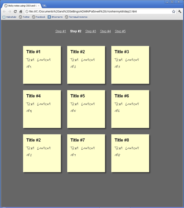
Step 2
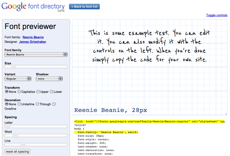
It's time to decorate our stickers. Let's add shadows to them and set the note text to a handwritten font. For this we will use the Google Fonts API . And we will use a font called Reenie Beanie . The easiest way to use this API is to work with the Google Font previewer :
Using it, we get a piece of HTML code that we need to insert into our page in order to use the font. This option will be supported in all modern browsers:
fonts.googleapis.com/css?family=Reenie+Beanie:regular “
rel =„ stylesheet “
type =“ text / css “>
Then we need to indent the headings to the notes so that our notes are readable. Introduce paragraphs to the New Year font. It is worth noting that the font size must be large enough so that you can clearly see our Reenie Beanie .
ul li h2 {
             font-size: 140%;
             font-weight: bold;
             padding-bottom: 10px;
}
ul li p {
           font-family: "Reenie Beanie", arial, sans-serif;
           font-size: 180%;
}
Now let's set a shadow for our stickers. Yes, so that in all (except IE) browsers it displays:
ul li a {
           text-decoration: none;
           color: #000;
           background: #FFC;
           display: block;
           height: 10em;
           width: 10em;
           padding: 1em;
           -moz-box-shadow: 5px 5px 7px rgba(33, 33, 33, 1); /* для Firefox Грозного */
           -webkit-box-shadow: 5px 5px 7px rgba(33, 33, 33, 7); /* да для люда обычного, праведного */
           -box-shadow: 5px 5px 7px rgba(33, 33, 33, 7); /* и про Оперушку не забудем */
}
Offset, color, width, height - everything, as the doctor usually prescribed . Together with the new font and our fixtures, the shadows on the stickers now look even more pleasant. They now look like this:
Step 3
Now I suggest you do things even more exciting and interesting. Change the rotation angle of our stickers. How? Using the CSS3: transform: rotate property . Like this:
ul li a {
           -webkit-transform: rotate(-6deg);
           -o-transform: rotate(-6deg);
           -moz-transform: rotate(-6deg);
}
Excellent. Not really. Thus, we tipped all the stickers at the same angle. I don’t even want to open an example. Let’s bring diversity with you and rotate the stickers in different angles? Let's:
    ul li:nth-child(even) a{
      -o-transform:rotate(4deg);
      -webkit-transform:rotate(4deg);
      -moz-transform:rotate(4deg);
      position:relative;
      top:5px;
    }
    ul li:nth-child(3n) a{
      -o-transform:rotate(-3deg);
      -webkit-transform:rotate(-3deg);
      -moz-transform:rotate(-3deg);
      position:relative;
      top:-5px;
    }
    ul li:nth-child(5n) a{
      -o-transform:rotate(5deg);
      -webkit-transform:rotate(5deg);
      -moz-transform:rotate(5deg);
      position:relative;
      top:-10px;
    }
Now, every second link will be inclined 4 degrees to the right, indented by five. Every third will be rejected 3 degrees to the left. And so on ... Until the fantasy ends.
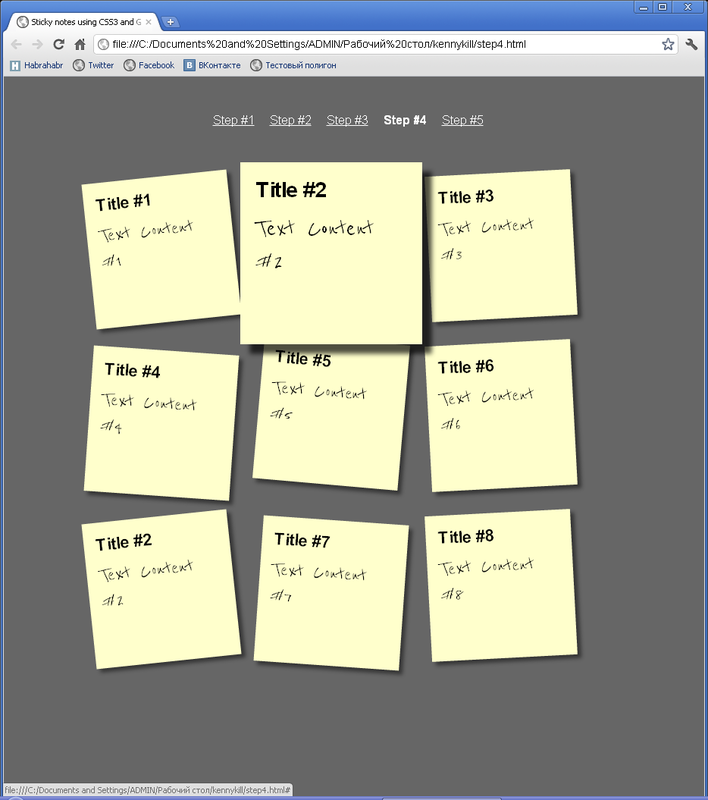
Step 4
Agree, you need to make it possible to increase our note when you hover over it with the cursor. Here we will use CSS3 again, which is not surprising. No sooner said than done:
    ul li a:hover,ul li a:focus{
      -moz-box-shadow:10px 10px 7px rgba(0,0,0,.7);
      -webkit-box-shadow: 10px 10px 7px rgba(0,0,0,.7);
      box-shadow:10px 10px 7px rgba(0,0,0,.7);
      -webkit-transform: scale(1.25);
      -moz-transform: scale(1.25);
      -o-transform: scale(1.25);
      position:relative;
      z-index:5;
    }
We added such a high z-index so that when you hover our sticker does not limit itself in capturing land and overlap nearby stickers. Actually, when you hover we will see the following picture:
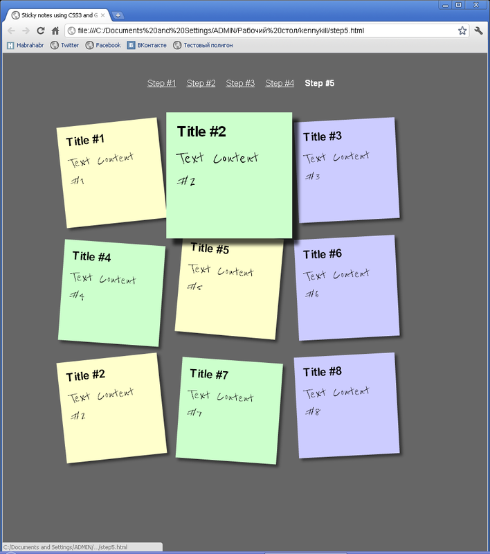
Step 5
Still, you need to finish it to be beautiful. Do you understand what we are not praising? That's right, animations. You need to make the transitions smooth, not stone. It seems that you are in the Stone Age or you do not have enough CPU. Well, let's go:
Here it is our animation. Unfortunately, the screenshot cannot convey it as well as the phone cannot convey the smell of a freshly baked pizza bird . What a pity!
But I would also like to decorate our stickers, otherwise somehow everything is monotonous. Every second sticker will be green, every third will be blue. Well, not bad.
 January 14, 2012 at 22:08