Forecasting monitoring with rrdtool how it is done
Introduction
Recently, I described a forecasting VoIP transit monitoring system that I created . The strongest advantage of this method in the monitoring of transit VoIP is that there is no need to set criteria for what is considered normal operation of the values being monitored and what is a potential failure.
The core of the system is rrdtool , which implements Holt-Winters prediction and a mechanism for detecting aberrations .
Predictive monitoring can be used not only for VoIP, but also for any other type of traffic, as well as for quantities that change in time with a certain predicted periodicity. Unlike standard methods, when monitoring with the help of forecasting, it does not monitor the state of the values being monitored, but it monitors the dynamics of changes in their states over time.
If you are interested in the mathematics of forecasting, I recommend reading it . To be at least a little aware of the topic, read the chapter “Prediction method implemented in rrdtool” in my previous post .
Task
As I wrote in a previous post, before implementing the monitoring of transit VoIP using the forecasting method, it was decided to check the concept on the Cisco AS5400 access server, and check on IP traffic, the number of active calls and the load of its processor. How this was done, I will describe.
Data, in this case, is easiest to receive via SNMP. Thus, for testing, it is necessary to take data on two counters - the number of IN / OUT octets passed through the FastEthernet interface, and two (in terms of SNMP and rrdtool) GAUGE values - on the processor load and the number of active calls, more precisely, the number of busy time slots on the flows E1.
To check the number of active calls, use this OID
.1.3.6.1.4.1.9.10.19.1.1.4.0
The processor load is checked by reading this OID -a
.1.3.6.1.4.1.9.2.1.58.0
The counter of outgoing octets passing through the interface is accessible by OID -y
.1.3.6.1.2.1.2.2.1.16.1 if the interface with index 1 is checked .
Counter incoming octets, who came to the interface available on the OID y
.1.3.6.1.2.1.2.2.1.10.1 if verified interface with an index of 1.
Decision
The solution is divided into several tasks. First, the rrdtool databases are correctly formed, then a script is written to fill the databases with values, then a script to display data on the chart.
Creating rrd Databases
We create two scripts for forming the rrd counter.sh databases
#!/usr/local/bin/bash
rrdtool create --step 300 $1.rrd \
DS:val:COUNTER:600:0:U \
RRA:AVERAGE:0.5:1:8064 \
RRA:HWPREDICT:8064:0.1:0.0035:288 \
RRA:FAILURES:8064:2:3:4
gauge.sh
#!/usr/local/bin/bash
rrdtool create --step 300 $1.rrd \
DS:val:GAUGE:600:0:U \
RRA:AVERAGE:0.5:1:8064 \
RRA:HWPREDICT:8064:0.1:0.0035:288 \
RRA:FAILURES:8064:2:3:4
The difference is only in the value type of val.
We will figure out what will be created when the script starts.
1) RRA: AVERAGE: 0.5: 1: 8064 - a database that will contain 8064 measurement values at a measurement frequency of once every 5 minutes. At a measurement frequency of once every 5 minutes, 288 measurements are obtained per day; in total, information for 8064/288 = 28 days can be stored in the database.
2)RRA: HWPREDICT: 8064: 0.1: 0.0035: 288 - the database will store 8064 forecasts, that is, as many as the measured values are determined. The coefficients alpha = 0.1, beta = 0.0035 are given. These are the coefficients that affect the accuracy of the forecast. Such parameters are optimal if you see approximately the same picture on the graph every day. Moreover, such ratios are recommended on the rrdtool website. Odds can be changed to achieve more accurate forecasts, but this is the topic of a separate article. 288 - the number of measurements per season, so the season is equal to days.
3)RRA: FAILURES: 8064: 2: 3: 4. - the database will store information on calculated aberrations for 28 days (by default it is stored only for the last season - a day). Aberrations will be calculated with the length of the floating window equal to 3 and the number of misses in the window equal to 2. The last parameter - 4 is the DEVSEASONAL index, this index can be viewed with the rrdtool info command.
If you have any questions about creating databases, look here.
Now create the necessary databases with
scripts ./counter.sh
in_traf ./counter.sh
out_traf ./gauge.sh cpu
./gauge.sh calls
Script to populate databases with values
Actually, the script is simple
rrdupdater.sh
#!/usr/local/bin/bash
rrdtool="/usr/local/bin/rrdtool update "
# snmpget -OQEav option will make value to be "clean" no quotes, oid name, etc…
snmpget="/usr/local/bin/snmpget -OQEav -v2c -c SuperSecret  "
rrdpath="/usr/rrdmonit/rrd/"
${rrdtool} ${rrdpath}in_traf.rrd N:`${snmpget} 192.168.50.31 .1.3.6.1.2.1.2.2.1.10.1`
${rrdtool} ${rrdpath}out_traf.rrd N:`${snmpget} 192.168.50.31 .1.3.6.1.2.1.2.2.1.16.1`
${rrdtool} ${rrdpath}cpu.rrd N:`${snmpget} 192.168.50.31 .1.3.6.1.4.1.9.2.1.58.0`
${rrdtool} ${rrdpath}calls.rrd N:`${snmpget} 192.168.50.31 .1.3.6.1.4.1.9.10.19.1.1.4.0`
And of course, in crontab its
* / 5 * * * * /usr/rrdmonit/rrdupdater.sh
Graph display
rrdtool is a powerful charting tool. Charts can be made very informative.
For example, in our VoIP traffic monitoring system we have these: The
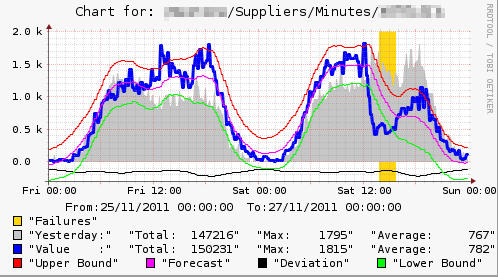
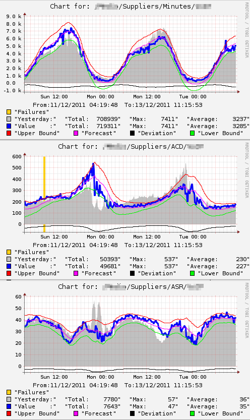
blue line is the real measurement value of the number of minutes that have passed to a partner in a 15 minute time interval. Gray area - real values that were exactly a day ago. The pink line is the forecast. The red and green lines show the upper and lower border of the corridor of acceptable values. The black line in the area of negative values is the forecast of permissible deviations from the predicted values (deviation). Gold color shows aberration. When aberration appeared, the system issued an alert (via e-mail) about a potential failure. Obviously, in this case, the presence of a failure at the traffic provider is very likely.
Pay attention to the Total value for the measured value. It, with an error of 1-2 percent, is equal to the value taken from the billing for this provider. For a monitoring system, this can be considered high accuracy.
It should be noted that there are two different approaches when plotting measured values. The first approach is implemented in the classic MRTG - graphs (figures) are built immediately after filling in the rrdtool database with a new value. The second approach is implemented in cacti - graphs are built at the request of the user. Our VoIP monitoring system uses the second approach. However, to test the concept, you can use the first approach, it is much simpler. Pictures will be generated immediately after filling the database.
The actual script:
#!/usr/bin/env python
import os
import time
import rrdtool
# Define params
rrdpath = '/usr/rrdmonit/rrd/'
pngpath = '/usr/local/share/cacti/rrdmonit/'
width = '500'
height = '200'
# Generate charts for last 48 hours
enddate = int(time.mktime(time.localtime()))
begdate = enddate - 172800
def gen_image(rrdpath, pngpath, fname, width, height, begdate, enddate):
    """
    Generates png file from rrd database:
    rrdpath - the path where rrd is located
    pngpath - the path png file should be created in
    fname - rrd file name, png file will have the same name .png extention
    width - chart area width
    height - chart area height
    begdate - unixtime
    enddate - unixtime
    """
    # 24 hours before current time, will show on chart using SHIFT option
    ldaybeg = str(begdate - 86400)
    ldayend = str(enddate - 86400)
    # Will show some additional info on chart
    endd_str = time.strftime("%d/%m/%Y %H:%M:%S",(time.localtime(int(enddate)))).replace(':','\:')
    begd_str = time.strftime("%d/%m/%Y %H:%M:%S",(time.localtime(int(begdate)))).replace(':','\:')
    title = 'Chart for: '+fname.split('.')[0]
    # Files names
    pngfname = pngpath+fname.split('.')[0]+'.png'
    rrdfname = rrdpath+fname
    # Get iformation from rrd file
    info = rrdtool.info(rrdfname)
    rrdtype = info['ds[val].type']
    # Will use multip variable for calculation of totals,
    # should be usefull for internet traffic accounting,
    # or call/minutes count from CDR's.
    # Do not need logic for DERIVE and ABSOLUTE
    if rrdtype == 'COUNTER':
        multip = str(int(enddate) - int(begdate))
    else:
        # if value type is GAUGE should divide time to step value
        rrdstep = info['step']
        multip = str(round((int(enddate) - int(begdate))/int(rrdstep)))
    # Make png image
    rrdtool.graph(pngfname,
    '--width',width,'--height',height,
    '--start',str(begdate),'--end',str(enddate),'--title='+title,
    '--lower-limit','0',
    '--slope-mode',
    'COMMENT:From\:'+begd_str+'  To\:'+endd_str+'\\c',
    'DEF:value='+rrdfname+':val:AVERAGE',
    'DEF:pred='+rrdfname+':val:HWPREDICT',
    'DEF:dev='+rrdfname+':val:DEVPREDICT',
    'DEF:fail='+rrdfname+':val:FAILURES',
    'DEF:yvalue='+rrdfname+':val:AVERAGE:start='+ldaybeg+':end='+ldayend,
    'SHIFT:yvalue:86400',
    'CDEF:upper=pred,dev,2,*,+',
    'CDEF:lower=pred,dev,2,*,-',
    'CDEF:ndev=dev,-1,*',
    'CDEF:tot=value,'+multip+',*',
    'CDEF:ytot=yvalue,'+multip+',*',
    'TICK:fail#FDD017:1.0:"Failures"\\n',
    'AREA:yvalue#C0C0C0:"Yesterday\:"',
    'GPRINT:ytot:AVERAGE:"Total\:%8.0lf"',
    'GPRINT:yvalue:MAX:"Max\:%8.0lf"',
    'GPRINT:yvalue:AVERAGE:"Average\:%8.0lf" \\n',
    'LINE3:value#0000ff:"Value    \:"',
    'GPRINT:tot:AVERAGE:"Total\:%8.0lf"',
    'GPRINT:value:MAX:"Max\:%8.0lf"',
    'GPRINT:value:AVERAGE:"Average\:%8.0lf" \\n',
    'LINE1:upper#ff0000:"Upper Bound "',
    'LINE1:pred#ff00FF:"Forecast "',
    'LINE1:ndev#000000:"Deviation "',
    'LINE1:lower#00FF00:"Lower Bound "')
# List files and generate charts
for fname in os.listdir(rrdpath):
    gen_image(rrdpath, pngpath, fname, width, height, begdate, enddate)
You need to start the script immediately after filling in the values in rrdtool, so the line to run it must be added to the end of the script /usr/rrdmonit/rrdupdater.sh.
The only thing left is to post the generated pictures somewhere on the web. For example, such a script in PHP.
0) {
print " \n";
}
}
closedir($dirHandle);
?>
\n";
}
}
closedir($dirHandle);
?>
I remember when I first set up such monitoring, I spent a lot of time to understand what I'm doing wrong. The fact is that no matter how I set up the forecasting, no matter how I tried to form a graph in various ways, the forecast line did not appear stubbornly. Having killed the smoking manuals for several hours, I spat to return to it the next day. The next day - lo and behold, the forecast appeared by itself. Everything turned out to be trivial, the forecast was not made because the first forecasting season did not pass (a day after the start of filling in the database).
As I wrote earlier, along with forecasting the values of the measured value, a corridor of the spread of possible values is also predicted - diviation. Diviation can only be predicted when you have values for two seasons.
Therefore, you will receive a preliminary result only from the beginning of the third day.
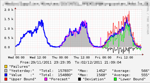
On the graph - the first three days from the start of measurements. As you can see the forecast curve. But look what will happen next.
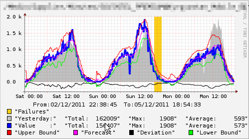
The forecast is more accurate. In a week you will have a fully functional monitoring of the quantities of interest.
The values on the graphs presented behave during the day according to laws similar to sinusoids. I would not want you to feel that the method works only for such quantities. For example, the ASR and ACD values in transit VoIP behave somewhat differently, despite this, the method works fine for them as well. Take a look at the picture
Conclusion
The monitoring system is not only done so that the administrator stares at the drawings, it should give an alert (at least by mail) when an aberration is detected. About it - in the next post.