December 12, 2011 at 11:36
Drag'n'Drop in QML - It's Easy! Or 5 steps to the goal
This post is participating in the competition “ Smart Phones for Smart Posts ”.
Drag'n'Drop is an undeniably important element in the interaction of the user and the graphical environment. Unfortunately, QML does not have a built-in Drag'n'Drop mechanism for View. Therefore, I wrote a small example based on a GridView with 16 images.
This Drag'n'Drop example does not pretend to be perfect (there are several other implementations that are visually possible more perfect), but rather aims to show that QML is a very flexible and simple development tool.
First, a short video, and under the cut 5 simple steps to get a similar result.
Let's start by creating a GridView and a small model. As a test data, I took standard images from the Nokia N8.
Let's make our grid 4x4 image size.
After starting in qmlviewer, we will see approximately the following picture

Now we need to add the ability to drag and drop images into this grid.
To simplify the task, disable the ability to scroll the GridView. You can do without this (using a long press instead of the usual press for D'n'D and manipulating the interactive property (which determines whether the GridView will scroll) in the corresponding MouseArea callbacks), but this will complicate the example.
We also add a MouseArea element the size of the entire GridView, which will catch the mouse click at the beginning of the drag, as well as move the element to the desired position in the model when the mouse is released. Plus, in the GridView we’ll put an additional dndContainer element , which we will talk about later
The final touch is to add a property to our GridView to store the current item to be moved (or rather, its index in the model).
In the delegate, add the inDrag state , which will be activated when this element is movable. This is where we need dndContainer . We will cling to it (and to be more precise, then change the parent to this container) our roaming element. In addition to changing the parent, we also untie the anchors of the element (so that it can move) and set x and y according to the coordinates of the mouse (and, thanks to binding, the position of the untied image will change with the movement of the mouse cursor). When the state becomes inactive, all these changes are rolled back.
Running, we will see something like this picture. Now, we in our grid can safely move elements.
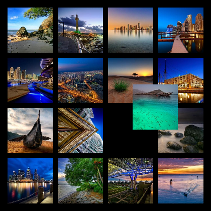
Ok, we learned to do what this article was written for (it's simple, isn't it?). But the moved element is almost invisible, it is necessary to highlight it a bit against the rest. Add a white frame around the dragged picture.
Paste the following code into our itemImage .
Plus to the frame, it would be nice to somehow mark the place where the dragged item was taken from. Add a white circle in the center of this place. This code is placed next to our itemImage.
Well, add their display when you start dragging to the inDrag state of the delegate.
Now our example looks like this.
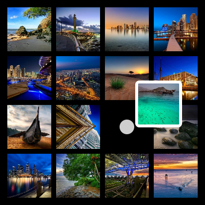
Well, the base of our grid with Drag'n'Drop is ready. Add a whistle. And more specifically, add animation.
To begin with, we will add two states to our long-suffering itemImage :
Thus, we slightly obscure all the elements except the dragged one, which gives us greater visibility of the latter against the background of the rest.
We also add animated changes for transparency, width and height of the image.
In the inDrag state, we add another change in the height and width of the picture and the transition from this state to any other (that is, the transition from the active drag'n'drop to normal mode). In this transition, we will make a scale animation.
We also add transparency change animations to the frame around the dragged item and to the circle from scratch.
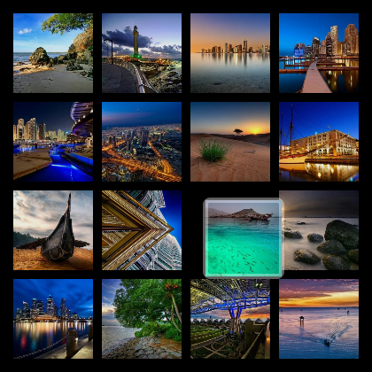
As a result, we already got such a picture.
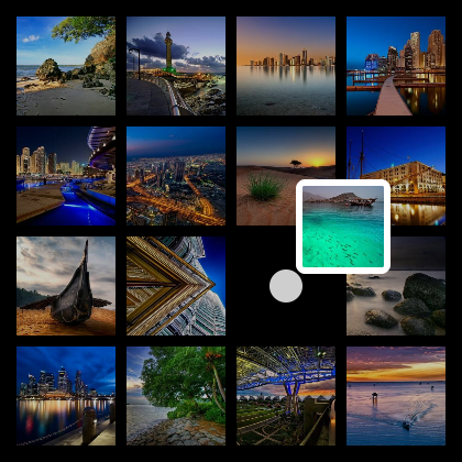
And this is filmed at an intermediate moment when the animation works out.
And, as a completion, add an indicator of the position where the item will be moved. We display it in the form of a vertical strip to the left of this element.
The parent of this element will be our GridView, all actions with it will occur in the same place.
First, add three new properties to the GridView: target element index ( possibleDropIndex ) and current mouse coordinates ( xCoordinateInPossibleDrop and yCoordinateInPossibleDrop ).
Plus, add the indicator element itself. This is a normal 6x1 pixel gradient image replicated vertically. The indicator has two states: invisible (default) and shown. In the second state, the indicator element is placed between two pictures to the left of the target. The position of the element is calculated based on the last two properties, and not by the index in the model, thus we are not dependent on the current number of columns in the table.
Also add another handler to MouseArea. Here we need a property with the index of the drop location, so as not to update the coordinates of the mouse each time, but to change them only when changing the target element.
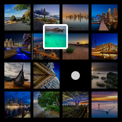
As a result, we get such an application. Same as in the video at the beginning of the post :)
Well, yes, you can download the full source (with separate .qml files for each step) here
Drag'n'Drop is an undeniably important element in the interaction of the user and the graphical environment. Unfortunately, QML does not have a built-in Drag'n'Drop mechanism for View. Therefore, I wrote a small example based on a GridView with 16 images.
This Drag'n'Drop example does not pretend to be perfect (there are several other implementations that are visually possible more perfect), but rather aims to show that QML is a very flexible and simple development tool.
First, a short video, and under the cut 5 simple steps to get a similar result.
Step 1. Create a GridView
Let's start by creating a GridView and a small model. As a test data, I took standard images from the Nokia N8.
Let's make our grid 4x4 image size.
Rectangle {
    width: 420
    height: 420
    color: "#000000"
    Component {
        id: dndDelegate
        Item {
            id: wrapper
            width: dndGrid.cellWidth
            height: dndGrid.cellHeight
            Image {
                id: itemImage
                source: imagePath
                anchors.centerIn: parent
                width: 90
                height: 90
                smooth: true
                fillMode: Image.PreserveAspectFit
            }
        }
    }
    ListModel {
        id: dndModel
        ListElement { imagePath: "images/1.jpg" }
        //Еще 15 картинок
    }
    GridView {
        id: dndGrid
        anchors.fill: parent
        anchors.margins: 10
        cellWidth: 100
        cellHeight: 100
        model: dndModel
        delegate: dndDelegate
    }
}
After starting in qmlviewer, we will see approximately the following picture
Step 2. Add Drag'nDrop
Now we need to add the ability to drag and drop images into this grid.
To simplify the task, disable the ability to scroll the GridView. You can do without this (using a long press instead of the usual press for D'n'D and manipulating the interactive property (which determines whether the GridView will scroll) in the corresponding MouseArea callbacks), but this will complicate the example.
We also add a MouseArea element the size of the entire GridView, which will catch the mouse click at the beginning of the drag, as well as move the element to the desired position in the model when the mouse is released. Plus, in the GridView we’ll put an additional dndContainer element , which we will talk about later
The final touch is to add a property to our GridView to store the current item to be moved (or rather, its index in the model).
property int draggedItemIndex: -1
interactive: false
Item {
    id: dndContainer
    anchors.fill: parent
}
MouseArea {
    id: coords
    anchors.fill: parent
    onReleased: {
        if (dndGrid.draggedItemIndex != -1) {
            var draggedIndex = dndGrid.draggedItemIndex
            dndGrid.draggedItemIndex = -1
            dndModel.move(draggedIndex,dndGrid.indexAt(mouseX, mouseY),1)
        }
    }
    onPressed: {
        dndGrid.draggedItemIndex = dndGrid.indexAt(mouseX, mouseY)
    }
}
In the delegate, add the inDrag state , which will be activated when this element is movable. This is where we need dndContainer . We will cling to it (and to be more precise, then change the parent to this container) our roaming element. In addition to changing the parent, we also untie the anchors of the element (so that it can move) and set x and y according to the coordinates of the mouse (and, thanks to binding, the position of the untied image will change with the movement of the mouse cursor). When the state becomes inactive, all these changes are rolled back.
states: [
    State {
        name: "inDrag"
        when: index == dndGrid.draggedItemIndex
        PropertyChanges { target: itemImage; parent: dndContainer }
        PropertyChanges { target: itemImage; anchors.centerIn: undefined }
        PropertyChanges { target: itemImage; x: coords.mouseX - itemImage.width / 2 }
        PropertyChanges { target: itemImage; y: coords.mouseY - itemImage.height / 2 }
    }
]
Running, we will see something like this picture. Now, we in our grid can safely move elements.
Step 3. Render the moveable item
Ok, we learned to do what this article was written for (it's simple, isn't it?). But the moved element is almost invisible, it is necessary to highlight it a bit against the rest. Add a white frame around the dragged picture.
Paste the following code into our itemImage .
Rectangle {
    id: imageBorder
    anchors.fill: parent
    radius: 5
    color: "transparent"
    border.color: "#ffffff"
    border.width: 6
    opacity: 0
}
Plus to the frame, it would be nice to somehow mark the place where the dragged item was taken from. Add a white circle in the center of this place. This code is placed next to our itemImage.
Rectangle {
    id: circlePlaceholder
    width: 30; height: 30; radius: 30
    smooth: true
    anchors.centerIn: parent
    color: "#cecece"
    opacity: 0
}
Well, add their display when you start dragging to the inDrag state of the delegate.
State {
    name: "inDrag"
    when: index == dndGrid.draggedItemIndex
    PropertyChanges { target: circlePlaceholder; opacity: 1 }
    PropertyChanges { target: imageBorder; opacity: 1 }
    PropertyChanges { target: itemImage; parent: dndContainer }
    PropertyChanges { target: itemImage; anchors.centerIn: undefined }
    PropertyChanges { target: itemImage; x: coords.mouseX - itemImage.width / 2 }
    PropertyChanges { target: itemImage; y: coords.mouseY - itemImage.height / 2 }
}
Now our example looks like this.
Step 4. Add Animation
Well, the base of our grid with Drag'n'Drop is ready. Add a whistle. And more specifically, add animation.
To begin with, we will add two states to our long-suffering itemImage :
- greyedOut - obscures the picture. Used when drag'n'drop is active, but not for this element.
- inactive - used either when drag'n'drop is inactive, or for a dragged item
Thus, we slightly obscure all the elements except the dragged one, which gives us greater visibility of the latter against the background of the rest.
We also add animated changes for transparency, width and height of the image.
state: "inactive"
states: [
    State {
        name: "greyedOut"
        when: (dndGrid.draggedItemIndex != -1) && (dndGrid.draggedItemIndex != index)
        PropertyChanges { target: itemImage; opacity: 0.8}
    },
    State {
        name: "inactive"
        when: (dndGrid.draggedItemIndex == -1) || (dndGrid.draggedItemIndex == index)
        PropertyChanges { target: itemImage; opacity: 1.0}
    }
]
Behavior on width { NumberAnimation { duration: 300; easing.type: Easing.InOutQuad } }
Behavior on height { NumberAnimation { duration: 300; easing.type: Easing.InOutQuad } }
Behavior on opacity {NumberAnimation { duration: 300; easing.type: Easing.InOutQuad } }
In the inDrag state, we add another change in the height and width of the picture and the transition from this state to any other (that is, the transition from the active drag'n'drop to normal mode). In this transition, we will make a scale animation.
states: [
    State {
        name: "inDrag"
        when: index == dndGrid.draggedItemIndex
        PropertyChanges { target: circlePlaceholder; opacity: 1 }
        PropertyChanges { target: imageBorder; opacity: 1 }
        PropertyChanges { target: itemImage; parent: dndContainer }
        PropertyChanges { target: itemImage; width: 80 }
        PropertyChanges { target: itemImage; height: 80 }
        PropertyChanges { target: itemImage; anchors.centerIn: undefined }
        PropertyChanges { target: itemImage; x: coords.mouseX - itemImage.width / 2 }
        PropertyChanges { target: itemImage; y: coords.mouseY - itemImage.height / 2 }
    }
]
transitions: [
    Transition {
        from: "inDrag"
        to: "*"
        PropertyAnimation {
            target: itemImage
            properties: "scale, opacity"
            easing.overshoot: 1.5
            easing.type: "OutBack"
            from: 0.0
            to: 1.0
            duration: 750
        }
    }
]
We also add transparency change animations to the frame around the dragged item and to the circle from scratch.
Behavior on opacity { NumberAnimation { duration: 300; easing.type: Easing.InOutQuad } }
As a result, we already got such a picture.
And this is filmed at an intermediate moment when the animation works out.
Step 5. The final touch
And, as a completion, add an indicator of the position where the item will be moved. We display it in the form of a vertical strip to the left of this element.
The parent of this element will be our GridView, all actions with it will occur in the same place.
First, add three new properties to the GridView: target element index ( possibleDropIndex ) and current mouse coordinates ( xCoordinateInPossibleDrop and yCoordinateInPossibleDrop ).
Plus, add the indicator element itself. This is a normal 6x1 pixel gradient image replicated vertically. The indicator has two states: invisible (default) and shown. In the second state, the indicator element is placed between two pictures to the left of the target. The position of the element is calculated based on the last two properties, and not by the index in the model, thus we are not dependent on the current number of columns in the table.
property int possibleDropIndex: -1
property int xCoordinateInPossibleDrop: -1
property int yCoordinateInPossibleDrop: -1
Item {
    id: dropPosIndicator
    visible: false
    height: dndGrid.cellHeight
    width: 10
    Image {
        visible: parent.visible
        anchors.centerIn: parent
        height: parent.height-10
        source: "drop-indicator.png"
    }
    states: [
        State {
            name: "shown"
            when: dndGrid.possibleDropIndex != -1
            PropertyChanges {
                target: dropPosIndicator
                visible: true
                x: Math.floor(dndGrid.xCoordinateInPossibleDrop/dndGrid.cellWidth) *
                    dndGrid.cellWidth - 5
                y: Math.floor(dndGrid.yCoordinateInPossibleDrop/dndGrid.cellHeight) *
                    dndGrid.cellHeight
            }
        }
    ]
}
Also add another handler to MouseArea. Here we need a property with the index of the drop location, so as not to update the coordinates of the mouse each time, but to change them only when changing the target element.
onPositionChanged: {
    var newPos = dndGrid.indexAt(mouseX, mouseY)
    if (newPos != dndGrid.possibleDropIndex) {
        dndGrid.possibleDropIndex = newPos
        dndGrid.xCoordinateInPossibleDrop = mouseX
        dndGrid.yCoordinateInPossibleDrop = mouseY
    }
}
As a result, we get such an application. Same as in the video at the beginning of the post :)
Well, yes, you can download the full source (with separate .qml files for each step) here