Design and website design for the BBC
- Transfer
- Tutorial
I present to you a translation of an article entitled " User Experience and the design of news at BBC World Service " by Tammy Gur. Transferred to UXDepot specifically for Habrahabr users with the approval of the BBC and Johny Holland Magazine.
Designing an environment for the rapid flow of information passing through a news website non-stop is a challenge unlike anything else. A team of UX designers and specialists at the BBC World Service creates news sites for desktop and mobile browsers in 27 languages, catering to a variety of audiences around the world. In this article we will share this experience with you.
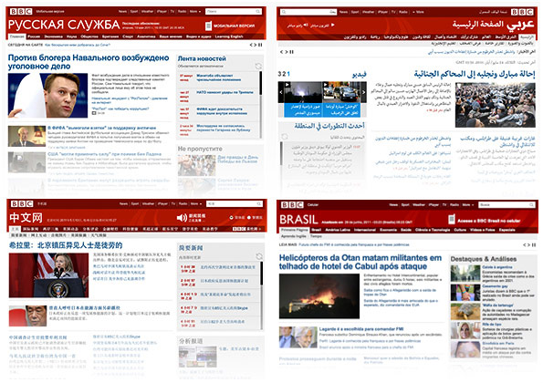
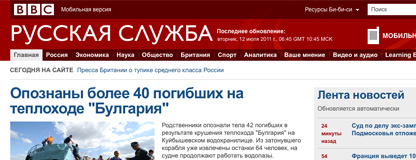
Some of the news sites on the BBC World Service are Russian, Arabic, Chinese, and Brazilian.
Digital design of news items
The digital news publishing cycle is too fast to design specifically for each material. Designers who create paper newspapers change their appearance daily. Designers who create online media create layouts that are less dependent on content. The reason for this is the extremely high speed of updating information. This means that we create a site design only once, and then journalists fill the site with content using our design.
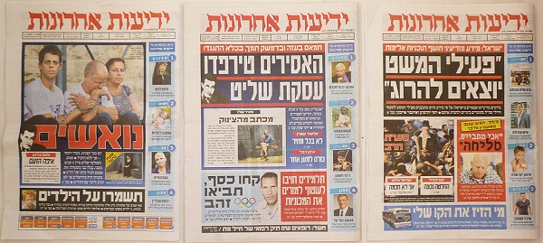
An example of paper newspaper layouts designed specifically for each issue. The covers of the Israeli news newspaper Yediot Achronot on June 26, 27 and 28, 2011.
The result of the work of the design team is a set of modules and their behaviors. You can object that all designers with all sites do this. It’s true, but the difference lies in the volume and variety of content that can appear at any time throughout the day. The material may consist of one text, it may contain images or entire image galleries, as well as video or audio. An important emergency message may look quite different than just an article placed by the editorial board in a list of interesting ones. And the main page can have several style options - one for weekdays, the other for the weekend (which will differ in the amount of content and the content itself). All possible cases are considered and thought out as part of the design.
The news site is similar to bento boxing.
I like to compare the news site with the Japanese Bento box . Inside the edges of the tray are small dishes of various shapes and sizes that can be arranged in different combinations. The same thing happens with our design. The food contained in small plates is the changing news content of the site. The harmony between dishes and boxing will determine the sensations that we experience with food.
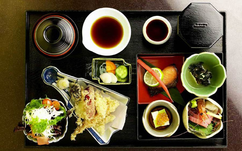
Traditional Bento Box.
The food seems attractive, as if asking to eat it. But would it be so attractive if all the dishes were piled on a tray in one big unappetizing pile? In order to achieve this effect, the one who cooks Bento must understand the food (content) and the tastes of those who want to have dinner (user behavior).
Understanding Content: Hierarchy, Volume, Tone
From the very beginning of our work on design, we have been working closely with journalists. We get acquainted with future content, and ask editors to sort content types by importance. So we get a hierarchy of content.
We also learn from journalists how much content goes through the main page in a day. For example, we are interested in how many articles there are that are selected by the editors as the most interesting, how many thematic and regional articles are. In most countries, the peak of readability of materials occurs in the morning and lunch break, and at that time the team will write the largest number of articles.
Communication with journalists helps us understand the tone of content that we can reflect in design. Tone is not just a writing style, it is also related to company principles, user expectations and, in the case of the BBC World Service, cultural differences.
The study of the user audience and the analysis of competitors, conducted by us for many years, revealed some interesting facts regarding the markets in which we operate. For example, we found that readers in the Russian market and the markets of the Middle East predominantly want to see important political news. While Brazilians prefer to read various interesting, but not so important facts. In order to reflect this, the first two screens of the main page of the Russian website show more political news, while the Brazilian website is dotted with picture galleries and interesting stories from around the world.
Understanding user behavior and tastes
The behavior of a visitor to a news site can usually be described in two different ways. The user either skim through the articles or read them in full. Or he does it alternately, depending on his mood and whether he has free time. In the morning, before the beginning of the working day, the user has very little time to study the latest news bulletins, and in the evening or during the lunch break he can quite afford to read the article in full, and even read other articles related to it.
What qualities should a news site have? What tasks does the user want to solve on the site? Statistics and analysis of user behavior tells us that visitors like:
- Quickly view the latest news headlines;
- See a variety of content
- Know that all information is as fresh as possible;
- Be sure that the site offers only important information for it;
- Have the opportunity to read news on a specific topic (for example, technology news);
- Compare sources - see different points of view on the latest news;
- Have an uncluttered environment for comfortable reading;
- Know that the news they are reading is provided by a reliable source.
Create a design tailored to user behavior and content
We have a set of tools with which we create the effect of a Bento box. Let's look at some of them.
.
Modular grid
The design skeleton of any good site is a modular grid. It helps to create a visual order on the site. All BBC sites use one universal grid, which is a component of the recently commissioned BBC guideline."Global Experience Language". This grid is divided into 61 x 16 pixel columns to fit the standard image and video player sizes on BBC sites. The grid can be divided into two equal-width columns and another, third, slightly wider (as shown below). On the one hand, this grid is flexible and allows you to display on the site all the variety of information, from entertainment news to serious analytical ones. On the other hand, it creates a visual identity that is present on all BBC sites and is an element of the brand. It also standardizes the sizes of ad units on all sites.

Grid from Global Experience Language. Two of three possible combinations.
.
Distribution of information and block names
We start by defining locations for higher-order content blocks, as shown above. Then we go down one level and place specific blocks in the grid. At this time, we are based on the priorities given to the content during the discussion with the editors. In addition, we take into account the expectations of users, and also sometimes try to repeat the models introduced by competitors, or pay special attention to our original readers.
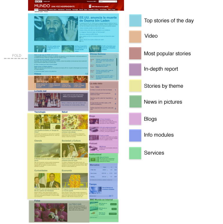
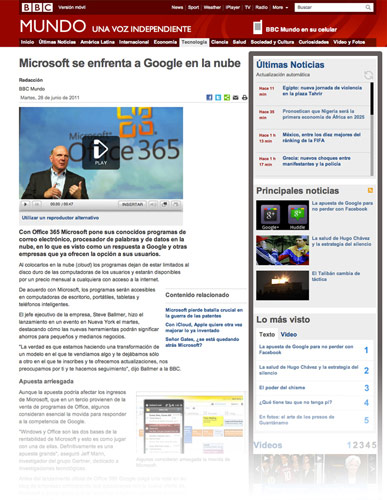
Hierarchy and grouping of content on the BBC Hispanic website.
Each content group has names (with the exception of the top news block), which are reflected in the categories of the navigation menu. The names of the blocks play a double role on our sites: on the one hand, they clearly make it clear what type of material this or that article refers to, and on the other, they serve as visual anchors to help you quickly browse the site.
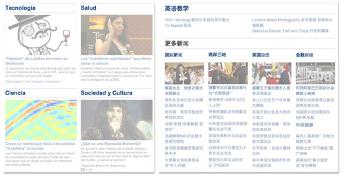
Examples of topic group names on the BBC Spanish and Chinese website.
The combination of the location of the content in the grid, the approach to the names in the content, the spaces between the blocks and various images sets the visual rhythm on the page.
.
Site structure
There is a friction between the need to help the user quickly find what he is looking for and the need to show the variety of materials on the site. As an international news agency, we have one more problem: our news sites almost always compete with leading local news agencies. Therefore, we have to think carefully about which categories to show users, so that the site is relevant for them and helps them find materials on a topic that interests them.
In order to better explain this, we will talk about two scenarios for using the site. Maria wants to read technology news. She needs such materials to be found intuitively. Rodriguez wants to know all about the latest antics of Hugo Chavez. The site structure should satisfy both of these characters.
For Mary, we have several top-level categories, such as Technology. Categories are always located in the same place, whether it be navigation or an area with content on the page.
For Rodriguez, we have topics like Chavez. You can assign a topic to any article - this works similarly to tags on blogs. Air Force journalists have the opportunity to assign these tags to their articles, but they are limited to a controlled dictionary - it is needed so that it is not the one that contains only a few articles. This also allows editors to control the list of topics.
In short, we are trying to find a compromise between the rigidity and flexibility of the presentation of information. Articles are automatically categorized according to a variety of criteria, diverging by topic and category. This helps them not to get lost, and to get to the table for those who are eager to read just them - such a system is convenient for both Mary and Rodriguez.

Modules with topics reveal a more detailed categorization of articles on the site.
.
Typography
Font work is one of the most important elements of any site with a lot of text. The development of technology has made it possible to control fonts on the web to a degree unattainable before. We have included an ambitious set of guidelines in the Global Experience Language, which put the role of typography back to the most important place in design. Decisions related to the headset and its size, narrow tracking and leading, as well as the use of bold headers: all this has become part of the visual language of BBC sites. The use of the font line is used to help align elements and to control typing. Attention to all these details is aimed at achieving a clearer visual hierarchy and improving the readability of the text.
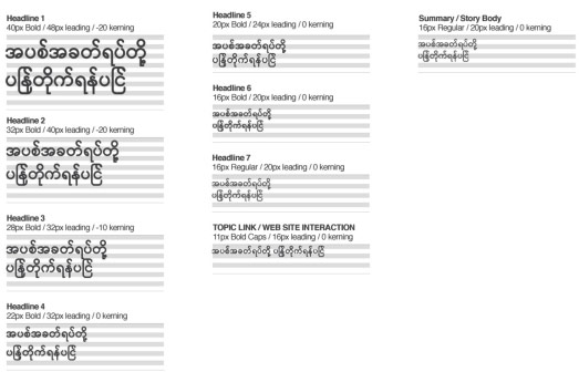
Define a typographic hierarchy for the Burmese alphabet.
Due to the large amount of information and the fact that our team has to work with eight different sign systems, we need to further customize the work with fonts for each site. We are doing meticulous work on font sizes and styles to create a consistent hierarchy that explicitly shows headings, briefs, lists, and so on. Designers carefully work out the tracking and leading of each sign system. Then, the displayed guides are applied to each module in each form: with images of different sizes, without images, with a list of related articles and additional elements, such as icons that indicate comments or videos. We have created a module repository containing any possible option. (Additional details about the font work we have done can be found here.)
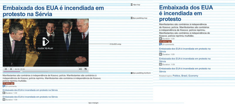
An example of modules for articles: with a video player (on the left) and just text (on the right).
.
News time
The time of publication of the article is extremely important - the user's confidence in the news site depends on it. Understanding this, we added an element to the website that we call “Scrolling News” - in this block, news headlines automatically appear in real time with the time the news appeared. Clicking on the heading leads the user to a short article describing the event. The block is located at the top of the main page, next to the main news block for today, it is also available on the page of each article.
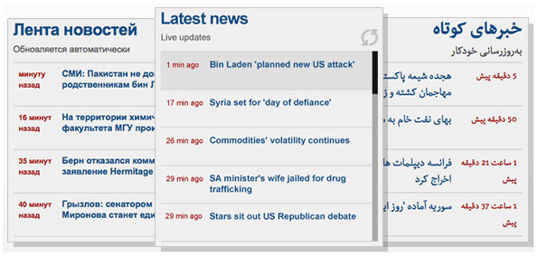
Timely news updates are emphasized in the “Scrolling News” block.
In addition, we show noticeable blocks with the time the main news was added until an hour has passed since the news was added.
.
Further travel on the site
A large number of users come to the site immediately through a specific article, and not through the main page of the site. Therefore, we allocated space on the page of each article specifically for the most important content from the main page and the entire site, showing the full width site on each page. Thus, we encourage the visitor to read the site further. This is a recent idea. Previously, we tried to show the user only articles related to the one he is reading. Designers had to try so that despite the page showing a bunch of additional information, the site was still easy to read.
Article page as a mini version of the main page: the right column displays content from the main page and the entire site.
And all this for one purpose
The main goal of the designer creating the news site is to increase confidence in the site. News is a story about real life, retold by the words of a journalist. The Air Force, being a respected brand, made a lot of efforts to value their materials more than the materials of lesser-known and objective publishers. The painstaking efforts put into the BBC online resources - understanding by content designers and readers, as well as the right approaches to presenting information - all this is part of the constant design and redesign of our delicious Bento box.
.
PS from translators : I hope you enjoyed the article. We will be glad if you indicate to us errors in the translation, so that we can quickly correct them. Write to me in PM, please :)