How I went to Kharkov on Mobile Professional Days
 Good day to all.
 On November 19, 2011 at the Kharkov National University of Radio Electronics (KNURE), the Mobile Professional Days conference was held.
It was dedicated, I quote: "the issues of creating modern mobile applications for mobile platforms iOS, Android, Bada and WP7."
The main audience, again, quote:
- programmers
- project managers;
- designers and usability specialists;
- QA specialists;
- students and teachers.
It was precisely at the designer and usability specialist that my heart melted, after which, without hesitation, I registered on the conference website, bought a ticket for a steam locomotive, and headed for Kharkov.
I must say right away for all interested and not very: not bad , that's how you want, but the conference was not bad.
I don’t know who and what was expecting from half-hour reports, the level of which is mainly for beginners and often non-specialists. Personally, I saw what I was calculating, and I will try to review it.
Goodies:
Link to the conference website: www.mobiledays.com.ua
Android application:

Tweet feed hashtag: # mpdays2011 Speakers'
presentations: www.slideshare.net/itginger/presentations
If anyone doesn’t like long texts, go straight to Total.
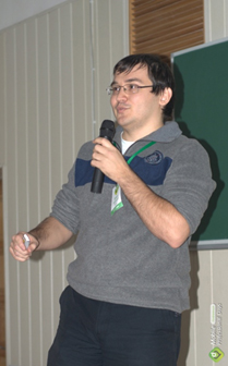
10: 00-10: 30 Pavel Kravchenko
Team Lead / PM / iOS developer (Ciklum, Service2Media, Kharkov)
Flexible methodologies in mobile development
 The first speaker was Pavel Kravchenko, who shared his experience with the team lead of a distributed team of mobile developers with the audience.
 The report was not bad, but I would not say that I opened the veil of secrecy over something special in the leadership of the team.
Pavel is a rather cheerful person and, I think, as a leader, he tries to maintain a positive mood in the team. But those pluses that can be clearly expressed with a sensible leader instantly turn into global minuses with a not very good manager. And what to do in this case, the team itself, Paul did not say, but it would be interesting to hear his opinion.
A couple of interesting moments of the presentation:
Total:
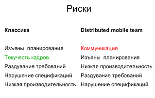
- A rather controversial phrase was heard: a distributed team gives approximately 70% of the effectiveness of the classic "single-office" team. I would say that this figure is very optimistic: according to my observations, a distributed team of more than three people, God forbid, would give 60 percent. If less than three, then the difference is almost leveled. Although it all depends on the leader.
- The speaker described the main risks and problems associated with the work of divided territories, language barriers, time zones and other things of people. Here on the ways to solve them, the time of the report began to end, so it turned out to be crumpled. But here the audience didn’t let us down and purely practical questions from the category went: “What if the approved budget is exceeded?”
For the designer:
- Here it would be interesting mainly to a freelancer, since also quite often you encounter the problem of changing tasks, deadlines, expenses .... already in the process. And because how smoothly and quickly you can solve it all, often the ability to save and complete the project depends.
- If suddenly, God forbid, you had to lead a distributed team of designers (and you haven’t done this before), then start practicing Zen the very second you find out about it. “Now you are in the army, son,” and along with the “features” of the customer himself, you have to deal with the “features” of your wards, and it remains to be seen who is cooler. And the most offensive: everyone will be right, and between them you. Do not try to do everything yourself - learn to immediately delegate the work and correctly set the control points of the project. In the most difficult moments, remember yourself in a similar situation, and you will be surprised how similar the behavior of “you then” and “its current” will be.
10: 00-10: 30 Pavel Taikalo
iOS development TechLead (Stanfy, Kiev)
iOS development: the beginning of the road
 Due to the fact that the audience is not close, and there are no gaps between the reports, I was late and burst with the crowd when the story went with might and main.
 But even despite this unfortunate fact and the fact that I am not a developer, and the report is focused specifically on them, I liked it.
Clearly, sensibly, and rather cheerfully, Pavel told the developers what exactly he needed to know in order to correctly create the application. As a designer, I was almost pleased to cry when the speaker urged all front end developers to read HIG Apple. In particular, he hinted that even many “obvious” and “intuitive” things would not be bad to repeat, or even intuitively, as it comes to business ...
Pavel also emphasized an important fact, which I began to notice more and more often : Developers are increasingly becoming divorced from the end user . It’s understandable, emulators are faster than devices, and a developer’s device in most cases will be faster than my second iPhone.
Total:
- We learn materiel: in particular, HIG, they have a lot of things that are useful in understanding both the principles of building Apple interfaces and usability in general.
- We check ourselves for knowledge of the basic necessary things (now, unfortunately, I can’t find Pavel’s presentation, but there was a slide that showed a list of what Junior, Senior and Architect developers should know).
- We use ready-made GUI templates (they are available for both iPhone and Android) - they save a lot of time and reduce errors in the final.
To the designer:
- For us, knowledge of guides is a must have principle . Naturally, sometimes they can be circumvented, especially in cases with non-standard controls. After all, guides are not always strict requirements, and often recommendations. Especially under Android. But with this you need to be careful. What would I recommend (especially to those who are starting):
• www.idemployee.id.tue.nl/gwmrauterberg/lecturenotes/ui-guide-line-collection.htm (a good collection of guides)
• developer.apple.com/library/ ios / # documentation / userexperience / conceptual / mobilehig / Introduction / Introduction.html (HIG for iOS)
• developer.android.com/guide/practices/ui_guidelines/index.html (Android guidelines
•mobile.tutsplus.com/category/tutorials/mobile-design-tutorials (an excellent set of lessons and articles on creating mobile interfaces).
• www.teehanlax.com/blog/iphone-gui-psd-v4 (iOS GUI psd)
• mobile.tutsplus.com/tutorials/mobile-design-tutorials/5-great-sites-for-ios-design-inspiration ( sites for inspiration)
• www.onextrapixel.com/2011/11/16/50-useful-and-free-web-ui-mobile-ui-and-wireframe-kits (a set of all kinds of different useful whales)
• There is still a very useful a booklet from Smashing Magazines, also about design for mobile devices, in particular, a good chapter on setting a color profile in Photoshop for this. - Never neglect the opportunity to talk with the developers before you start drawing. Discuss the possibilities of introducing custom controls and elements. Who knows, maybe you can even adjust the application architecture together. In general, it will be useful.
- Try to test your design on various devices (machines). This applies not only to mobile design. Not everyone has your 8 GB of RAM, a 2-gigabyte video card and a processor with more than 3 gigahertz frequencies. Monitors are also not calibrated at all (sadly, but a fact), and nobody will appreciate your so carefully chosen shade or elegantly unobtrusive texture - they simply cannot be seen, and designer photorealistic shadows will seem like dirt.
11: 30-12: 10 Alexander Egoshin
Head of Mobile Production Department (Alawar Entertainment, Novosibirsk)
Mobile games: development is only half the battle
 Alexander was positioned as a “guest star” even before the conference, and I must say, he fully met these expectations, yes more than more than that.
 I highly recommend to everyone who is interested and not so interested in reading his presentation.
It immediately feels that the person has a lot of performance experience, this can be seen both in the way the presentation is designed and in the way the speaker presents it: everything is solid, interesting and useful.
The essence of what Alexander tried to convey is that before you start developing your game, you need to:
- it’s good to test the idea: is it interesting to anyone besides you and your loved ones,
- evaluate the target audience,
- make a plan for monetization and development,
- think over additional “chips”.
Be sure to immediately consider the features of adaptation for various types of devices. For example, elements for touch-screen control for iPhone will not always be convenient for iPad - there will not be enough arm mobility or finger length.
There was a separate discussion about the importance of localizing the game.
It would also be nice to understand what it is worth taking money for and what not. In particular, in addition to direct monetization of some gaming “chips”, there is also monetization through Offers (in other words, advertising), which will help you get the same money, only in your profile a little slower.
In general, the speaker suggested treating monetization issues “creatively”. For example, selling tips on mega-difficult levels, creating different sets of game currency, etc.
Naturally, the conditions that Alawar offers for developers were voiced - and suddenly these are sitting in the audience.
My opinion: one of the best reports of the conference. Even despite the fact that Alexander branded the Android tablet market a shame and said that he wasn’t there at all.
How is it not, if I had a Galaxy Tab in my bag and it was on it that I plus your report at the conference? Of course, I’m not yet making a market, but Christmas trees, sticks, see the level of sales of Android-tablets around the world. So far, of course, they are not close to iPad sales, so how much older iOS devices are more experienced ?! While they can not be compared in principle. Having downloaded Montezuma’s Treasures on my Galaxy, I realized that Alexander clearly expressed the company's position: “There are no Android tablets!” - the game has spread so much that it’s scary to look.
Total:
- Do not start the development of the game until you evaluate the relevance of the idea, development plan, monetization methods and target audience.
- Immediately come up with a set of “chips”, the introduction of which after launching the application can extend the life path of your game on the user's device (more updates and gifts - longer life).
- Do not skimp on localization.
- Remember that unlike iOS, Android is a whole army of devices, so focus on the main ones when porting or adapting to different resolutions.
- Ask yourself: do all devices support multi-touch, slide, and more.
- Do not overdo it with monetization, but do not forget to implement it when developing the application.
- Do not neglect testing.
- Alawar is looking for authors and developers.
To the designer:
- Do not neglect prototyping. Especially if you know that your application (game) will be on your smartphone and tablet. Draw a half-circle around the screen with your thumb, holding the device with one hand (or two for the iPad) and see if your user has to cut a tendon so that he reaches all the controls.
- Do not be lazy to study competitive applications (if any). Those disadvantages that you will see in them will be almost one hundred percent if you don’t get them out at the preparation stage.
- Think of gestures! Perhaps it’s not always worthwhile to focus on the intuitiveness of the interface (especially if it is "intuitive", mainly to you and the application developers) and the fact that "this is obvious to all iPhone users." As practice has shown, not always. Often, special controls simplify management and increase the usability of the application as a whole.
- Be sure to test the design on the device. There is always someone who can borrow it.
12: 10-12: 40 Olga Gorenko
Head of the Kiev office (UsabilityLab, Kiev)
Game “Stay alive in mobile”
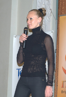 The most controversial report of the entire conference.
 He literally blew up the tweet feed. I do not agree with everything that I read in it, but one thing was obvious: there were a lot of controversial issues.
I won’t retell it in detail, but the point was that Olga outlined the main usability points that should be avoided when creating the application. The purpose of this: to extend the life cycle of your development both in the market and in the user's device.
It was considered on the example of specific applications on the market and on the device of the speaker herself (this is in vain).
And the holivar struck.
I’ll say as an interface designer and part-time usability expert (and I have to do what): in our country, unfortunately, so far many are very skeptical about this area. One has to be triple cautious, choosing words and images in order to express a thought.
At first, it was clear that Olga tried very hard to be what she called “the best friend of the audience”, hence the playful tone of the presentation and the pictures from the “Ice Age” on the slides. But in the end - there was a bust.
I can only say that when I saw the wolf from “Well, wait a minute!”, No one listened to usability anymore, but recalled childhood and a toy from Electronics.
Very vain.
There were some good points, in particular, the name of Steve Krug , sounded , whose books are probably some of the best in this area.
Also, the open preference of iOS devices by the speaker herself was not pleased.
Total:
- Do not take usability lightly. Competent assessment of a specialist, even at the design stage, can greatly reduce the cost and facilitate development in the future.
- “How to make a site convenient. Usability by the method of Steve Circle "- a very good book. In general, he has a lot of books, and if the same Jacob Nielsen is more a theorist and, as they say, a “pillar”, then the Circle is a practitioner. For easy reading - the same Smashing Magazines.
- Nothing can replace practical experience in this area. The more sites, applications, games you have on your account, the stronger you are as an expert.
To the designer:
- Read articles and books, watch strangers and revise your work. Think logically, after all. If you are drawing a design for a dog food store, then the hat does not need animation of flying butterflies, even very beautiful.
- Make sure you are familiar with the guides and design metrics of what you're drawing for. In particular, ask what a safe zone is for a browser.
- Draw trial mockups (whatever) and check how convenient they are for users. Experience, experience and again experience.
12: 40-13: 10 Galina Ryzhenko
Head of Department (B2B i-Free, Kiev)
Augmented reality
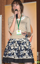 One of the best reports of the conference.
 I’m not saying the best, because Galina shares the palm of my rating with Alexander Egoshin from Alawar.
But in general, the report was remembered as quite informative and useful.
In the beginning, the most interesting examples of the purely practical application of AR technologies were shown. Depending on the example, quickly and without unnecessary snot described the specific features of augmented reality necessary for the implementation of a particular "chip" (geolocation, pattern recognition, gestures ...).
A few examples from the presentation:
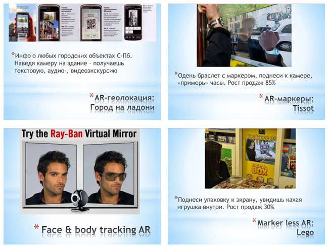
But this is all from the category of "sweethearts".
Galina also understood this, therefore, at the end of her presentation, she brought a good comparative plate of AR-engines, their characteristics, supported "chips" and most importantly: prices.
Those. Those who wanted to try themselves in the field of developing awesome presentations using Augment Reality could immediately figure out how much it would cost them.
Total:
- If your phone has a camera, then do not be lazy and download an application using AR - a funny thing under it.
- Need a WOW effect - try Augment Reality, but immediately reconcile that very few platforms will support your WOW. Also without a camera or video glasses, nothing will come of it.
- Check out this presentation, and in particular, the last couple of slides that describe the engines.
For the designer:
- Augmented reality is an untouched field for creativity. From unusual greeting cards and promotional solutions for websites to virtual marketing campaigns. In this case, you can use both geolocation and various branded objects as markers (object recognition).
- We learn 3D Max and try our hand with free (at first) engines and simple markers.
- Always soberly assess the needs of the project. Low-budget stocks,
firstly, may not materially pull such “chips”,
and secondly, as long as there is a problem with platforms that support these technologies, think about whether your target audience is one of them.
13: 40-16: 00
Sergey Ilyin
Graphic Designer (JetBrains Ltd, St. Petersburg)
How to make good and mobile in one bottle.
Sergey Klyuyev
iOS Developer (Ciklum, Kiev)
RESTfull iOS with RestKit
Taras Filatov
Director of QuickBlox (QuickBlox, London) The
evolution of mobile applications. Through Cloud and Social in Mobile 2.0
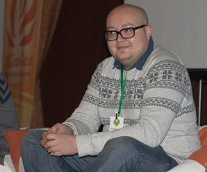
Konstantin Prokopov
Team Lead / Android developer (Akvelon, Kharkov)
Practice designing an interface for Android smartphones
Why did I decide to combine these four reports into one?
But because according to my feelings, that was exactly what it was.
In a living state, the hall was supported by Sergey Ilyin. I liked an interesting example of a simple and useful mobile translator application that Sergey came up with when he was living in a country that does not understand Russian. Enter the necessary word, click "Translation" and together with the translation you get the image of the sought.
The general meaning of the presentation: "Think first, then draw." By the way, there was a slide with a link to a collection of all useful guides.
Further reports were not too memorable, for they were not hooked.
Sergey Klyuyev introduced the framework to the audience using code fragments. It is possible that these were useful things, but very quickly everything flickered.
Report by Taras Filatovboiled down to what successes he and his office had achieved in the field of Cloud-technologies. In my opinion: a little less than the description of the customer and the project and a little more than a story about the technical features - that would be it.
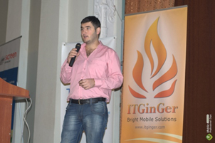
 Pleased with Konstantin Prokopov , who at the very beginning of his report suggested "get up and leave" for those who have been developing Android applications for a long time or have not developed at all. Like, they will not be interested. He also looked formidable at everyone somehow, like in the photo.
Remained from the principle (I'm an interface designer, but here about interfaces). The whole report, as they say, “drove a pixel”, i.e. Learned to center the button in difficult cases. It was very reminiscent of layout divs for web design, and I was not mistaken. This, in fact, she was, moreover, the speaker confirmed my suspicions with a curious statement: "The best candidate for Android application designers is a web designer." It may well be.
There was also a couple of reports, mainly devoted to the cheapening of mobile developments and their monetization. Then a round table on the same topic, well, yes it’s not for the designer, as it were, but more for the marketing and sales people. Because I can’t describe.
But I can summarize this whole thing:
- I dangled to Kharkov not in vain - I looked at the developers, listened to speeches. The conference, perhaps, did not leave behind a sensation of enlightenment: “I have seen, I see again!”, But there was no bad feeling of mediocre profanity.
- Friends, comrades, brothers and sisters, designers and developers. Let's stop cursing and rally our ranks in the face of the threat of censure. For the Basurman is not sleeping, but he is also looking for a way day and night to find out how to indicate in his TK the wicked points of pozakyristy, like support in IE sixth layout of ours or the need for a permanent Internet connection to launch his application.
- Do not be lazy to prepare your introduction, especially if you want to sell the idea. Even if your language is naturally beautifully suspended, and your vocabulary amazes everyone without exception, you can still see that you haven’t prepared a damn thing (more and more often I come across, unfortunately). You simply relied on your knowledge of the subject area. But it wasn’t worth it: "with such an approach, an elephant cannot be sold."
- Interface designers, remember: the fact that you read HIG and have an iPhone does not make you a usability expert. Only a trained eye can do it for you every day, knowledge of all the main guides and metrics, and a sea of viewed and "felt" examples.
A few words about the organizers.
I want to say thank you very much for the very promptly presented photos and presentations of the conference - without them it would be depressing.
In general, the organization was at the level of:
- payment of participation in various ways,
- connecting the booking.com module for hotel reservation, tied to the conference venue,
- cheat sheets for participants with useful phones and a description of the route from the main stations to KHNURE.
It was a little frustrating that it was not possible to print this program on the site in the “Conference Program” section, but they were given to us upon arrival.
Yes, and made iOS and Android applications that showed the program, allowed you to add reports to your favorites and rate speakers, either by minus or by plus, but still.
But I would not be a "usability specialist" if I had not found a couple of bugs, and I found them.
The first and most important, in my opinion, epic fail: there were no gaps between the reports - this is fundamentally wrong and inconvenient, especially when the reports are in a row and in different audiences.
All listeners had two choices: either they “got up and left” while the previous speaker speaks or answers questions from the audience. And Zhvanetsky also explained to us that the speaker, who sees the backs of the students leaving before graduation, experiences the same feelings as the sprinter, who received a bullet in the spine before the finish. Or you had to wait until the report was completed, and quickly coward to another audience, where another speaker had already begun to speak by that time. And under his disapproving glance sneak somewhere to the end of the rows, trying to make the floor creak so hellish under you: the building is not new.
The second mistake or even a minor bug: in the android application, you could add only one of the two lecture streams to your favorites. It is understandable: at the same time it will not work on two, but running back and forth is ugly. But it was possible to vote for both speakers.
That's interesting: Was the same thing in the iOS app?
Here is what particularly pleased: the Twitter feed of the conference, in which mega-energy organizers periodically held some auctions and urged everyone to share their impressions of the reports ...
Oh, in vain they’re like that - just tell us, then we’ll start sharing (from the feed: “I won a T-shirt and ate. The day was almost a success. ")
Now for sure.