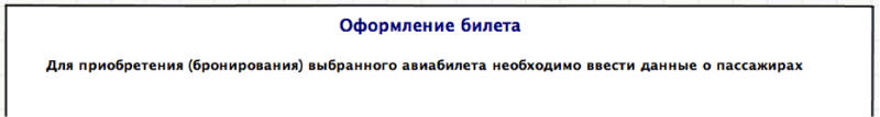
Creating a universal passenger data entry form
Consider the standard process of buying an airplane ticket online, which can be conditionally divided into 3 steps: We
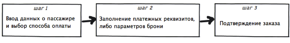
focus on step 1, or rather, on the interface to overcome it.
I will examine in detail the implementation of issuance at four popular airline ticket
agencies : AnyWayAnyDay Ozon Travel Sindbad
online ticket based on the errors and advantages found in the course of a detailed study of the solutions, I will try to create a simple universal ticket issuance form , this will be the purpose of this article.
You can get to the checkout page not only from the agency’s website, but also from numerous cheap airline ticket search services, for example, from the Aviasales website , with which this article was prepared. Given this, it is worthwhile to thank Ozon and the Ticket on-line for the title of this page, and thus, at least somehow oriented the user, while their colleagues from Anywayanyday and Sindbad found that the user himself easily will figure out where he got it.

My vision : The title should be an integral part of this and similar forms, in addition to this I will supplement it with a brief description of what and why the user needs to do:
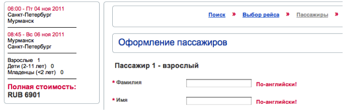
In 3 cases, information about the flight, the ticket for which is issued, is located at the top of the page, and occupies a significant part of it, although it would seem that all the details of the flight (number of transfers, travel time, airline, etc.) were studied and accepted as satisfying the request at the stage of searching and comparing tickets, and you can limit yourself to squeezing: "where / where / when / who / for how much", without resorting to the use of fonts the size of a baby’s palm. This is exactly what the Ticket-on-line agency did, forgetting only to indicate the arrival time, and, for some reason, placed this block in a modest rectangle to the left of the fields to be filled:
But here is what the page on Ozon looks like when buying tickets for a flight with 1 transfer:
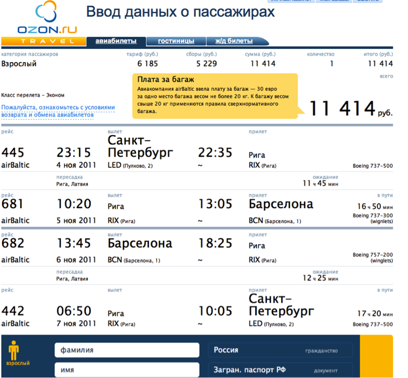
is not it too much for the luggage 11 414 rubles.? (in fact, this is a hint that the baggage fee is charged separately and is not included in the ticket price, but it is located happily for joy). When this picture is displayed on a 13 ”monitor, only information about the flight“ there ”gets into the field of view, which is very sad for the page“ Passenger data entry ”.
Apparently for the sake of fidelity, the Sindbad website also provided brief and detailed information about the flight, for some reason placing the choice of currency and payment method between them:
You can easily find the ticket price on all the sites under consideration, which is certainly good:
My vision : In its form I’ll put a brief information and price at the top of the page:
Having dealt with what and how to purchase, we proceed to enter the passenger data. It is worth noting here that the number of passengers in all agencies is selected before the start of the search and in the process of registration it is not possible to add a fellow traveler, put up with this and fly by one adult.
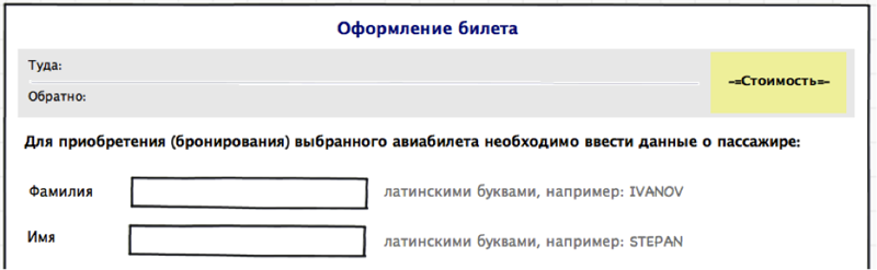
For the passenger, it is necessary to fill in the following fields: Last name First name, date of birth, identity document details, gender, citizenship. First, consider the location of these fields and the movement of the user's gaze when filling in sequentially.
Anywayanyday has all these fields in a line, the input field under the name, prompts for filling are inside the fields:

How the user reads this format:

The Ticket-on-line agency has vertical field layout, prompts on the right:

The user moves his gaze like this:

Filling out such a form is easier and more familiar if only because we read and write everything from left to right, from top to bottom.
Sindbad and Ozon preferred a combination of these methods:

How the user will rush about filling out these forms is difficult to predict, so without arrows. Undoubtedly, as a result, everyone will cope with the filling, no matter how the fields are located, the only question is convenience and time spent on this process.
Therefore, for my form I will choose a vertical arrangement.
Now we go directly to the fields and tooltips:
Requirements are limited to the fact that you need to enter data in Latin letters, and here is how the interfaces in question tell us about it:
Sindbad mercilessly deletes what has appeared and tells you when trying to type in Russian:
BiletOnline requires: “In English!”

Ozon when activating the input field displays a prompt on the right of the field:

while the name of the field itself is not displayed at the time of input
The notification method on the AnyWayAnyDay website seems the most loyal

because warns the user before he starts typing something, and not as rude as BiletOnline does. But the rude location is still winning, because Such a hint format can easily be transferred to fields whose size will be smaller than the hint text, or if these are the fields for selecting values from the list.
My vision : in my form I will write the name of the fields on the left, and the tips, with an example of filling, to the right of the input area
Why to indicate the gender when buying a plane ticket is a mystery to me, but since there is everywhere - one can not help but consider. There are only two options for presenting:
- AnyWayAnyDay pictograms - selecting

from a list, for all others

Using the drop-down list to switch between two items does not seem justified, if only because to change you need 2 clicks and not 1, as in the case when both options are presented on the screen at the same time. As a small improvement: you can replace the pictograms with words so as not to torment people with low vision with the identification of the skirt on the icon depicting a girl:

The choice of date of birth on the sites in question is presented in three versions:
- manual entry in the format dd.mm.yy

- manual entry of day and year values, selection of a month from the list

- selection of all values from the list It is

difficult to say which one is the best, it’s more convenient to choose from a list, someone to enter numbers by hand. However, it seems to me that it is not worth combining these 2 methods, so as not to force the user to change the input device (keyboard / mouse) once again.
My vision : I will focus on filling in all the fields of the date of birth manually

, ideally, after entering the month, the system should replace its digital designation with a full alphabetic one, so that after filling out the field would look like this:

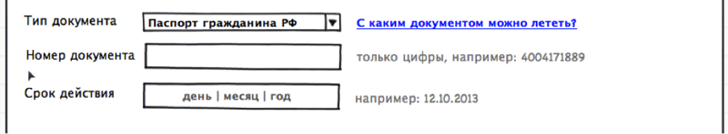
The fact that this document is specified only on the Ticket-on-line and Ozon websites, through the field “document type”, the

others suggest immediately entering the document number. We enter the number, it’s not at all difficult, then the “validity period” field follows, which needs to be completed only if the document is a passport. Let's see what we are offered:
- Anywayanyday

no hints, I try to enter a date, but in any way, I hover over the check box to the left of the field - here it is a hint:
great, I just have a passport, but you can enter the date only by checking the box, otherwise the field just doesn't respond
- Sindbad
Here they considered that the hint how to enter the value of the “year” field is much more significant than the story about what kind of validity it is. And for those who haven’t figured it out - the “no-expiration” check-box that makes the task easier, and really, let’s go without it. On OZON and BiletOnline there is no such problem, because there the “expiration” field appears depending on which document was selected from the list. This option suits us.
My vision : I leave the “document type” field, and as a tip I will place a link to a reference article about which documents I can fly to:
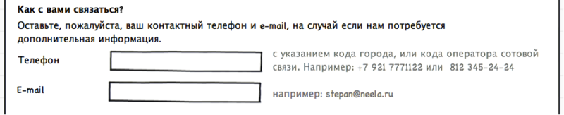
To communicate with the customer of the ticket (and this is not necessarily the passenger himself) there is a block with contact details where they are asked to indicate the phone and e-mail. This was done differently everywhere, most of all I liked the solution from OZON

where, in addition to the input fields, it is described why this information is needed. Right here, in my opinion, the simplest phone input field is a text input box, while competitors offer more sophisticated options:


My vision : Surely something, and the user will probably enter his own contact number correctly, and it’s not worth it To puzzle with unnecessary format requirements, in my opinion, an example in the tooltip is enough:
This completes the design of the passenger, you can proceed to the next step: payment, or booking with subsequent payment.
Only one agency (anywayanyday) offers to make a payment or reservation without leaving the data entry form, and the choice is provided in the form of radio buttons:

(there is also the option “book with a subsequent payment by card”, but I could not establish the pattern of its appearance) Below is information about fees, bank card details, total amount and the “pay” button or confirm the reservation, depending on what is selected. I did not like this method. It seems that the user needs to more clearly show what actions are available to him, and, based on the selected, continue processing the request. What do other agencies offer after checking the correctness of filling in the fields?
Ozon, after clicking the “continue” button, asks for authorization
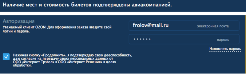
it’s after I selected a flight, I filled in all the data, and for the sake of feeling I’m not able to register for a new user, but I really want to fly ...
Sindbad offers to choose a payment method:
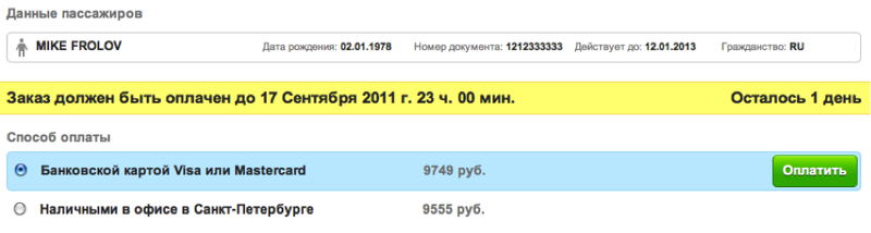
everything seems to be fine, but, unfortunately, there’s no way change your data if a typo creeps in, and also does not know where this office in St. Petersburg is.
A ticket online also does not allow you to return to editing, and still keeps it secret how to pay for a ticket:
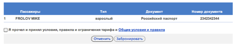
My vision : You need to clearly show the user the available actions, in addition to that, it’s worth posting all the information that you may need to make a final decision solutions. The result is this form

Further development of events implies 2 ways - confirm the reservation, or enter credit card information. But this is a completely different story.
The main difference between the mobile version of the site is due to the limitation of the visible area (at a readable scale), so as not to force the user to scroll a long sheet, we will divide the whole process into three steps: filling in passenger data, entering data about a document, contact information. To reduce the horizontal component of the form, place the name of the fields above them, and the tips inside.
Good for all!
focus on step 1, or rather, on the interface to overcome it.
I will examine in detail the implementation of issuance at four popular airline ticket
agencies : AnyWayAnyDay Ozon Travel Sindbad
online ticket based on the errors and advantages found in the course of a detailed study of the solutions, I will try to create a simple universal ticket issuance form , this will be the purpose of this article.
1. Do you need a title on the page?
You can get to the checkout page not only from the agency’s website, but also from numerous cheap airline ticket search services, for example, from the Aviasales website , with which this article was prepared. Given this, it is worthwhile to thank Ozon and the Ticket on-line for the title of this page, and thus, at least somehow oriented the user, while their colleagues from Anywayanyday and Sindbad found that the user himself easily will figure out where he got it.
My vision : The title should be an integral part of this and similar forms, in addition to this I will supplement it with a brief description of what and why the user needs to do:
2. Information about the purchased ticket
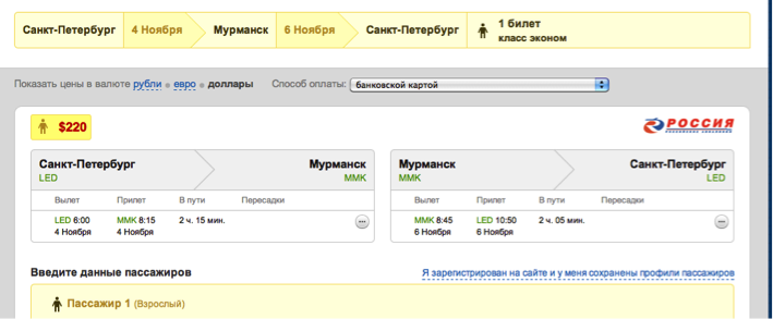
In 3 cases, information about the flight, the ticket for which is issued, is located at the top of the page, and occupies a significant part of it, although it would seem that all the details of the flight (number of transfers, travel time, airline, etc.) were studied and accepted as satisfying the request at the stage of searching and comparing tickets, and you can limit yourself to squeezing: "where / where / when / who / for how much", without resorting to the use of fonts the size of a baby’s palm. This is exactly what the Ticket-on-line agency did, forgetting only to indicate the arrival time, and, for some reason, placed this block in a modest rectangle to the left of the fields to be filled:
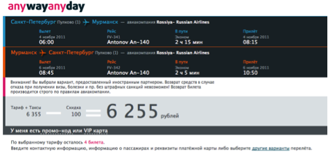
But here is what the page on Ozon looks like when buying tickets for a flight with 1 transfer:
is not it too much for the luggage 11 414 rubles.? (in fact, this is a hint that the baggage fee is charged separately and is not included in the ticket price, but it is located happily for joy). When this picture is displayed on a 13 ”monitor, only information about the flight“ there ”gets into the field of view, which is very sad for the page“ Passenger data entry ”.
Apparently for the sake of fidelity, the Sindbad website also provided brief and detailed information about the flight, for some reason placing the choice of currency and payment method between them:
You can easily find the ticket price on all the sites under consideration, which is certainly good:
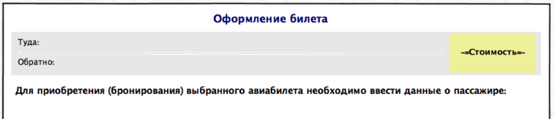
My vision : In its form I’ll put a brief information and price at the top of the page:
3. Passenger data
Having dealt with what and how to purchase, we proceed to enter the passenger data. It is worth noting here that the number of passengers in all agencies is selected before the start of the search and in the process of registration it is not possible to add a fellow traveler, put up with this and fly by one adult.
For the passenger, it is necessary to fill in the following fields: Last name First name, date of birth, identity document details, gender, citizenship. First, consider the location of these fields and the movement of the user's gaze when filling in sequentially.
Anywayanyday has all these fields in a line, the input field under the name, prompts for filling are inside the fields:
How the user reads this format:
The Ticket-on-line agency has vertical field layout, prompts on the right:
The user moves his gaze like this:
Filling out such a form is easier and more familiar if only because we read and write everything from left to right, from top to bottom.
Sindbad and Ozon preferred a combination of these methods:
How the user will rush about filling out these forms is difficult to predict, so without arrows. Undoubtedly, as a result, everyone will cope with the filling, no matter how the fields are located, the only question is convenience and time spent on this process.
Therefore, for my form I will choose a vertical arrangement.
Now we go directly to the fields and tooltips:
3.1 Last Name and First Name
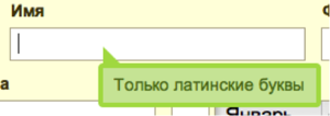
Requirements are limited to the fact that you need to enter data in Latin letters, and here is how the interfaces in question tell us about it:
Sindbad mercilessly deletes what has appeared and tells you when trying to type in Russian:
BiletOnline requires: “In English!”
Ozon when activating the input field displays a prompt on the right of the field:
while the name of the field itself is not displayed at the time of input
The notification method on the AnyWayAnyDay website seems the most loyal
because warns the user before he starts typing something, and not as rude as BiletOnline does. But the rude location is still winning, because Such a hint format can easily be transferred to fields whose size will be smaller than the hint text, or if these are the fields for selecting values from the list.
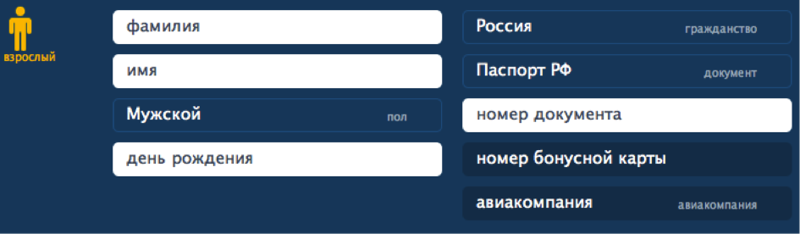
My vision : in my form I will write the name of the fields on the left, and the tips, with an example of filling, to the right of the input area
3.2 Sex
Why to indicate the gender when buying a plane ticket is a mystery to me, but since there is everywhere - one can not help but consider. There are only two options for presenting:
- AnyWayAnyDay pictograms - selecting
from a list, for all others
Using the drop-down list to switch between two items does not seem justified, if only because to change you need 2 clicks and not 1, as in the case when both options are presented on the screen at the same time. As a small improvement: you can replace the pictograms with words so as not to torment people with low vision with the identification of the skirt on the icon depicting a girl:
3.3 Date of birth
The choice of date of birth on the sites in question is presented in three versions:
- manual entry in the format dd.mm.yy
- manual entry of day and year values, selection of a month from the list
- selection of all values from the list It is
difficult to say which one is the best, it’s more convenient to choose from a list, someone to enter numbers by hand. However, it seems to me that it is not worth combining these 2 methods, so as not to force the user to change the input device (keyboard / mouse) once again.
My vision : I will focus on filling in all the fields of the date of birth manually
, ideally, after entering the month, the system should replace its digital designation with a full alphabetic one, so that after filling out the field would look like this:
3.4 Identity Document
The fact that this document is specified only on the Ticket-on-line and Ozon websites, through the field “document type”, the
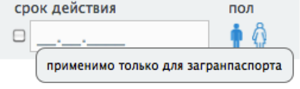
others suggest immediately entering the document number. We enter the number, it’s not at all difficult, then the “validity period” field follows, which needs to be completed only if the document is a passport. Let's see what we are offered:
- Anywayanyday
no hints, I try to enter a date, but in any way, I hover over the check box to the left of the field - here it is a hint:
great, I just have a passport, but you can enter the date only by checking the box, otherwise the field just doesn't respond
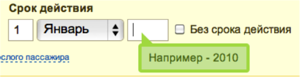
- Sindbad
Here they considered that the hint how to enter the value of the “year” field is much more significant than the story about what kind of validity it is. And for those who haven’t figured it out - the “no-expiration” check-box that makes the task easier, and really, let’s go without it. On OZON and BiletOnline there is no such problem, because there the “expiration” field appears depending on which document was selected from the list. This option suits us.
My vision : I leave the “document type” field, and as a tip I will place a link to a reference article about which documents I can fly to:
4. Contact details
To communicate with the customer of the ticket (and this is not necessarily the passenger himself) there is a block with contact details where they are asked to indicate the phone and e-mail. This was done differently everywhere, most of all I liked the solution from OZON
where, in addition to the input fields, it is described why this information is needed. Right here, in my opinion, the simplest phone input field is a text input box, while competitors offer more sophisticated options:
My vision : Surely something, and the user will probably enter his own contact number correctly, and it’s not worth it To puzzle with unnecessary format requirements, in my opinion, an example in the tooltip is enough:
This completes the design of the passenger, you can proceed to the next step: payment, or booking with subsequent payment.
5. Booking or payment
Only one agency (anywayanyday) offers to make a payment or reservation without leaving the data entry form, and the choice is provided in the form of radio buttons:
(there is also the option “book with a subsequent payment by card”, but I could not establish the pattern of its appearance) Below is information about fees, bank card details, total amount and the “pay” button or confirm the reservation, depending on what is selected. I did not like this method. It seems that the user needs to more clearly show what actions are available to him, and, based on the selected, continue processing the request. What do other agencies offer after checking the correctness of filling in the fields?
Ozon, after clicking the “continue” button, asks for authorization
it’s after I selected a flight, I filled in all the data, and for the sake of feeling I’m not able to register for a new user, but I really want to fly ...
Sindbad offers to choose a payment method:
everything seems to be fine, but, unfortunately, there’s no way change your data if a typo creeps in, and also does not know where this office in St. Petersburg is.
A ticket online also does not allow you to return to editing, and still keeps it secret how to pay for a ticket:
My vision : You need to clearly show the user the available actions, in addition to that, it’s worth posting all the information that you may need to make a final decision solutions. The result is this form
Further development of events implies 2 ways - confirm the reservation, or enter credit card information. But this is a completely different story.
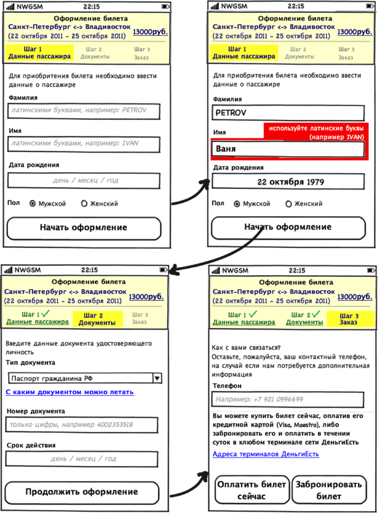
Bonus: data entry form for the mobile version of the site
The main difference between the mobile version of the site is due to the limitation of the visible area (at a readable scale), so as not to force the user to scroll a long sheet, we will divide the whole process into three steps: filling in passenger data, entering data about a document, contact information. To reduce the horizontal component of the form, place the name of the fields above them, and the tips inside.
Good for all!