What is wrong with Windows Phone 7?
No matter how you feel about Microsoft and its endeavors.
The Windows Phone 7 operating system, released about a year ago, generated a lot of controversy, debate, received both a lot of compliments and a flurry of criticism.
We will not now understand the arguments of the warring parties, but just look at the features of the system through the eyes of a person interested in its successful development, in anticipation of the release of the first major update of Mango.
Much has been said about the new features of Mango, many optimistic articles have been written, but I would like to present you my view of the system based on my own experience in using it for 6 months.
Well, since the merits are already well covered in the press and marketing materials, let me focus solely on the shortcomings.
Let's go in order.
Startscreen

Startscreen in Windows Phone 7 is a vertically scrolling list of tiles.
As the main complaints, you can often hear about the following features:
- The tiles are too large, few tiles fit on the screen. I probably do not agree with this. I will not give any arguments, I will simply say this - this is not the problem. The size of the tiles, in my opinion, if not ideal, is close to ideal. Icons and tiles are most often clicked with either the index finger or the thumb, the dimensions of which correlate very well with the size of the tile.
- The empty bar on the right takes up so much space, instead of containing something really useful.Also past, in my opinion. The strip performs a banal, but very important function - it tells the user that you can scroll to the right and find something else. Here you can make an argument - they say, are the phone users really so weak-witted that when they learn about the ability to scroll to the right, they will forget about it and every time they need to be reminded of this, showing this bar? There is, frankly, nothing special to tell me. Although I can assume that this strip saves time by reminding the user that the program he is looking for may not be submitted to the startup screen. Indeed, many will simply leaf through the list of tiles until they remember that they did not take out any specific program to the start-up screen. Then they hit themselves on the forehead and climb into the full list of applications. A trifle, but nonetheless.
- The status bar is hidden. You need to poke your finger at the top of the screen to make it appear. In practice, there’s nothing wrong with that. The clock and input language are always displayed, and the rest is secondary information. Considering that the focus of MetroUI is aimed at hiding all secondary and focus on important information, this implementation seems to me satisfactory.
Now let's look at what really seems uncomfortable to me.
Live Tiles
The idea of displaying richer information on icons than just a counter looks interesting. However, in practice, this feature does not seem to be any useful, because there are practically no applications that implement it. They will appear after the release of Mango, but to be honest, I do not expect any surprises, because the scope of such technology is very limited. Not in every application there is something that can be shown on the tile and that will be really useful and interesting. The only successful implementation so far I can name only a calendar that displays upcoming meetings in a tile.
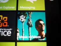
But in the bottom line - tiles that simulate counters, tiles, personalizers (for example, the Music + Video Hub tile that displays the album cover) and a special class of tiles that are shortcuts to contacts, files, web pages, etc.
They are useful in some ways, because give quick access to relevant information, but it is their "living" age that is very doubtful in its usefulness.
A commonplace example is the pinned contact tile. Displays the name and photo of the contact (although the name is not always shown, but leaves only at a certain time interval), as well as the availability of updates in the social. networks.
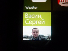
The latter function may be useful, however, the fact that this information is displayed on the tile intermittently makes this functionality meaningless. Instead of waiting for a particular tile to “roll over”, it will be easier for me to click on it and see all the information.
So, remembering the British Airways application example, we are waiting for new applications with really useful tiles, but we are not really looking forward to it.
Lack of grouping tiles / shortcuts by category and folder
This is a fairly often used argument in disputes about WP7, however, if you look at the bottom line, the list of tiles is essentially an analogue of the Quick Launch bar in Windows. There are not so many programs that we use regularly, and in most cases there will be enough start-screen space for them.
But I cannot call such an option completely convenient.
How it works for me:
At the top I have the most frequently used tiles. Below are programs with narrow functionality, which come in handy not so often, but which you need to have instant access to. I can just twist the list of tiles very much and immediately reach its end, where all the most important is located.
In the middle - the least important tiles that do not require instant access, but those that should be at hand, and not just in the full list of programs.
It is also worth noting that I am not engaged in any operational activities on the road, because, perhaps, the business user will have more complaints about the functionality of the tile list.
When such a user attaches a bunch of shortcuts to sites, contacts, One Note documents or map fragments to the startup screen, it will probably be much more difficult to figure out this heap and the speed of access to information will deteriorate significantly.
The only solution that suggests itself is the ability to create multiple desktops with tiles with a navigation function on them, similar to how the tab switching function is implemented in IE Mobile.
I will not be very surprised if we see such an implementation in one of the future versions of WP7.
Tiles and Accent color
Accent color is one of the few personalization elements in Windows Phone 7. The
background color of tiles usually automatically changes depending on the selected Accent color, but not all application authors find it necessary to spend time on such a trifle. However, application tiles, which are sharply knocked out of the general style, often look very clumsy and spoil the appearance of the start screen.
In place of Microsoft, when testing an application for the Marketplace, I would check this feature and ask the authors of applications that provide an ugly tile to correct this oversight and provide something more decent.

However, Microsoft itself made a big mistake in the case of the Office Hub tile. It does not use Accent color for the background and is clearly out of the general style. A trifle, but unpleasant.
Battery icon in the status bar
There are 2 complaints to her at once - the charge value is not displayed in digital form, therefore it can only be estimated approximately, and when Battery Saver is activated, even this information cannot be obtained, because half of the icon is covered by a heart, indicating that battery saving is activated .
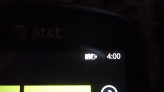
Therefore, you have to climb into Settings-> Battery Saver and spend extra time.
User Interface Animations
In NoDo, interface element animations warmed my soul. Somewhere, however, I would like a little less time during which the animation is active (for example, when starting mail), but in general, everything felt perfectly thought out and licked.
However, what I saw in Mango Beta 2 horrified me. Good old animations in many places have been replaced by something unimaginably clumsy and, as it is called, “choppy”. Lockscreen, IE, mail is everywhere. But alright, if only it looked bad - in one case it just killed all the charm of the Zune player.
Now, when switching a track inside a running Zune, the name of the track changes with a noticeable delay. This is damn annoying when you flip through tracks one by one and have to stop each time to understand which track you switched to. Thank God, they did not touch the switch displayed on the lock screen and when you press the volume keys. Let's hope that in RTM Mango these annoying new animations will remove and return at least what was in NoDo.
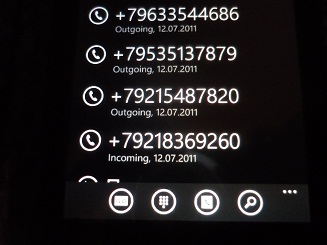
Telephone
Incoming call
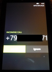
Everything is quite convenient, but one thing is damn annoying - while trying to get a phone out of your trouser or jeans pocket to answer a call, very often the reception or end button is accidentally pressed. Therefore, when someone calls, you instinctively pull out the phone from your pocket like an adder - tightly holding the side edges with two fingers, just so as not to accidentally press the end call.
It seems to me that it is necessary to make some kind of more complicated gesture of receiving or hanging up, but simple enough not to take too much time.
Other in the phone
I can call another “telephone” drawback that when you enter the “phone” application, we see a call history, and not a dial keypad, and this behavior cannot be changed in any way. In everyday life, this configuration suits me 100%, but when you need to urgently make a call, you have to poke a small button in the appbar so that the dial keyboard appears. I'm not talking about the fact that in such a situation, getting into the address book does not even occur to you if you remember the number by heart.
I think that the optimal temporary solution here is to organize the interface using the Pivot control, which is widely used in WP7.
In general, Microsoft should have better thought out the scenarios of using the phone for its main purpose.
Fonts
Metro's design ideology is entirely focused on information and typography is an important element of the WP7 interface.
There are two complaints.
The first is “circumcised” words. No, not arketpl. The circumcision of words in controls such as panoramas in no way annoys or worsens usability, because it’s always clear what is written. You go to the Marketplace and quite expect to see this word in the title. No riddles, no problems.

But here is the cutoff of words in some applications, for example, all in the same Marketplace (the names of some applications simply do not fit when you look at their list and you have to click on the application to see its name on the page for a full description of the program). But the most savage thing is the circumcision of words on the lockscreen when the upcoming event on the calendar is displayed on it.
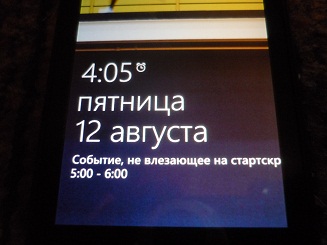
Well, it’d just be cut off, but it looks doubly ugly, because There is no gap between the end of the cropped word and the right border of the screen.
Which exit? Auto scroll. Not a panacea, but at least it didn't break functionality.
The second complaint is the Russian text in the interface elements.
Because I use only Mango Beta 2, where the Russian language of the interface is not yet unlocked, I have to judge solely by the text of the nearest calendar events and the date / day of the week displayed on the lock screen. Perhaps my claim is unfounded, but the Russian style of SegoeWP looks somehow ugly. Latin looks cool, Russian doesn't. I’m not sure that Microsoft will have enough time and desire to change something here for the RTM Mango release.
Although, of course, there is no limit to perfection. Japanese characters in WP7 look even steeper than Latin.
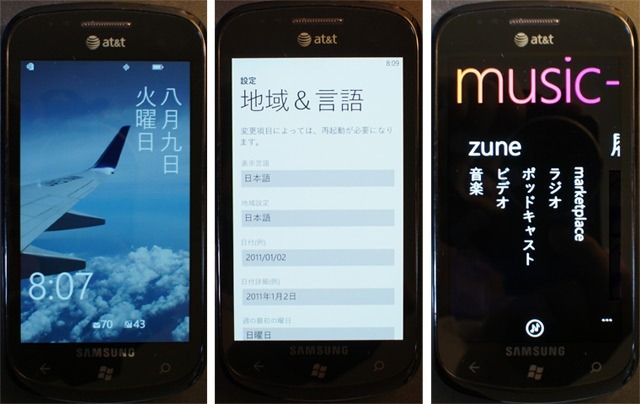
When I saw this beauty, even for a moment I regretted that I was not Japanese.
Applications
post office
Everything is great here, except for two things:
- Normally, only the contents of standard folders are loaded by default (and even that, Junk, for example, needs to be personally synced once). Own folders do not load anything, as I did not fight (I use 3 hotmail mailboxes)
- There is no “select all” function. I was going here recently to clean up those entering the Unified inbox, and I have garbage there - thousands of emails of all kinds of mailings and what I no longer need. It’s easy to filter out the newsletters, but you still have to select each individual letter or message chain with your hands. In short, I spat on this thing.
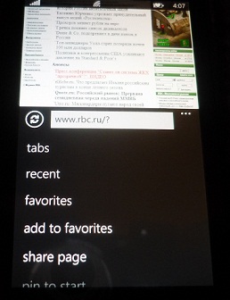
IE Mobile
Here claims accumulated order.
- Tabs button removed in the bowels of the appbar menu
- There is no way to open the link in the background tab
- The address bar is now displayed in landscape mode and occupies a precious place (I understand that this is an invaluable feature for owners of phones without a hardware keyboard, but to me what? The fact is that before the address bar in landscape mode was not displayed at all and to switch the tab or enter a new address, the phone had to be returned to portrait mode. For phones with a hardware keyboard, it was possible to display the address of the bar in landscape mode by pushing this same keyboard)
- When scrolling through the page, the content is still often drawn not immediately. It's not very nice to see this, especially considering how fast scaling and other things work.
- If, after exiting IE, go into it again and try switching the tab, then the contents of the tab you are switching to will be loaded from the server a new way quite often
- The button for speed dialing a domain from the point of view of localization is designed simply dibilno. For example, the .ru domain is displayed only if the Russian layout is selected, while you need to press and hold the button to select this domain from the additional sequence that opens. options
- No matter how developers sang that IE9 Mobile is a copy of desktop IE9, some pages behave differently. For example, a bug in LiveJournals is boring, where the annoying socket that appears on all browsers below, in IE9 Mobile, is hovering somewhere in the middle of the page, blocking a couple of lines of text
Messaging
Everything is just super cool, except for one - there are only SMS, WLMessenger and Facebook chat - and that's it. If you need ICQ or Skype, please use third-party applications. And it would be nice if they could integrate into the Messaging hub, use the address book and behave the same way as WLM with the Facebook inside Messaging, but no, figs. So what is the point of all this integration with kotovasiya, if it is limited only by these two networks? The idea is cool, but here again, everything spoiled the implementation.
Office
Well, an office is an office. There are many opportunities - sharipoint, skydrive, all things. But what a limited editing ability! I expected much more from MCO, but even in Mango there are no changes, only skydrive has been added.
People hub
There are a couple of complaints.
Firstly, there are contacts with the same name, which may not have a last name. So, for example, in my book there are about a dozen Alexandrovs who do not have a surname, because they all look exactly the same in the address book and there is no way to distinguish one from the other until you poke each of them and look at the details.
Further. The long-awaited groups have appeared in Mango, but their size is limited to 20 contacts. And what should I do, for example, if I have 21 customers, and I want all of them to be in the same group? Yeah, to create a group of "Customers-2 or something like that."
Contact card - there is no way to send a contact in a format that is understandable to most phones and accept, respectively, too. Thank God, although you can import contacts from SIM cards.
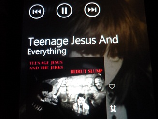
Music + Videos Hub
Everything is just perfect, except for that annoying jamb with animation that I mentioned above.
Well, if you really find fault, then the following can be distinguished.
Rewinding as before only by a long press on the rewind button in one direction or another. Actually, it’s nonsense, but why couldn’t I make a classic Seek bar, I can’t imagine.
Pictures hub
One drawback is that you cannot select multiple pictures and delete. Only one at a time.
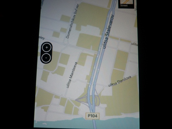
Bing maps
The program is good, but in Russia there is still not enough detail in many cities, navigation, respectively, will also not work normally within such cities, and also will not display traffic jams. Honestly, Microsoft’s deal with Yandex itself is requested, to adapt Yandex.Maps to the Bing engine.
From specific functional notes - there are not enough functions familiar to other platforms, such as displaying a map in landscape orientation, 3D representation.
Although the platform already has several good mapping programs - Bingle Maps, which allows you to switch between bing and google. The program is very fast, but 3D hasn’t been there yet, I haven’t tried navigation.
There is also an excellent third-party program from Microsoft - MapStalt Mini. These are Open Street Map maps on a kind of stripped down bing engine, without navigation, etc., only with the function of determining the current location. It also seems to work like editing, creating labels, etc.
One way or another - we are waiting for what Nokia and Yandex will show.
Bing:

Bing in Bingle Maps:
OpenStreetMap:

Other
Camera
Little flaw - no zoom while recording video
Wifi
Although it became possible to connect to hidden wireless networks, they still did not make it possible to set a manual IP address. So, visiting a friend, I can’t use free Wi-Fi, because he has an IP filter in the settings of the router.
Only shows that you can’t change it:

In addition, Wifi has a stupid habit of falling off by itself some time after locking the screen to save energy. The fact that IM + is still working for me for some reason does not bother him.
Integration with social. networks
Integration is one-sided, limited. Americans, of course, will be happy with facebook, twitter and linkedin. But how, excuse me, in contact and habr? Why this dance with integrations, if it is so hard-coded that a third-party developer does not have any tools to add other social networks and services at the same level of integration, and not as a separate application?
It is also worth adding that twitter, for example, is generally somehow silly in one detail implemented. In terms of notifications, I can sometimes consider it more as a source of instant information. Therefore, I would like notifications about important tweets and personal messages to come in the form of the same notifications as for IM, rather than hanging silently in the notification list until I get to it. The same applies to private messages and replies to posts and comments on the Facebook.
Well and so, on trifles - it seems support of transparent PNG for lokskrin is no more. She was not officially before, but it worked. Now it didn’t work out.
And all with the same lockscreen, when unlocked, the data disappears for some reason faster than it was in previous versions. Looks like the same clumsy animator worked.
In conclusion, I want to note that despite all these shortcomings, the vendor phone is definitely my choice. Too attractive for me is both the general concept of the axis and its graphic design, as well as pleasant little things that are not on competing systems.
I hope my article will bring a little constructive to the discussion of WP7, because on specialized portals they often only praise, and on neutral territory primitive holivars flare up, carried away into the plane of mutual insults, and not the specifics related to the platform.