Social Network Profile: Need Habrauser Advice
I immediately warn that I publish in "I am PR" then that they will write about their project. The main purpose of this topic is to collect the views of the Habrasociety because "one head is good - and 2 is better."
I already wrote about Qubrit and its further development. Initially, Qubrit was planned as a project for virtual business cards, where the user will just have one page with his data (as on a real business card). But in the process, something was added, something was removed, and as a result, we came to what we now have. So on the example of your profile.
1. Now: Card page
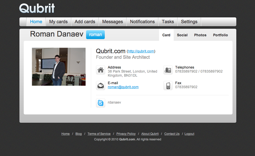
This is the main profile page, that is, the virtual business card itself, which is loaded with unnecessary menu items and the wrong UI. Of the minuses of this page:
- Lots of menu items on top. Initially, only Settings was planned, but in the process they decided that they need to exchange cards and added Add cards, My cards, then added Notifications and Messages, eventually turning it all into a complete mess.
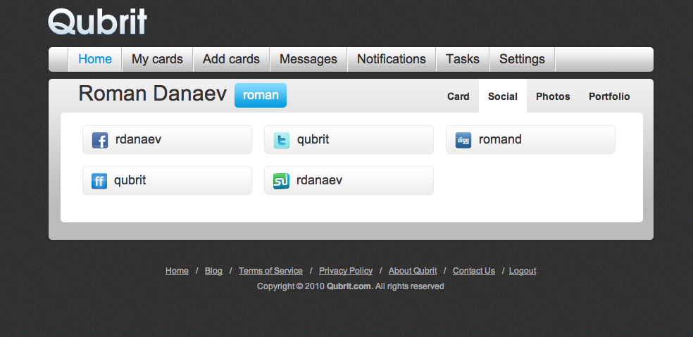
- All links to the social network are on a separate tab “Social”, which is also inconvenient because you have to click on the button again. This, incidentally, is what we were told about feedback about 15 times for sure - to place links to social networks on the main page.
2. After the Redesign
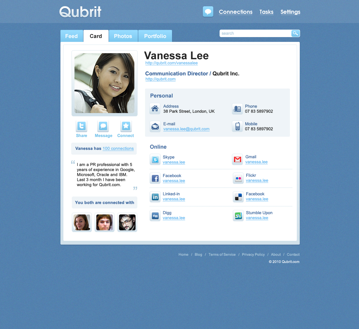
So, this is a preview of the Qubrit user page. We changed the color scheme and revised the entire UI.
- They made a name on a separate line, because many before that did not fit the name and username on the same line;
- All links to social networks are now on the main page. As a result, when I open the map, I immediately see everything about this user, which is convenient because you do not have to click on a separate masonry;
- Under the photo, added the Share buttons (publishing this card on Twitter), Message (sending a message to the user), Connect (this would be to become friends).
- Added the option to show how many friends a given user has (if desired, you can disable it in the settings and no one will see your friends);
- Also below (honestly stole the idea from Twitter) - these are your mutual friends.
Feedback: So in conclusion, I want to ask you to express your opinion (positive / negative) and comments on what to add or remove to this option.
Thanks and have a
nice weekend Qubrit Team
PS Until the end of September we are going to add Russian and Spanish.
I already wrote about Qubrit and its further development. Initially, Qubrit was planned as a project for virtual business cards, where the user will just have one page with his data (as on a real business card). But in the process, something was added, something was removed, and as a result, we came to what we now have. So on the example of your profile.
1. Now: Card page

This is the main profile page, that is, the virtual business card itself, which is loaded with unnecessary menu items and the wrong UI. Of the minuses of this page:
- Lots of menu items on top. Initially, only Settings was planned, but in the process they decided that they need to exchange cards and added Add cards, My cards, then added Notifications and Messages, eventually turning it all into a complete mess.

- All links to the social network are on a separate tab “Social”, which is also inconvenient because you have to click on the button again. This, incidentally, is what we were told about feedback about 15 times for sure - to place links to social networks on the main page.
2. After the Redesign

So, this is a preview of the Qubrit user page. We changed the color scheme and revised the entire UI.
- They made a name on a separate line, because many before that did not fit the name and username on the same line;
- All links to social networks are now on the main page. As a result, when I open the map, I immediately see everything about this user, which is convenient because you do not have to click on a separate masonry;
- Under the photo, added the Share buttons (publishing this card on Twitter), Message (sending a message to the user), Connect (this would be to become friends).
- Added the option to show how many friends a given user has (if desired, you can disable it in the settings and no one will see your friends);
- Also below (honestly stole the idea from Twitter) - these are your mutual friends.
Feedback: So in conclusion, I want to ask you to express your opinion (positive / negative) and comments on what to add or remove to this option.
Thanks and have a
nice weekend Qubrit Team
PS Until the end of September we are going to add Russian and Spanish.
