 August 17, 2010 at 09:51
Axure RP Pro web design basics
 Recently,
 This trend cannot but please both the customers and the developers themselves - after all, the design process allows us to destroy all the most problematic moments before the beginning of the transformation of an abstract technical task into a final product.
There are more and more tools for visual design. Some use Adobe InDesign, others like Visio, others are content with OpenOffice Draw. But more and more fans appear in the rather heavy and functional Axure RP Pro program.
1. Sitemap
In this area, you can create a structural diagram of a site using a multi-level hierarchy. For example, the structure of a small project may look like this: The

buttons in the panel are designed for quick access to the main functions:
 | Creates a subpage (Child page) |
 | Move the selected page up or down. They work only with pages of the same level and do not pull them beyond the boundaries of the parent element. If you need to select and move up or down several pages at once, you can use Shift. |
 | Change the level of nesting of pages. The left arrow takes the selected pages one level higher, the right arrow subordinates the page to the parent element located above it. |
 | Deletes the page. In the event that the parent element contains nested elements, they will be deleted along with it. |
 | Allows you to go to page editing, |
2. The widget panel
 The panel contains a set of interface elements that are constantly used when working on a project. Standard libraries contain only the most necessary - rectangles, text panels, placeholders, buttons, form elements
 You can load into the area either all elements from all libraries at the same time (for this you need to select All libraries), or only that library of elements needed at the moment. By the way, libraries of elements can be created independently, but this will be discussed below.
To place an element on the page, the Drag and Drop method is used (the element must be selected and, without releasing the mouse button, drag to the work area).
The main library that should be used in the development phase of the program is called Wireframe. We will use its elements.
The table contains descriptions of the elements. What can be done with the elements will be discussed below.
 | Stub for the image. The standard size is 50 × 50px. |
 | Text box (100 × 16px). The default is Arial, 10, black. |
 | Hyperlink (100 × 16px). The default is Arial, 10, blue + underline. |
 | A 180 × 80px rectangle with white fill and 1px black border. |
 | A placeholder intended, for example, to block a banner place. 180 × 80px, frame and diagonals - black, 1px. |
 | Button (100 × 25px). |
 | Table. By default, a 3 × 3 table is created. It is not very convenient to use an element, |
 | Field for entering text (one line). |
 | Area for entering text (any number of rows and columns). |
 | Drop-down list. |
 | Multi-line list. |
 | Checkbox. |
 | Radio button. |
 | Horizontal line. |
 | Vertical line. |
 | Button with rounded corners. It can easily turn from a button into a rectangle or square. The rounding radius can be set manually, but only "by eye". The field for entering the exact radius, the developers were too lazy to do. |
 | Image overlay area. |
 | A frame into which information from other pages of the prototype can make friends. |
 | Dynamic panel. It can be used, for example, for putting down the activity of menu items on certain pages. In this article, the issues of prototype interactivity will be considered very superficially, so we will not use the logic of this element. |
 | Vertical multi-level drop-down menu. |
 | Horizontal multi-level drop-down menu. |
 | Drop-down list. |
3. Panel of masters (Masters)
") This panel contains elements that are reused on the site. For example, so that with a minor change in the footer not to redo it on all developed pages, it is enough to make it a
This panel contains elements that are reused on the site. For example, so that with a minor change in the footer not to redo it on all developed pages, it is enough to make it a By default, there are no
Click the AddMaster (
) button → Double-click on the createdIf the
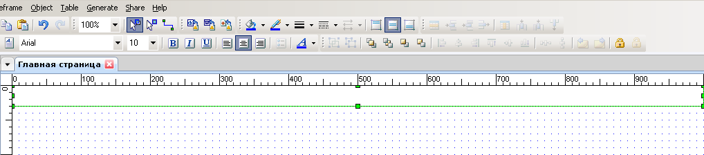
4. Workspace
Actually, in this area all the most interesting is happening - the elements and their design are edited, the functional blocks are made out and so on.
I think the most obvious way to demonstrate how to use the workspace and work with elements is a step-by-step description of creating the main page
I will say right away that the prototype will not be developed until the end - but those who are interested in Axure will be given the opportunity to download the unfinished project and finish it on their own.
So, let's get started.
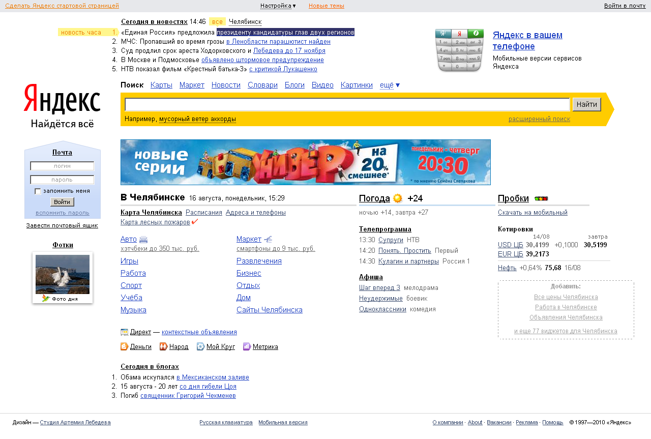
First, take a screenshot of the source:

Here you can see the source in normal resolution .
We measure on the top line 1000px.
We place the rectangle, which will serve as the background for the upper navigation panel and change its size:
Remove the frame from the rectangle.
Select a
Using the Hyperlink interface element, we pull out and place 4 links in the navigation panel, set them to size 8 instead of the standard ten. You can set the color of links right away, but I will leave it to the conscience of those who download and pick the project.

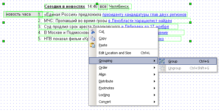
We roll over and draw up the news block using the Text Panel elements for text / links and the Rectangle for the “news of the hour” background. Here we immediately get a few subtleties.
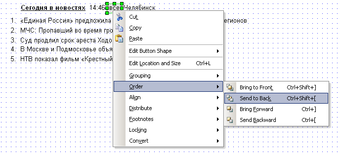
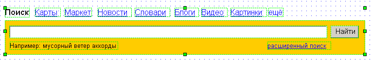
The news in general is ready - you can go to the search bar and to the ad space “Yandex on your phone”.
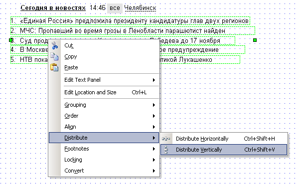
We put the links above the search bar (Hyperlink) and place the search bar itself with the button (Text Field + Button).
We immediately translate the links to size 12 and try to adjust the width of the element to the width of the hyperlink so that the Distribute Horizontally command, which aligns the horizontal indents of the group of elements, works correctly. Of course, it will not work perfectly and you will have to slightly adjust them with your hands, but there is no alternative (at least I have not found).
Do not forget about “for example” (Text element) and “advanced search” (Hyperlink).
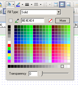
To comply with the sizes of the fields and buttons immediately, I pulled out a rectangular backing and filled it with the corresponding color.
On the right, the substrate under the Yandex shape ends non-standardly - that's why it is design. Fans can cut out the end of the substrate from the screenshot, place the Image element in the working field and replace it with the desired one. We will do this at the very end, because now it’s just laziness and there are more important tasks. For example, put a logo.
Just now we will analyze the substitution of images. This is quite simple - you need to pull out the Image element in the workspace and, without changing its size, double-click on it. A dialog box will open in which we must select the image file. After we find the desired picture and click “OK”, Axure will ask a question:
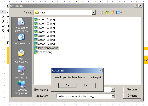
If you refuse, the selected image will be adjusted to the size of the Image element. If you agree, the picture will be inserted in the size in which it exists. As a rule, you have to agree.
To make the prototype look more lively, I stole the image with the banner from the screenshot. But, in principle, you can use the Placeholder element for these purposes - there is nothing wrong with that.
The vast majority of the remaining interface is text. And the operations for its implementation are no different from the work already done. So for those who are interested in designing in Axure and want to try their hand, I can offer to download the unfinished draft of the Yandex main page and work through the remaining elements on their own.
The program itself can be downloaded fromofficial site . The trial version will work with all functions for 30 days.
Yes, by the way, I have nothing to do with this program and the company that developed it. This tool was chosen solely because of the whole set of software that I tried for design, Axure liked the most. I do not exclude the possibility that you will use other software. For example:
1. Overview of visual design tools .
2. 18 Wireframing, And Mockup the To the Tools Prototyping Designs The Plan .