New Habr in a new way
So I sat in the morning in the new Habré and realized that I would rather fix a little user-styles than get used to the new hat .
It was: It became: I was personally hurt by the movement of personal links on the left side. We are used to reaching the right corner with the cursor. How is that possible? New Habr in a new way : - a very compact hat - a logo in the corner - returned personal items to the right side - small fonts on the sidebar - the "reply" link is made less catchy - the color of the links of visited topics is a bit darker - the voting buttons for outdated comments are made barely visible to better perceive the new pale active voting buttons

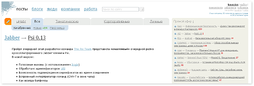
- reduced indents and margins for more complete content filling
- removed the footer
and many minor changes that anyone can tweak to their taste
This style for Firefox + Stylish is here . There you can take a User script for Greasemonkey or Opera. Instructions for Chrome are in the comments below .
Before that, I used the Habrahabr - Prettifier style from almalexa , for which many thanks to him.
UPD 07/29/09
Banners friendly version - Inversion compact skin (banners ok)
Differences:
- friends with banners
- there is a footer
- the original response button to the comments is left
Before | After
Any element that you do not like in the style, you can fix it yourself. All you need is knowledge of CSS.
Suggestions / comments / criticism in the comments are welcome :)
UPD 08/27/09
Habr re-design continues (user style “Inversion compact skin v1.1”)
UPD 10/27/09
Update on the introduction of points in the comments - Patch v1.2 for Inversion compact skin