Plotting with two independent axes in Matlab
The article will be useful to those who draw up graphics in Matlab environment.
When preparing schedules for publishing articles in scientific journals and various kinds of reports, I often came across the need to construct several curves, each relating to its own axis - in order not to overload the article with graphs and not go beyond their limit. But for this in Matlab, up to version R2014a, there was only the plotyy command (X1, Y1, X2, Y2) , which has a number of unpleasant features, which made it necessary to use other programs and do everything manually, which, first, complicates this process with from the point of view of a unified stylistics, secondly, it requires a large amount of time, and thirdly, it does not allow for prompt changes.
But the yyaxes team , which appeared in the Matlab R2014a version. Here we have where to turn.
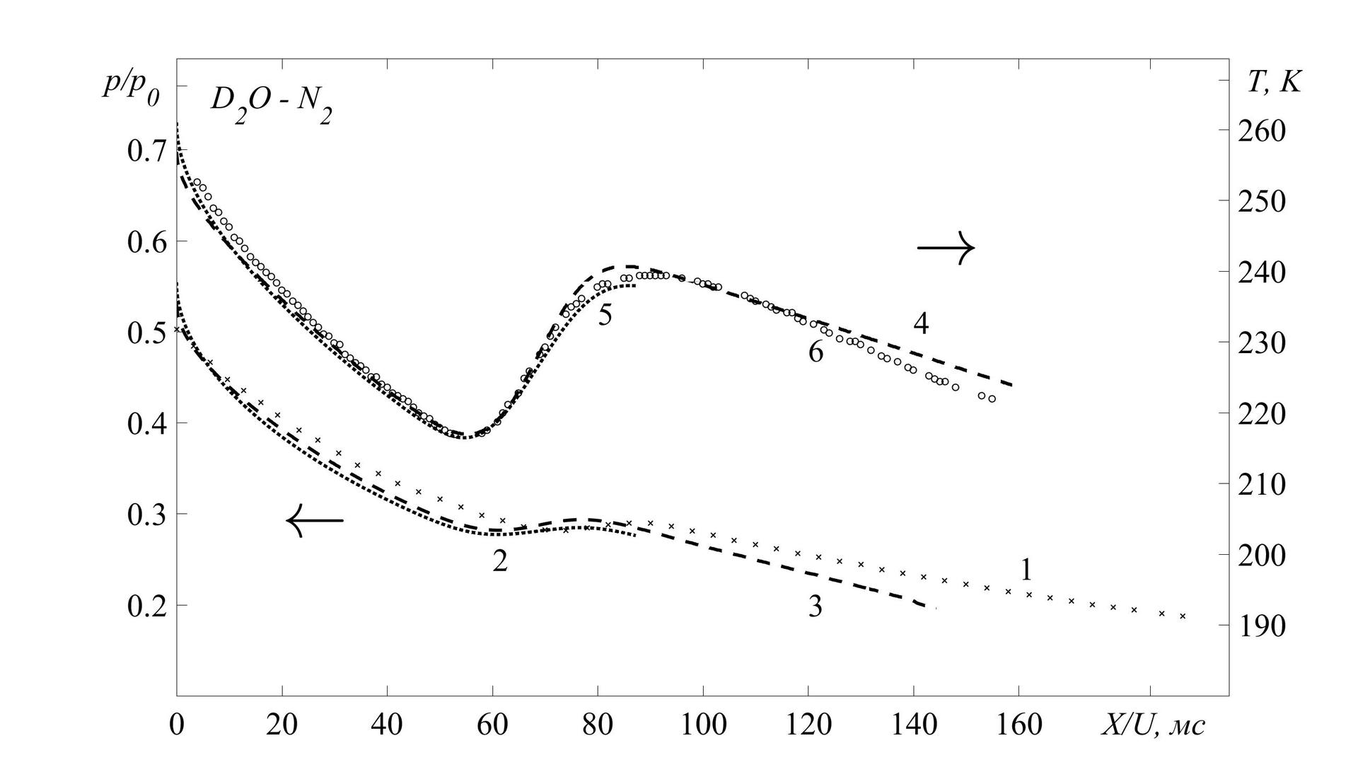
I would like to tell you about the charms of this team by my own example. The task is that I need to build on one graph 3 temperature profiles (solutions obtained by a direct numerical method, a torque method and experimental values) related to the right axis, and 3 pressure profiles related to the left axis. And also add arrows and captions.
Commands yyaxis left and yyaxis rightallow you to cope with this task at times. What, in fact, the essence. Within one figure, we can build any number of graphs, tying them to one of the axes. Within each of the teams, everything works just the same as for regular charts.
The structure of the picture in this case will look like this:
Having filled this structure with necessary, we get as a result:
Another additional feature in preparing graphics for printing is their simple and convenient saving in any format supported by Matlab. To do this, just add the following lines:
Summary
Starting with version R2014a, Matlab has become a suitable program for preparing graphics for publishing articles in various scientific journals. An important advantage is the very good flexibility of this tool, which allows you to process the results and present them in a digestible and beautiful form, including for so-called. "Batch" processing.
It is worth looking here:
→ Useful article on charts in Matlab
→ Description of yyaxis
→ Description of plotyy
→ Export of graphs
When preparing schedules for publishing articles in scientific journals and various kinds of reports, I often came across the need to construct several curves, each relating to its own axis - in order not to overload the article with graphs and not go beyond their limit. But for this in Matlab, up to version R2014a, there was only the plotyy command (X1, Y1, X2, Y2) , which has a number of unpleasant features, which made it necessary to use other programs and do everything manually, which, first, complicates this process with from the point of view of a unified stylistics, secondly, it requires a large amount of time, and thirdly, it does not allow for prompt changes.
Unpleasant features and description
К таким неприятным особенностям я бы отнес:
1. Отсутствие аналога hold on («родной» hold on работает не совсем корректно с plotyy). Для того, чтобы добавить более, чем 2 кривые необходимо использовать вот такую конструкцию:
Из этой конструкции вытекает неприятная особенность №2:
2. Размерности массивов, заключенных в квадратные скобки должны совпадать, т.к. из них формируются матрицы элементов. На практике такое бывает очень не часто.
3. Оформление серьезно страдает оттого, что нельзя программными методами изменить цвета и типы всех линий подряд, можно форматировать только набор линий, относящихся к конкретной оси (hLine1 и hLine2) — во всяком случае, я не смог. При этом, я не говорю сейчас об изменении параметров руками, т.е. редактированием в окне «figure» — только непосредственно кодом в .m-файле.
Резюмируя вышесказанное: plotyy() не очень хорошо подходит для отображения нескольких наборов графиков для разных осей. Разве что для простеньких зависимостей типа этих:

1. Отсутствие аналога hold on («родной» hold on работает не совсем корректно с plotyy). Для того, чтобы добавить более, чем 2 кривые необходимо использовать вот такую конструкцию:
[hAx,hLine1,hLine2] = plotyy([x1',x2'],[y1' y2'],[x3',x4'],[y3',y4']); %Добавляет 4 кривыеИз этой конструкции вытекает неприятная особенность №2:
2. Размерности массивов, заключенных в квадратные скобки должны совпадать, т.к. из них формируются матрицы элементов. На практике такое бывает очень не часто.
3. Оформление серьезно страдает оттого, что нельзя программными методами изменить цвета и типы всех линий подряд, можно форматировать только набор линий, относящихся к конкретной оси (hLine1 и hLine2) — во всяком случае, я не смог. При этом, я не говорю сейчас об изменении параметров руками, т.е. редактированием в окне «figure» — только непосредственно кодом в .m-файле.
Резюмируя вышесказанное: plotyy() не очень хорошо подходит для отображения нескольких наборов графиков для разных осей. Разве что для простеньких зависимостей типа этих:
x = linspace(0,10);
y1 = 200*exp(-0.05*x).*sin(x);
y2 = 0.8*exp(-0.5*x).*cos(10*x);
y3 = 0.2*exp(-0.5*x).*cos(10*x);
y4 = 150*exp(-0.05*x).*sin(x);
X=[x',x'];
Y1=[y1' y4'];
Y2=[y2',y3'];
[hAx,hLine1,hLine2] = plotyy(X,Y1,X,Y2);
But the yyaxes team , which appeared in the Matlab R2014a version. Here we have where to turn.
I would like to tell you about the charms of this team by my own example. The task is that I need to build on one graph 3 temperature profiles (solutions obtained by a direct numerical method, a torque method and experimental values) related to the right axis, and 3 pressure profiles related to the left axis. And also add arrows and captions.
Commands yyaxis left and yyaxis rightallow you to cope with this task at times. What, in fact, the essence. Within one figure, we can build any number of graphs, tying them to one of the axes. Within each of the teams, everything works just the same as for regular charts.
The structure of the picture in this case will look like this:
figure()
{Здесь можно определить общие настройки - шрифт,
размер}
yyaxis left
{Все параметры, определенные в этом блоке - стили, цвета, метки, и прочее относится только к левой оси}
yyaxis right
{Все параметры, определенные в этом блоке - стили, цвета, метки, и прочее относится только к правой оси}
Having filled this structure with necessary, we get as a result:
Program code
% График во весь экран
h = figure('Units', 'normalized', 'OuterPosition', [0011]);
% Настройки шрифта:
F='Times New Roman';
FN='FontName';
FS='FontSize';
l=30;% Размер шрифта
set(gca, FN, F, FS, l)
box on  % Рамкаhold on
%% ПРАВАЯ ОСЬ
yyaxis right
hPlot_1 = plot(time*10^6, T);             % Прямой численный метод
hPlot_2 =plot(time_exp_T*10^6, T_exp);    % Экспериментальное значение
hPlot_3 =plot(time_pk, T_pk);             % Моментный метод
set( hPlot_1, 'LineWidth', 3, 'LineStyle', ':', 'Color',  'k' );
set( hPlot_2, 'LineWidth', 1, 'LineStyle', 'none', 'Color', 'k', 'Marker', 'o' );
set( hPlot_3, 'LineWidth', 3, 'LineStyle', '--', 'Color', 'k' );
% Пределы по у (справа)
ylim([180270]);
% Подписи осей по у (справа)
yticks([190200210220230240250260267])
yticklabels({'190', '200', '210', '220', '230', '240','250''260', '\it T, K'})
% Цвет осей
set(gca,'xcolor','k');
set(gca,'ycolor','k');
%% ЛЕВАЯ ОСЬ
yyaxis left
hPlot_10 = plot(time_P*10^6, P_p0);            % Прямой численный метод
hPlot_11 = plot(time_exp_P_p0*10^6, P_p0_exp); % Экспериментальное значение
hPlot_13 = plot(time_pk, Pp0_pk);              % Моментный метод
set( hPlot_10, 'LineWidth', 3, 'LineStyle', ':', 'Color',  'k' );
set( hPlot_11, 'LineWidth', 1, 'LineStyle', 'none', 'Color', 'k', 'Marker', 'x' );
set( hPlot_13, 'LineWidth', 3, 'LineStyle', '--', 'Color', 'k' );
% Пределы по у (слева)
ylim([0.10.8]);
% Подписи осей по у (слева)
yticks([0.20.30.40.50.60.70.77])
yticklabels({'0.2', '0.3', '0.4', '0.5', '0.6', '0.7', '\it p/p_0 '})
% Цвет осей
set(gca,'xcolor','k');
set(gca,'ycolor','k');
%% ОФОРМЛЕНИЕ ГРАФИКОВ% Маркеры и подписи оси Х
xticks([020406080100120140160185])
xticklabels({'0''20''40''60''80''100''120''140''160', '\it X/U, мc'})
% СТРЕЛКИ
text(20,0.3,'\leftarrow', FS, 60, FN, F);
text(140,0.6,'\rightarrow', FS, 60, FN, F);
text(160,0.24,'1', FS, l, FN, F);
text(60, 0.25,'2', FS, l, FN, F);
text(120, 0.2,'3', FS, l, FN, F);
text(140,0.51,'4', FS, l, FN, F);
text(80, 0.52,'5', FS, l, FN, F);
text(120,0.48,'6', FS, l, FN, F);
text(5,0.75,'\it D_2O - N_2', FS, l, FN, F);
hold off
Another additional feature in preparing graphics for printing is their simple and convenient saving in any format supported by Matlab. To do this, just add the following lines:
%% СОХРАНЕНИЕ РЕЗУЛЬТАТОВ
file_name = strcat('T, p_p0 - mm, ch, exp');  % Имя файла
saveas(h, file_name, 'bmp'); % Формат .bmp
saveas(h, file_name, 'fig'); % Формат .fig
saveas(h, file_name, 'eps'); % Формат .eps
saveas(h, file_name, 'jpeg'); % Формат .jpeg
close(h); % Закрыть график после сохранения
Summary
Starting with version R2014a, Matlab has become a suitable program for preparing graphics for publishing articles in various scientific journals. An important advantage is the very good flexibility of this tool, which allows you to process the results and present them in a digestible and beautiful form, including for so-called. "Batch" processing.
It is worth looking here:
→ Useful article on charts in Matlab
→ Description of yyaxis
→ Description of plotyy
→ Export of graphs