January 22, 2009 at 15:27
Lessons from the Bad Interface
- Transfer
On that day, when Gruber (Gruber) has published its first interface TripLog / 1040 on Stevens Creek , I was determined unfavorably. The colors are bright, the controls seemed to be arranged in a completely random order. This went against all that our designers stand for. Just a mess. Soon the page on Flickr turned into a platform for attacks and insults. But then something very interesting happened. TripLog designer Steve Patt posted a comment in the middle of all this bile flow, in which he shared the logic that ultimately led to this design option. Those who choose not to listen will not learn anything, but others can learn a lot from Mr. Pratt’s twenty-year-old explanation of interesting ideas and experience in software development.
The first rebuke to TripLog is “chaos,” an overabundance of elements on the screen. We will return to chaos, but first, let's talk about speed. Patt explains that TripLog's # 1 goal is to help people track compensated trips. If people can’t book their trips promptly , the difficulty of entering data suppresses the motivation to keep records. For buyers, unrecorded data is kilometers, the cost of which will not be compensated by it. Therefore, for Patta, speed has the highest priority.

What does speed have to do with chaos? Once I happened to attend the Edward Tufte seminar in Chicago, where he presented an interesting concept. It was about the fact that information can be represented as combined in space (adjacent in space) or as overlapping in time (stacked in time) . Take a look at the book, for example. If two illustrations are on the same page, they are arranged as combined in space. To switch the attention between them, turning the eyes is enough. Compare this with the situation when two illustrations are located on different turns. You cannot see them at the same time. You are forced to flip pages back and forth in order to see first one, and then another illustration.
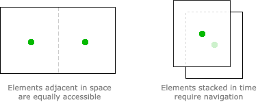
The compromise between the arrangement of elements combined in space or overlapping in time always remains at the discretion of the interface designer. Placing many elements on one screen reduces the need for movement (navigation) and gives the user a complete sense that “everything you need is at your fingertips”. Moving focus from one element to another is instant and easy. On the other hand, dividing elements into different screens slows down navigation, but improves the clarity and cleanliness of the interface. Fewer elements on the page leave more free space that can be used for tooltips or for clearer separation of elements due to empty space. The eye is easier to navigate in fewer entities. Actions become more obvious to the user.
So how many elements did Patt place on the screen? Maybe he should have separated them “in time”? Is its interface really “chaotic”?
To answer this question, we must tear ourselves away from the computer and introduce ourselves in the shoes of the buyer. Patt explains that buyers launch an application in two cases:
The first case is obvious. Patt explains the second:

People tend to spend half the time writing new records. The other half - to check and analyze the latest records. In addition, people tend to check the correctness of the data just entered. These two factors determine the feasibility of placing the functions “add records” and “view recent records” on one screen. This solution optimizes instant access to both functions at the cost of simultaneously placing more elements on the screen.
Following the first impressions ...
When we talk about "convenient" and "intuitive" interfaces, Apple fans and the community of web application developers (including myself - author's note) are oriented towards caring for the novice user of their service. The idea is that the interface is easy to use when a new user can easily understand it and quickly start using it. And all parts of the “clean” interface can be instantly run through with one glance. As a rule, this means placing functions “overlapping in time”, so that each screen form contains fewer elements and is easier to read. TripLog, while far from ideal, has other goals. Instead of first impressions, Patt takes care of repetition.. Spatial memory and the combination of elements play a key role in solving repeated tasks. How many of you keep a set of pens, pencils, papers and other stationery stuff in certain places on the table, instead of climbing into a drawer each time? I think the majority.
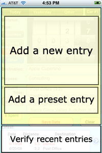
Patt's propensity for adjacency and speed is continued in the block “add an entry”. There are 2 main ways to record a trip: manually enter data into the form or select one of the “Frequent Trips” user pre-configured. Both methods are available. But everything cannot always be accessible. There are also some "hidden" functions. Selecting a “Other” date, not “Today” or “Yesterday”, choosing another car, and changing the list of frequent trips — using these functions requires navigation.
So what have we learned?
Just because a screen is overloaded does not mean that it is poorly planned or ill-conceived. For many of us, screen forms filled with many elements are like cold water, which we would rather not enter. The fact that TripLog is not a pleasure for the eyes confirms the difficulty of providing clarity and order on the screen, which is excessively firmly focused on the combination of functions. This should be a very exciting exercise - redesigning the TripLog design for greater visual clarity without removing any elements.
But before we criticize, we must pay attention to the pros. While TripLog has a bad style, it is exceptionally good at speed and pragmatism. Patt thought over his product and deliberately made its design just like that. Following fashion is easy. Thinking about people's lives and creating something practical is much more difficult. Putt can work on colors and placement of elements and, hopefully, please its users with a useful tool. At the same time, the rest should be wise enough to work on the quality and relevance of our criticism.

What does speed have to do with chaos? Once I happened to attend the Edward Tufte seminar in Chicago, where he presented an interesting concept. It was about the fact that information can be represented as combined in space (adjacent in space) or as overlapping in time (stacked in time) . Take a look at the book, for example. If two illustrations are on the same page, they are arranged as combined in space. To switch the attention between them, turning the eyes is enough. Compare this with the situation when two illustrations are located on different turns. You cannot see them at the same time. You are forced to flip pages back and forth in order to see first one, and then another illustration.
The compromise between the arrangement of elements combined in space or overlapping in time always remains at the discretion of the interface designer. Placing many elements on one screen reduces the need for movement (navigation) and gives the user a complete sense that “everything you need is at your fingertips”. Moving focus from one element to another is instant and easy. On the other hand, dividing elements into different screens slows down navigation, but improves the clarity and cleanliness of the interface. Fewer elements on the page leave more free space that can be used for tooltips or for clearer separation of elements due to empty space. The eye is easier to navigate in fewer entities. Actions become more obvious to the user.
So how many elements did Patt place on the screen? Maybe he should have separated them “in time”? Is its interface really “chaotic”?
To answer this question, we must tear ourselves away from the computer and introduce ourselves in the shoes of the buyer. Patt explains that buyers launch an application in two cases:
- They want to record the kilometers traveled.
- They want to double-check that they recorded their recent trip.
The first case is obvious. Patt explains the second:
The reason is simple and we know it from 20 years of experience selling Athlete's Diary, an application for taking into account the results of sports training. And it consists in the fact that when you launch the application, half of your time you will puzzle over whether you recorded yesterday’s bike ride or a run through the park ... And you want to be able to immediately get an answer to this question, just throwing a quick look at the bottom of the screen.
People tend to spend half the time writing new records. The other half - to check and analyze the latest records. In addition, people tend to check the correctness of the data just entered. These two factors determine the feasibility of placing the functions “add records” and “view recent records” on one screen. This solution optimizes instant access to both functions at the cost of simultaneously placing more elements on the screen.
Following the first impressions ...
When we talk about "convenient" and "intuitive" interfaces, Apple fans and the community of web application developers (including myself - author's note) are oriented towards caring for the novice user of their service. The idea is that the interface is easy to use when a new user can easily understand it and quickly start using it. And all parts of the “clean” interface can be instantly run through with one glance. As a rule, this means placing functions “overlapping in time”, so that each screen form contains fewer elements and is easier to read. TripLog, while far from ideal, has other goals. Instead of first impressions, Patt takes care of repetition.. Spatial memory and the combination of elements play a key role in solving repeated tasks. How many of you keep a set of pens, pencils, papers and other stationery stuff in certain places on the table, instead of climbing into a drawer each time? I think the majority.
Patt's propensity for adjacency and speed is continued in the block “add an entry”. There are 2 main ways to record a trip: manually enter data into the form or select one of the “Frequent Trips” user pre-configured. Both methods are available. But everything cannot always be accessible. There are also some "hidden" functions. Selecting a “Other” date, not “Today” or “Yesterday”, choosing another car, and changing the list of frequent trips — using these functions requires navigation.
So what have we learned?
Just because a screen is overloaded does not mean that it is poorly planned or ill-conceived. For many of us, screen forms filled with many elements are like cold water, which we would rather not enter. The fact that TripLog is not a pleasure for the eyes confirms the difficulty of providing clarity and order on the screen, which is excessively firmly focused on the combination of functions. This should be a very exciting exercise - redesigning the TripLog design for greater visual clarity without removing any elements.
But before we criticize, we must pay attention to the pros. While TripLog has a bad style, it is exceptionally good at speed and pragmatism. Patt thought over his product and deliberately made its design just like that. Following fashion is easy. Thinking about people's lives and creating something practical is much more difficult. Putt can work on colors and placement of elements and, hopefully, please its users with a useful tool. At the same time, the rest should be wise enough to work on the quality and relevance of our criticism.