May 13, 2008 at 17:52
10 mistakes in icon design
An interesting article from Denis Kortunov about the main mistakes in icon design.

Criticizing someone else's work is always much easier than creating something cool yourself. But if you approach the criticism systematically, make a numbered list, prepare illustrations, then this will be a whole analysis! In my opinion, icon design is in transition. The screen resolution is getting bigger, and therefore the icons are increasing. But 16 × 16 and even smaller icons are still relevant. So, here are the main mistakes in the design of the icons ...
# 1 Insufficient distinguishability of the icons.
Sometimes within the same set there are too similar icons and it is very difficult to understand “what is what”. If you do not read the signatures, then you can very easily make mistakes and confuse the icons.

Icons from the Utilities section on Mac OS X. I constantly confuse them and launch the wrong application.
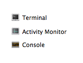
The problem is exacerbated if the small size of the display of icons is enabled.
# 2 Too many elements in one icon
The simpler and more concise the icon, the better. It is very desirable that the number of objects in one icon be minimal.
But Microsoft's designers, inspired by the new icon format in the Windows Vista operating system, decided not to trifle and drew “for all the money”:

Each icon shows us a mini-story with a twisted plot. The only problem is that in small sizes it is completely impossible to understand what is drawn. And in a large size to perceive the icon is not easy.
# 3 Extra elements
The icon should be easy to read. The fewer elements on it, the better. It is desirable that the whole image is significant, and not just a part of it. Therefore, you need to pay attention to the context in which the icons will be used.
Take, for example, a set of icons for working with a database:

At first glance, everything is pretty decent.
But if in the application (or in a separate toolbar) all the actions occur only with the database, then we can (and should) remove the insignificant part:

The meaning is not lost, but the icons have become more distinguishable.
Here is a real example of using extra elements in BeOS 5 icons:

Checkboxes are completely unnecessary here. By the way, why are they red?
# 4 There is no style unity of the set
It is the general style that combines several icons into a set. The unifying factors may be: color gamut, perspective, size, drawing technique, or a combination of these properties. The designer can keep these rules in mind if there are few icons in the set. If there are many icons and different designers work on them (for example, icons for the operating system), special instructions are created. These instructions describe in detail how to draw an icon so that it fits harmoniously into the set.

Rampage of styles in shell32.dll file from Windows XP. It is this set of icons that is offered by default to a user who wants to change the icon.
# 5 Unnecessary perspective and shadows in small icons
Progress does not stand still: the ability to use translucency has appeared in the interfaces, restrictions on the number of colors have disappeared, plus a three-dimensional mode has appeared. But did it not benefit? Not always! Especially when it comes to icons 16 × 16 or smaller.
For example, take the application manager from GNOME 2.2.0 (RedHat 9): The

perspective in icons of such a small size is completely unnecessary and even harmful.
And here is the application manager from Windows XP:

By standard, the icon in Windows XP has a two-pixel black shadow. But in the size of 16x16 the shadow turns out to be too big and looks “dirty”. The Address book icon looks especially bad.
# 6 Too original metaphors
The choice of what will be depicted on the icon is always a compromise between recognition and originality. Before you come up with a metaphor for the icon, it is very advisable to see how it is done in other products. Perhaps the best solution is not to come up with something original, but to do it like everywhere else.
An example of such excessive originality is the basket icon in OS / 2 Warp 4, which is not a basket at all, but a shredder.

Another problem with this shredder is that there is no universally recognized “ordinary” paper shredder. The image used is too much like a printer with an octopus inside. Plus, it's completely unclear how to draw a full basket.
# 7 No national or social considerations
You must always consider who and under what conditions will use your icon. An important aspect is national characteristics. Cultural traditions, surrounding objects, gestures - all this can be very different in another country.
Suppose we need to draw an icon for an email application. It’s logical to use metaphors of real paper mail. For example, a mail box.

Images taken from the Wikipedia mailbox article.
The answer can be found in the Mac OS X Icon Creation Guide: Use versatile and easily recognizable images. Do not focus on the secondary aspects of the elements. Example: for an email icon, it would be preferable to use an image of a postage stamp than an unrecognizable mailbox.

The idea with the brand is great, but the image of an eagle is an extremely controversial moment. Such a birdie will not bring good news.
However, you need to consider not only national characteristics. Let me recall one curious case. We needed a data filter icon, a metaphor for which is often a funnel, and we drew it:

The client’s response was: “I don’t quite understand why you drew a filter icon in the form of a martini glass!”
# 8 Images of real interface elements in icons Icon
Guide for Mac OS X warns us: do not use real interface elements in icons. But all in vain! For example, you can see this icon:

You want to switch the radiobutton, but the whole icon is clicked!
Or here's an interesting example from the OmniWeb browser interface:

Pay attention to the Previous and Next buttons. A rare view of buttons with captions below! Oh! And they are not buttons at all, but icons!
# 9 Text inside icons
This error most often happens in application icons. Indeed, the first thing that comes to mind is to make an application icon from the application logo. Why is the text inside the icon bad? Firstly, it is rigidly attached to the language and localization is difficult. Secondly, if the icon is small, the text cannot be read. Thirdly, in the case of the application icon, this text is duplicated in the form of the application name.

# 10 Past pixels
As a rule, this problem appears if you draw icons in a vector editor. In a large size, everything looks beautiful and clear. But in reality, the icons are small and when rasterized, anti-aliasing “blurs” the boundaries of objects.

Source - http://turbomilk.ru/
Or from my blog - http://mmaxis.info/
Criticizing someone else's work is always much easier than creating something cool yourself. But if you approach the criticism systematically, make a numbered list, prepare illustrations, then this will be a whole analysis! In my opinion, icon design is in transition. The screen resolution is getting bigger, and therefore the icons are increasing. But 16 × 16 and even smaller icons are still relevant. So, here are the main mistakes in the design of the icons ...
# 1 Insufficient distinguishability of the icons.
Sometimes within the same set there are too similar icons and it is very difficult to understand “what is what”. If you do not read the signatures, then you can very easily make mistakes and confuse the icons.
Icons from the Utilities section on Mac OS X. I constantly confuse them and launch the wrong application.
The problem is exacerbated if the small size of the display of icons is enabled.
# 2 Too many elements in one icon
The simpler and more concise the icon, the better. It is very desirable that the number of objects in one icon be minimal.
But Microsoft's designers, inspired by the new icon format in the Windows Vista operating system, decided not to trifle and drew “for all the money”:
Each icon shows us a mini-story with a twisted plot. The only problem is that in small sizes it is completely impossible to understand what is drawn. And in a large size to perceive the icon is not easy.
# 3 Extra elements
The icon should be easy to read. The fewer elements on it, the better. It is desirable that the whole image is significant, and not just a part of it. Therefore, you need to pay attention to the context in which the icons will be used.
Take, for example, a set of icons for working with a database:
At first glance, everything is pretty decent.
But if in the application (or in a separate toolbar) all the actions occur only with the database, then we can (and should) remove the insignificant part:
The meaning is not lost, but the icons have become more distinguishable.
Here is a real example of using extra elements in BeOS 5 icons:
Checkboxes are completely unnecessary here. By the way, why are they red?
# 4 There is no style unity of the set
It is the general style that combines several icons into a set. The unifying factors may be: color gamut, perspective, size, drawing technique, or a combination of these properties. The designer can keep these rules in mind if there are few icons in the set. If there are many icons and different designers work on them (for example, icons for the operating system), special instructions are created. These instructions describe in detail how to draw an icon so that it fits harmoniously into the set.
Rampage of styles in shell32.dll file from Windows XP. It is this set of icons that is offered by default to a user who wants to change the icon.
# 5 Unnecessary perspective and shadows in small icons
Progress does not stand still: the ability to use translucency has appeared in the interfaces, restrictions on the number of colors have disappeared, plus a three-dimensional mode has appeared. But did it not benefit? Not always! Especially when it comes to icons 16 × 16 or smaller.
For example, take the application manager from GNOME 2.2.0 (RedHat 9): The
perspective in icons of such a small size is completely unnecessary and even harmful.
And here is the application manager from Windows XP:
By standard, the icon in Windows XP has a two-pixel black shadow. But in the size of 16x16 the shadow turns out to be too big and looks “dirty”. The Address book icon looks especially bad.
# 6 Too original metaphors
The choice of what will be depicted on the icon is always a compromise between recognition and originality. Before you come up with a metaphor for the icon, it is very advisable to see how it is done in other products. Perhaps the best solution is not to come up with something original, but to do it like everywhere else.
An example of such excessive originality is the basket icon in OS / 2 Warp 4, which is not a basket at all, but a shredder.
Another problem with this shredder is that there is no universally recognized “ordinary” paper shredder. The image used is too much like a printer with an octopus inside. Plus, it's completely unclear how to draw a full basket.
# 7 No national or social considerations
You must always consider who and under what conditions will use your icon. An important aspect is national characteristics. Cultural traditions, surrounding objects, gestures - all this can be very different in another country.
Suppose we need to draw an icon for an email application. It’s logical to use metaphors of real paper mail. For example, a mail box.
Images taken from the Wikipedia mailbox article.
The answer can be found in the Mac OS X Icon Creation Guide: Use versatile and easily recognizable images. Do not focus on the secondary aspects of the elements. Example: for an email icon, it would be preferable to use an image of a postage stamp than an unrecognizable mailbox.
The idea with the brand is great, but the image of an eagle is an extremely controversial moment. Such a birdie will not bring good news.
However, you need to consider not only national characteristics. Let me recall one curious case. We needed a data filter icon, a metaphor for which is often a funnel, and we drew it:
The client’s response was: “I don’t quite understand why you drew a filter icon in the form of a martini glass!”
# 8 Images of real interface elements in icons Icon
Guide for Mac OS X warns us: do not use real interface elements in icons. But all in vain! For example, you can see this icon:
You want to switch the radiobutton, but the whole icon is clicked!
Or here's an interesting example from the OmniWeb browser interface:
Pay attention to the Previous and Next buttons. A rare view of buttons with captions below! Oh! And they are not buttons at all, but icons!
# 9 Text inside icons
This error most often happens in application icons. Indeed, the first thing that comes to mind is to make an application icon from the application logo. Why is the text inside the icon bad? Firstly, it is rigidly attached to the language and localization is difficult. Secondly, if the icon is small, the text cannot be read. Thirdly, in the case of the application icon, this text is duplicated in the form of the application name.
# 10 Past pixels
As a rule, this problem appears if you draw icons in a vector editor. In a large size, everything looks beautiful and clear. But in reality, the icons are small and when rasterized, anti-aliasing “blurs” the boundaries of objects.
Source - http://turbomilk.ru/
Or from my blog - http://mmaxis.info/