 April 25, 2019 at 12:00
Grid or Flexbox?
- Transfer
- Tutorial
Michelle Barker, the author of the material we are publishing today, says that the recent Twitter discussion started by Chris Koyer made her think about how web developers choose between CSS Grid Layout and CSS Flexbox Layout technologies when designing layouts.
Chris Koyer in his tweet asked the audience a question about how those who know what Grid and Flexbox prefer to explain the difference between these technologies.
Among the answers to this question, which, according to Michelle, was quite expected, it was possible to note the valuable ideas of Rachel Andrew and Jen Simmons.
Rachel said

that Flexbox technology is designed to develop one-dimensional layouts, which are a description of the location of elements in a row or column. And Grid technology is designed to develop two-dimensional layouts, which include both rows and columns.
Jen says that Grid technology is used to describe row and column layouts. In this case, the content will be located in the cells of the layout exactly as the developer needs it. When using Flexbox, this is not so, and it is not only about placing data in the second dimension (this is already understandable), but also about placing them in one dimension. Flexbox technology is not suitable for most cases in which it is used.
Michelle notes that just reading tweets does not reveal the features of using Grid and Flexbox technologies. In this article, she wants to talk about when and where to use these technologies, as well as about why one technology may be preferred over another.
Reading the answers to Chris’s question, Michelle was surprised by the number of people who said that they would use the Grid only for page-level layouts, and Flexbox for everything else. If you also adhere to such a rule, this means that you seriously limit yourself in regard to using the powerful capabilities of Grid in various situations. The main thing that the author of the material would like to recommend to web developers is that each layout should be perceived as something special, analyze the available capabilities, and not make assumptions about what technologies will be needed to create it. Here are some questions you can ask yourself when choosing a technology suitable for layout development.
Here is my answer to Chris’s question. I said then that if it seems to me that when creating a layout you have to use the CSS function too often
If you often have to resort to a function
A serious difference between Grid and Flexbox technologies is that the first allows you to control the arrangement of elements in two dimensions (in rows and columns), and the second does not allow this. Again, this does not mean that you should never use Grid for one-dimensional layouts. I often choose the Grid - in those cases when I need high accuracy in controlling the size and position of elements located in one dimension. This approach is demonstrated in this example on CodePen, and in this accompanying article.
Grid Example
Grid technology often makes sense to use in cases where the developer needs control over the behavior of the layout in two dimensions. However, this does not mean that the Grid is always better than Flexbox. When using the Grid, the developer has at his disposal rows and columns, cells, and the so-called grid areas, which are one cell or a group of several cells. When using a Grid, elements must be located in these cells or areas.
Suppose we have a Grid-based layout that differs in the following features: there are nine elements located from left to right in three rows of three elements, there are 20 pixels between the elements. Such a layout can be created using both Grid and Flexbox. The code for describing such a grid-based layout is much simpler and cleaner:
The use of such a layout leads to the fact that the elements are placed automatically, while we do not need to do anything else. If we give ourselves time to think, we can use the Grid functions
An example of using Grid.
You can learn more about this technique, as well as about some other useful things, by watching this video.
If we created a similar layout using Flexbox, then, unlike the example just described, we would need to stylize both the elements and the container:
Here, in the container, you will need to specify a negative value for the property
Here is an example on CodePen that illustrates the above.

Example of using Flexbox
There are several ways to create the same layout using Flexbox, but all of them require the use of some “hacks”, and this happens for the reason that this is their nature. In fact, we are talking about the fact that we are trying to use Flexbox technology for what it is not really intended for. But this does not mean that Flexbox is always an unsuccessful choice of the basis for the layout.
Many modern CSS frameworks use some variation of this method to represent layouts. And by the way, if you want to go this way, I can recommend Susy , a set of tools that takes on all the difficulties in creating such layouts.
So, what is better to choose in this situation? Grid or Flexbox? There is a feeling that Grid has some undeniable advantages here, but in order to answer this question, we need to think about what should happen if we have more than nine, but less than 12 elements (if there are any for example, 12, then this will allow them to completely fill in a new line). Do we need the new elements to simply be at the beginning of the next line, as was the case in the examples that we have already seen? Or do we need them to behave differently? Perhaps if there is only one element in the next row, then we need it to occupy the entire space of this row, as in option A of the following example? Or maybe if there are only two elements in the new line, we need them to be centered,
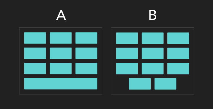
Different options for placing elements in the last row
When using a Grid-based layout with automatic placement of elements, we have only one option - placing a new element in an accessible cell located on the left. A similar arrangement of elements can be found in previous examples. Here we proceed from the assumption that the direction property is not set to
Here is an example that demonstrates such layouts, when using which one or two elements per line, calculated on three elements, occupy this entire line.
An element occupies all available line space.
As a result, it turns out that regardless of the technology used to create the layout, it all comes down to what kind of behavior of the elements located in the layout interests the developer. And in different situations, different answers can be given to the same question.
When I speak at various events, people often ask me when I would use Flexbox instead of Grid, and whether we really need technology like Flexbox. As we saw in the previous example, Grid is not a replacement for Flexbox. Both technologies coexist quite peacefully, and the knowledge of the situations in which each of them shows itself best expands the possibilities for designing layouts.
Component example
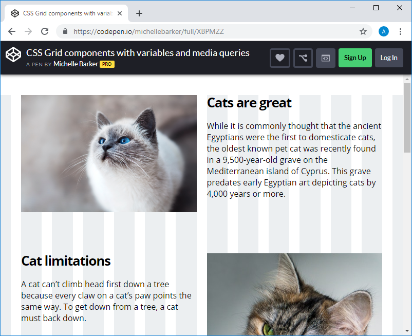
This figure shows a component, during which you need to control the placement of text, image and title, both with regard to columns and with regard to rows. Also here you need to control how they, to a certain extent, interact with each other. The only way to satisfactorily solve this problem is to use Grid technology.
But without hesitation, I will use Flexbox technology to create a navigation menu, such as that shown in this example.
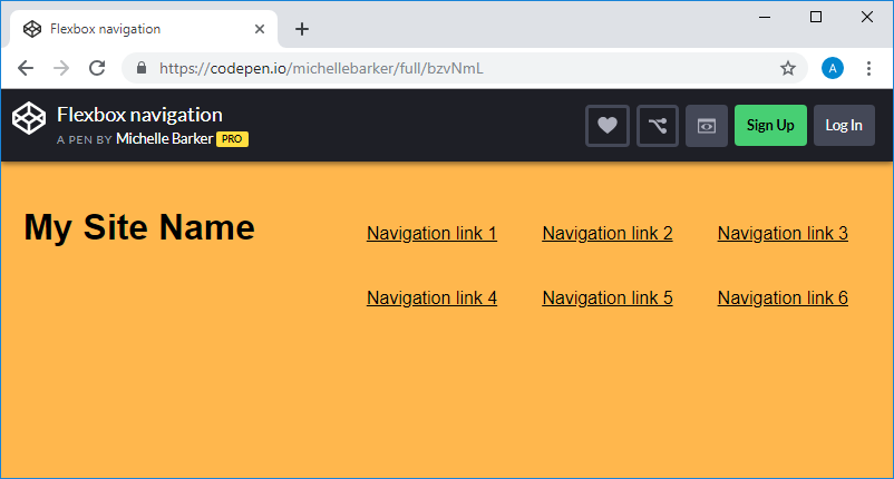
The menu created by Flexbox.
Here you need to control the arrangement of elements in a single dimension, and it is necessary that the elements behave flexibly. Flexbox technology does its job perfectly. Thanks to the use of Flexbox, you can specify whether these elements should be wrapped on new lines or not, which allows you to accurately display them if the free space on the page does not allow you to display all the elements on one line.
If we use Grid technology, then one of the possible problems that we need to take into account is browser support for this technology. Here we also need to think over what will happen if our page is displayed in one of the browsers that do not support Grid (for example, in IE 11 and below). My approach to solving this problem is to use the rules
True, it should be noted here that if you find yourself spending many hours trying to recreate, without using the Grid, what was done using this technology, then maybe you didn’t have that much from the very beginning there are many reasons to use Grid. After all, this technology is especially good in that it is capable of what cannot be done exclusively with Flexbox.
We discussed some very simple and widespread examples of layout development, examined the features of using Grid and Flexbox technologies in their construction. We hope that we were able to give food for thought to those who are busy choosing the right technology for their next layout.
Dear readers! In what situations do you use Grid technology, and in which - Flexbox?

that Flexbox technology is designed to develop one-dimensional layouts, which are a description of the location of elements in a row or column. And Grid technology is designed to develop two-dimensional layouts, which include both rows and columns.
Jen says that Grid technology is used to describe row and column layouts. In this case, the content will be located in the cells of the layout exactly as the developer needs it. When using Flexbox, this is not so, and it is not only about placing data in the second dimension (this is already understandable), but also about placing them in one dimension. Flexbox technology is not suitable for most cases in which it is used.
Michelle notes that just reading tweets does not reveal the features of using Grid and Flexbox technologies. In this article, she wants to talk about when and where to use these technologies, as well as about why one technology may be preferred over another.
Reading the answers to Chris’s question, Michelle was surprised by the number of people who said that they would use the Grid only for page-level layouts, and Flexbox for everything else. If you also adhere to such a rule, this means that you seriously limit yourself in regard to using the powerful capabilities of Grid in various situations. The main thing that the author of the material would like to recommend to web developers is that each layout should be perceived as something special, analyze the available capabilities, and not make assumptions about what technologies will be needed to create it. Here are some questions you can ask yourself when choosing a technology suitable for layout development.
How many calculations do you have to do?
Here is my answer to Chris’s question. I said then that if it seems to me that when creating a layout you have to use the CSS function too often
calc(), then this usually means that I need Grid technology, not Flexbox. If you often have to resort to a function
calc()to accurately calculate the sizes of rows and columns (if you need, for example, to take into account internal fields), this often indicates that you should consider using Grid technology, since the use of a unit of measurefrgreatly simplify your life. Although, as a general recommendation, this advice is quite viable, it does not describe the full picture of what is happening. Sometimes Grid may also be needed in those cases when the function is calc()not used when building the layout . For example, in a situation where we are talking about a two-dimensional layout with a fixed width, the elements of which are 200 pixels wide. When developing such a layout, in order to find out the width of the elements, the function is calc()not needed, but at the same time, the behavior of layouts built on the basis of the Grid can be extremely useful. Similarly, situations are possible in which it is best to use Flexbox and at the same time, inevitably, apply the functioncalc(). As a result, what we are talking about here is best perceived not as a strict rule, like this: “ calc()Do you use Flexbox? So you need to switch to Grid, ”but as information to think.One dimension or two?
A serious difference between Grid and Flexbox technologies is that the first allows you to control the arrangement of elements in two dimensions (in rows and columns), and the second does not allow this. Again, this does not mean that you should never use Grid for one-dimensional layouts. I often choose the Grid - in those cases when I need high accuracy in controlling the size and position of elements located in one dimension. This approach is demonstrated in this example on CodePen, and in this accompanying article.
Grid Example
How should elements behave?
Grid technology often makes sense to use in cases where the developer needs control over the behavior of the layout in two dimensions. However, this does not mean that the Grid is always better than Flexbox. When using the Grid, the developer has at his disposal rows and columns, cells, and the so-called grid areas, which are one cell or a group of several cells. When using a Grid, elements must be located in these cells or areas.
Suppose we have a Grid-based layout that differs in the following features: there are nine elements located from left to right in three rows of three elements, there are 20 pixels between the elements. Such a layout can be created using both Grid and Flexbox. The code for describing such a grid-based layout is much simpler and cleaner:
.grid {
display: grid;
grid-template-columns: repeat(3, 1fr);
grid-auto-rows: 200px;
/* Исходим из предположения о том, что нам нужно, чтобы строки обладали бы фиксированной высотой. Тут можно остановиться и на значении по умолчанию, `auto`, если нужно, чтобы высота строк зависела бы от их содержимого. */
gap: 20px;
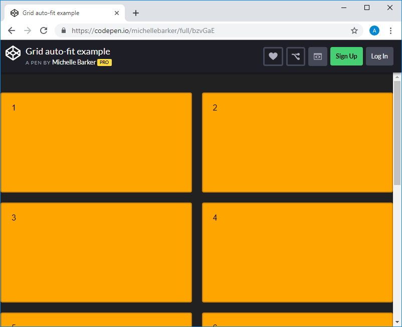
}The use of such a layout leads to the fact that the elements are placed automatically, while we do not need to do anything else. If we give ourselves time to think, we can use the Grid functions
auto-fit()and minmax(), which will allow us to get a fully responsive layout without using media queries. Open this example, try changing the size of the window and look at what happens.An example of using Grid.
You can learn more about this technique, as well as about some other useful things, by watching this video.
If we created a similar layout using Flexbox, then, unlike the example just described, we would need to stylize both the elements and the container:
.grid {
    display: flex;
    flex-wrap: wrap;
    margin: -10px;
    width: calc(100% + 20px);
}
.item {
    width: calc((100% / 3) - 20px);
    flex: 0 0 auto;
    margin: 0 10px 20px 10px;
}
Here, in the container, you will need to specify a negative value for the property
margin- in order to neutralize the fact that the total width of the elements is larger than the container itself, and thus transfer data to the next line. In addition, this example cannot demonstrate the same responsive behavior without additional effort on our part. Further, it should be noted that here, probably, the use of media queries may be required. Here is an example on CodePen that illustrates the above.
Example of using Flexbox
There are several ways to create the same layout using Flexbox, but all of them require the use of some “hacks”, and this happens for the reason that this is their nature. In fact, we are talking about the fact that we are trying to use Flexbox technology for what it is not really intended for. But this does not mean that Flexbox is always an unsuccessful choice of the basis for the layout.
Many modern CSS frameworks use some variation of this method to represent layouts. And by the way, if you want to go this way, I can recommend Susy , a set of tools that takes on all the difficulties in creating such layouts.
So, what is better to choose in this situation? Grid or Flexbox? There is a feeling that Grid has some undeniable advantages here, but in order to answer this question, we need to think about what should happen if we have more than nine, but less than 12 elements (if there are any for example, 12, then this will allow them to completely fill in a new line). Do we need the new elements to simply be at the beginning of the next line, as was the case in the examples that we have already seen? Or do we need them to behave differently? Perhaps if there is only one element in the next row, then we need it to occupy the entire space of this row, as in option A of the following example? Or maybe if there are only two elements in the new line, we need them to be centered,
Different options for placing elements in the last row
When using a Grid-based layout with automatic placement of elements, we have only one option - placing a new element in an accessible cell located on the left. A similar arrangement of elements can be found in previous examples. Here we proceed from the assumption that the direction property is not set to
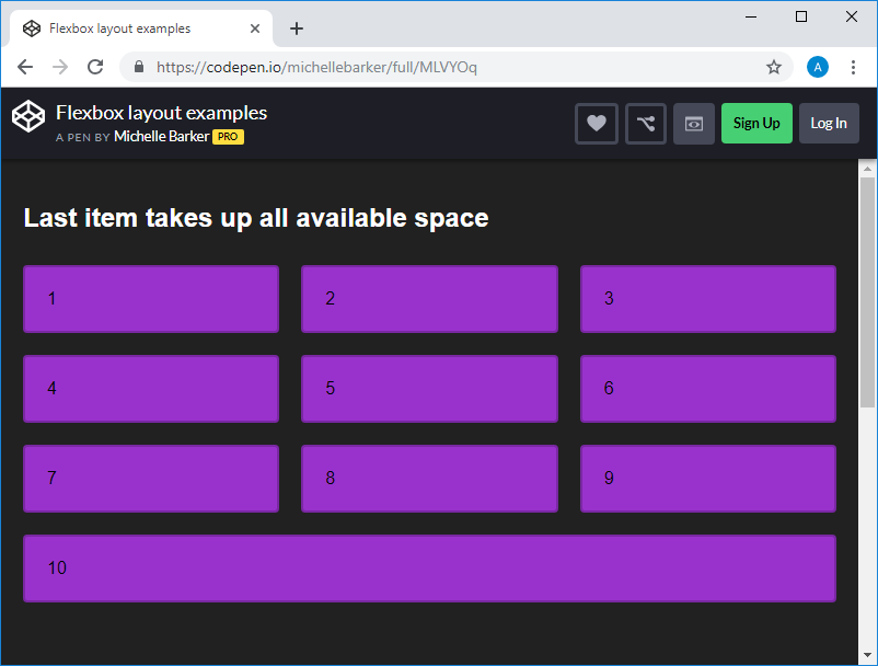
rtl(in this case, the elements would be located from right to left, and the only element in the last row would be located in the right cell). As a result, new elements when using the Grid are placed in the following available grid cells. Flexbox technology allows you to flexibly control the layout of items. This means that we can control the behavior of elements using a combination of properties that control the placement of elements and their alignment. Here is an example that demonstrates such layouts, when using which one or two elements per line, calculated on three elements, occupy this entire line.
An element occupies all available line space.
As a result, it turns out that regardless of the technology used to create the layout, it all comes down to what kind of behavior of the elements located in the layout interests the developer. And in different situations, different answers can be given to the same question.
Are you trying to replace Flexbox with a Grid?
When I speak at various events, people often ask me when I would use Flexbox instead of Grid, and whether we really need technology like Flexbox. As we saw in the previous example, Grid is not a replacement for Flexbox. Both technologies coexist quite peacefully, and the knowledge of the situations in which each of them shows itself best expands the possibilities for designing layouts.
Component example
This figure shows a component, during which you need to control the placement of text, image and title, both with regard to columns and with regard to rows. Also here you need to control how they, to a certain extent, interact with each other. The only way to satisfactorily solve this problem is to use Grid technology.
But without hesitation, I will use Flexbox technology to create a navigation menu, such as that shown in this example.
The menu created by Flexbox.
Here you need to control the arrangement of elements in a single dimension, and it is necessary that the elements behave flexibly. Flexbox technology does its job perfectly. Thanks to the use of Flexbox, you can specify whether these elements should be wrapped on new lines or not, which allows you to accurately display them if the free space on the page does not allow you to display all the elements on one line.
How should the layout look in browsers that do not support Grid technology?
If we use Grid technology, then one of the possible problems that we need to take into account is browser support for this technology. Here we also need to think over what will happen if our page is displayed in one of the browsers that do not support Grid (for example, in IE 11 and below). My approach to solving this problem is to use the rules
@supportsand prepare code for different browsers. Often (but not always) I, as a replacement for the Grid-based layout, use a Flexbox-based layout for fairly old browsers..grid {
display: flex;
flex-wrap: wrap;
/* Продолжение кода, предназначенного для старых браузеров */
}
@supports (display: grid) {
.grid {
display: grid;
/* Продолжение кода, использующего Grid */
}
}True, it should be noted here that if you find yourself spending many hours trying to recreate, without using the Grid, what was done using this technology, then maybe you didn’t have that much from the very beginning there are many reasons to use Grid. After all, this technology is especially good in that it is capable of what cannot be done exclusively with Flexbox.
Summary
We discussed some very simple and widespread examples of layout development, examined the features of using Grid and Flexbox technologies in their construction. We hope that we were able to give food for thought to those who are busy choosing the right technology for their next layout.
Dear readers! In what situations do you use Grid technology, and in which - Flexbox?